7 fantastic design fails – and what we can learn from them
Everyone can learn from these unfortunate design choices.
Design is a problem-solving process. It's about coming up with the best solution for the client (whether they realise it or not), on time and on budget. Sometimes though, the process always quite go to plan. Sometimes a solution can go so off brief that outsiders are left wondering how and why the work was ever signed off.
Fortunately, however, one designer’s misfortune is another designer’s free lesson on what not to do. From print ads to packaging designs, here, we’ve rounded up seven whopping design fails and what we can learn from them.
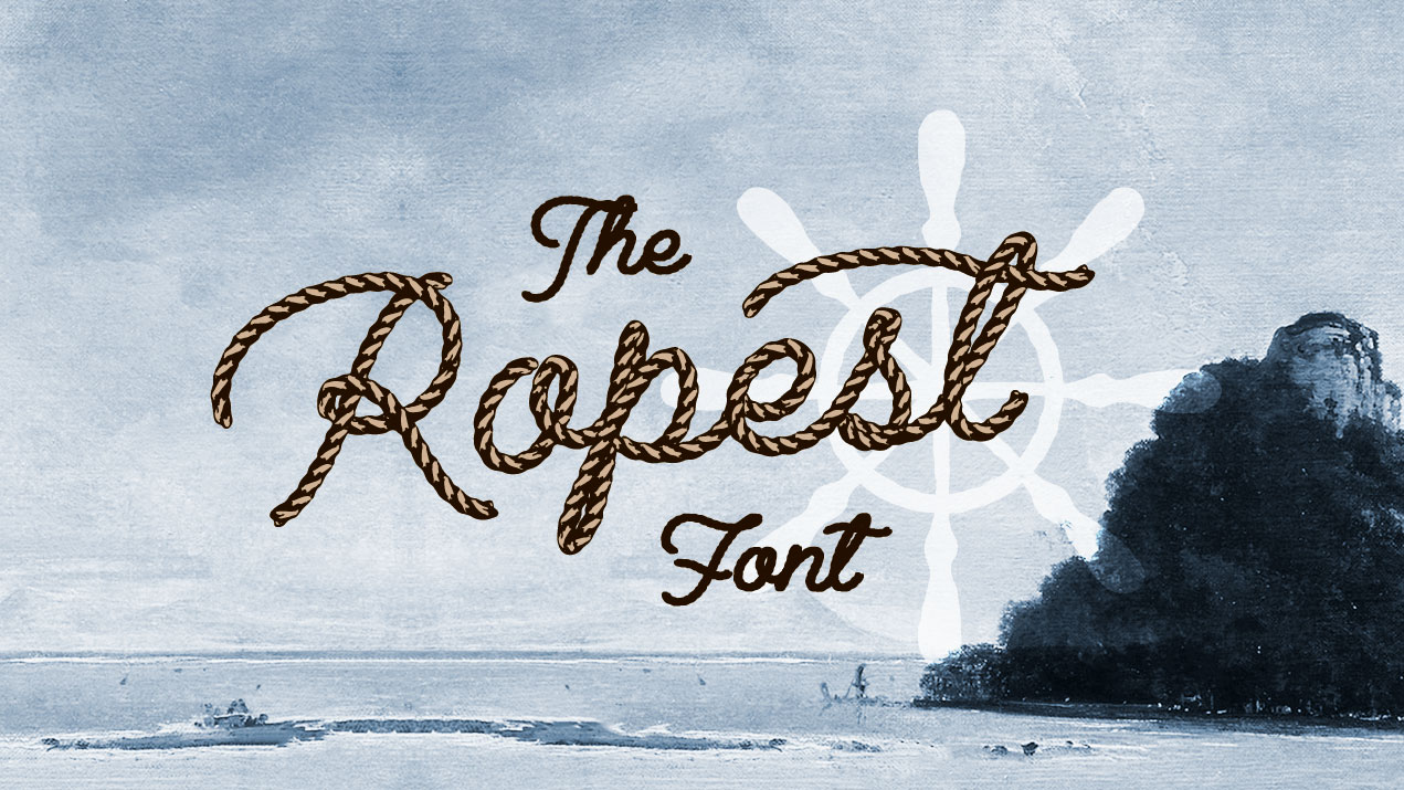
01. Ropest font

We totally get that this font is supposed to be made of rope, and is therefore called, Ropest. But the ligature between the 'o' and the 'p' makes the 'o' looks so much like an 'a' that we can't help seeing a different word when we look at it: Rapest.
The creator of Ropest, Måns Grebäck has created over 256 type families, many of which are extremely popular (and can be found in our list of free fonts). So we're surprised that he didn't notice his font was alluding to rape, or that no one else he showed it to thought to point this out.
The lesson here? Always run your design by various people and ask them what they see, and what it reminds them of. And tread very carefully when the word you're designing has any similarity to a word you want to avoid.
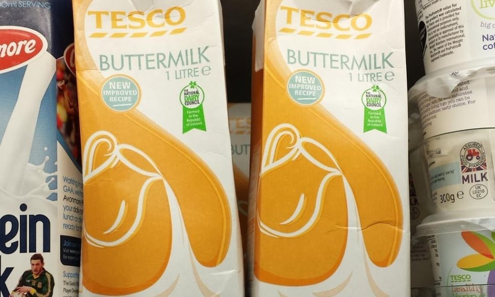
02. Tesco buttermilk carton

This is definitely one of those 'once you see it you can’t un-see it' design fails. It might look like a perfectly ordinary illustration for a piece of own-brand value packaging, but once you focus on the negative space in the image you see a certain body part you don’t want on a buttermilk carton.
Created by Oisín Hurst, creative director at wondr.io, this mishap was one of his first commissions (read more about the mishap here). Crucially, Hurst designed it on a flat keyline and didn’t think to mock up the illustration. As he says, it’s only buttermilk, “what could go wrong?”
Get the Creative Bloq Newsletter
Daily design news, reviews, how-tos and more, as picked by the editors.
Well, the carton could go down as one of the biggest packaging blunders to be picked up by the internet. The too-good-to-be-true packaging crease on the image above only serves to add insult to injury.
To avoid the same fate as Hurst, remember to step back from your design occasionally (or get others to give it a once-over) and allow yourself enough time to revise the design before you send it off. Even an apparently everyday commission could come back to haunt you...
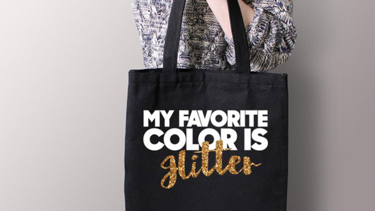
03. BelleChic tote bag

As our first example shows, whenever you’re working with typography, it’s paramount that the message can't be misinterpreted (unless that's what you're going for, of course). Unfortunately, this tote bag for online fashion store BelleChic put design above functionality.
The concept is there for sure, it just doesn’t stick the landing. Picking out the word ‘glitter’ with a suitably glittery piece of typography makes perfect sense in this context, however the unfortunate cursive font choice turns the design into something altogether more sinister.
As the internet was keen to point out, this piece of word art makes the word glitter look a lot like the word Hitler if you read it quickly. Let this tote bag stand as a warning from design history: keep your typography clear by making sure you don’t compound an elaborate font with a tricky to read print material.
04. Steve Jobs mag spread

On our travels around the web to find some examples of fantastic design fails, we came across this warped image of Steve Jobs. While we have an idea of what magazine this was printed in, we can't be sure, however, the design fail here is strikingly obvious. A young Steve Jobs is almost unrecognisable as his much of his face is swallowed by the magazine gutter.
We're not sure what the art ed in charge here was thinking, or not thinking as the case may be. But this epic design fail totally contradicts the entire piece, which is to celebrate an icon of design and innovation. The moral of the story? Always design around the gutter.
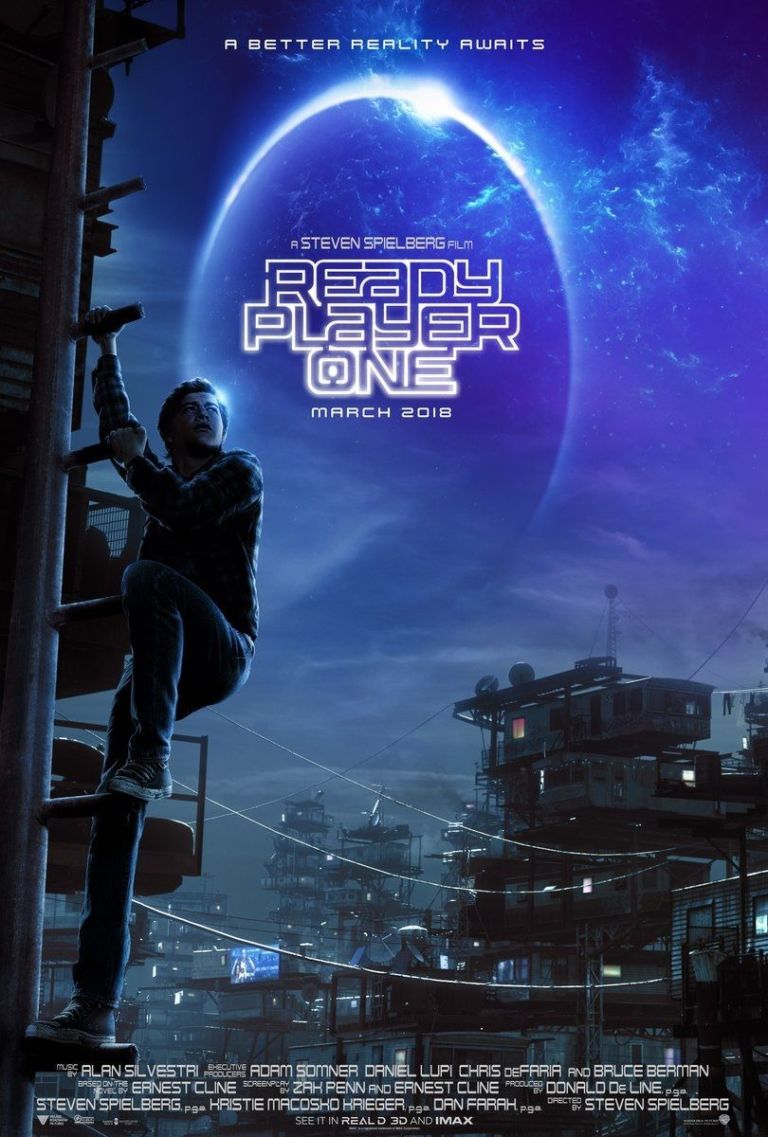
05. Ready Player One poster

Unlike the two designs above, it’s difficult to decide if this poster for Ready Player One fails or whether it’s too right for its own good. The problem has nothing to do with the Ready Player One logo, which itself does a good job of incorporating the theme of the film while still making the title clear - something BelleChic could learn from.
Instead, there’s something a bit off about the character’s right leg as he scales the telegraph pole. Perhaps it’s the angle, or maybe it’s the climbing action, either way, the leg looks far too long.
But is it? Life drawing experts were keen to take to social media to defend the poster and point out that technically the leg is the correct length. Even so, if it looks wrong to the eye, does a design have to stay true to life? Dodge a social media design backlash in the future by finding a balance between aesthetics and accuracy when it comes to character design and composition.
06. Pepsi ad
Chances are you heard about this one when it was first unleashed upon an innocent viewing public at the start of 2017. Tapping into the charged political atmosphere of Black Lives Matter and Trump protests is a… brave move for a brand, but that’s just what Pepsi did with this misguided advert.
It’s a brand manager’s job to treat their company like the most important and influential product on the face of the Earth. However, they’re usually clever enough to use nuanced sales techniques like subtlety and persuasion. Not so for Pepsi. In this tortuous marketing campaign we see Kendall Jenner bring together every demographic under the sun with a little help from metaphorical wigs and a can of Pepsi. It’s enough to make you buy Coke out of protest.
As you’d imagine, a huge backlash ensued that makes the Ready Player One poster scandal look like peanuts. Tapping into cultural movements can be an effective marketing strategy, but brand managers need to know where the limit is. Shoppers are becoming increasingly keen to pay their money into what they believe in, as well as purchasing based solely on the quality of the product. A blunder on the scale of the Pepsi ad is sure to cost advertisers dearly.
07. Quit smoking bus poster

This is a prime example of how even the most sincere of designs turn into a fail. Its position on the back of a school bus next to other bits of signage has unfortunately transformed the message of this well-meaning poster.
Unlike the glitter/Hitler fiasco earlier in this list, this blunder is down to a problem of context rather than a design error. The quit smoking message is clear and concise enough that it would work perfectly on its own dedicated billboard, but the placement of the route name makes it look like an overly sincere call for kids to chuck in their education.
When it comes to context, there’s only so much a designer can do to ensure their work doesn’t become a laughing stock. However if you’re working with a format that allows for some content variation here and there, it’s worth testing out the design with every available option to make sure you’re not setting your work up for a comedic fall.
Related articles:

Thank you for reading 5 articles this month* Join now for unlimited access
Enjoy your first month for just £1 / $1 / €1
*Read 5 free articles per month without a subscription

Join now for unlimited access
Try first month for just £1 / $1 / €1

Dom Carter is a freelance writer who specialises in art and design. Formerly a staff writer for Creative Bloq, his work has also appeared on Creative Boom and in the pages of ImagineFX, Computer Arts, 3D World, and .net. He has been a D&AD New Blood judge, and has a particular interest in picture books.
