10 best CSS frameworks in 2020
We round up the best CSS frameworks right now, from the big players to more specialised tools.
Looking for the best CSS framework? This guide is here to help. In this feature, we're going to help you get familiar with some of the most interesting and powerful CSS frameworks available. Some of these are well-known, while others are newer tools that are just starting to pick up steam. Either way, you’ll benefit greatly from getting to know these useful tools.
Bootstrap | Foundation | UIkit | Semantic UI | Bulma | Tailwind | Picnic CSS | PaperCSS | NES.css | Animate.css
We'll kick things off with some well-known names. With any of these CSS frameworks you’ll be fully equipped to build clean, maintainable projects with minimal time investment (if you'd like something even less time consuming, build your next site with a website builder). However, sometimes you need something a little more specific. For that reason, towards the end of the list you'll find some libraries and frameworks that have very specific use cases.
For more CSS inspiration, take a look at our roundup of top CSS animations and how to code them. Plus, it's always worth making sure you've got the best web hosting option for your site's needs, and the perfect cloud storage, too.

01. Bootstrap

Let’s start with the most popular framework in the world. While Bootstrap is certainly not exclusively a CSS framework, its most popular features are the CSS-based ones. These include a powerful grid system, badges, buttons, card components, navbars and much more. There are also a whole load of free Bootstrap themes to explore.
If you’re not familiar with how a framework like Bootstrap works, a few code examples will help, so you can see how easy it is to build maintainable interfaces by editing nothing but HTML.
Bootstrap’s grid system is a great place to start. The Bootstrap grid has been a valuable commodity since the framework’s first public release in 2011. And no wonder – it’s ridiculously easy to use. Once you’ve included Bootstrap’s CSS, creating a responsive flexbox-based grid that works in all browsers is as simple as this:
<div class="container">
  <div class="row">
    <div class="col-sm">
      Column 1
    </div>
    <div class="col-sm">
      Column 2
    </div>
    <div class="col-sm">
      Column 3
    </div>
  </div>
</div>
As mentioned, Bootstrap also boasts a comprehensive collection of UI components. Some of those that have been difficult to style in the past are just plug-and-play with a framework like Bootstrap. These include a breadcrumb navigation component, a card component and a pagination component. Here’s the HTML to implement pagination:
Get the Creative Bloq Newsletter
Daily design news, reviews, how-tos and more, as picked by the editors.
<nav aria-label="Page navigation example">
  <ul class="pagination">
    <li class="page-item"><a class="page-link" href="#">Previous</a></li>
    <li class="page-item"><a class="page-link" href="#">1</a></li>
    <li class="page-item"><a class="page-link" href="#">2</a></li>
    <li class="page-item"><a class="page-link" href="#">3</a></li>
    <li class="page-item"><a class="page-link" href="#">Next</a></li>
  </ul>
</nav>
All of these components can be built without writing a single line of CSS. In many cases, you’ll likely theme the components to suit the project’s branding. Whatever the case, the mobile-friendly structure will already be in place, making it incredibly easy to reach a finished product in record time. Bootstrap also includes advanced features for responsive layouts, utility components and it’s built on Sass, so it’s super-flexible and customisable.
02. Foundation

The Foundation framework, like Bootstrap, has become immensely popular and is known as a more sophisticated framework with some advanced but easy-to-implement CSS components. Foundation is built on Sass so, like Bootstrap, it’s customisable. In addition to that, it also boasts some powerful responsive features that mean making mobile-friendly designs is super-easy.
The responsive table component is one of our favourites:
<table class="responsive-card-table unstriped">
  <!-- table rows code goes here... -->
</table>
Also, the vertical timeline is a layout feature you don’t see in many frameworks. This component uses the .timeline class for the container, which then holds multiple .timeline-item elements with an icon and content for each item:
<div class="timeline">
  <div class="timeline-item">
    <div class="timeline-icon">
      <img src="image.svg" alt="Icon">
    </div>
    <div class="timeline-content">
      <p class="timeline-content-date">2019</h2>
      <p>Example text for timeline item.</p>
    </div>
  </div>
  <!-- More timeline items here ... -->
</div>
That’s just a small sampling of the many components that make Foundation one of the best CSS frameworks available today.
03. UIkit

UIkit is another popular frontend framework and maybe a little under-appreciated in terms of CSS features. In addition to many features similar to those found in other popular frameworks, there are a few useful specialised components.
First of all, if you’re still not very comfortable with flexbox, you can do complex flexbox-based layouts with UIkit using plain HTML. It might seem strange at first to use flexbox syntax in your HTML classes but this saves you from having to know all the quirks about flex wrapping, columns/rows, flex grow and so forth. Here’s an example:
<div class="uk-flex uk-flex-wrap uk-flex-wrap-around">
  <div>Item 1</div>
  <div>Item 2</div>
  <div>Item 3</div>
  <div>Item 4</div>
  <div>Item 5</div>
  <div>Item 6</div>
</div>
UIkit includes dozens of components that offer attractive styles out-of-the-box. Many of the features are specialised utility classes, including the following:
- .uk-align-left, .uk-align-right and .uk-align-center for aligning or floating elements
- .uk-column-1-2 up to .uk-column-1-6 for multi-column, magazine-style text layouts
- .uk-radio, .uk-checkbox and similar for attractive form inputs
- Various margin and padding utility classes (.uk-margin-top, .uk-padding-small etc.)
- Various utility classes to relatively position an element inside a container (.uk-position-top, .uk-position-left etc.)
UIkit is worth a try if you want a fresh, well-maintained CSS framework with a slew of component options. It’s available in Less and Sass and even includes a stylesheet to cater for right-to-left languages.
04. Semantic UI

Semantic UI has a lot of feature overlaps with other popular frameworks but the way it works (implied by the name) is based on the semantic nature of the class names that are used to build components. In other words, the class names are human friendly.
Take a look, for example, at how you would build a four-column grid:
<div class="ui grid">
  <div class="four wide column"></div>
  <div class="four wide column"></div>
  <div class="four wide column"></div>
  <div class="four wide column"></div>
</div>
Notice the way the class names communicate exactly what’s built. The CSS doesn’t necessarily have a unique set of styles for each of the classes listed but instead the classes work together. Thus, much like language where words make sense in context, the class names work together to build cohesive, mobile-friendly components.
Here’s another example, which builds a simple data table:
<table class="ui celled table">
  <!-- ... rest of the table code here... -->
</table>
This is a great demonstration of how Semantic UI uses class names to describe the component being built. If you’re more accustomed to traditional frameworks like Bootstrap or Foundation, the learning curve on this one might be steeper. But once you get the hang of it, it’s pretty powerful and enjoyable to use.
05. Bulma

Bulma is another popular CSS framework and its primary feature is the fact that its components are largely dependent on flexbox, making it a truly modern framework. You can think of Bulma is being somewhat like a hybrid of Bootstrap and Semantic UI but without any of the complexity. It uses some of the same principles as Semantic UI with its class names, includes many of the popular components, yet manages to keep things simple – for example, form elements have little to no styles to maintain a cross-browser look.
The following example demonstrates how a Bulma component can be built and is easy to maintain:
<section class="hero is-dark">
  <div class="hero-body">
    <div class="container is-fluid">
      <h1 class="title is-size-2">Example Heading</h1>
      <h2 class="subtitle">Example text goes here</h2>
      <p>Some example paragraph text here.</p>
    </div>
  </div>
</section>
Notice the containing <section> element is given the hero and is-dark classes. This indicates you want a hero banner that uses the default dark theme (one of seven theme colours included with Bulma, all of which can be changed via Sass variables).
Also, notice the is-* classes on the container and primary heading. The is-fluid class enables the container to be fluid on any size screen, centred with margins and with no max-width. Without this value, the max-width of the container changes depending on the size of the viewport. The is-size-2 class defines the size of the heading, with sizes ranging from 1 to 7.
As you can see, Bulma makes it incredibly easy to build mobile-friendly interfaces via readable class names.
06. Tailwind

Many modern CSS frameworks are taking advantage of a recent trend in building user interfaces: the use of single-purpose utility classes also known as Atomic CSS (see the accompanying box). Tailwind is one such framework. The idea behind Tailwind is that instead of starting out with pre-styled cookie-cutter components, you build everything from the ground up using utility classes.
The learning curve is definitely higher on this one, especially if Atomic CSS is new to you. But with Tailwind, specificity issues and other override problems common in large stylesheets are avoided.
As an example, Tailwind doesn’t include any kind of ‘button’ component. But you can build your own button using something like the following:
<button class="bg-blue-500 text-white font-bold py-2 px-4 rounded">
  Button
</button>
From there, if you decide what you've created is a valid component for reuse, you can do that by means of Tailwind's component extraction feature. So a component like the button shown in the previous code block can be included like this:
<button class="btn btn-blue">
  Button
</button>
<style>
  .btn {
    @apply font-bold py-2 px-4 rounded;
  }
  .btn-blue {
    @apply bg-blue-500 text-white;
  }
</style>
As you can see, the learning curve for Tailwind is pretty high. Not only do you have to get accustomed to the utility-first styles but it’s also recommended to use component extraction, done using Tailwind’s @apply directive – which is just one way to do extraction; see its documentation for more.
07. Picnic CSS
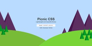
If you don’t like the idea of including presentational classes in your markup, which is common in most, if not all, of the popular frameworks, then Picnic CSS might be the framework for you. Picnic is in many ways the opposite of Tailwind in that it’s not only less complex but very opinionated.
For example, some HTML elements are pre-styled with no need to add class names. These include <button>, <button disabled>, <table>, <input type="checkbox"> and <input type="radio"> (the latter two of which also have a nice little animated check/uncheck actions).
In addition to a number of existing default styles on many HTML elements, Picnic has some other nicely designed interactive pure-CSS components that don’t require any JavaScript. These include a modal dialog, a tab switcher, a file uploader and a tooltip. Some of these can be enhanced with scripting but they’re all functional with just CSS.
08. PaperCSS
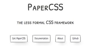
We're getting into the more speciality options in our list of the best CSS frameworks here. This won’t be your go-to CSS tool but it’s one of the quirkiest frameworks out there. PaperCSS is billed as the “less formal CSS framework". The components have a hand-drawn, cartoon-like appearance. Use cases might include a website for kids, a blog, a game or a comic strip.
PaperCSS includes a flexbox grid, badges, buttons, cards and some interactive pure CSS components. The accompanying image gives you a taste of what this unique framework produces.
09. NES.css
Like PaperCSS, NES.css has a unique set of styles suitable for only a narrow set of projects. It mimics the 8-bit Nintendo Entertainment System graphics, creating a retro gaming look.
In addition to common components found in other frameworks, NES.css also includes styles for comment balloons, reaction icons, plus unique containers with borders. Below is the code for a couple of comment balloons. The accompanying image shows how they look along with a couple of the many icons (built via CSS shadows) that are bundled with the framework.
<div class="nes-balloon from-left">
  <p>Comment Balloon Example</p>
</div>
<div class="nes-balloon from-right">
  <p>Another comment balloon example with a little more text.</p>
</div>
If you like this, check out PSone.css.
10. Animate.css
There are multiple libraries that more or less do the same thing: add one or more animations to a specified element. The first such library that gained popularity in recent years was Dan Eden’s Animate.css. This fun library contains dozens of pre-built animations that shake, fade, slide, zoom and more.
There are some other similar libraries that offer users alternative animations, including Woah.css, which has some undeniably offbeat animations that probably aren’t to everyone’s taste. There’s also Vivify, which has many more unique animation options and is quite different from Animate.css. Another great option to explore is CSSFX, a new project that has even more options for plug-and-play style animations.
Finally, if you’re on the hunt for animated loading indicators, you might want to check out Epic Spinners, which features some unique CSS-only animated graphics.
Do I need a CSS framework?
It’s not uncommon to hear people bash CSS. With its focus on the cascade, global styling and the idiosyncrasies of its layouts, it has attracted its fair share of ire from frustrated developers. For these people, CSS frameworks and libraries that modify vanilla code to make it more intuitive are an absolute godsend. Meanwhile, for some CSS purists, frameworks simply add a layer of abstraction to something that needs no adornment.
Neither side is right or wrong. There’s great value in understanding the core language (especially some of the new features like flexbox and Grid Layout) but there’s also great value in being able to build something quickly that’s scalable and maintainable. That’s where CSS frameworks and libraries can help.
It might be that you love writing your CSS from scratch. But with easy-to-use, flexible and adaptable frameworks and libraries like the ones discussed in this feature, you can build interactive and maintainable UIs for your app in little time.
We'd always encourage developers to keep learning and writing vanilla CSS. There’s no substitute for that. But if you need to build or prototype a new layout or design on a tight deadline, using one of the best CSS frameworks can be a huge productivity booster.
If you’re looking to learn the latest creative and practical skills to take your career to the next level, then join us at Generate CSS our conference for web designers and developers. Find out more at www.generateconf.com. Use special offer code WEBDESIGNER2 for a 10% discount on tickets!
This article was originally published in net, the world's best-selling magazine for web designers and developers. Buy issue 321 or subscribe.
Read more:

Thank you for reading 5 articles this month* Join now for unlimited access
Enjoy your first month for just £1 / $1 / €1
*Read 5 free articles per month without a subscription

Join now for unlimited access
Try first month for just £1 / $1 / €1
Louis is an author, speaker and frontend developer who’s been involved in the web development industry since 2000. He curates the popular newsletter Web Tools Weekly and blogs about code at Impressive Webs.
