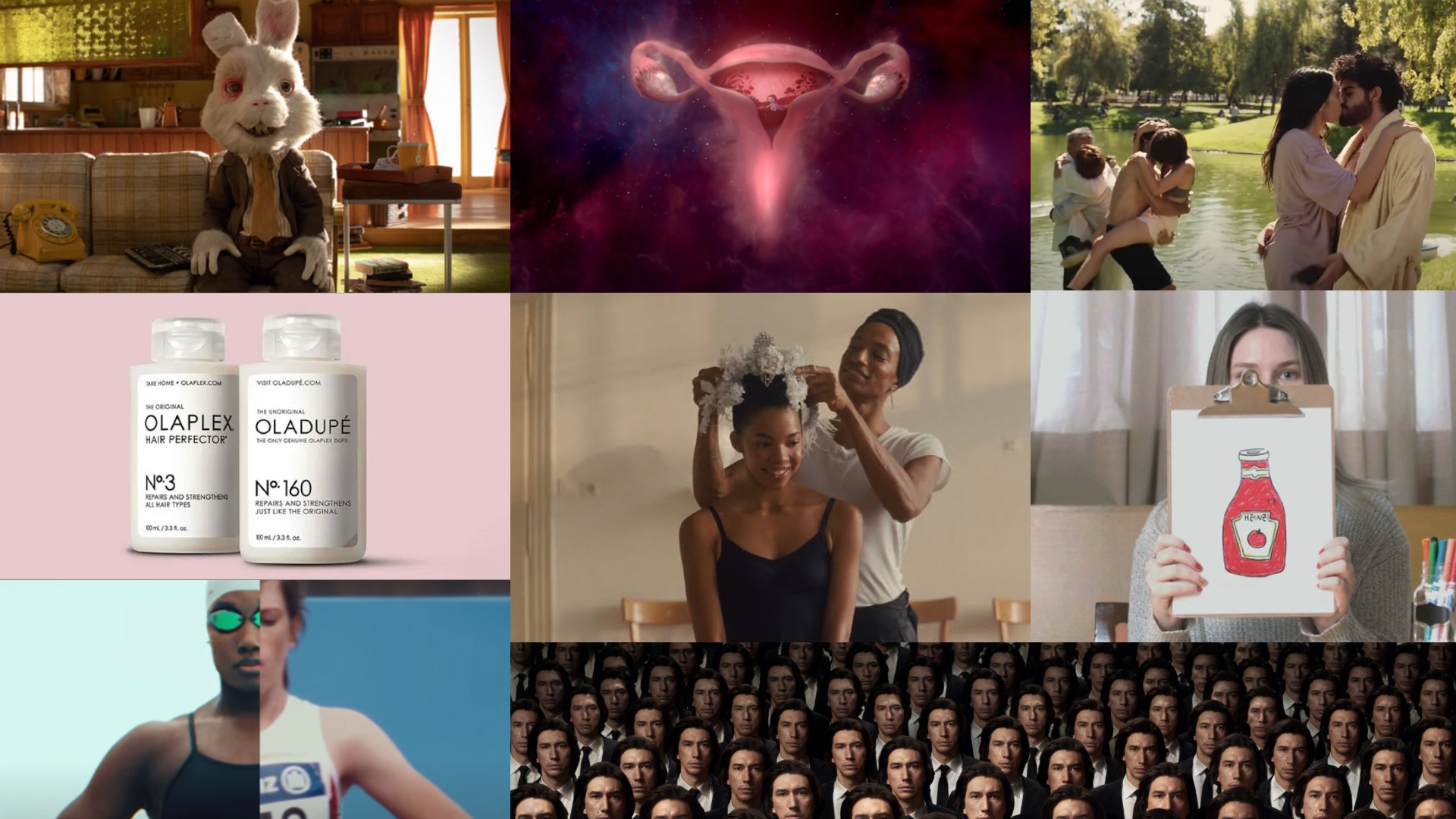
Picking the best ads of the 2020s might seem premature: after all, we're not even halfway through yet. But it certainly feels like this decade has lasted an age, and it's undeniable that it's been distinctive.
First, came the pandemic, then the lockdowns. Then opening up, then more lockdowns. Then things started getting back to normal, only rather than the huge global party and economic resurgence we all hoped for, we got supply chain issues, energy price hikes and major wars. But hey, at least the Barbie movie was good.
All the while, the ad industry did what it's always done in challenging times: adapt to changing norms and come up with inventive new approaches, for everything from print ads to TV to socials and beyond. In this article, we round up the best ads of the decade with input from industry experts, who explain why they worked so well.
01. Emily Crisps: Poster (2020)

The 2020s will be forever marked and remembered as the pandemic decade. But unfortunately, while the world locked itself inside, the media was awash with quite a lot of dreadful advertising.
As Ellie Roberts, client development director at Wake the Bear puts it: "Campaigns veered from the peppy and upbeat – made in haste as brands had to adapt to the ‘new normal’ – to the scary and preachy government ads, which repeatedly, and it turns out hypocritically, told us to STAY AT HOME," says Ellie. "There are very few pieces which stand out from this melee."
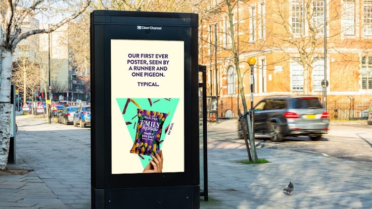
But here was one glowing exception. Emily Crisps, a healthy vegetable crisp brand, were about to run their first ever outdoor media campaign in April 2020, just as lockdown went into full effect, and the streets emptied of people. Yet instead of getting angry, the team saw the humour in the situation. They turned their misfortune into a smile-worthy campaign aimed at key workers and those still venturing outdoors.
The four eye-catching ads featured quirky messages such as 'Our debut poster: Witnessed by one runner and a curious pigeon. Classic!' alongside vibrant pictures of the crisps and the brand's motto, 'Eat Bold'. The campaign ran for two weeks across digital billboards in the UK.
Get the Creative Bloq Newsletter
Daily design news, reviews, how-tos and more, as picked by the editors.
"This brand successfully showed how to adapt and pivot creatively to the pandemic in a way which was not emotionally jarring," says Ellie. "They knew the campaign would not be seen by their target audience or even by humans. The creative work acknowledges this and gently poked fun at the situation. When I saw the campaign on Instagram, it made me smile at a time when my mouth was often downturned."
02. Nike: You Can't Stop Us (2020)
On the other side of the Atlantic, here was another powerful response to the year Covid-19 swept the world. Cleverly spicing together a variety of sports and a diversity of participants across a split-screen device, it was visually entrancing in the extreme. Meanwhile, an inspiring narration addressed the fact that events were being cancelled across the world, but projected a spirit of optimism that somehow, sports would survive. The following year the ad, created by Wieden + Kennedy, won the Emmy for Outstanding Commercial.
"This is arguably one of the most impactful adverts of the 2020s, celebrating the return of sports after the pandemic," enthuses Karim Salama, director at e-innovate. "This ad seamlessly weaves together compelling storytelling, powerful visuals and a unifying message of resilience and unity, showcasing the brand's commitment to empowerment and inclusivity."
"This ad wasn’t just a beacon of hope in the midst of a pandemic," adds Shelley Adamson, creative director at UNIT9. "It was also a work of visual mastery, lovingly crafted at a time before Gen AI was widely available to help.
"The beauty of this ad is evident in its creation," she continues. "A message of togetherness is reinforced by the seamless joining of contextually different frames, while perseverance is embodied in the knowledge that someone probably spent hundreds of hours scouring through footage to find just the right moments. The result is unforgettable, and unmistakably Nike."
03. Bodyform: #wombstories (2020)
Once upon a time, any mention of periods in ads was strictly taboo. It wasn't until 1972 that tampon ads were shown on US TV at all. And then, for decades, any discussion of what period products actually did was studiously avoided. The focus was on the activities women could now enjoy with 'feminine hygiene products' – swimming, horseback riding, playing tennis – rather than the biological aspects of menstruation
Even in the 2010s, there was something quite coy about most tampon ads, which still used blue liquids to represent menstrual fluid, rather than showing or mentioning actual blood (see our piece on the problem with period product branding for more on this). So Bodyform's #wombstories campaign, created by Abbott Mead Vickers BBDO, was quite a step forward – it portrayed the straightforward reality of how women's bodies work, and covered both the joy and pain in equal measure (and was nominated for our Creative Bloq Advert of the Decade award).
"There is so much to say about this ad," says Kirsty Hathaway, executive creative director at JOAN London. "I have always applauded Bodyform for repeatedly putting its head above the parapet to address ‘taboo topics’ – like period blood is taboo! And this campaign tackles the unspoken stories of women’s periods, vulvas and wombs, which are never simple.
"The encapsulation of nuanced and diverse stories, the art direction showing beautiful juxtaposition, the attention-grabbing execution and the impactful message perfectly remind us that brands can play an important role in challenging the societal norms that need to change.
"And change it has," Kirsty concludes. "The cultural conversations that this ad has brought with it around the nature of the female reproductive system is helping to normalise the topic for people of all ages, and I’m beyond delighted."
04. Amazon: The Show Must Go On (2020)
When the pandemic first hit, we all assumed – just as in the early days of World War One – that it would 'all be over by Christmas'. But by December 2020, things were looking very different.
You might have expected the folks at Amazon to feel a little smug at this point: a succession of stay-at-home orders were making the global retail giant even more profitable and powerful than ever before. But they wisely chose to keep that to themselves in this ad, made by Lucky Generals, which instead takes a sympathetic look at the struggles of a teenage ballet dancer, as she spends months unable to rehearse with others or perform in front of an audience.
"‘The Show Must Go On’ laid down a marker in a deeply troubling moment in time, representing the human spirit’s ability to unite in a crisis and build a vision for the future and capturing a rarely-experienced spirit of community collectiveness," recalls Rebecca Winch, managing director of Way To Blue.
"With compelling storytelling, it illustrated the raw human emotions experienced by us all, specifically by the young whose education, invaluable friendships and forward trajectory were halted. The advert encapsulated that, portraying the disappointment and loss that was impacting their physical and mental wellbeing. It celebrated humanity at a grassroots level, building a picture of the value in celebrating small successes in a dark time."
Was there a touch of schmaltz? "Possibly. But that Christmas we needed to see a way forward and believe there was a way to live life fully again. Amazon gave us that and I challenge anyone who says they weren’t moved by their efforts."
05. Extra Gum: For When It's Time (2021)
When lockdown restrictions began, most people were willing to go along with them, thinking it would only last a few months at most. By 2021, though, it was starting to feel like they might last forever. So when things did start to ease, it was a huge cultural moment. And this ad made by Energy BBDO for Extra Gum was one of the best to sum up that feeling.
Set in a "not-too-distant future," the ad plays on the idea of restrictions lifting and people returning to social activities they missed. We see people hesitantly leaving their homes, then shedding inhibitions and engaging in joyful reunions, friendships, and even romance. The tone is uplifting and celebratory, with a touch of humour about the awkwardness of re-entering social situations.
"I remember precisely the first time I saw this, which is the hallmark of a great ad," recalls Shelley. "We’d endured almost a year of the 'new normal' that was Covid life: lockdowns, quarantines, working from home and limited physical contact. It came at a pivotal moment when restrictions were beginning to ease and it just spoke so poignantly to the depravity everyone was feeling after months of being stuck indoors.
"For me, the ad itself felt like an outlet," she adds. "I remember almost letting out a sigh of relief at the brevity of it during such a challenging time. It sent a signal that there was a light at the end of the tunnel. And that, yes, I would need to clean myself up after months of being cooped up at home!"
06. Reddit: Wow, That Actually Worked (2021)
Sometimes in advertising, less is more. And here's perhaps the best example of recent years.
Every year, brands spend millions of dollars to make a Super Bowl commercial that stands out. In 2021, though, message board app Reddit went in the exact opposite direction, making possibly the shortest and cheapest Super Bowl ever created.
And of course, that meant it stole the headlines away from the big-budget fare without breaking a sweat.
"Minimal airtime, seemingly no production budget, the sheer brand recall: this ad, created by R/GA, did what we all strive to do with our work: elicit an immediate reaction," recalls Jason Cary, creative director at Orci. "I went on social media to talk about it. We rewound the broadcast just to watch it again. It was simple, disruptive, and brilliant. It still sticks with me even years later."
07. Humane Society: Save Ralph (2021)
When it comes to issues like animal testing, most people come down on one side or the other, and it's unlikely that even the most brilliant ad is going to change your mind. What an effective ad can do, however, is two things: help persuade the undecided, and encourage the uncommitted to donate or become active. And we're pretty sure this ad from the The Humane Society of the United States will have achieved both.
Starring Taika Waititi, Ricky Gervais and Zac Efron, and produced by Jeff Vespa, this stop-motion animation aimed to raise awareness about animal testing in the cosmetics industry. The ad follows Ralph, a fictional animated rabbit, who discusses his life as a "tester" for cosmetic products, highlighting the cruelty and suffering endured by animals in laboratory experiments. Even if you're in favour of vivisection, the ad can't fail to pull on your heartstrings just a little.
Elliott Starr, creative director at Impero, contrasts the effectiveness of this approach with a more traditional spokesperson ad. "No one's going to watch that," he argues. "No chance. But along hops this charmingly heartbreaking commercial and it shows us, once again, that brilliant, insightful ideas, crafted to the hilt, don't only survive, they thrive.
"Yes, it's a spokesperson. Yes, it's long. But it's good. That matters. And that's why it helped shove several countries to ban cosmetic animal testing."
08. Heinz: Draw Ketchup (2022)
First launched in 1876, Heinz Ketchup was facing declining brand loyalty and wanted to reignite consumers' emotional connection with their product.
Consequently, the Canadian advertising agency Rethink conducted a social experiment across 18 countries. Participants were anonymously asked to simply "draw ketchup" without any brand cues. And here's the kicker: despite the anonymity, 97% of the participants drew elements that clearly represented Heinz ketchup – the classic glass bottle, the red colour, or even the Heinz label.
The campaign capitalised on these real-life drawings. They showcased the artwork in various formats – out-of-home ads, print media, social media, and even a TV commercial. The message was clear: when people think ketchup, they think Heinz.
"This was an incredibly simple and effective way of leveraging social proof and reinforcing category ownership," recalls Amanda Christensen, strategist at Cubaka. "Plus, executionally, this was a great 360 campaign, ranging from OOH and POS activations where some of the ketchup bottles were 'redesigned' as the drawings, doubling down on both attention and exclusivity there."
The campaign also included social media competitions, where people made their own ketchup drawings, with the chance to have those bottles created and sent to them, all of which boosted engagement and user-generated content.
"This was the starting point of a whole overarching strategic move," adds Amanda. "The success of this campaign was recreated in a number of different ways, from AI interpretations of ketchup to their recent worth the wait campaign. The results are memorable proof of a brand’s success in owning a category and engaging with its fans."
09. Squarespace: The Singularity (2023)
Whenever you make an ad, you dream that everyone will end up talking about it. But with this commercial, website builder platform Squarespace went one better. "How many Adam Drivers can you get in one Super Bowl spot?" asks Grant Hunter, chief creative officer at Iris. "It’s the question that broke the internet before this ad even dropped."
The tongue-in-cheek ad, created in-house by Squarespace and directed by Alex Thompson and Jose Pepe Hernandez, featured multiple versions of actor Adam Driver, in a subtle parody of the Matrix movies, and sci-fi cinema in general. Like all the best parodies, it's brilliantly directed and looks like a movie you'd actually want to watch, were it real.
"To celebrate their 20th anniversary, Squarespace went back to their original proposition: a website that makes websites," he explains. "It’s a big spot, with a big star, but it’s the big conversations that played out online that make it a standout to me.
"It generated massive buzz before and after the big game. The creative team crafted the digital content for each touchpoint with some mesmerising design work that played with the notion of infinity. The repetition of the line created and re-awoke memory structures, and the phrase 'A website that makes websites' ingrained itself into the psyche of a nation and, more importantly, into the very soul of the internet."
10. Olaplex: Oladupe (2023)

If you're young, interested in beauty and fashion, and engaged on TikTok, you'll probably already know all about 'dupe' culture. For the rest of us, here's a quick primer.
'Dupe' stands for 'duplicate', and refers to a wide range of products that mimic luxury brands at a more affordable price. Dupes aren't to be confused with counterfeits, though. They're legal products, which simply exploit weaker brand loyalty among Gen Zers with descriptors such as 'contains the same ingredients as [X]'.
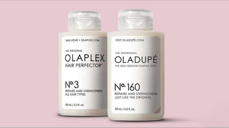
Recently, though, luxury brands have started to hit back. And here's a great example shared by Sammi Price, lead designer at Trinity Create. "Olaplex has duped the dupers with their latest product, Oladupé," she explains.
"The brand utilised social listening to discover that 30.4 million people are searching for good Olaplex dupes on TikTok alone, and so they launched their own dupe campaign," Sammi recalls. "They worked with over 100 paid and earned influencers to do unboxing videos and rate the product. They named it 'number 160' to mark their 160 patented ingredients, and drove consumers to https://oladupe.com/.
"Then came the punchline: they revealed that there was no dupe – Oladupé was just Olaplex in different packaging – and rewarded them with 20% off. A brand that has made themselves un-dupable."
11. Maybelline: Sky High (2003)
Here's another ad that wasn't what it seemed, and got everyone talking on social media. In two brilliantly conceived clips, made in partnership with video creator Ian Padgham, a London bus and Tube train appear to be mounted with huge eyelashes. Suddenly, they then receive a lick of mascara from an enormous overhead wand. It was all done with CGI, of course, but that didn't stop people talking about whether or not it was real.
"This campaign gave us all a good laugh last summer and had the masses talking in droves," recalls Alexandra Johansen, account executive at Carnsight Communications. "I still remember singing its praises in the office. TfL’s Jubilee line and double-decker buses were a clever allusion to a high-profile partnership without all the red tape.
"Consumers don’t always appreciate being duped, but in this instance, I’d argue it paid off in folds. Maybelline served up an ad with a true WOW factor for a fraction of the budget and resources it would take to produce in person and had major success with organic amplification across social platforms.
"Getting your audience to not only engage with your ad is one thing, but to have thousands sharing it it is another feat entirely. So, between that and the creativity of this ad, it’s a real winner for me. It also sparked a great conversation about scepticism, which is certainly growing more and more topical with the likes of VR, AR, AI, and CGI taking over not just the creative space, but our everyday environments too.
"We saw Jacquemus pull off a similar feat a few months before larger-than-life-sized digital recreations of its Le Bambino bags seamlessly traversing the streets of Paris in the manner of any regular bus or tram service. These industry-disrupting campaigns seem to have worked especially well for larger brands like Jacquemus and Maybelline because they’re high profile that audiences could suspend their disbelief and entertain the possibility just enough to not immediately dismiss the ads as a definite fake."
For more great adverts, see our pieces on the best ads of the 2010s and best ads of the 2000s. For more on Bodyform you can read our piece on current period product branding.

Thank you for reading 5 articles this month* Join now for unlimited access
Enjoy your first month for just £1 / $1 / €1
*Read 5 free articles per month without a subscription

Join now for unlimited access
Try first month for just £1 / $1 / €1

Tom May is an award-winning journalist and editor specialising in design, photography and technology. Author of the Amazon #1 bestseller Great TED Talks: Creativity, published by Pavilion Books, Tom was previously editor of Professional Photography magazine, associate editor at Creative Bloq, and deputy editor at net magazine. Today, he is a regular contributor to Creative Bloq and its sister sites Digital Camera World, T3.com and Tech Radar. He also writes for Creative Boom and works on content marketing projects.
