Behind the scenes on the design of the BBC's new font
How BBC Reith was built to work across multiple platforms.
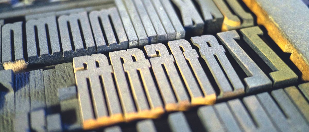
Earlier this year, the BBC commissioned independent font foundry Dalton Maag to design a font family. Starting with Latin and Cyrillic character sets, BBC Reith had to support almost 100 languages from day one.
The BBC wanted a font for everyone that would echo its typographic legacy, while balancing contemporary form with function. With a diverse audience to cater to across a plethora of services, it needed high performance and a range of expression.
Here, we go behind the scenes on the creation of the BBC's new font.
Rationale for a new typeface
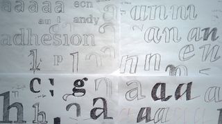
David Bailey, creative director, GEL, BBC: We decided to commission a new typeface to directly benefit our audiences, first and foremost. Previously our shared design framework, GEL (Global Experience Language), offered Helvetica as our online reading font. Gill Sans (our corporate typeface) and Helvetica were both designed 100 years ago for the printed page.
Thus, they don’t perform well on modern screens, resulting in poor legibility when set at smaller sizes. A digitally-optimised typeface solves these issues. And, because we buy licences to existing typefaces, having our own one will significantly reduce our costs.
The aim was also to benefit our visual identity. Helvetica is a great-looking font, but it’s somewhat anonymous. Designers love it, hence its ubiquity. One could argue its anonymity makes it the perfect typeface for a neutral public service. But an internet-fit BBC needs to be more expressive and appealing to stay relevant in a competitive market. Having a typeface in a number of weights and styles provides a wider range of tonality and personality.
Our brief asked for a typeface for everyone, something that would continue the BBC’s typographic tradition of functionality, but in a more contemporary form. We wanted a beautiful workhorse, so to speak.
Get the Creative Bloq Newsletter
Daily design news, reviews, how-tos and more, as picked by the editors.
The name emerged once the project was underway: I suggested it to our steering group as a working title. John Charles Walsham Reith founded the BBC in 1922, with a vision to ‘educate the masses’. And since reading and writing, for most of us, is a core component of learning, naming the font after him seemed fitting. Plus Reith sounds rather elegant, don’t you think?
Answering the brief
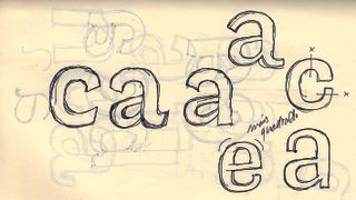
Bruno Maag, founder, Dalton Maag: What really grabbed us about the brief were the unique problems that the BBC faces. Every custom client is trying to enhance their visual identity and trying to rationalise their licensing and logistics, but very few have so many output channels – from print to myriad devices – where the wrong font can compromise a whole design experience at the pixel level.
We proposed a handful of completely different scopes and approaches, which we felt would meet the BBC’s needs and requirements. The options remained open until quite late into the pitching process. One approach we suggested was a typographic system where each channel and service would use only one font from an extended and related family. So there would be a family resemblance between all of the channels and services, and yet a distinctive voice for each.
I liked such a strong typographic solution as part of a group of related visual identities, but ultimately the selected route was a multifunction typographic toolbox, which could do all of this, and more, with fewer fonts and at a lower cost. Once this route was chosen there were still questions on design route, weight ranges, and targeted functionality.
Input and feedback from David, the UX team, and everyone else was there right from the very start – during the collaborative workshop. That’s what allowed us to establish the basic design parameters for the Ideation stage.
In both the sans and the serif you’ll see a calligraphic construction, open counters and apertures, ascenders that project above the cap height, regularised proportions and sharp connections between bowl and stem. The aim is to contrast features. Some anchor the design in tradition, others give a modern and progressive outlook. Together you get BBC expressiveness, which still works on small screens.
Implementation
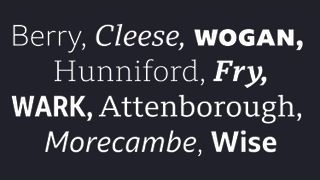
David Bailey: This summer BBC Sport launched their newly-harmonised branding across broadcast and online. They chose to adopt BBC Reith Sans, and we understand that it’s been well received by audiences. Technically, it’s performing great. Needless to say our researchers and accessibility specialists are running user-testing sessions as we speak.
Look closely and you’ll see the rigorous craftsmanship in of the each characters’ construction
We’re delighted with BBC Reith. Look closely and you’ll see the rigorous craftsmanship in each character’s construction. It’s a thing of beauty. And performance-wise it’s ticking the boxes. Having a new typeface has created a palpable buzz among colleagues. Personally, I was blown away with how well the project ran. It’s been quite a journey, but the shared belief and support from colleagues right across the BBC has been fantastic.
Plus, Dalton Maag are great teachers. They schooled us in type design; its history and craft, and not just from an aesthetic point of view but also the science behind reading and how our brains absorb and process type. It really is a fascinating topic. As a designer of some 20 years, I thought I knew this stuff. I didn’t. Now at least I know some of it.
This article was originally published in issue 272 of Computer Arts, the global design magazine – helping you solve daily design challenges with insights, advice and inspiration. Buy issue 272 here or subscribe to Computer Arts here.
Related articles:

Thank you for reading 5 articles this month* Join now for unlimited access
Enjoy your first month for just £1 / $1 / €1
*Read 5 free articles per month without a subscription

Join now for unlimited access
Try first month for just £1 / $1 / €1
