Behind the scenes of Coca-Cola's design challenge
We take a look at the Coke X Adobe X You international design challenge.
At Adobe Max 2017, back in October, Adobe and Coca-Cola announced a design collaboration called Cola x Adobe x You. As a partner to the 2020 Olympics in Tokyo, Coca-Cola gave away all its brand assets to creatives around the world, asking them to participate in a design challenge using Adobe Creative Cloud software.
Working with Adobe, Coca-Cola invited 15 creatives to contribute to the launch of the challenge at Adobe Max 2017. Using Coca-Cola Red Disc, Spencerian Script Coca-Cola Logo, Contour Bottle icon and Dynamic Ribbon – plus their own imaginations – each was asked to create imagery. We have a look behind the scenes at how the project launch took shape.
"When I attended the Adobe Max event in San Diego in 2016, I admired the scale and presence the company has with the global creative community," explains James Sommerville, the vice president of Global Design at the Coca-Cola Company. "We discussed ideas around how we could collaborate, and connect with the design community using Coca-Cola’s cherished assets, and that led us to formulate this challenge.
"Coke x Adobe x You is a pre-campaign exploratory design challenge. It’s an opportunity for Coke, as a global brand, to take the pulse of the design community and see what creatives can do with our brand assets. The challenge looks towards the 2020 Tokyo Olympic Games, but at this stage we have not formulated our global campaign for Tokyo 2020.
"At Adobe Max 2017 in Las Vegas, we invited the design community at large to visit the site www.cokexadobexyou.com to find out more about the challenge. The brief is simple, but the possibilities really are endless. We have restricted the elements to the Coca-Cola brand colour palette, the Coca-Cola assets, and what the designer thinks of when they think of Coca-Cola, Japan and the Olympics."
Artists chosen to inspire and lead
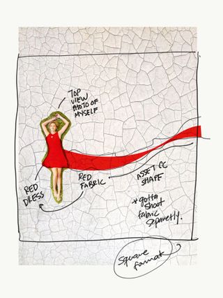
"Initially, we invited 15 creative influencers to participate, so that we would have their images at launch to inspire others," says Somerville. "It was important to us to work with people using all the design disciplines, including 2D, 3D, motion, illustration, photography and typography, in order to show the extent of this brief in terms of application.
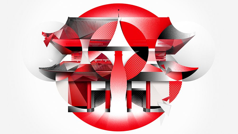
"Kouhei Nakama uses motion graphics, Vasjen Katro creates fabric graphics, Birgit Palma [who designed the Tokyo-inspired geometric design in the main image] is a type designer, and Guy Aroch is a photographer, for example.
Get the Creative Bloq Newsletter
Daily design news, reviews, how-tos and more, as picked by the editors.
"Each of the 15 creatives has worked with the same brief and assets, and it was important that they all worked with the same elements. The Olympics brings the world together through sport, and we felt the design challenge would do the same thing through creativity.
"Over the decades, many artists ranging from Andy Warhol, Norman Rockwell and Mr Brainwash have embraced the Coca-Cola identity, and provided their unique perspective on our brand. Today the tools may be different, but the passion remains, and all of our creative influencers have been excited to participate. This work will become a moment in time, and they will be part of that, and the work may one day live in our archives.
"Aside from the constraints of the simple brief, it was open for our 15 designers to take any approach. We wanted to explore what individuals can create with no firm direction from me or the Coca-Cola Design team. This is a design challenge, not a commercial campaign."
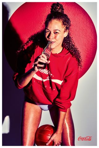
"The assets provided include the Coca-Cola Red Disc, Spencerian Script Coca- Cola Logo, Contour Bottle icon and Dynamic Ribbon. The only colours to be used in the challenge are the Coca-Cola red, black and white.
"Red is our precious colour and few brands come as quickly to mind as Coca-Cola when you think of red. While we hope to have many diverse styles across different mediums, it is important to have a thread, and our Coca-Cola red is that thread."
The 15 creatives involved in the campaign launch were Asjen Katro, Birgit Palma, Kouhei Nakama, Sha’an d’Anthes, Ion Lucin, Frankie Cihi, Guy Aroch, Max Muench, Jati Pratama, Olivia Odiwe, Kei Meguro, Mike Winkelmann, David Tshabalala, Karen Cantuq and Filip Hodas.
Let's see how three of the creatives made their designs for the launch of the campaign.
01. Gif design
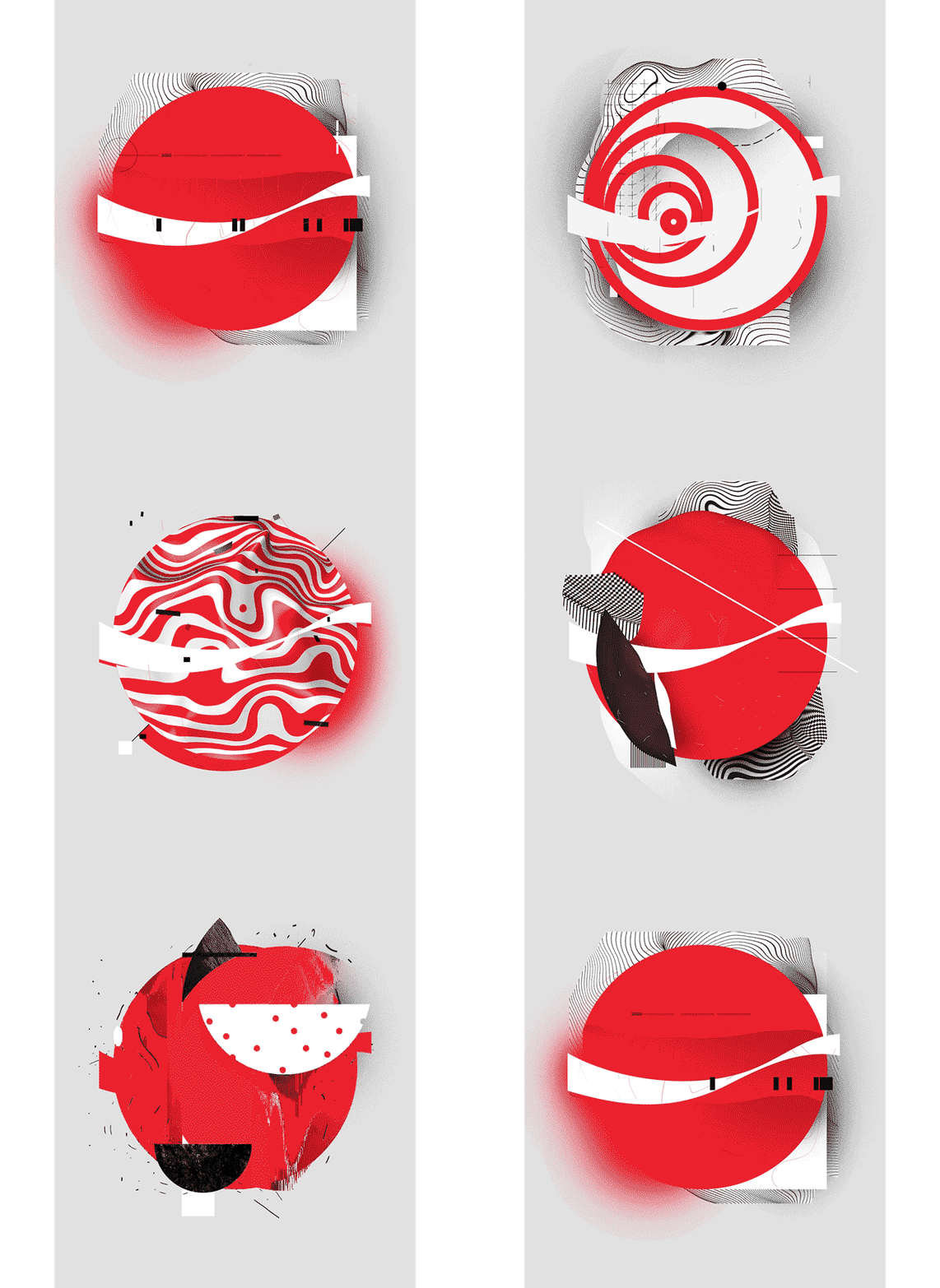
Vasjen Katro’s creation riffs on circles and repeated forms. "After I discovered that the Olympics are held over 16 days, I decided to create a different piece of artwork for each day of the event," he explains.
"Every day is different and has its own unique qualities but also has similarities, so my approach was to translate all that into a series of different images. When you watch the final video you get an overall feeling of these differences, but you also see one element that doesn’t change, which is the circle and the Coca-Cola identity.
"I began the artwork in Photoshop before moving to Illustrator to create the illustrations and elements. Each piece was compiled and merged in Photoshop. For the video, I worked in After Effects and exported the file using Media Encoder."
02. Video
A photo posted by @kouhei_nakama on Oct 18, 2017 at 7:46pm PDT
Motion graphics artist Kouhei Nakama explains how he created two stunning videos to inspire others: "At first glance, using red, white and a circle as required in the brief seemed quite simple, but there was a risk that my final artwork would end up looking quite similar to that of the other creatives doing the challenge. I focused on creating something simple that was also original.
"In my first video, the camera zooms in to Japan’s flag. I wanted to create something that got people excited about the Tokyo Olympic games. By describing the athlete’s dynamic performances in the flag, I’m hoping viewers will get that feeling of excitement.
A photo posted by @kouhei_nakama on Oct 25, 2017 at 1:43am PDT
"For the video where athletes are painted with the Coke logo, I wanted to use 3D. You can’t see the whole logo in one frame, but it fills in across the sequence. The logo is invisible in the still, but it is visible in the movie and this serves to enhance the logo.
"First, I created 2D materials and textures in Photoshop and Illustrator. I then imported them into my 3D software, modified them and sorted the layout. After compositing the rendered footage in After Effects, I edited it. Then I compressed the files with media encoder and posted them.
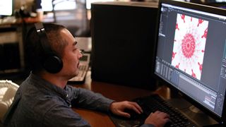
"The most difficult part of the challenge for me was generating the idea. I needed to come up with something original and sophisticated, something that people would instantly recognise. I spent a lot of time thinking about how the videos would work before I started producing the design. Once I had finalised my idea, the production process went pretty smoothly."
03. Geometric art

Illustrator Birgit Palma says of her geometric Olympic artwork at the top of this article: "I was inspired by the shapes of the elements we were given, and decided to take the most important ones – the circle, the bottle of Coca-Cola and the Asakusa Kannon – as symbols to communicate the characteristics of Tokyo.
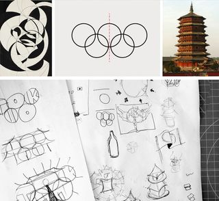
"Those shapes were fascinating and I decided to use their symmetry as the basis of my artwork. I scribbled down some ideas, and when I had chosen one I started to compose the different elements and to sketch it out geometrically in Illustrator.
"To give it more depth, I switched to Photoshop and coloured in the composition, concentrating on the colour balance of the artwork and on the details at the intersections and triangular parts."
This article was originally published in issue 274 of Computer Arts, the global design magazine – helping you solve daily design challenges with insights, advice and inspiration. Buy issue 274 here or subscribe to Computer Arts here.
Related articles:

Thank you for reading 5 articles this month* Join now for unlimited access
Enjoy your first month for just £1 / $1 / €1
*Read 5 free articles per month without a subscription

Join now for unlimited access
Try first month for just £1 / $1 / €1
Garrick Webster is a freelance copywriter and branding specialist. He’s worked with major renewable energy companies such as Ecotricity and the Green Britain Group, and has helped develop award-winning branding and packaging for several distilleries in the UK, the US and Australia. He’s a former editor of Computer Arts magazine and has been writing about design, creativity and technology since 1995.
