Why modern branding needs Bauhaus
How the Bauhaus movement is making a comeback.
When turning to a design movement for inspiration, Bauhaus is always top of the list. Since its foundations in Weimar at the end of the first World War, to its 'official' end in Berlin 1933, Bauhaus has continued to impact design.
The next few years will see a revival of Bauhaus in brand. Its principles of simplicity and functionality provide an antidote to the information overload and fake news that make it increasingly difficult for people to put their trust in brands today, and could also be an answer to accusations that branding has become boring.
But what does it mean for brands to take on the ethos of Bauhaus, in a way that transcends the modernist sensibilities of the era, to help them effectively communicate their message and purpose?
After staying at the Colorado campus at the Aspen Institute, designed by Bauhaus architect Herbert Bayer, Steve Jobs made a conscious decision to shift the direction of Apple: “The way we’re running the company, the product design, the advertising, it all comes down to this: Let’s make it simple. Really simple.” Jobs' revelation led to Apple’s move away from bulky consumer electronics to create the light, colourful and streamlined products we know and love today (see today's Apple deals to get your hands on them).
Form follows function

The ‘less is more’ approach helps create transparency and authenticity in brands. With Gen Z sniffing out anything with token messaging, it is no longer enough to come up with attractive logos and catchy jingles.
But creating simplicity in brands is not just about a clear, pared-back logo, it’s about getting to the heart of a brand’s purpose and expressing that in every aspect – from strategy to product design to marketing – everything has to align. "Design isn’t just what you see and feel, the design also relates to how something functions," said Jobs.
It isn’t an easy feat. This is why, at fst, we have adopted the Bauhaus principle ‘form follows function’. The more complex the content, the greater the need for simplicity.
Get the Creative Bloq Newsletter
Daily design news, reviews, how-tos and more, as picked by the editors.
Both Bauhaus and Apple worked with complex functions and distilled in them something easy for consumers to use. Bauhaus founder, Walter Gropius, demanded his students go back to basics by focusing on the building blocks of art and craft – line, shape, colour, and composition – as they were also pivotal components of the framework for function.

In furniture, appliances and architecture, this principle was applied, resulting in designs that were elegant, eminently functional, and producible en masse. Staying true to materials also helped create clarity and linearity in form and function. For example, for ‘The ‘Wassily’ Chair (above), Marcel Breuer chrome-plated the aluminium to make the high-tech material even more noticeable and futuristic.
When you hold or use an iPhone in your hand, you just know it’s an iPhone or Apple product, you don’t have to check the logo to make sure. Its mechanics have been distilled into an identifiable, easy-to-use product that is transparent in how it functions. The work speaks for itself.
Gesamtkunstwerk
Brand is more than an ID or a signature. A brand must be united on all fronts – from product design to the way a team is run – and when it works you don’t need a logo to recognise it.
Bauhaus designers subscribed to a philosophy. Their shared vision enabled consistency without uniformity across the school that worked with multiple mediums including architecture, furniture, photography, typography and weaving. Even under multiple directorships, geographical shifts and Nazi suppression, their identity and purpose remained the same.
Gesamtkunstwerk (loosely translated as comprehensive artwork) grounded Bauhaus in the idea that all the arts would eventually be brought together. The idea of the ‘total design’ not only gathered artists, artisans, and craftsmen under one roof, it advocated consistency of design through all elements and stages of production.
The end of WWI was an era of change and disillusionment, and the rise of technology and mass production was swiftly changing the landscape. The moralistic and romantic connotations of high art craft were discarded to embrace a unification of artist and craftsman come together to serve the needs of a developing civilisation. By bringing wide-ranging mediums and expertise together, they fused art with industry to create a more holistic and egalitarian approach to design.
A similar post-crisis clarity is needed today to make brands with purpose. Brands need to be reassessed through the lens of Gesamtkunstwerk – where product design and strategy to web design and marketing are all resonating with each other. This ensures brand philosophy underpins and emanates throughout all aspects, and even allows the brand to extend beyond its remit.

Volvo recently produced LifePaint to make bikes more visible on the road. Although Volvo does not make bikes, its philosophy is bound up in safety, so the paint is an extension of its identity and can be recognised instantly as a Volvo product.
Gesamtkunstwerk should inform the way we collaborate. The Bauhaus school encouraged teachers and students to pursue their crafts together in design studios and workshops. Creative communication is key for brand integrity.
Bauhaus ‘blanding’

If a brand’s message is right, a logo can afford to be recessive.
Bauhaus artists created new imagery by stripping away the inessential, and they were able to create complex visuals using only a few strategically placed shapes. Bauhaus was marked by the absence of ornamentation and by harmony between the function of an object or a building and its design.
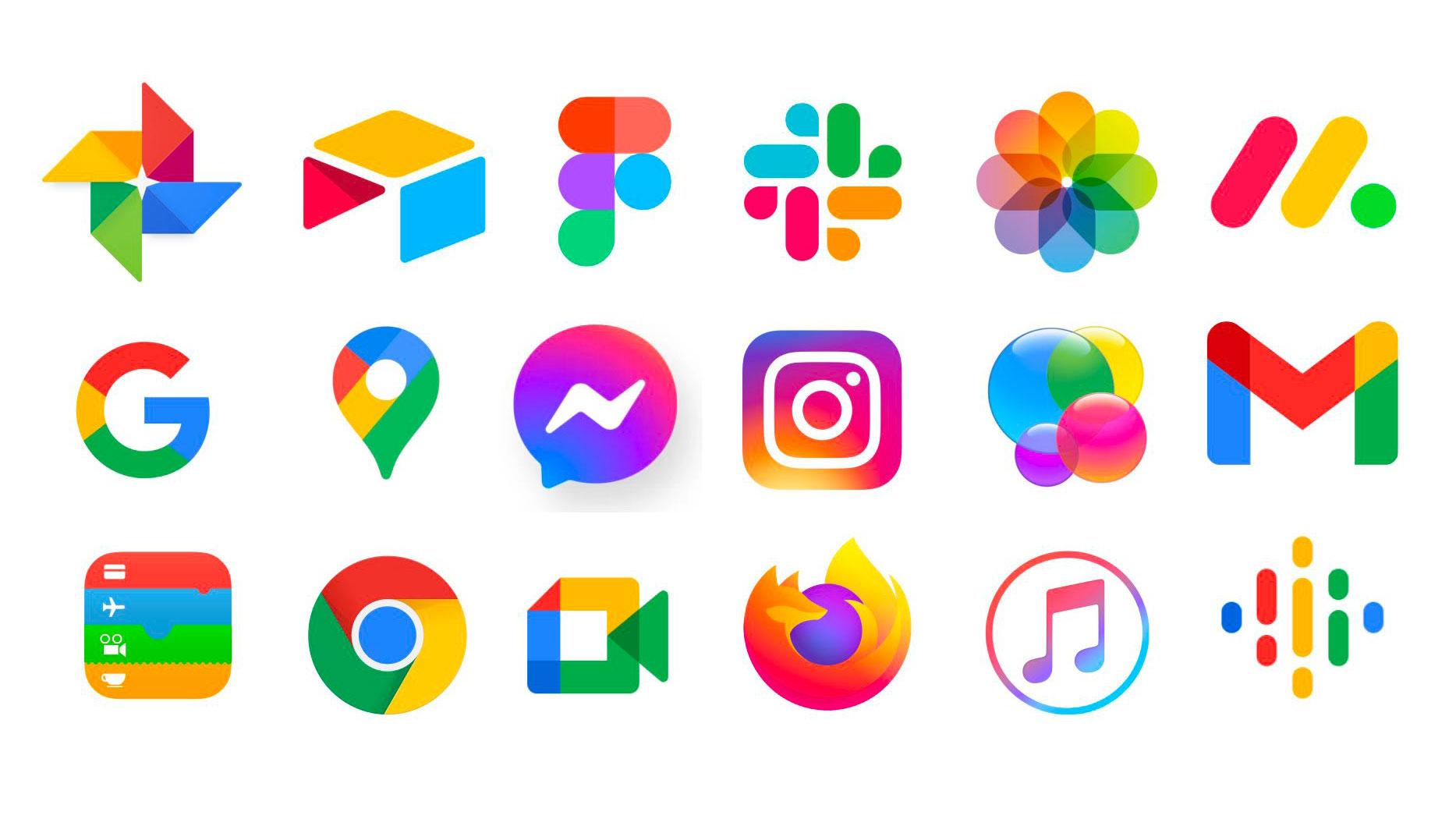
Today, it is possible to see how the ‘blanding’ trend taps into this idea (see the app icons above). The demands of consumers today are changing rapidly, and 61% are more likely to recommend a brand because it’s simple.

Bauhaus was all about condensing complexity into simple and functional tools and products with a consistent identity. The less fuss, the less likely people will be confused. The theory is neatly wrapped up in Herbert Bayer’s 1925 Bauhaus logo (above) – a simple, clean extension of the philosophy.
Read more:

Thank you for reading 5 articles this month* Join now for unlimited access
Enjoy your first month for just £1 / $1 / €1
*Read 5 free articles per month without a subscription

Join now for unlimited access
Try first month for just £1 / $1 / €1
Charlie is a partner at strategy-led brand agency fst.
