Are movie posters in a design crisis?
After the backlash the Spider-Man: Homecoming poster received, we ask if mainstream film posters are in a creative rut.
Last month saw the release of the poster for Spider-Man: Homecoming. The design was – well – pretty crowded to say the least. Featuring Peter Parker, Tony Stark as himself, Tony Stark as Iron Man, new baddie Adrian Toomes and the Vulture twice, plus both fireworks and lasers, and the Manhattan skyline and the Washington Monument squished in for good measure.
Unsurprisingly, it didn’t take long for the internet to react, with fans and critics offering a unanimously negative response. Some even took the time to mock up their own versions, arguing that there was no way to make the poster worse than it already was. And while some called it a bad Photoshop job and others branded it plain amateurish, the collage-style it evokes is nothing new.
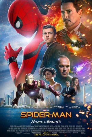
The likes of Drew Struzan and John Alvin became iconic for their illustrated, collage-style, ‘floating-head’ poster designs, so why is it that posters of a similar style now seem lazy and inauthentic? Is it all down to lazy Photoshop work? Or is it simply that mainstream movie posters are mimicking the apathetic movie industry – producing sequel after sequel, remake after remake – that despite what the poster looks like, the movie will sell well anyway.
I love the new Spider-Man trailer but what the hell is this poster? Did someone win a competition on Reddit? pic.twitter.com/Z4kLxIOKz8May 24, 2017
Illustrator Sam Gilbey, who has produced pop culture artwork for properties including Marvel's Avengers, Teenage Mutant Ninja Turtles, The Karate Kid and Flash Gordon, argues that the introduction of Photoshop may have harmed the industry by making it easier for inexperienced designers to put together collage-style posters without the design skills to back them up.
“Obviously you think of the masters like Richard Amsel, working pre-Photoshop, and you can see how marketing departments have often thought they can now produce something similar internally,” he explains.
I'll be honest: I tried to improve the very busy SPIDER-MAN HOMECOMING poster, and I no longer know where the original ends and mine begins pic.twitter.com/Sazywe9gwhMay 24, 2017
“If you’re simply moving photos around though, you’re not going to get that cohesiveness that an illustration can bring you. A skilled artist can take all those disparate elements and weave them together into a beautiful composition, whilst capturing the aspirational ‘feel’ of a movie at the same time. Of course now the fantastic thing is that as an artist you can use Photoshop to aid the process. The ‘problem’ is that you don’t need to be an artist to give it a try, or to understand how good compositions and colour palettes really work.”
Out of context
It seems that colour palette and composition is where this Spider-Man poster begins to go wrong, as illustrator Graham Humphreys explains. “My first impression is an issue with colour balance and the obvious cut-outs – the images don't appear to exist in the same context,” he says.
Get the Creative Bloq Newsletter
Daily design news, reviews, how-tos and more, as picked by the editors.
“Even though we are used to seeing unrealistic scale and smaller elements alongside larger ones, effects of colour and light should allow the suspension of physics and scale. In this poster, it would appear that no such consideration has been applied. It looks more like a page in a scrapbook – a concept in itself perhaps, but not one clearly intended (or relevant) here.”

The participants gaze in all directions without having any idea there might be someone else in the same poster
Graham Humphreys
He adds that when the poster composition needs to be of the floaty-head variety, there still needs to be a form of narrative. This is usually achieved through eyelines, emotional expressions and reactions, which can add a layer of interest and insight into the film’s storyline and characters.
“Here, the participants gaze in all directions without having any idea there might be someone else in the same poster! In addition, they are all closed-mouthed, neutral gazes – with the bizarre exception of a curiously happy young lady in the bottom right,” he continues. “The angle from which the heads are viewed are also numerous and without order. There is no narrative of threat, romance, fear, good, evil... in fact none of the theatrical tropes that are recognisable human traits and cinematic emblems. Unless boredom is the intended threat.”
Marketing casualty
Sadly, BLT – the agency that produced this poster – was unable to discuss any specifics of the poster due to the client relationship. However, this particular design is jarringly different to the posters the agency initially released, which saw Spider-Man hanging out in various NYC spots.

BLT is also responsible for some of the best poster designs and campaigns in recent months – its fantastic Baby Driver campaign and the brilliant rom-com Deadpool ad for example. So why such a break from form?
“One thing that I can recognise is client intervention,” explains Humphreys. "Endless changes that will please executives, accountants and marketing needs, but changes made in ignorance of the visual cohesion that might have made a good poster. Most designers and illustrators will attest to this endless mortal combat."
Perhaps the cult of celebrity and the selfie have crushed the soul out of mainstream cinema posters
Graham Humphreys
“Mainstream posters, by and large, are marketing tools intended to appeal to a wide base that it is assumed has no interest in lasting design or creative integrity. A quick look at the work of Saul Bass will tell us that this wasn't always so. His amazing work on mainstream releases shows us that a cloud of disengaged headshots isn't the only way a poster can communicate the core of a film.
"With access to so much imagery and visual stimuli now (more than ever), how have we become so visually illiterate that only a roughly assembled photograph of the cast reassures us we are going to be entertained? Perhaps the cult of celebrity and the selfie have crushed the soul out of mainstream cinema posters. I hope not.”
Alternative routes
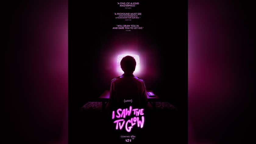
Gibley argues that it’s not all bad though. With an increase in alternative movie poster design (see the likes of Olly Moss and Mondo), studios have clocked on to the fact that this type of aesthetic can give their movie an edge (and allow them to sell a bunch of prints). Moonlight, The Lobster and Green Room are all examples of studios producing interesting, timeless pieces, giving hope that there are still decent mainstream movie posters out there.
"It feels like overall, decent movie posters are actually becoming more common, even if they’re being done in parallel to the main campaigns,” Gibley says.
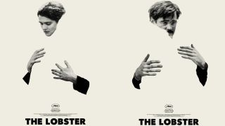
He points out that, although it's a shame not many actual campaign posters are being assigned to individual artists and designers, it's exciting to see alternative interpretations being shared on social media or given away at IMAX screenings. On top of that, many older movies are getting new artwork when they are re-released on Blu-ray.
"Whilst that Spider-man one stands out for being particularly terrible, hopefully the negative reaction will actually keep moving us onwards,” he adds.
Related articles:

Thank you for reading 5 articles this month* Join now for unlimited access
Enjoy your first month for just £1 / $1 / €1
*Read 5 free articles per month without a subscription

Join now for unlimited access
Try first month for just £1 / $1 / €1
Sammy Maine was a founding member of the Creative Bloq team way back in the early 2010s, working as a Commissioning Editor. Her interests cover graphic design in music and film, illustration and animation. Since departing, Sammy has written for The Guardian, VICE, The Independent & Metro, and currently co-edits the quarterly music journal Gold Flake Paint.
