Are microframes the future of wireframing?
How microframes amplify all the benefits of wireframing.
Wireframes are dead! Interactive prototypes are everything! We’ve heard these shouts for at least the past seven years. If the popularity of these discussions proves anything, it’s that the opposite is true. The mere fact that we continue to discuss the alleged death of wireframing proves that wireframing and wireframe tools continue to suit at least some projects and some designers.
So how has wireframing survived? It continues to evolve. Long gone are the days of black on white wires built in Microsoft Visio or Excel Spreadsheets (yes, I worked with PMs who used to place wireframes in spreadsheets).
The evolution of wireframes
Today’s wireframing has been split into multiple techniques that serve the different purposes, projects or preferences of designers.
Lightweight interactive wireframes
Some designers like to gather early feedback with lightweight interactive wireframes (take a look at The Guide to Interactive Wireframing). Interactive wireframes are design deliverables that represent the high-level architecture and the most basic interactivity. Created in the span of hours instead of days, they help with user testing and getting early buy-in from stakeholders. Interactive wireframes might be destroyed soon after their creation, or evolve into a completely different asset that is part of the overall concept.
Content wireframes
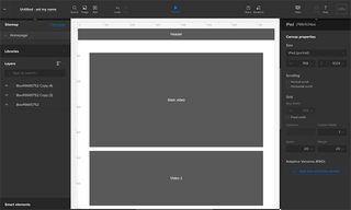
Another version is a content wireframe (see the Content Wireframing for Responsive Design guide). This static form serves as a structure that is used to plan content and information architecture before investing time and money into the rest of the interface design. This technique works well for content-heavy websites, which need a careful content strategy, before we designers get all creative with their form and beautiful looks. After all, content is king.
Microframes
Finally, there are wireframes that have evolved to be even lower fidelity. In this form the wireframe is minimised, text is replaced by geometric shapes and every piece of the interface is simplified as much as possible. That’s my favourite new form of wireframing.
What microframes are
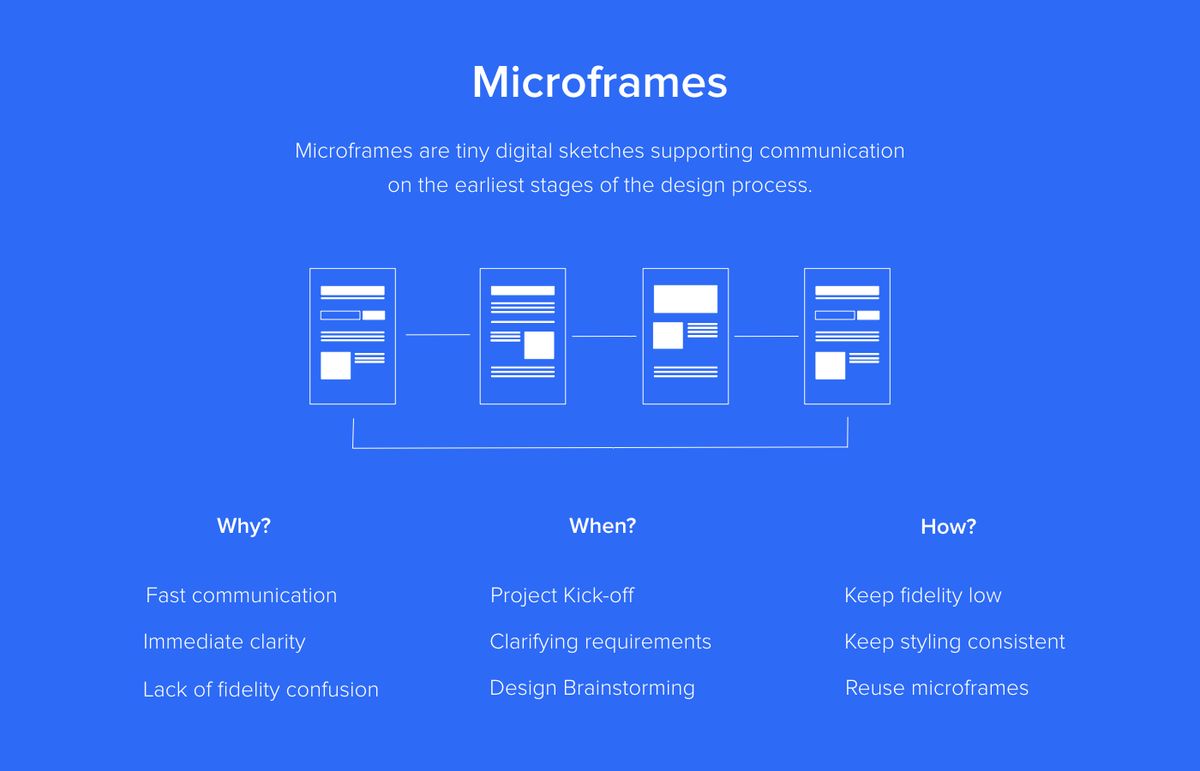
Microframes, or micro-wireframes, are miniaturised versions of wireframes. Microframes amplify the benefits of wireframing and eliminate most of the shortcomings. Their benefits include speed, clarity of communication and lack of confusion.
Get the Creative Bloq Newsletter
Daily design news, reviews, how-tos and more, as picked by the editors.
Microframes are as fast as sketching, but let you easily iterate on your work and immediately share the results with anybody, despite the location. They clearly communicate plans and requirements and let designers iterate together with a customer towards the common vision, without over-investing in disposable assets, and they cannot be confused with the final product because their form is drastically minimised.
Microframes are also extremely flexible. They can be used on their own, as part of a user journey chart, documentation or even as part of a project roadmap. They serve as a cheap illustration and a tool to enhance design thinking.
And guess what? You’ve been microframing for years – you were just doing it on a whiteboard. Microframes are digitised versions of the whiteboard sketches that designers use all the time when brainstorming with colleagues and clients. Unlike your whiteboard drawings, though, microframes are easy to share and optimised for speed and reusability.
Get started with microframing
Microframing is very intuitive. If you try to fit your ideas into a 200px x 300px container, the microframe will naturally come to life. To increase readability, consider the following:
- Avoid text: Replace text by blocks symbolising different levels of typographic hierarchy
- Use colours to represent different pieces of the interface: Separate CTAs, navigation links and blocks of text by assigning each a different background colour (preferably shades of grey)
- Add icons to remove confusion: Icons can clarify elements that can be easily confused with others – for example, the classic landscape icon could be used to indicate an image
- Skip details: You’ll have plenty of time to add them later once the concept is crystallised for higher levels of fidelity
Once your basic drawings are ready, think about what needs to be added to enhance their communication value. A text description? Flows? There are no rules here. Whatever serves the purpose is good.
Microframing design language
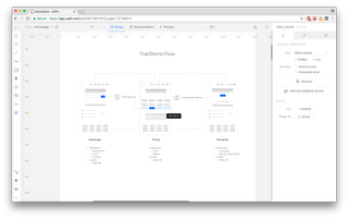
To optimise your microframing process for speed and reusability you have to create your micro design language. Think about a convention that works for you and recipients of your work, then document it.
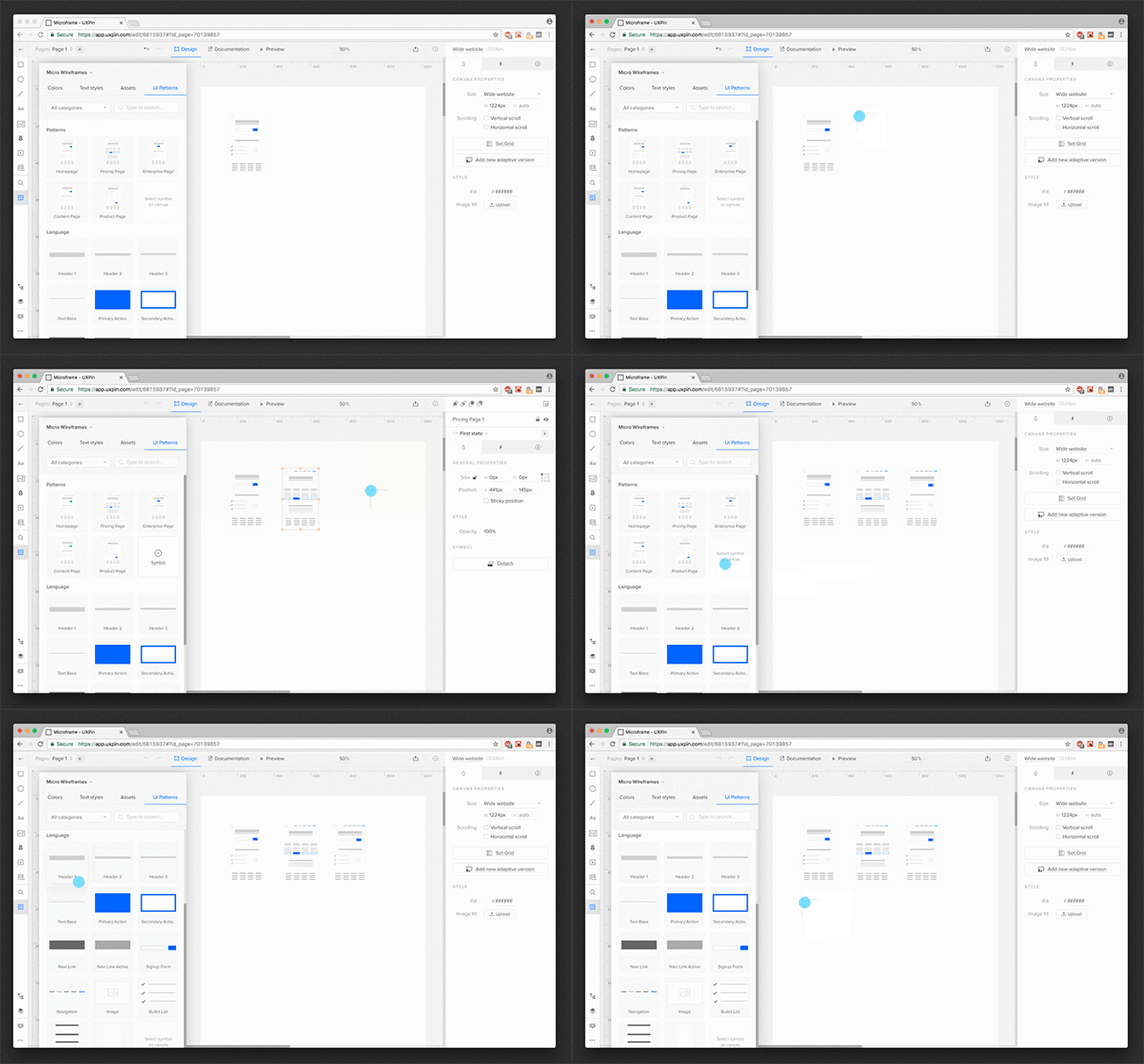
Just like with a full-sized design, you should start with the foundation and gradually move to higher-level structures (if you’re interested in building a full-scale design system – I’m sharing my experience in this series of posts). Take all your text blocks and tiny patterns and turn them into symbols, nest them in your microframes and turn those into symbols as well.
So is wireframing dead?
Definitely not. Wireframing won’t die as long as we need ways to quickly create and share digital sketches. Creating micro-wireframes only enhances the communication and creativity of the team, without sacrificing the speed of the process. We’ve recently really fallen in love with this little deliverable. Hopefully, you’ll find it useful too.
For more wireframing best practices, download UXPin’s free 100+ page Guide to Wireframing.
Related articles:

Thank you for reading 5 articles this month* Join now for unlimited access
Enjoy your first month for just £1 / $1 / €1
*Read 5 free articles per month without a subscription

Join now for unlimited access
Try first month for just £1 / $1 / €1


