It cost 50K to digitise: 5 surprising Apple logo facts
Apple logo designer Rob Janoff shares the story of his iconic design.

Everyone knows the Apple logo. As far as designs go, it's up there with McDonald's Golden Arches and the Nike swoosh. Chances are you're even reading this article from a device decked out with the iconic image.
If you're trying to figure out why it's so successful, you might have turned to our guide to logo design. However the Apple logo is built on some surprising facts, as we discovered when we caught up with its designer, Rob Janoff, at this year's D&AD Festival.
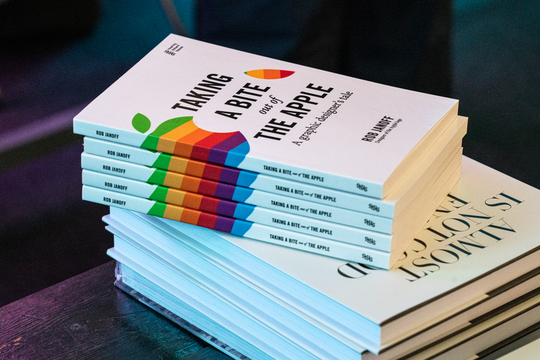
Here are five unusual nuggets of Apple logo information from Janoff as he shared the story behind his most famous work. And if you want to know the full story, check out his new book, Taking A Bite Out Of The Apple.
01. There was practically no brief

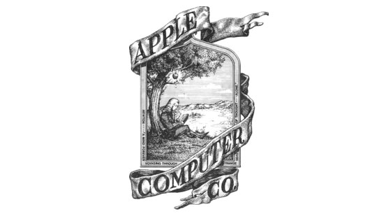
It's hard to imagine now, but at one point Apple was an unknown fledgling startup. This means that branding wasn't exactly the company's top priority, despite Steve Job's famous attention to detail when it comes to aesthetics. Its original logo (above) was an elaborate drawing by Ronald Wayne, but when it came to a redesign, Janoff says that he was offered a "non-brief".
Back in the mid '70s, things weren't so sophisticated. "They weren't called briefs, they were like memos that somebody would put out," says Janoff, who created the logo as a piece of work for a little agency. "They weren't nearly as detailed or as in-depth as they are now."
All that's changed now though, as Janoff likes to give his clients a long questionnaire to fill out. "It's all about meeting your client, and finding out what's important to them," he adds. "Usually, the wrong things are important to them. They want too much."
02. It was the only design idea on the table
During his talk at D&AD, the audience was clamouring to know if Janoff had surviving drafts of other Apple logo ideas. Sadly not, and it's unlikely they would've looked too different anyway, That's because he didn't prepare any alternative designs when working on the logo.
Get the Creative Bloq Newsletter
Daily design news, reviews, how-tos and more, as picked by the editors.
"The Apple logo was the clearest bell of a visual I've ever had," adds Janoff. "There was a bite taken out of it because that's what apples look like. I remember ABC books. A is for Apple. And they would almost always show the apple but there was a bite out of it."
It was a risky but confident approach that paid off big time. Janoff's logo stuck, and he didn't have to present alternative suggestions. This isn't a working method he would recommend to designers though: "ALWAYS have back-ups!"
03. The logo succeeds because it's simple

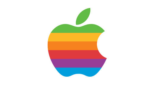
Some people have read some symbolism into Janoff's Apple logo, which was originally a multicoloured affair. But while he cites the animated film Yellow Submarine as an inspiration, the loaded metaphor of the apple eaten by Adam and Eve didn't come into it.
"The key, I think, to effective, memorable designs, is keeping it very simple so somebody can remember you," Janoff reveals. And as for that bite, besides referencing picture books, it was also a simple way to give the apple scale.
Meanwhile the colours served as an elegant introduction to the graphics capabilities of early Apple computers. "An apple shape wouldn't do," adds Janoff. "It had to be very distinctive. The colours did that."
04. It cost 50 grand to digitise

Considering that it was created back in 1977, it's no surprise to learn that Janoff's Apple logo was created with analogue tools. However, when the time to bring the design up to date, Apple forked out an eye-watering sum to digitise its logo.
"Steve had it digitised so that the colours would brighten up," says Janoff. "And the shape got squeezed a little bit. I think they paid 50 grand for it."
Making a digital version had to happen though. Because without any kind of separation or black line, the logo's colours wouldn't be able to sit alongside one another.
"It's hard to realise that back in the day, there was no four colour process. Everything was laid down in separate PMS colours, which was a bitch for them to register."
Digitising the logo only improved the design in Janoff's eyes though. "It not only brought it up to date, but you were able to get beautiful, dense colours that sparkle because they were made out of pixels."
05. It changed colour to stay ahead
The Apple logo is no longer colourful though, so what happened? "When I did the design with colours, it was a time when no computers were doing things in colour," says Janoff. "So clearly there was a point of difference."
After a while though, the promise of colour was no big deal. So according to Janoff, the logo "needed to be different, it needed to be more sophisticated. Because Apple really wanted to get into business."
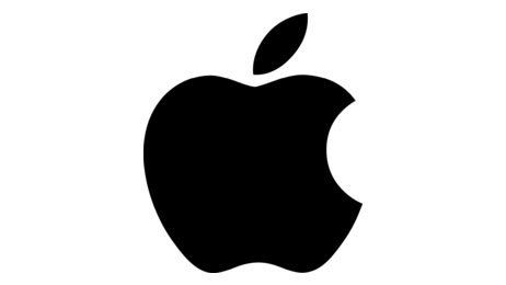
"I'm glad they changed it to keep up with the times. And now it's white, and what could be more minimal and beautiful than white?"
Is there any chance the Apple logo will change more drastically in the future? Janoof doesn't think so. "They would never do that. Once they had the logo, it was never going to get touched."
Related articles:

Thank you for reading 5 articles this month* Join now for unlimited access
Enjoy your first month for just £1 / $1 / €1
*Read 5 free articles per month without a subscription

Join now for unlimited access
Try first month for just £1 / $1 / €1

Dom Carter is a freelance writer who specialises in art and design. Formerly a staff writer for Creative Bloq, his work has also appeared on Creative Boom and in the pages of ImagineFX, Computer Arts, 3D World, and .net. He has been a D&AD New Blood judge, and has a particular interest in picture books.
