Add a stunning Grade UI kit to your web design tools – free of charge
Own pro designer Sergey Azovskiy’s brilliant UI tools completely free with Affinity Designer.
Russian designer Sergey Azovskiy creates UI kits which combine must-have tools and ultimate usability with breath-taking visual presentation.
And the great news is that you can now own his amazing Grade UI kit for no cost, thanks to the folks at Affinity.
To celebrate the release of v1.5 of their acclaimed graphic design Mac app Affinity Designer, which contains some major upgrades, they’re now including the kit absolutely free of charge – a saving of $58 on the usual price.
The great news is that it’ll also be included in the Windows version of Affinity Designer, which has been in public beta since June 30 and is expected to go on full sale this autumn.
Sergey’s Grade UI kit
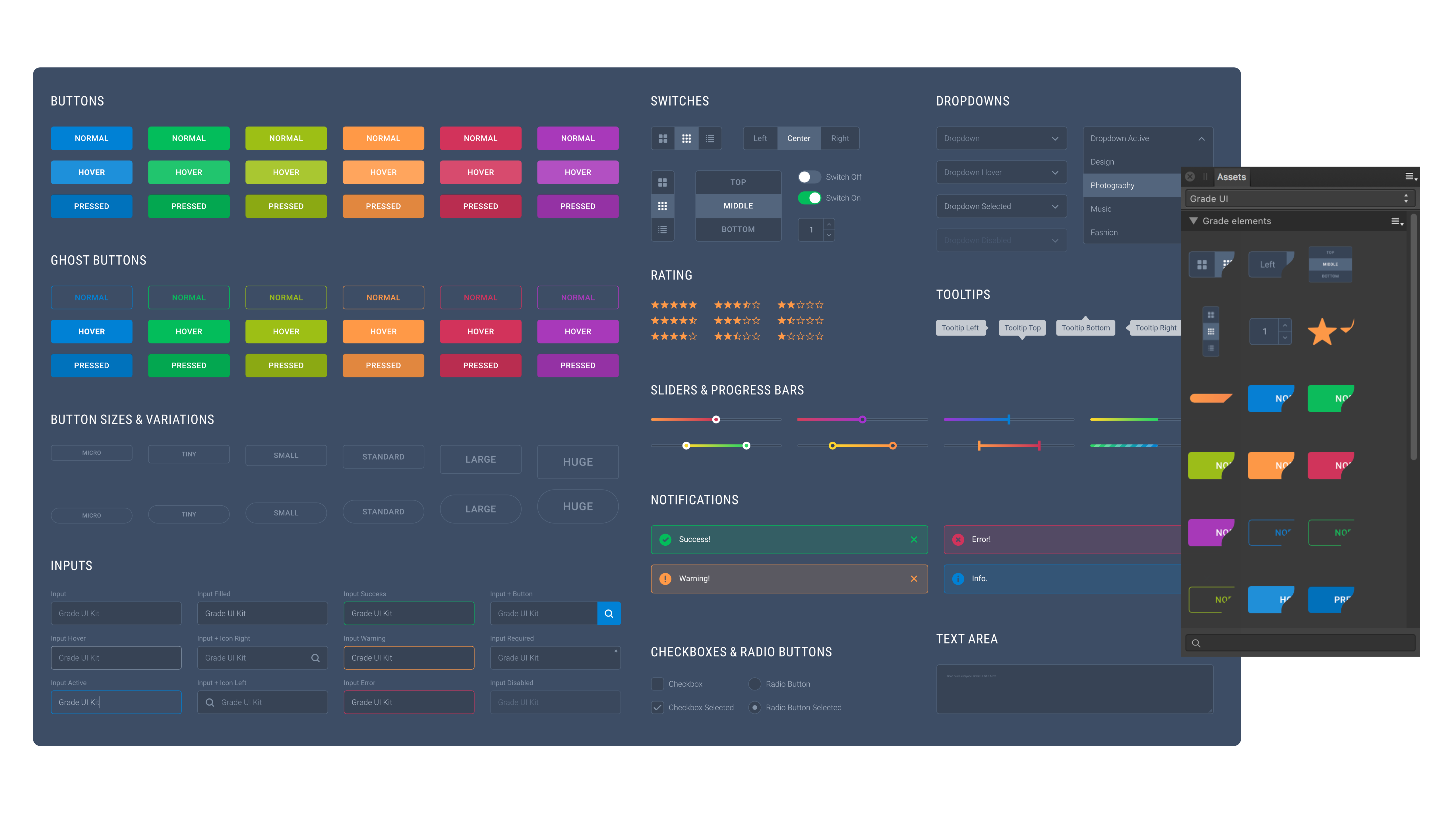
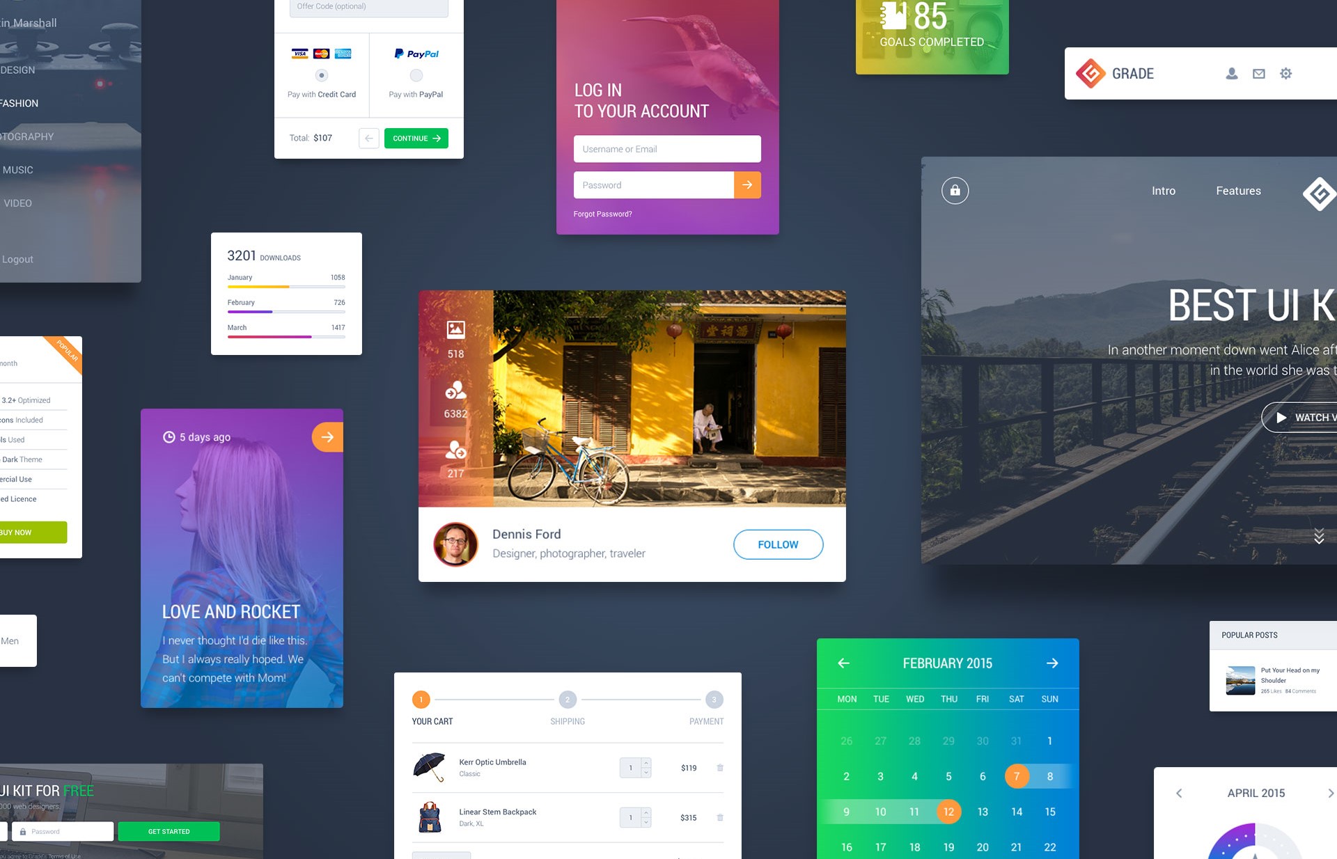
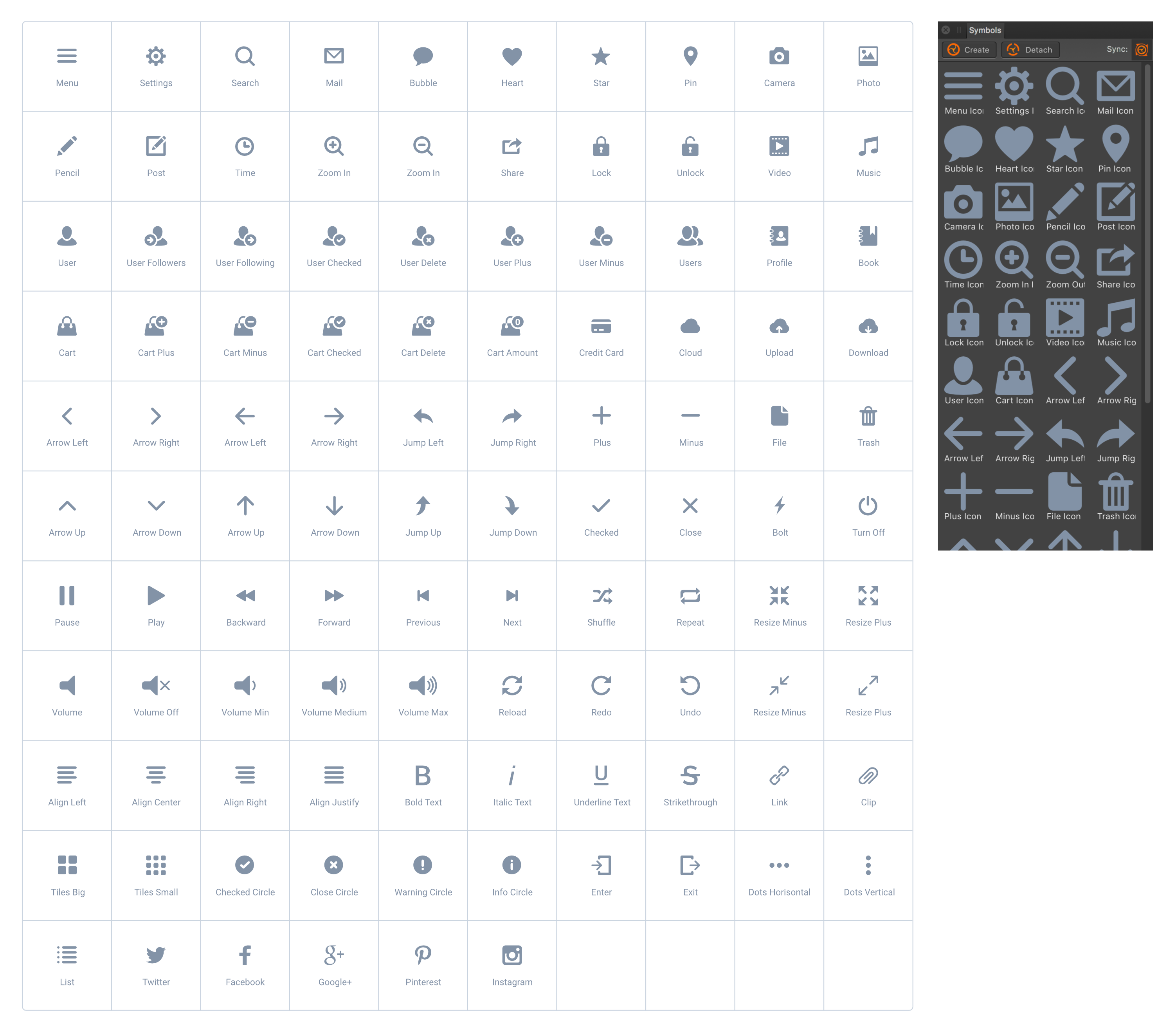
Featuring 10 categories, 100+ icons and an incredible 1000+ elements, Sergey’s must-have Grade UI kit is something that every creative should tuck away in their toolbox.
Made with focus on detail and pixel perfection, giving projects a professional flair, it’s fully customisable and its vector shape construction means every element works at whatever size you need.
Elements also come in light and dark variants, to help you mix and for stunning design combinations. And it’s unbelievably easy to use – just drag and drop components where you need them, because everything is made to fit together perfectly within a grid layout.

Sergey rates the Grade UI kit as one of his most ambitious projects, and a long way from his first steps in design. We asked him how he got started…
“Like most designers, I'm self-taught. Since childhood I have been interested in computers and everything to do with them. For some time, I studied HTML and CSS and tried to make websites, just simple designs for myself, almost as a hobby.
“After a while I realised that I was much more interested in the process of design than tinkering with the code, so I started to learn about design software and UI design.”
How do you start designing a Grade UI kit?
“The design of any UI kit starts with the style of the search. I really like bright, contrasting work. I usually start with the creation of several of the components you have to have, like navigation options.
“Once the overall style starts to emerge, I create separate pages with basic elements like colours, buttons, and so on. As it develops, the overall style may change slightly, but this page is the foundation on which the entire UI kit built.”

This Grade UI kit is a stunning collection. Tell us about the process of creating it.
“This is one of the most ambitious projects on which I have ever worked with. I tried to make the Grade UI Kit as versatile and useful as possible for designers and developers. At the same time, I wanted to give users the ability to choose from a variety of design options for the same component.
“For example, if you need a product banner for an online store, you can choose one of the provided variants and quickly customise them for your own project. Creating from scratch takes a lot of time, so the presence of so many universal components means you can create an entire site design in just a few minutes.
“I’ve had really great reviews from people who have bought this Grade UI kit, and I’m delighted that I now have the opportunity to share it with Affinity Designer users.”

Which designers' work inspires you?
“There are so many talented designers, it’s difficult to single out anyone in particular. I think the easiest way is to check out my account on Dribbble.
“There you can look at who I follow, and whose work inspires me – as well as keeping up to date with the projects I’m working on.”
Affinity Designer
Already the winner of an Apple Design Award in 2015, version 1.5 of Affinity Designer introduces great new features.
Constraints – the ability to control the position or size of an object relative to its container – makes it possible to create reusable elements which perform in a pseudo-responsive fashion.
Meanwhile the Symbols feature allows users to have multiple instances of the same object, where editing one object will edit them all simultaneously.
The speed, power and sleek usability of Affinity Designer have certainly impressed Sergey.
“I love the Symbols feature in Affinity Designer. It really is a powerful feature that allows you to create responsive web design for different platforms and lets you make changes on the fly,” he says.
“This saves an incredible amount of time, especially if you are working on large projects with many pages or screens.
“It’s nice to see that Affinity is not just keeping up with the times, but moving the design industry forward. I look forward to even more useful features for UI designers in future versions.”

Getting the Grade UI kit couldn’t be simpler; owners of Affinity Designer will see the offer pop up on the welcome screen in-app, then it’s just a case of following the on-screen instructions.

Thank you for reading 5 articles this month* Join now for unlimited access
Enjoy your first month for just £1 / $1 / €1
*Read 5 free articles per month without a subscription

Join now for unlimited access
Try first month for just £1 / $1 / €1
Get the Creative Bloq Newsletter
Daily design news, reviews, how-tos and more, as picked by the editors.
The Creative Bloq team is made up of a group of design fans, and has changed and evolved since Creative Bloq began back in 2012. The current website team consists of eight full-time members of staff: Editor Georgia Coggan, Deputy Editor Rosie Hilder, Ecommerce Editor Beren Neale, Senior News Editor Daniel Piper, Editor, Digital Art and 3D Ian Dean, Tech Reviews Editor Erlingur Einarsson, Ecommerce Writer Beth Nicholls and Staff Writer Natalie Fear, as well as a roster of freelancers from around the world. The ImagineFX magazine team also pitch in, ensuring that content from leading digital art publication ImagineFX is represented on Creative Bloq.
