A web designer's guide to CSS methodologies
How to use Object-oriented CSS, BEM, SMACSS and Atomic CSS.
As you have probably gathered from this article, each CSS methodology comes with its own benefits and drawbacks. It is, however, possible to combine aspects of multiple methodologies together to create your own custom one that's specifically suited to your needs.
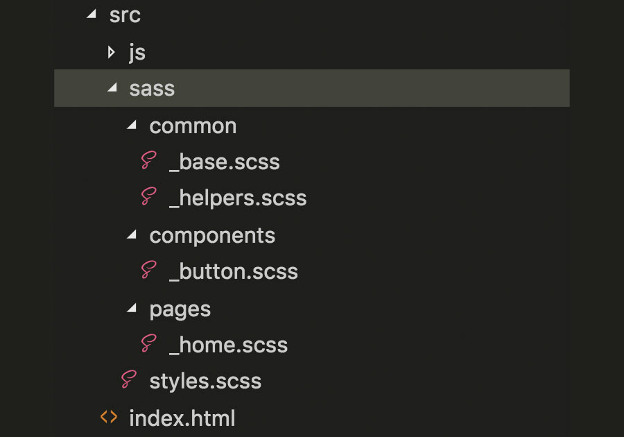
Let's look at one way of combining the four methodologies discussed on page 1, for a site with a homepage and a button component, using Sass as a preprocessor. Applying SMACSS principles, we can divide our code across multiple Sass partials as shown in the image below.

Then import them into styles.scss that will be converted to styles.css by Sass, as follows:
@import 'base';
@import 'helpers';
@import 'components/button';
@import 'pages/home';
Next we can add any styles that override the browser defaults to _base.scss, allowing mainly element selectors and their pseudo-classes:
* { box-sizing: border-box; }
html,
body { height: 100%; }
a
{
 &, &:active, &:focus, &:hover, &:visited {
   text-decoration: none;
 }
}
Selector chains are sometimes required to override unwanted styles applied by external frameworks. For example, the Materialize.css framework applies padding to grid columns using a two-class selector chain .row .col, making it impossible to override with a single-class BEM selector.
Such overrides should also be added to _base.scss, for example .row .col {padding: 16px}. For this to work make sure external libraries are sourced in the HTML before styles.css.
Using ACSS ideas we can create helper classes that apply consistent styles to any element, eliminating the need to create a new class name and component file for elements requiring a single CSS declaration. Instead, we can apply the helper class directly to the HTML. For example, we can create a responsive, top margin helper class in _helpers.scss:
Get the Creative Bloq Newsletter
Daily design news, reviews, how-tos and more, as picked by the editors.
.h-margin-top {
 margin-top: 16px;
 @media (min-width: 720px) {
   margin-top: 24px;
 }
}
For each component we will have a separate file in the components directory and use a BEM methdology. We will allow BEM formatted single-class selectors, their pseudo-elements and an infinite number of chained pseudo-classes.
For example, the CSS of buttons can be defined in _button.scss as following, with modifier button--is-disabled greying out the button and showing a tooltip with the message disabled on hover:
.button {
 position: relative;
 &__icon { width: 12px; }
 &__text { text-transform: uppercase; }
 &--is-disabled {
   background: grey;
   &::after {
     content: 'disabled';
     position: absolute;
     top: -150%;
     left: 16px;
   }
   &:not(:hover)::after {
     display: none;
   }
 }
}
Finally, we can add page-specific overrides to a corresponding file in the pages directory. To ensure that these overrides are always applied to our elements and those from external libraries with potentially multi-class selectors, we will give each page a unique ID.
For example, we can hide disabled buttons on the homepage by adding the following to _home.scss:
#home {
 .button--is-disabled {
   display: none;
 }
}
As you can see, combining methodologies is easy and can lead to a personalised, consistent approach to CSS development that scales effortlessly and is easily maintained. The custom methodology detailed above is just a suggestion, and my advice is for you to develop your own.
Combine aspects you like from as many methodologies as you can find, adapting them to your liking, and stick to them. There is little point in creating a methodology if you constantly deviate from it. If you find yourself doing so, then incorporate these deviations into your methodology in a way that is consistent and easy to understand.
Why do we need CSS methodologies?
CSS preprocessors such as Sass, Less and Compass, have done wonders to mitigate this problem by allowing selectors to be nested and blocks of code to be replaced with single-line 'mixin' declarations (take a look at What is Sass? for more on this). While this helps, large projects can still require thousands of lines of code. Fortunately, preprocessors also allow CSS to be split across smaller files, or 'partials'. But what to include in each partial and how they are named must be agreed upon by a team, otherwise their use can do more harm than good.
Another potential problem experienced with complex projects is managing specificity. CSS assigns a weight to each style rule, so when multiple rules are used on the same element, the highest weighted rule is considered more specific and is therefore applied. When multiple, equal-weight rules are used the lowest one wins.
Specificity is calculated using four number groups represented as 0-0-0-0, where numbers do not overflow from one group to another, so 0-12-21-5 is valid. Each element or pseudo-element in a selector increments the right-most group, e.g. h1 is 0-0-0-1 and div::before is 0-0-0-2. Each class, attribute or pseudo-class increments the next group, e.g. .some-class.another-class is 0-0-2-0 and section.some-class .another-class:hover is 0-0-3-1.
IDs increment the next group, e.g. #some-id#another-id is 0-2-0-0 and ul#some-id img.some-class:active is 0-1-2-2. Inline styles applied using HTML style attributes increment the leftmost group and are therefore the most specific selectors.
The higher the overall number, the more specific the selector. So if one developer uses div.some-class to apply styles to an element, it is not possible to override them lower down the code using .some-class on its own. It is therefore common practice to use only single-class selectors when possible.
This article was originally published in creative web design magazine Web Designer. Buy issue 282 or subscribe.
Read more:

Thank you for reading 5 articles this month* Join now for unlimited access
Enjoy your first month for just £1 / $1 / €1
*Read 5 free articles per month without a subscription

Join now for unlimited access
Try first month for just £1 / $1 / €1
