A designer's guide to Instagram Stories
8 ways creatives can harness Instagram Stories to increase engagement, make money and promote themselves.

Designers and creatives are increasingly using the ephemeral Instagram Stories – which disappear after 24 hours – to promote their brand, show off another side of their design portfolio, expand their reach and sell their products.
There are now 400 million people using Stories every day, 80 per cent of Instagram's one billion users follow at least one business, and people are spending more time than ever on the platform.
As one in five organic Stories from businesses lead to a direct message, it's no wonder that brands are focusing more time and money on this area of Instagram.
But using Stories well isn't just a case of taking the odd selfie, or showcasing the best of your graphic design portfolio, and the interface can be tricky to get to grips with at first. How do make the most of Stories' rich features and ensure you're adding value to your brand without annoying your followers? Read on to find out...
For more inspiration, take a look at our roundup of the best Instagram design feeds.
01. Consider sponsored vs free
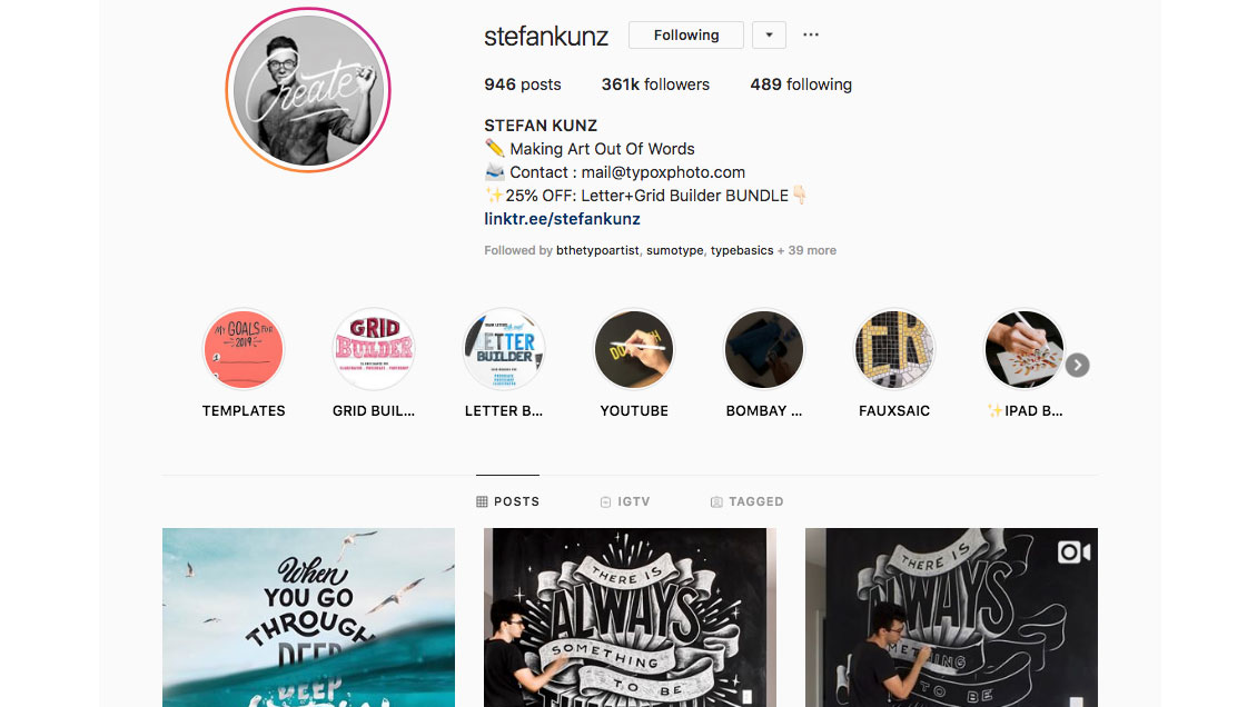
Companies such as Samsung, Lego and D. Franklin all report success from sponsored Stories. And creatives like Stefan Kunz – a lettering artist with over 361,000 followers – are using paid campaigns to promote themselves and others.
In 2017, Kunz found that one campaign resulted in 1,000 clicks to his website, while promoting a fellow Instagrammer won his friend an additional 2,000 followers.
Daily design news, reviews, how-tos and more, as picked by the editors.
But you don't necessarily need to create a paid campaign to reap the benefits of Stories. Marylou Faure – a French freelance illustrator based in London, who has over 56,000 followers – noticed the impact of using Stories straight away.
"Usually my Stories do better than my normal posts when it comes to products I'm trying to sell," she says. "It might be that my followers are a bit more open to seeing my self-promotion in my Stories than in my posts."
02. Experiment with videos and photos
Instagram frequently adds new features to Stories, making exploration key. By using a mixture of the following features, you can add personality to your Stories and increase engagement. To create a new Story from your main newsfeed, swipe right or tap the camera icon in the top left corner. You can also click on your profile picture.
Use saved photos by clicking on them, or scroll to choose from the following options:
- Type: Create a typed message
- Music: Add background music to your Story
- Live: Create a live video broadcast for up to 60 minutes
- Normal: Tap to take a photo, hold the button to make a video
- Boomerang: Take a burst of photos that create a looping video
- Superzoom: Make a video that zooms in on one object with a dramatic sound (tap to select an area to zoom in on, then hold to record)
- Rewind: Create a video that plays in reverse (hold to take a video, tap once to record hands-free)
- Hands-Free: Take a video by tapping just once
With all of these options, you can use the flip icon to switch to the front or rear camera, and the face icon to add fun face filters. Swipe left to choose a filter.
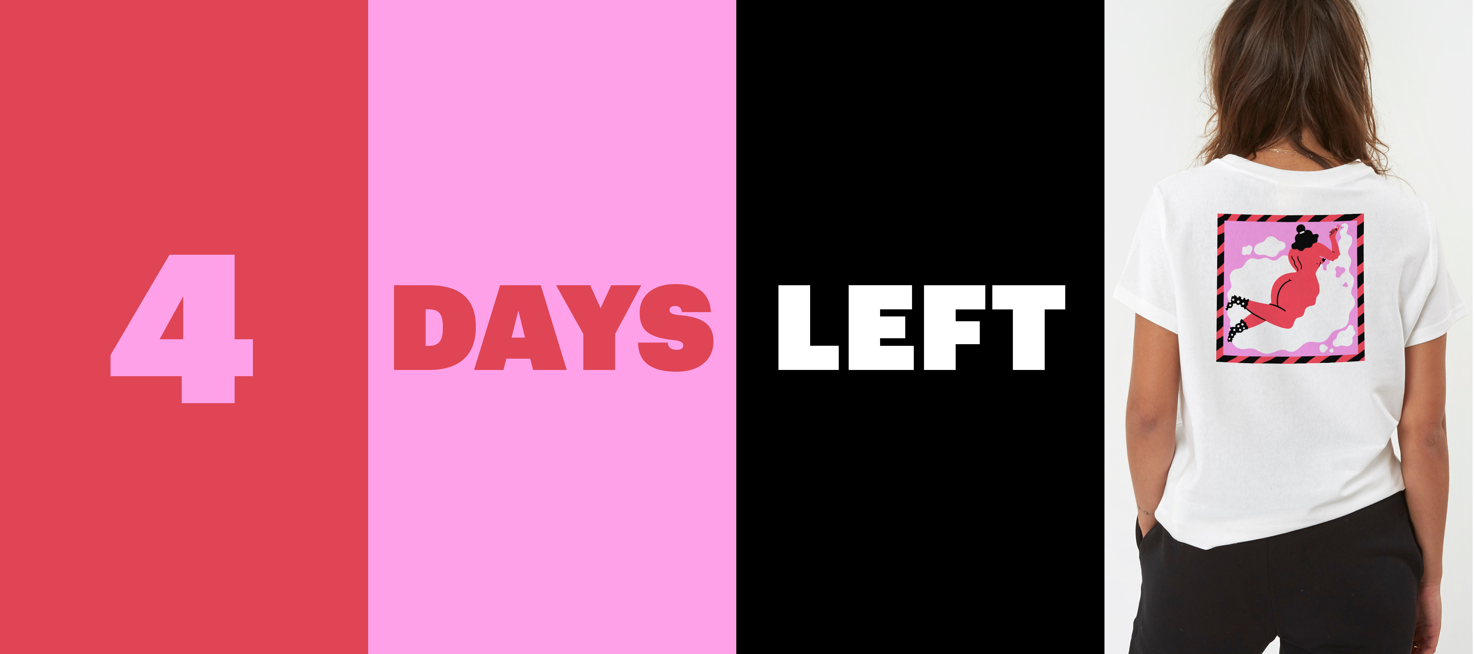
Most creatives quickly find some features suit them and their work more than others: Mat Roff, an illustrator with 3,000 followers, has been experimenting with Instagram Live.
"I love doing a weekly Live Stream from Instagram, where I ink a sci-fi character live in my sketchbook and talk to my followers," he explains. Roff also found Stories a "helpful test run" for his eventual move to Twitch.
03. Use Stickers to add interest
Once you've taken your video or photo, add to it using the icons on the top right. The first is Face Filters, where you can choose a filter for your image, then there's Stickers – here you can include hashtags and your location to increase the likelihood of others finding your Story, or choose from a range of other Stickers, such as emojis, a selfie or days of the week.
When you've chosen your Sticker, drag it to adjust its position and use two fingers to rotate and resize. Tap and hold your Sticker and then tap Pin to stick it to a fixed place in a video.
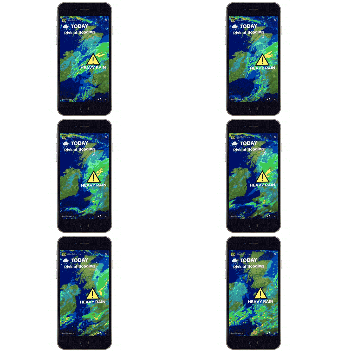
The Met Office has found that the poll Sticker is popular with its 64,000 followers: "We get great interaction with polls," says Ross Middleham, content lead of the Met Office's in-house design team. "We often tie them in with similar polls on Facebook or Twitter. Who doesn't love a quick poll?"
Middleham also loves the ability to add a link to your Story by swiping up – a feature available on verified accounts or those with over 10,000 followers only. "Swipe up is a great way to drive people to other content. It's often absolutely crucial if we want people to stay up-to-date with weather warnings, for example. It's a direct call-to-action," he says.
Faure agrees. "I like the swipe-up option as it's a quick and easy way to share a link I want my followers to visit," she explains.
04. Annotate your Story
To draw on your Story, click the pen and then experiment with pen sizes, effects and colours. By holding down a colour, you get access to the entire colour wheel; tap the Dropper icon or hover over your image to use a colour from within your Story.
To fill the screen with one colour, click on a colour and then tap and hold on your Story. Use the eraser to reveal the layer below your fill colour.
Press the 'Aa' icon to write on your Story. You can add tappable hashtags as well as links to other accounts using the @ symbol, such as @creativebloqofficial. Move the slider on the left to adjust text size; select text colour and move your text as with Stickers.

As well as experimenting with different tools, Verònica Fuerte, founder of Barcelona-Based design studio Hey, says that you need to consider the style of your work when choosing Story features. "We use Instagram features that reflect the style of our work," she explains.
"We love standard pictures and videos. Boomerangs are a fantastic way to do both at the same time: you get the simplicity of an image with the impact that movement adds."
Mistakes are the best ways to achieve something interesting that reflects who you are
Verònica Fuerte, Hey
Fuerte also mentions another of her favourites – the rainbow feature. This is where you make your text appear in rainbow colours by selecting it, choosing a colour and then swiping left with one finger on the text and one on the colour spectrum (see our Instagram hacks for a short video of the process). "Everyone loves rainbows!" she enthuses.
"My advice would be to just be yourself!" Fuerte sums up. "Experiment, have fun and don't be afraid to make mistakes because those are the best ways to achieve something interesting that reflects who you are."
However, if you do make a mistake you'd rather forget, use the Undo button, or delete an element from your Story by dragging it down the screen and dropping it into the trash can.
When you're satisfied, click Your Story, or Send to – where you have the option of sharing with everyone or with individuals or groups of followers. You can also create groups of Close Friends to share your Stories with. To add more than one image or video to your Story, simply post each one to Your Story, then go back into Stories to add more.
05. Don't treat Stories like your feed
Stories may be part of Instagram, but they are a different beast to the main feed, and therefore require a different approach. Middleham believes that you should consider Stories and your feed as separate, but also think about how they link together.
"It's a big challenge to tie up the content on your feed with Stories," he says. "We try to be quite defined with the sort of thing you'll find on each. Beautiful, amazing, unusual photos on the main feed, and supporting explainers, did-you-knows, general interest stuff on Stories."
Roff also thinks that Stories have a unique role: "I use Stories to clearly separate my everyday updates from my more important work updates. Fans can get more behind-the-scenes footage if they wish, as well as general updates on my day-to-day life as an illustrator," he says.
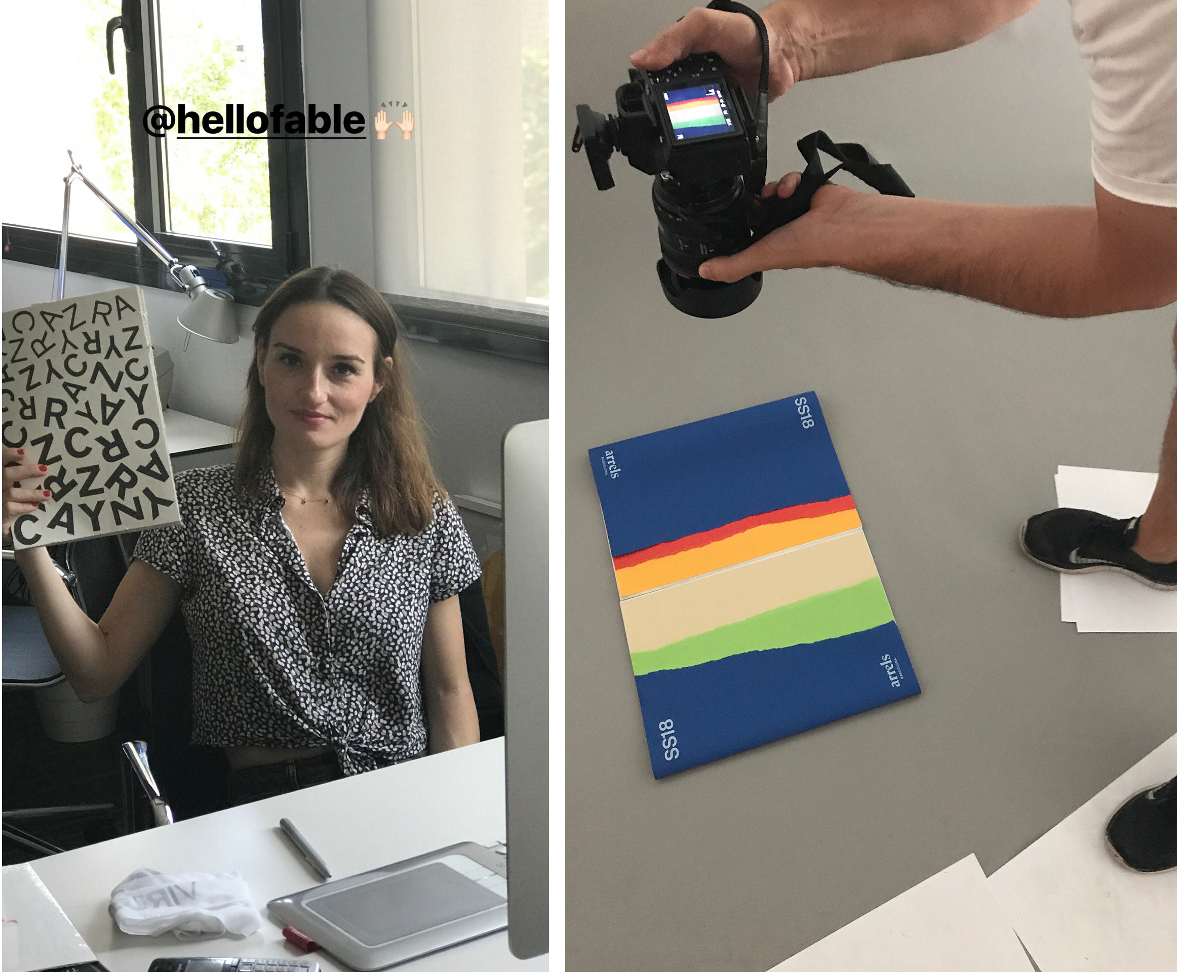
You can use that separation between feed and Stories to your advantage, says Kunz. "Your feed is kind of your portfolio. Everything is more meticulously planned and created," he explains. But in Stories, you can share behind the scenes or mention a new post. There's a lot you can do."
Fuerte agrees. "For me Stories is more about your everyday life, it's not your shop window where you display what you have done," she says. "Instead it is more like stepping inside the studio itself and getting to know us more as people. You can show more of your personality."
Fuerte uses Stories to create a connection with the studio's 230,000 followers. "When people get to know you better and understand you more, then there is more of a connection and that is always positive," she explains. "Nowadays your brand isn't just your graphics, it's you as well."
06. Consider the length of your Instagram Stories
To find out how your followers are engaging with your Stories, switch to a business account (we outline how to do this in our how to make money on Instagram post), where you can see your posts' reach, number of views, taps and crucially, swipes away. Many find that the length of their posts has an impact on these figures.
"I'm really happy with 15 seconds," says Kunz. "I feel people should learn to be more concise and say more with less." He also admits that he tends to swipe away from long Stories, or those he feels don't bring him any value. "It's important to respect people's time," he insists.
However, he still thinks it's worth playing around with the length of your Stories. "Try new things, see if they work," he advises. "If people respond... that's how you learn."
A bit of storyboarding, especially if you mix types of content into one Story, goes a long way
Ross Middleham, The Met Office
Middleham is also put off by long Stories, and agrees that considered experimentation is key. "Thinking about your story before creating it is really important," he explains. "A bit of storyboarding, especially if you mix types of content into one Story, goes a long way."
One way to ensure your Stories reach your followers is by continually adding to them. "We are starting to add to stories so that they become 'rolling'," says Middleham. "By adding stuff throughout the day, it brings the story back to the front in people's feeds."
Roff, meanwhile, is a fan of longer content, but stresses you need to use the time wisely. "I tend to use the full 16 seconds," he says. "I'll even do a few posts if I'm talking about a subject directly to camera, or showing a technique. I think when you do this you just need to keep it to no more than two or three videos – because people will start to trail off. Nothing turns me off more than seeing loads of little bars of content at the top."
Faure agrees that the ideal Story length depends on what you are trying to achieve. "If it's just to show a visual or a new illustration, just two to three seconds is enough. However if you're at an event or an exhibition or are showing some work in progress, it can be a bit longer," she explains.
Fuerte concurs: "I think it shouldn't be about length but about content and how you are using it to explain something. Obviously, you are competing for attention with a lot of other things, so a shorter story is better, but if it isn't saying what you want to say, then it doesn't really matter how long or short it is."
07. Vary your Stories
The fleeting nature of Stories and the frequent addition of new features means they are perfect for trying out new things. "Mix it up bit," advises Roff. "Don't just do photos, videos, or selfies – do a bit of everything. Use Stories to promote yourself, but also other people as well. You can build a good community that way too."
Kunz also thinks Stories provide opportunities for experimentation: "Make it something that people will look forward to seeing every day. It could be a promotional code that you have to find, clues you are sharing for a game, or like another great Instagrammer @jessedriftwood, a daily vlog. Stories are amazing, there are so many possibilities!"
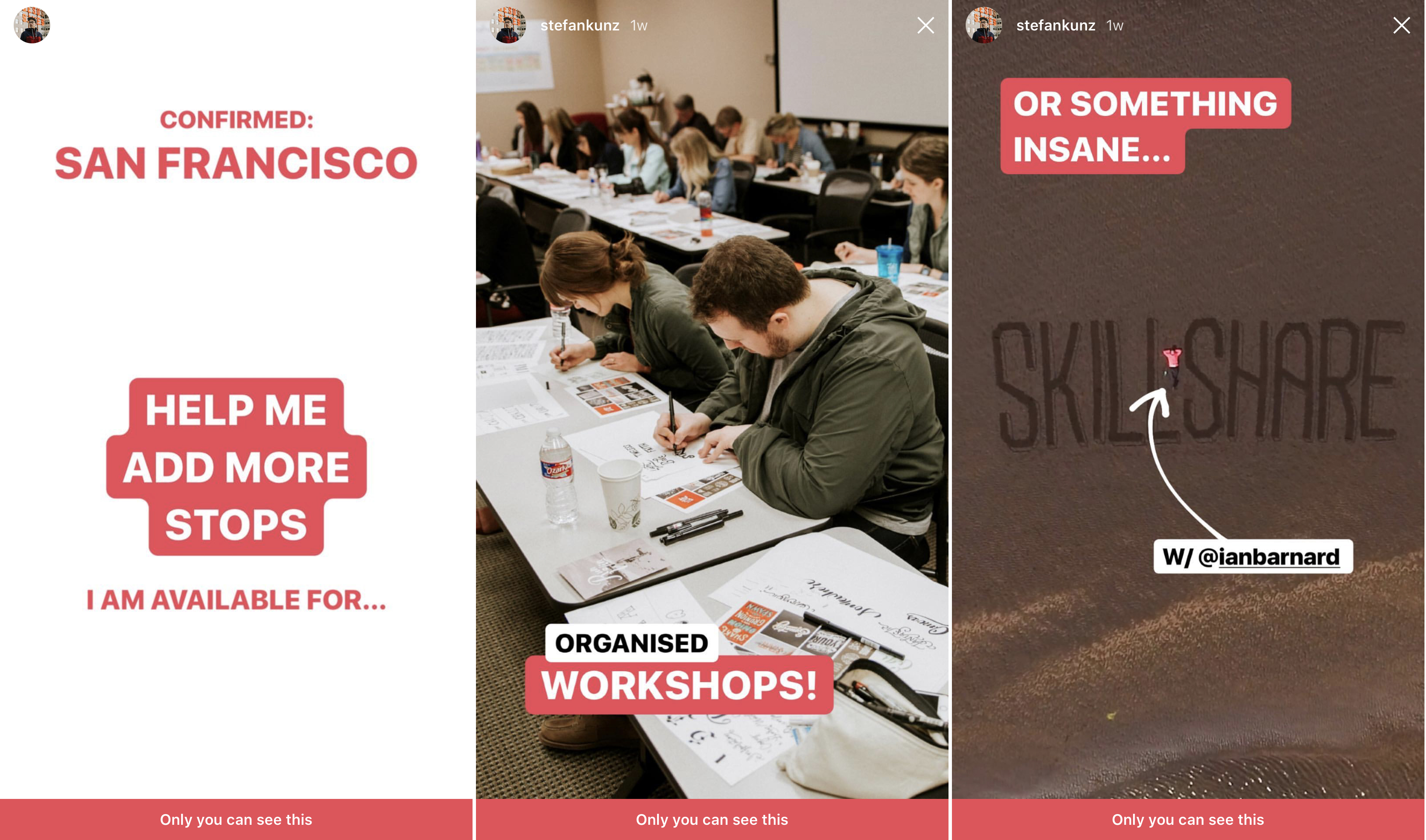
But with all these possibilities, achieving the right balance can be tricky, as Middleham attests: "In our eyes, stories need to have the right balance between polished and rough around the edges, and we're constantly trying new things to achieve this," he says.
Some things should remain off-limits, however: "Nasty colours, too much tilt on your text and/or busy Stories are Story killers," explains Middleham. "You can very easily make a Story look bad if you don't give it a bit of hierarchy and visual consistency."
08. Use Story Highlights

Stories are no longer as short-term as they used to be. In 2017, Instagram announced a feature that enables users to automatically save their Stories to a private Stories Archive and immortalise their favourites on their profile as Stories Highlights. Named collections of Highlights appear in a horizontal bar at the top of the user's profile.
As well as the new Instagram TV feature, (IGTV), Story Highlights are ideal for creating content that lasts for more than a few hours. "Highlights are useful if there's something happening with my work for a long period of time, because then I can just have a main Story that covers the topic and I don't need to push it as much with a new Story every day," says Faure.
They're also useful for promoting content without a sell-by date. "We're beginning to use them as holding spots for timeless or evergreen content," says Middleham.
And as Fuerte points out, that are multiple reasons why you might not want all of your Stories to disappear. "In the end, Stories are only 24 hours and there are always special things that you want to keep for longer for different reasons," she says. "I guess, like everything else on Instagram, how this feature is used will just evolve naturally over time."
Read more:

Rosie Hilder is Creative Bloq's Deputy Editor. After beginning her career in journalism in Argentina – where she worked as Deputy Editor of Time Out Buenos Aires – she moved back to the UK and joined Future Plc in 2016. Since then, she's worked as Operations Editor on magazines including Computer Arts, 3D World and Paint & Draw and Mac|Life. In 2018, she joined Creative Bloq, where she now assists with the daily management of the site, including growing the site's reach, getting involved in events, such as judging the Brand Impact Awards, and helping make sure our content serves the reader as best it can.
