A beginner's guide to working with colour in watercolour
Learn how to break down your watercolours and mix them to create a limited colour palette.
The most exciting part of working with watercolours is watching those luminous colours come alive and react to water on paper as you experiment with painting techniques. However, the fun dies down when the watercolours you’re trying to use just aren’t doing what you want them to, and that can happen often.
Every watercolour has different properties for different uses, and so part of understanding what works best for you involves a lot of practice and experimentation. A basic understanding of the colour wheel, colour theory and a starter palette of colours will go a long way – see our pick of the best watercolour paints to get started.
Colour schemes are like shortcuts for guaranteed colour harmonies or provocative compositions. However, integrating a limited colour palette is my favourite route to a successful painting, using only a few colours to create a wide range of possibilities.
In this article, we’ll be looking at how to combine the properties of watercolour along with colour schemes and palettes to get the results that make watercolour so special, and how to avoid the pitfalls of combining ill-suited watercolours. So, grab the best watercolour paper and read on for all you need to know.
01. Not all colours are equal
Watercolours are either transparent, semi-transparent or opaque. With transparent colours, the white of paper will show underneath. With the opposite, the luminosity is diminished and layering becomes difficult.
Another characteristic you’ll see is staining versus non-staining. With staining colours, the watercolour won’t readily be lifted after being applied to the paper, which will make any stray marks a pain to deal with.
Lightfastness determines how well the pigment stands up to sunlight and acids over time, so ratings of I and II are recommended. The properties of watercolour may seem intimidating; however, with practice, you’ll understand which properties in watercolour to look for when formulating a palette.
Get the Creative Bloq Newsletter
Daily design news, reviews, how-tos and more, as picked by the editors.
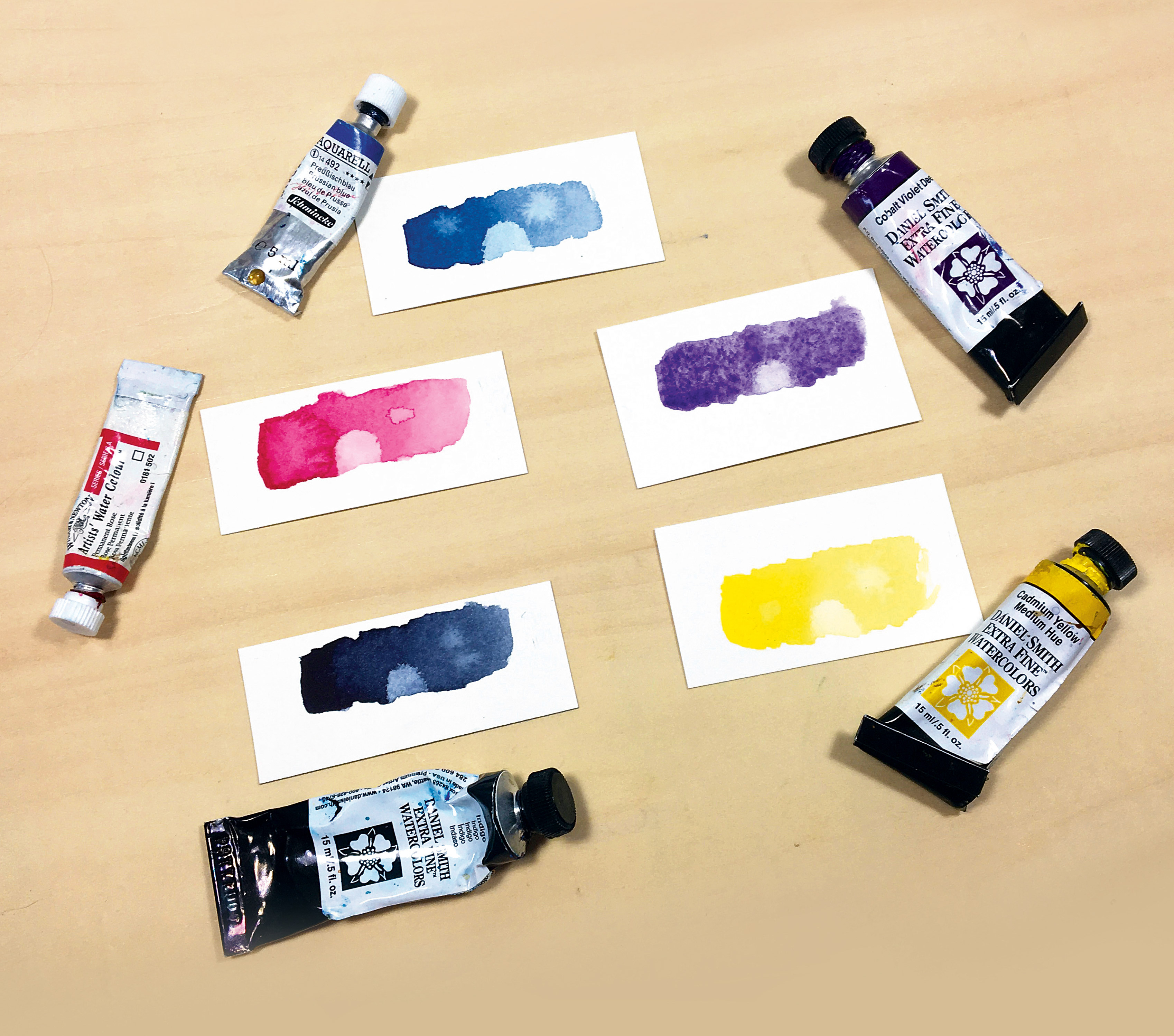
Let's go through the colours and their properties, starting with the Prussian Blue on the top left (above) and working clockwise.
Prussian Blue by Schmincke is a semi-opaque, staining cool blue watercolour. Its flow need a little work to get moving and mixing, but its vibrancy makes up for it. It does well with water blossoms and salt, but layering is limited because it’s not transparent.
Cobalt Violet Deep by Daniel Smith is a transparent, low-staining watercolour. While the colour is gorgeous and its high granulation offers possibilities for achieving texture, the flow is limited, making it difficult to spread. However, because it’s a transparent colour, it’s easy to lift off the paper when needed.
Cadmium Yellow Medium by Daniel Smith is a semi-transparent and low-staining, vibrant, warm yellow watercolour. Its flow is decent and it mixes really well with vibrant, transparent colours. Because this isn’t a transparent yellow, its layering properties are a little hindered, but because it’s so rich, you won’t need to layer it too heavily.
Daniel Smith’s Indigo is one of my favourite colours to mix and add depth to my work without muddying it up. It’s a transparent colour and offers a very high range in value. However, it’s a low-staining colour, so any stray marks with this one and you’ll have to get creative in removing it!
Permanent Rose by Winsor & Newton is a transparent, staining but brilliant colour and one of my favourites to work with. It’s easy to control and its flow is fairly high, which makes it easy to mix. It also reacts with water seamlessly and because it’s transparent, it’s an excellent colour to glaze with.
02. Understand colour
Before choosing your palette, it’s important to develop a basic understanding of colour theory and how colours relate to one another. This will aid you in choosing appropriate colour palettes for your paintings, to evoke a mood or emphasise a concept. This is also essential in choosing the tubes you mix new colours with. Colour temperature, hue and purity are all characteristics to consider when developing your painting.
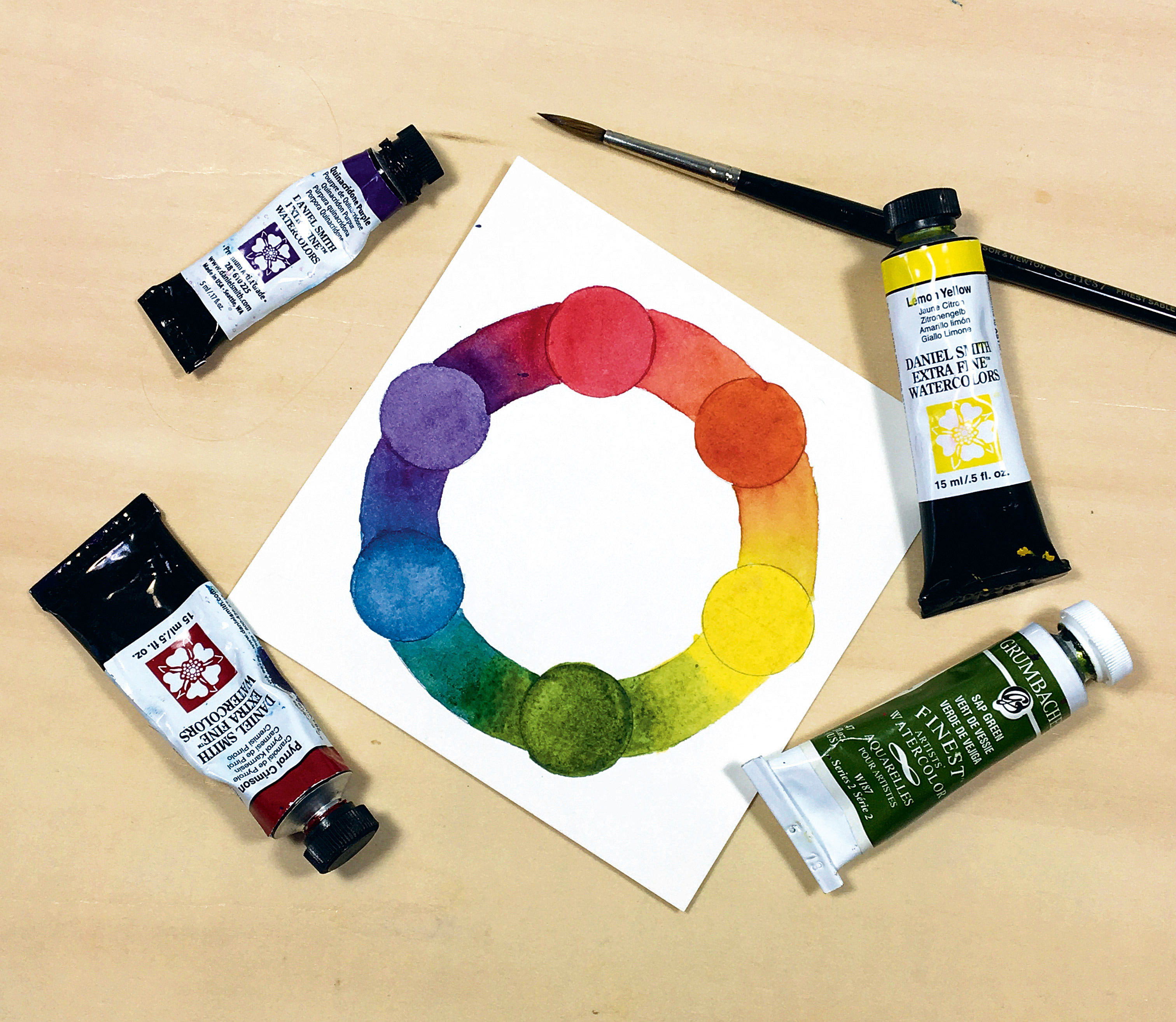
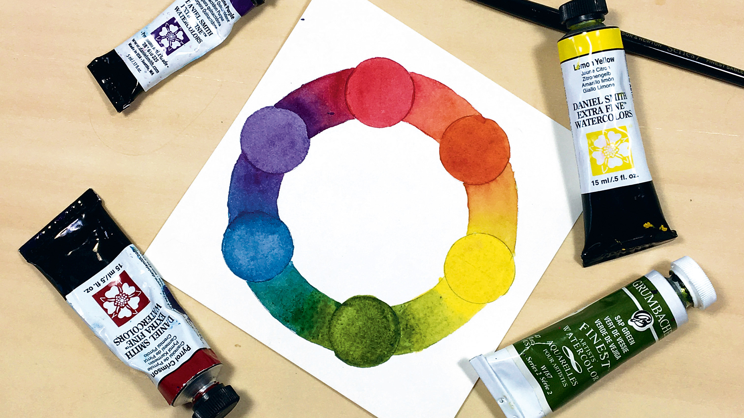
The purity, or intensity, of a colour is its saturation. On a colour wheel this is the colour at its purest form. To dull a colour, simply add its complementary colour, or its opposite on the colour wheel. The more vibrant a colour, the more attention it draws – especially when it’s a transparent or semi-transparent colour. Dulling hues will reduce tension and lessen the mood.
Meanwhile, the temperature of a colour is the suggestion of warmth or coolness. Warm hues are inviting, active and come forward in a composition. Cool hues are relaxing, refreshing and tend to fall back. On a colour wheel, reds, oranges and yellows are considered warm hues, while greens, blues and violets are cool hues. However, any colour can be warm or cool in relation to another, such as red violet (cool) versus red orange (warm).
03. Build your palette
A traditional palette comprises a warm and cool version of the primary colours, together with any additional colours that supplement mixing. In general, try not to overload your palette with too many semi-transparent or opaque colours, since these won’t lend themselves well to mixing and layering. For more intense colours, transparent and staining colours will make up most of your palette. For a dull palette, earthier staples such as burnt sienna, indigo and sepia will be prevalent, but expect to dilute to avoid muddiness.
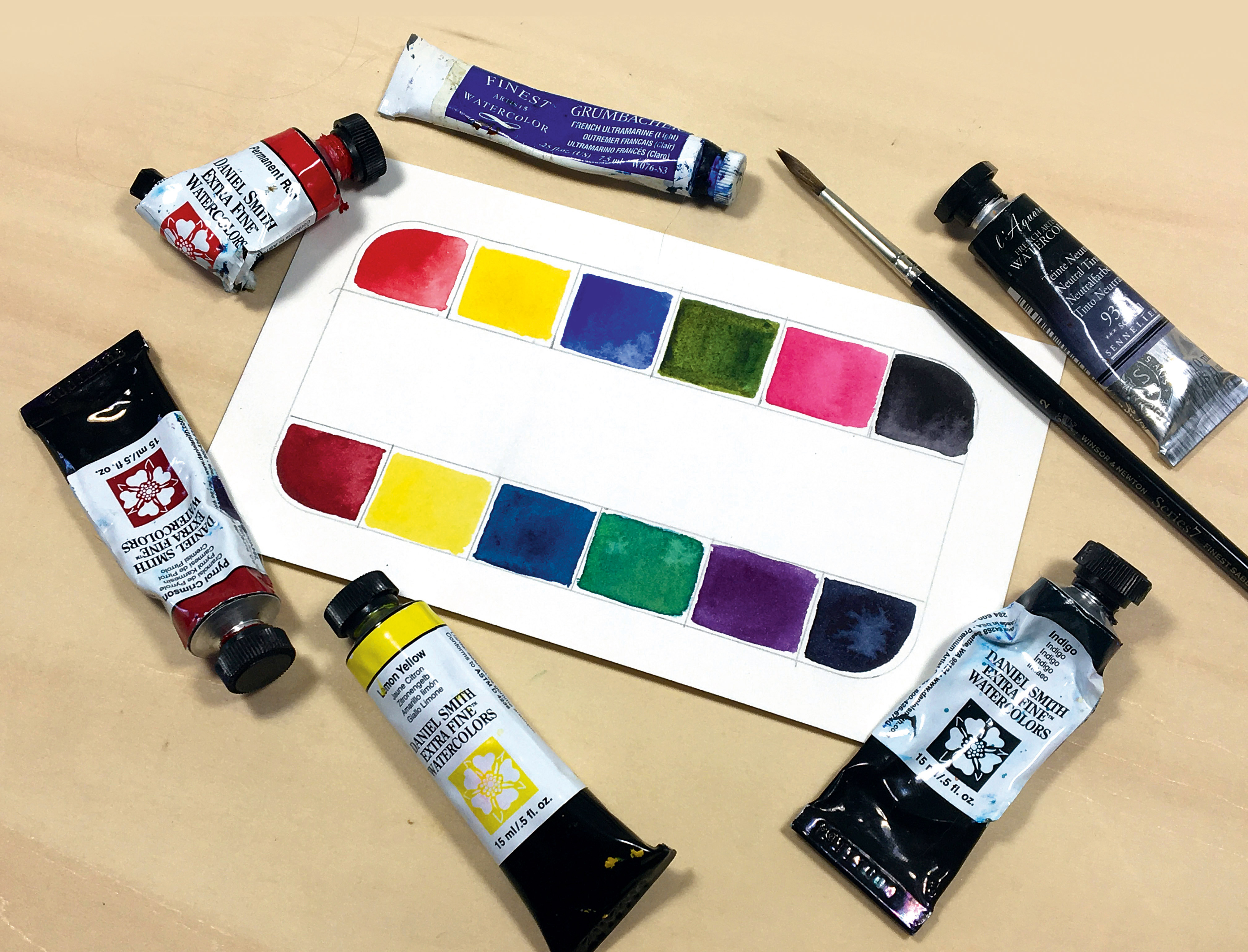
The warm side of the palette can be found at the top. This includes Permanent red, Cadmium yellow, Ultramarine blue, Sap green, Permanent rose and Neutral tint. On the bottom side you can see the cool colours, such as Pyrrol crimson, Lemon yellow, Prussian blue, Viridian green, Quinacridone purple and Indigo.
In the top right corner you can see the Neutral tint. Neutral tint is essentially the perfect mixture of all primaries that complete the full colour spectrum, which when mixed together work to cancel out the light value in each other. To use Neutral tint, try adding it slowly to an intense colour and watch it become a duller shade, without having to add its complement.
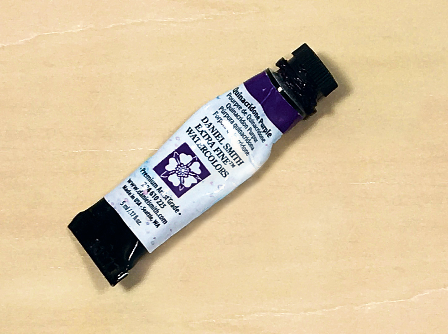
I keep Quinacridone purple close by at all times, because it’s become an excellent colour to mix with. I’ve found violets in the past difficult to mix without losing intensity. It’s excellent for glazing because it’s transparent.
04. Colour schemes
One reason it’s important to understand how the colour wheel works is in using it as a map to help you choose a colour palette. Using a colour scheme is an excellent place to begin that process, with many offering tried-and-true combinations of colours that help determine the mood and assist in expressing the idea. Here are a few of my favourites, working clockwise from the yellow on the top right corner of the image below.
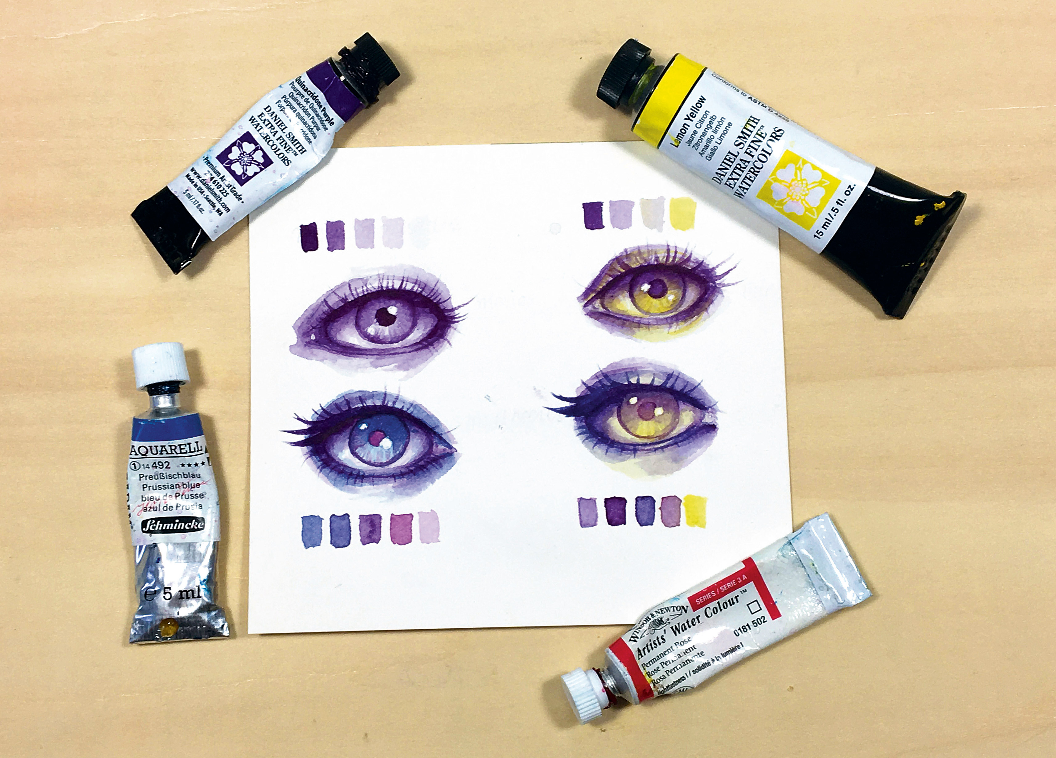
This complementary colour scheme involves two colours that are opposite of one another on the colour wheel. In my example, I’ve added lemon yellow with my Quinacridone violet. These opposites enhance each other and also pack solutions for contrast by mixing the two to create duller colours.
Split complementary colour schemes like the one on the bottom right are ideal for creating an intriguing mood. This is achieved by choosing one colour and then the two colours surrounding its complement, such as yellow, red violet and blue violet.
Analogous is a colour scheme that makes use of three to four colours that are next to each other in the colour wheel. In my example, I’m using Quinacridone purple with Prussian Blue and Permanent Rose to develop Violet, Red violet and Blue violet. Invariably, this results in using the warm and cool versions of a colour and lends itself to bright, harmonious palettes because the mixtures don’t dull or offer contrast. Instead, you have to rely on value range to determine contrast.
Monochromatic is an easy solution for guaranteeing colour harmony in a piece, because it depends entirely on a range of values to offer contrast. When choosing a watercolour to do this with, look for a deep colour that offers a wide range, such as Quinacridone purple.
05. Unify your palette
Now that your palette is set up and you understand how various watercolours interact with one another, let’s choose a limited palette. Often what results in a muddy painting lacking colour harmony is when the artist chooses too many colours to work with. The easiest path to a harmonious use of colours is by limiting it to between two and four colours. A wide range of colours can be created with very little, but pack a huge punch in a final painting.
For the example below, I’m using Lemon yellow, Permanent rose and Pthalo turquoise – a triad of sorts. Together, these create six distinct colours, including a spring green, peach and a moody violet. The potential with this combination is huge!
When I’m choosing a colour palette, I do tests similar to those in the top right, where I practice combining the colours in my palette to see how they react with one another, layer, and blend together.

If you begin running into problems with colours you’ve chosen, try to figure out what’s causing it. That's what I've done with this lattice of colours. Is one of your colours opaque and mixing it makes the colours muddy? Could one of your colours have high granulation and that’s causing your blending to be funky? Do you have too many unsaturated colours? Try introducing a vibrant, transparent colour.
For better chances at a balanced colour palette, ensure that at least one of your chosen colours has a wide range of value. This is why I often use indigo (on the bottom right) in my colour schemes, because it produces one of the richest deep values I can make without muddying everything up. For mixing purposes, try to keep your darkest valued watercolour either transparent or semi-transparent.
This article was originally published in issue 164 of ImagineFX, the world's best-selling magazine for digital artists. Buy issue 164 here or subscribe to ImagineFX here.
Related articles:

Thank you for reading 5 articles this month* Join now for unlimited access
Enjoy your first month for just £1 / $1 / €1
*Read 5 free articles per month without a subscription

Join now for unlimited access
Try first month for just £1 / $1 / €1
