When you're putting together your portfolio, it’s very easy to focus on what friends, colleagues or fellow designers are going to say about it.
But at the end of the day, what really matters is what employers think. Because all the ‘likes’ and nice comments you get from peers are worth nothing without the freelance commissions or new job you were looking for.
In this post, we’ll look at nine things employers are looking for in your portfolio. Tick all these things off the list, and your portfolio should be well on its way to being fit for purpose.
01. What you specialise in
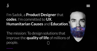
One of the first things an employer will want to see from your portfolio is what area or areas of design you specialise in, so they can quickly judge whether you fit with a particular position or freelance gig that’s available.
Don’t think, then, that including ‘a little bit of everything’ will help your cause. In fact, that can convey a lack of focus, and encourage employers to dismiss your portfolio and move on to the next one.
Instead, think carefully about where your passions truly lie and what kind of work you really want to do in future. Then carefully curate your work to sell that version of you. It’s the version that employers are most likely to react to positively. Sadok Cervantes’ portfolio, shown above, offers a good example how to convey your specialism clearly and concisely.
02. Clear, sharp images
On the one hand, you don’t want the images you include in your portfolio to be too large. If it’s a website, it will load too slowly; if it’s a PDF it may get rejected from the employer’s email inbox. But don’t go too far in the opposite direction either. If the images are too small and pixelated, your work will look sloppy and amateurish. So test your portfolio on as many devices as possible, large and small, to ensure that you’re presenting your work in a professional light.
Get the Creative Bloq Newsletter
Daily design news, reviews, how-tos and more, as picked by the editors.
03. The project brief
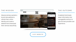
One of the biggest crimes when it comes to portfolios is showing images of work without any context. It doesn’t matter how pretty a design is, the employer needs to judge how well it met the needs of the client. So make sure you include accompanying text describing what the project brief was, and how you went about fulfilling it. To see a series of good examples, check out freelance web designer Ryan Gittings’ portfolio site.
04. What role you played in group projects
There’s nothing wrong with including group work you played a part in. After all, design is by its nature a collaborative activity. But an employer needs to know exactly what role you played in that project; after all, it’s you they’re potentially employing, not the group. So make sure you provide accompanying text that explains exactly what you contributed, how your contribution made the project a success, and credits for other designers where appropriate.
05. How to contact you
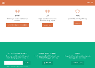
This might sound obvious, but if an employer is interested in your portfolio, they’re going to want to contact you. So the more options you can offer for doing that, the better. If, for example, your portfolio is online, only providing a contact form might be your undoing; the employer may decide it’s just not worth the hassle.
Ensure it’s easy for them to find both an email address and mobile number for you too, as UX and visual designer Maria De La Guardia does elegantly on her About page. Getting the perfect job or freelance opportunity is a small price to pay for attracting the odd bit of spam.
06. Good spelling and grammar
Employers we speak to regularly complain about poor spelling and grammar in portfolios, which seems like a spectacular own goal on the part of designers. But admittedly, it is sometimes very difficult to spot your own mistakes. So make sure show your portfolio to as many (literate) friends and colleagues as possible, to be absolutely, 100 per cent sure that you haven’t let any howlers through.
07. Your creative personality
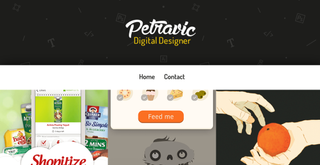
Design studios aren’t just looking for software skills, they’re seeking the kind of personality that will fit in with the rest of the team. It’s not always obvious how to convey that in a portfolio. But it’s still something to bear it in mind when you’re designing the portfolio, curating your projects and writing the accompanying text. Ask yourself: will people get an accurate sense of what I’m about from my portfolio? For a good example, check out the portfolio of digital designer Andrius Petravicius.
08. A quick read
Design studios get dozens of new portfolios a week, and often can’t spare the time to give them a proper look. So make it easy for employers to get a quick impression of you in a short space of time, by making the navigation simple, the number of projects manageable, and the amount of text short and concise.
09. That it’s up to date
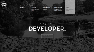
If your portfolio remains untouched for months, employers may assume you’re either to lazy to refresh it, or that you haven’t done any new work. So you need to find a way of updating your portfolio regularly. That can be a challenge if you’re working under nondisclosure agreements, of course. But there are always other strategies to keep your portfolio updated, such as including a side project or a blog, as Irish web designer Owen O’Donnell has done on his portfolio site.

Thank you for reading 5 articles this month* Join now for unlimited access
Enjoy your first month for just £1 / $1 / €1
*Read 5 free articles per month without a subscription

Join now for unlimited access
Try first month for just £1 / $1 / €1

Tom May is an award-winning journalist and editor specialising in design, photography and technology. Author of the Amazon #1 bestseller Great TED Talks: Creativity, published by Pavilion Books, Tom was previously editor of Professional Photography magazine, associate editor at Creative Bloq, and deputy editor at net magazine. Today, he is a regular contributor to Creative Bloq and its sister sites Digital Camera World, T3.com and Tech Radar. He also writes for Creative Boom and works on content marketing projects.