9 things designers do that they'd never admit
Designers have secrets they don’t want to get out. We kiss and tell.
We designers are a fickle bunch of people. We live and breathe design, but it's a very precise and individual experience bringing an idea into being. So it's not surprising that we can get a little bit cagey when it comes to our sources of inspiration, design practices, or little habits and superstitions.
Of course, everyone is different, and you may not recognise all of these traits in yourself. But we reckon there's a good deal of commonality across the profession, whether you'er an illustrator, creative director or graphic designer.
So read on to see some of the most common things designers do that they don't want to admit to, and let us know in the comments if we've missed any obvious ones...
01. Steal Stuff

If you've got a nice pen and loan it to a designer, be prepared to not get it back. This is equally likely when it comes to pencils, paper and paints; inspirational material such as books and magazines; quirkily designed packaging, items of furniture...
Basically, if it looks good and is portable, you need to make sure it's nailed down. We're not suggesting that all designers are criminals, of course. Just that they're 'good at gathering'.
02. Procrastinate for longer than is healthy

A certain amount of procrastination is essential to the design process. Purposeful use of time to ponder and explore different ideas and concepts before committing to a fully fledged design approach and mockup can help inform and define ideas, resulting in a much better end product.
But that said, do we really need to rearrange our copies of Computer Arts by issue number, sort our sharpies into a chromatic rainbow, and read absolutely every post on every design blog before starting work?
Get the Creative Bloq Newsletter
Daily design news, reviews, how-tos and more, as picked by the editors.
03. Overpromise

The creative process doesn't always run smoothly. Yet many of us have a tendency to promise fully designed mockups with three variations by the next day – only to then discover we've not given themselves enough time to do a good job.
This issue isn't limited to designers, of course, but as the creative process itself does involve a little bit of purposeful procrastination (see point 02), it's not always possible to accurately predict how long it will take to develop a workable solution to a design problem.
04. Use fashionable design approaches rather than developing a new paradigm
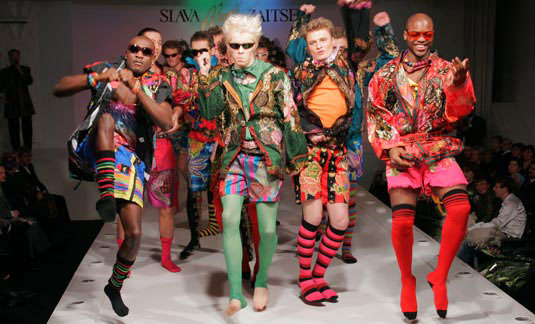
As with any artistic discipline, the design world has trends and movements. What makes a trend is the tendency for designers to imitate each other, and reflect the currently popular vernacular.
Most of us don't like to admit this because it suggests we're adopting a formulaic approach to our craft. This isn't the case, of course, as to pull it off effectively there's still an enormous amount of creative work required. Nonetheless, it's something we don't readily admit to doing.
05. Hate their own work

As designers our biggest critic is often ourselves. In fact, our natural state of mind is to believe we don't deserve to be where we are, that our work is sub-par, and that one day the 'real' designers will find us out.
A lack of confidence in our abilities, and a definite inferiority complex (at least in work terms) are almost a prerequisite of the profession, although mostly we won't admit these secret thoughts. It's perceived as a sign of weakness, so we hide our fears away.
06. Work in our jim-jams
In some circles the term 'graphic designer working from home' has become a euphemism for someone who doesn't bother to get dressed, lounges about all day in their pyjamas and has poor personal hygiene.
We disagree with all of the above. But there's probably not a single one of us that hasn't worked on a project from home all day long in our pyjamas. And that's fine... although when you start to have client conversations over Skype in your jim-jams, then you know you have a problem.
07. Buying a product for its packaging rather than what's inside

Walking down a supermarket aisle, a product catches our eye – not because we need, or even like, red bush tea. But because it's got a pretty box that uses a nice font and bold colour scheme.
It's not limited to cheap tea bags either. Famously a kitchenware manufacturer has a range of not-so-practical goods that look good, and many of us have parted with money purely on the basis of form rather than function.
08. Add comments to signs, or scribble out misplaced apostrophes
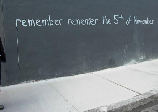
Just like the old student favourite of adding an 'i' into the middle of a To Let sign, we have a propensity for adding our own typographical corrections or enhancements to signage, books, point of sale or even graffiti.
It's not at all uncommon to see grocer's apostrophes crossed out, and some designers even use services like Moo.com to get stickers printed for the explicit purpose of providing guerrilla-style punctuation corrections to street signs.
09. Know the Hexadecimal, RGB, CMYK or Pantone reference for colours
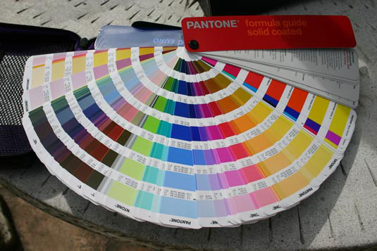
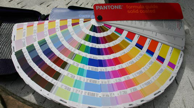
Ask the average person on the street what their favourite colour is, and you might get an answer a along the lines of 'red', 'green' or 'blue'. Ask us and you're far more likely to get an answer such as Pantone 1795 or #cc009a. It's not that we're deliberately using an incomprehensible system to describe colour. We just want to be precise...

Thank you for reading 5 articles this month* Join now for unlimited access
Enjoy your first month for just £1 / $1 / €1
*Read 5 free articles per month without a subscription

Join now for unlimited access
Try first month for just £1 / $1 / €1

Sam is a designer and illustrator based in Scotland, UK. He splits his time between art and design, motion and video and writing for various creative titles. He has written a book about web design, Pro CSS3 Layout Techniques and contributed to typography book, Fonts and Typefaces Made Easy.
