Despite the old saying, people do judge a book by its cover. And so in a crowded market, giving your horror novel the right look is crucial in making it stand out on the shelves.
In fact, even with proven bestsellers, publishers are continually innovating and trying out new cover designs; repackaging the classics to see what sells best. And as a result, we’ve seen some truly stunning artwork gracing the covers of the horror fiction releases over the last few decades.
Here we bring together nine of our favourite horror novel covers to inspire your own designs.
01. Dracula by Bram Stoker
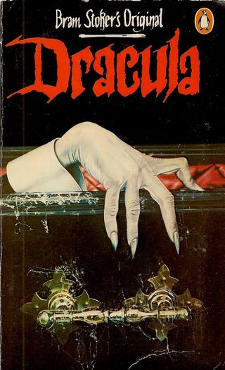
This classic 1897 novel by Irish author Bram Stoker introduced us to the iconic character of Count Dracula, spawning a century of movie and theatre adaptations that eventually led to cute and cuddly parodies like Count Duckula and Sesame Street’s The Count. But the original novel remains a bloodcurdling classic, and this classic 1980s Penguin cover conveys that sense of brooding malevolence beautifully.
Depicting Dracula’s thin, pale hand emerging from a cobwebbed coffin, this cover masterfully proves the horror axiom that hinting at a monster’s presence is more sinister than revealing it completely. You can see other classic covers for Bram Stoker’s novel here.
02. Salem’s Lot by Stephen King
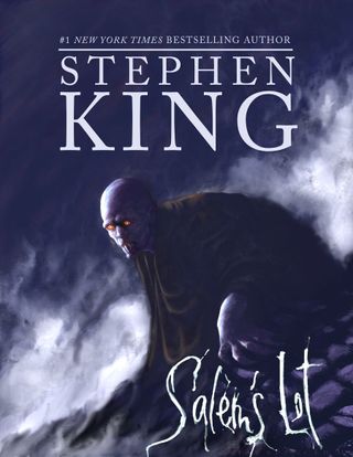
In the second half of the 20th century, Stephen King became the undisputed king of horror fiction. Sadly, though, the covers for many of his best books have been a little low-rent. But here’s one that, in our opinion, bucks the trend.
King’s second novel, 1975’s Salem’s Lot, tells the story of a writer who returns to his childhood town only to discover that the residents are becoming vampires. And this 21st-century cover design gets right to the heart of the horror. It sets a chilling atmosphere with its sinister, impressionistic style, haunting central character and scrawled lettering, instantly summoning the feel of a desperate struggle to survive. You can see a larger selection of Stephen King novel covers here.
Get the Creative Bloq Newsletter
Daily design news, reviews, how-tos and more, as picked by the editors.
03. The Amityville Horror by Jay Anson
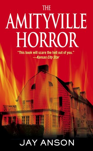
First published in 1977, The Amityville Horror is claimed to be based on the real-life paranormal experiences of a family in Long Island, who moved into a house said to be possessed by a murderer, although it has since attracted lawsuits over its truthfulness.
That controversy asides, the novel is a true horror classic, and this contemporary cover design from Pocket Books shows how sometimes the simplest ideas can be the spookiest.
Although the novel’s subtitle ‘A True Story’ has now been dropped (presumably for legal reasons), casting a black-and-white photo of the actual house against a subtle filter of hellfire flames conveys the same idea with quiet efficiency.
04. The Silence of the Lambs by Thomas Harris

First published in 1988, The Silence of the Lambs is the second novel by Thomas Harris featuring cannibalistic serial killer Hannibal Lecter, who was later immortalised by Anthony Hopkins in the blockbuster film.
The iconic novel has had many covers, mainly themed around what looks like a butterfly, but is actually a death's-head hawkmoth (so-called because the patterns on its thorax resemble a skull). This eerie design is our favourite: with its starkly visceral, stencilled moth against a distorted anguished background, it echoes the morbid nature of the tale brilliantly.
05. Lightning by Dean Koontz
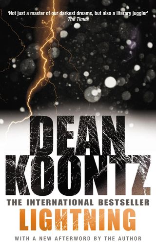
Often the most effective horror covers hold back from being too literal in favour of the sinisterly suggestive, and here’s a great example. The 1989 novel by the best-selling horror writer Dean Koontz, Lightning tells the story of a girl born during a freak lightning storm. This 2003 reprint features an arresting design that eschews the visual cliches of lightning (stormy skies, windswept landscapes) and goes for something a little more abstract.
But it’s no less spooky for that, and by seamlessly combining the evocative artwork with the main typography, the effect is instantly eye-catching and intriguing.
06. American Psycho by Bret Easton Ellis
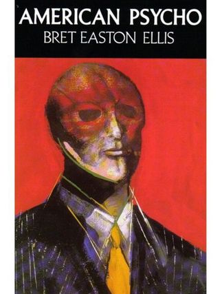
Bret Easton Ellis’s 1991 story of Patrick Bateman, a serial killer and Manhattan businessman, is a thrillingly dark satire of consumerism, greed and the 1980s yuppie lifestyle. And in some countries it was deemed so disturbing that it could only be sold shrink-wrapped.
Luckily, other nations weren’t so squeamish, and were rewarded with this stunningly evocative cover painting from New York artist Marshall Arisman. Its expressionistic depiction of a faceless businessman, formed from smeared brush strokes, is chillingly sinister and masterfully conveys the unnerving atmosphere of this groundbreaking novel.
07. Coraline
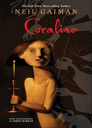
The story of Coraline, a girl who steps through a door to find another house strangely similar to her own, is now best known for the child-friendly 2009 movie adaptation. But Neil Gaiman’s original horror novella of 2002 is pretty dark stuff, and this front cover by Paul A. Hotaling harnesses the essence of child-like drawings to portray that sense of the sinister perfectly. Who can’t fail to be creeped out by those ghostly grabbing hands? The beautiful black-and-white sketches by Dave McKean inside the book are very much worth checking out too.
08. Let The Right One In by John Ajvide Lindqvist
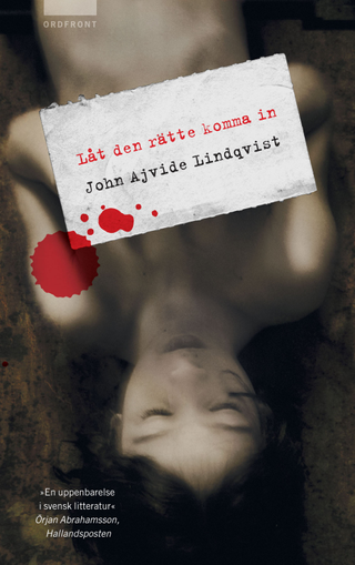
Let the Right One In was a 2004 tale of the relationship between a 12-year-old boy and a vampire child in a working-class suburb of Stockholm in the 1980s. This game-changing novel has sported a variety of covers over the years, but this eerie design for the original Swedish edition remains our favourite. Illustrating one of the story’s pivotal scenes in an ethereal, otherworldly style, it nonetheless feels grounded in real-life; just like the novel.
09. Pride & Prejudice & Zombies by Jane Austen & Seth Grahame-Smith
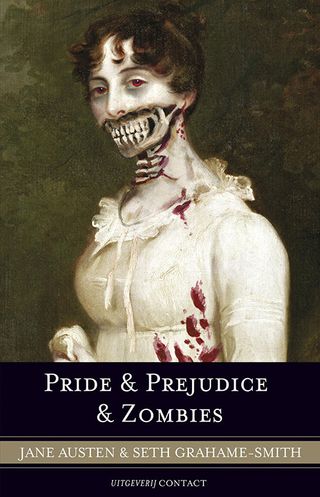
From the sublime to the (intentionally) ridiculous. A tongue-in-cheek mashup of a Jane Austen's classic 1813 Pride and Prejudice with modern zombie fiction, Seth Grahame-Smith’s 2009 parody novel took a similar approach to its cover art. Created by comedian and illustrator Doogie Horner, it’s a "zombification" of an early 19th-century painting of Marcia Fox by William Beechey. A simple idea, but one that’s been executed perfectly and can’t help but raise a smile from bookshop browsers.
Read more:

Thank you for reading 5 articles this month* Join now for unlimited access
Enjoy your first month for just £1 / $1 / €1
*Read 5 free articles per month without a subscription

Join now for unlimited access
Try first month for just £1 / $1 / €1
Tom May is an award-winning journalist and editor specialising in design, photography and technology. Author of the Amazon #1 bestseller Great TED Talks: Creativity, published by Pavilion Books, Tom was previously editor of Professional Photography magazine, associate editor at Creative Bloq, and deputy editor at net magazine. Today, he is a regular contributor to Creative Bloq and its sister sites Digital Camera World, T3.com and Tech Radar. He also writes for Creative Boom and works on content marketing projects.
