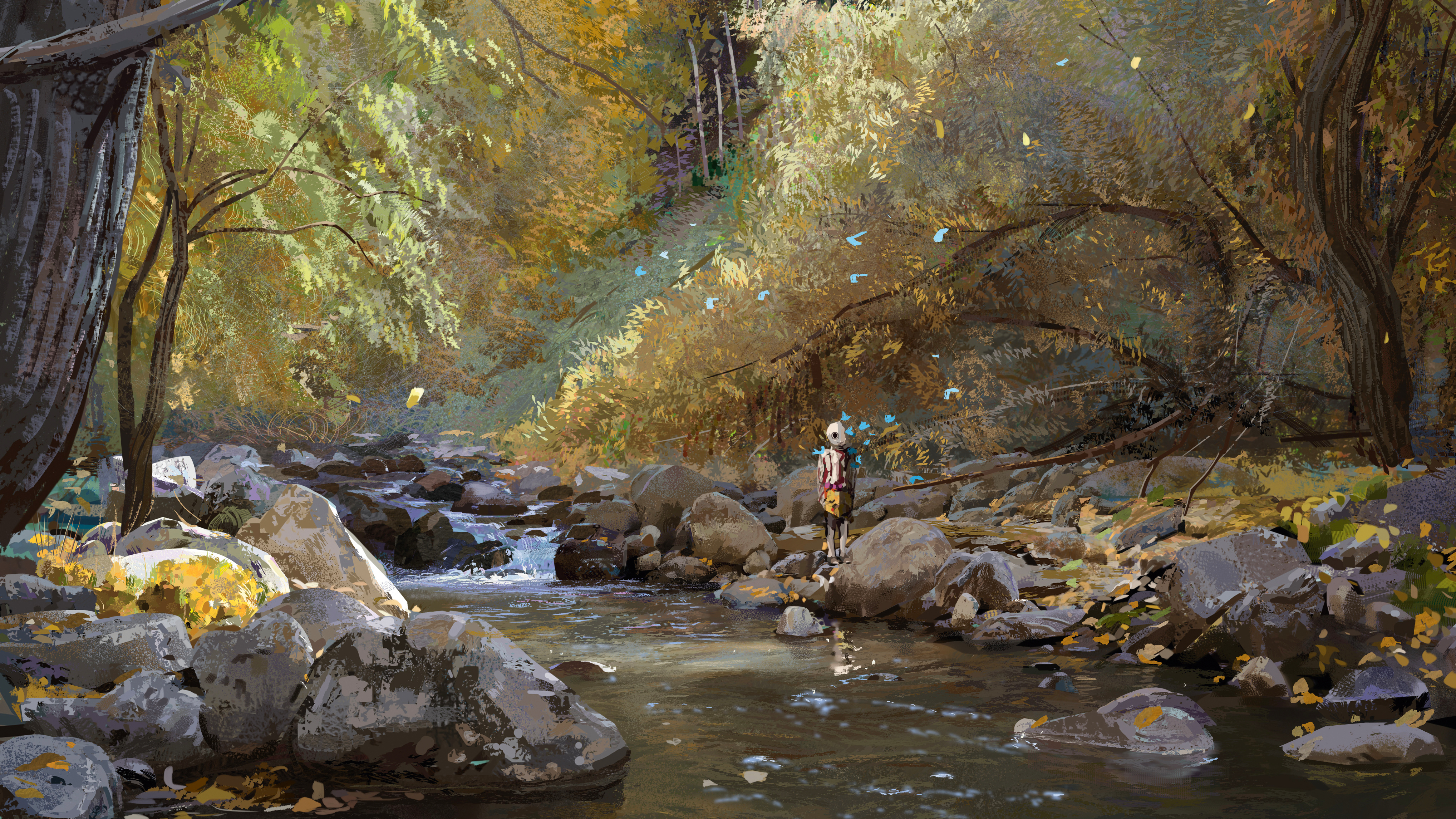
At its core, sport is about the passion and dedication to succeed. And so the best sports photography doesn’t just capture the action, but a moment that strikes an emotional chord with audiences everywhere.
Used carefully, such evocative images can be harnessed to make a website design really sing, and here we’ve picked nine great examples of how it can be done.
Of course, this list is by no means definitive. If you’ve spotted any other great examples of sports imagery in web design, then we’d love to hear about it in the comments!
01. Reebok: Be More Human
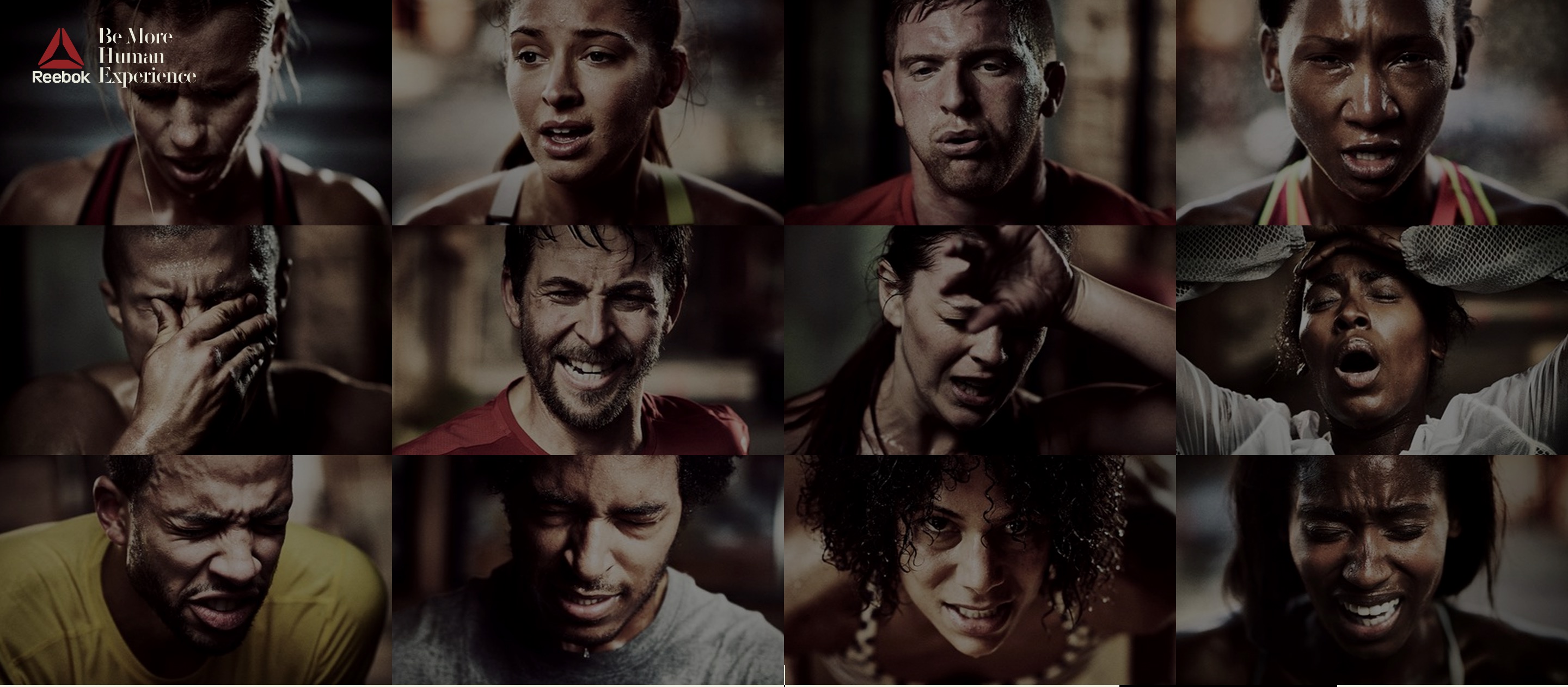
Reebok always sets the gold standard in engaging with its audience, and its 2014-2015 campaign ‘Be More Human’ was no exception.
The campaign saw the sportswear brand shift its focus away from sporting celebrities towards real people working hard on their fitness goals.
The accompanying website, designed by Venables Bell and welikesmall, makes great use of photography to give the brand a new sense of honesty and authenticity. It even includes Reebok followers’ own photos, after the brand encourage them to upload their ‘honest selfies’ to Instagram with the hashtag #breaktheselfie.
02. Speedo: Art of the Cap
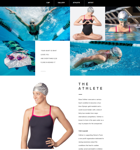
High-level design meets cool sportswear in this collaboration between Californian digital agency Hello Design and Speedo USA. The campaign pairs five Olympic athletes with five artists to design limited-edition swim caps for five worthy causes. The accompanying website presents it all beautifully, with the stunning photography above showcasing Jessica Hische’s cap design for freestyle relay gold medallist Dana Vollmer.
Get the Creative Bloq Newsletter
Daily design news, reviews, how-tos and more, as picked by the editors.
03. Ashworth Golfman
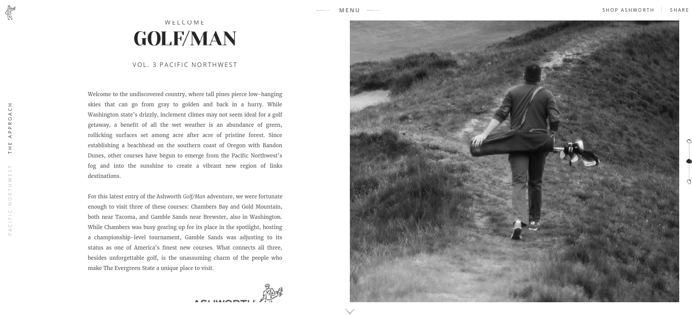
Golf apparel and footwear brand Ashworth wanted to project an image of authenticity and quality, and this strikingly original website design does just that. Created by Active Theory and Zambezi, it combines the layout style of an old-school magazine with elegant transitions and a topographic menu made in CSS3D. It all adds up to a high quality, photo-led experience.
04. Joern Pollex
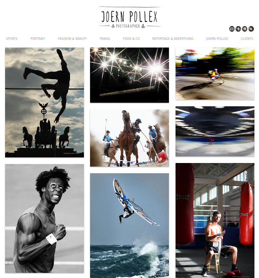
Any decent sports photographer is going to have some impressive work on his website, of course. But this offering from Hamburg-based photographer Joern Pollex stands out for us more than most. While the site itself is fairly basic, the selection of images on the homepage instantly convey the veteran photographer’s unique eye on the world, and wills you on to discover more.
05. This Girl Can
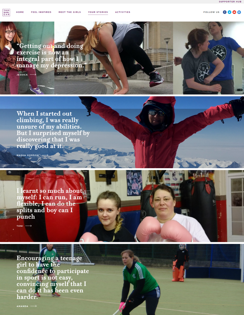
‘This Girl Can’ is a campaign by Sports England aiming to inspire women to engage in sport and exercise and ignore any fears of being judged for it. Suitably enough, the website is packed full of authentic images that show real women doing real activity, with not an airbrush or a supermodel in sight.
06. Focus Bikes
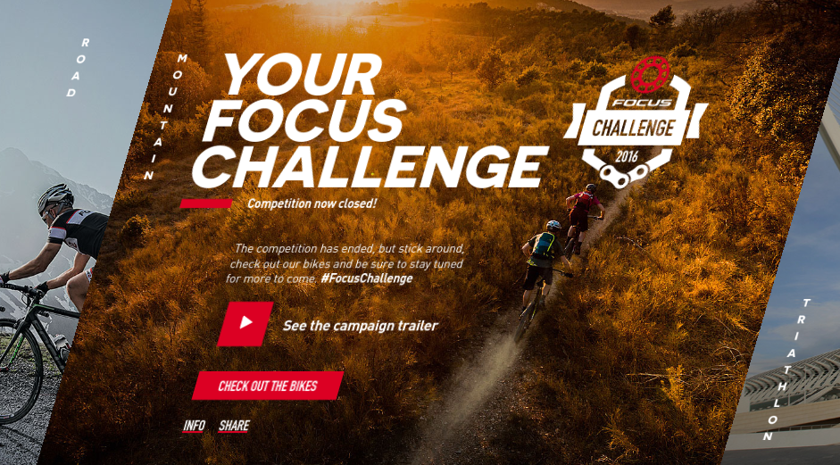
When done right, angled text can be a great way to add some visual flourish to a homepage, as web pioneer Jeffrey Zeldman’s new site has proved. And here’s another great example, in which slanting text combines perfectly with beautiful photography to subtly evoke the tough challenge of uphill cycling. This sleek site was created for German brand Focus Bikes by MediaMonks and Superhero Cheesecake.
07. Adidas ACE
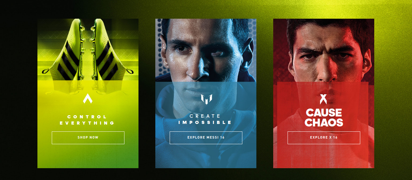
Superhero Cheesecake, DDB and Tribal Amsterdam all collaborated on this site to promote Adidas’ ACE 16 football boots, which boast an advanced design with no laces. The imagery is suitably futuristic, using stylised photographic manipulation to present stars like Lionel Messi in a sci-fi-esque light.
08. Nike Soccer
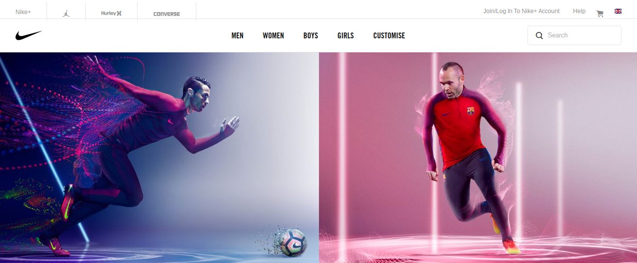
More futuristic soccer imagery comes courtesy of Nike’s soccer site. The beautifully stylised photography, enhanced with neon effects and colourful light trails, is part of the ‘Spark Brilliance’ campaign masterminded by W+K Amsterdam.
09. Amir Khan
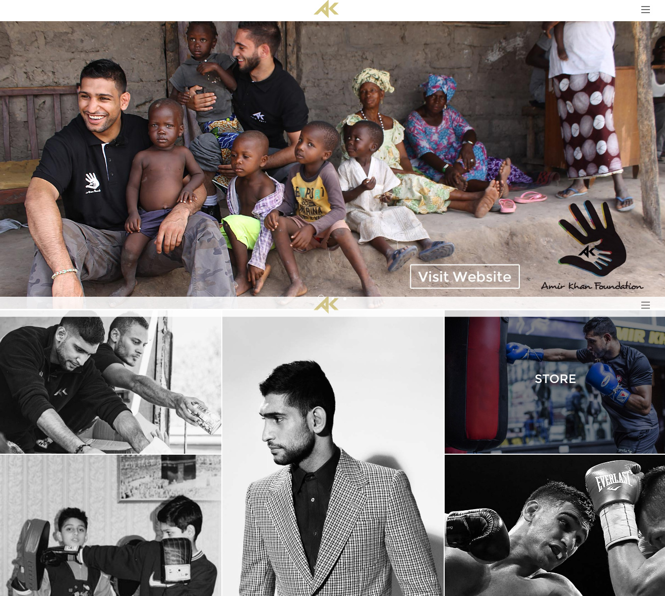
British boxer Amir Khan’s scrapbook-style homepage, created by Manchester agency Brunch, does a great job of evoking an emotional response. Combining photographs of the star’s sporting achievements with other aspects of his life, including his philanthropic work, it instantly conveys a sense of a man with real hidden depths.

Thank you for reading 5 articles this month* Join now for unlimited access
Enjoy your first month for just £1 / $1 / €1
*Read 5 free articles per month without a subscription

Join now for unlimited access
Try first month for just £1 / $1 / €1

Tom May is an award-winning journalist and editor specialising in design, photography and technology. Author of the Amazon #1 bestseller Great TED Talks: Creativity, published by Pavilion Books, Tom was previously editor of Professional Photography magazine, associate editor at Creative Bloq, and deputy editor at net magazine. Today, he is a regular contributor to Creative Bloq and its sister sites Digital Camera World, T3.com and Tech Radar. He also writes for Creative Boom and works on content marketing projects.
