9 design trends that defined the year of rebellion
2019 was all about self-expression, subversion and activism – with design at the forefront.
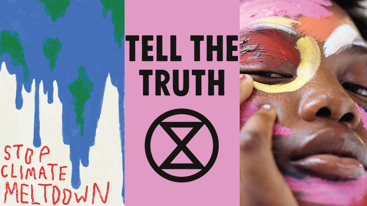
An empowering year of protest has seen rebellion in its many forms influence art and design, from fashion and product through to services and the way in which we consume. It has infiltrated the likes of graphic design and communications, from substrates and mediums to the use of colour, and none more so than climate activism. In this article, we'll explore the art and design movements that have intertwined with this mood of rebellion over the course of 2019.
The discourse around climate change is shifting. Today’s youth are rising up, declaring a state of emergency and seeding an infectious sense of agency at a time of inaction. It is schoolchildren who are pushing the climate crisis to the top of the international agenda, humbling and inspiring audiences of all generations to demand action.
This renewed activist vision is a far cry from hard-edged punk rebellions. It’s about human potential and community strength
And while the devastating effects of our current models of consumption have been known for some time, it is Greta Thunberg’s hand-scribed ‘Skolstrejk För Klimatet’, her #fridaysforfuture and heroic Atlantic crossings to the United Nations headquarters that are inspiring young people across the world to fight for a future at all. With the weight of the planet seemingly on their shoulders, Gen Z-ers (and Alphas) are indeed angry, but also hopeful and resilient in their crusade for change.
- Explore our 20 biggest design trends for 2020
This renewed activist vision is a far cry from hard-edged punk rebellions. It’s less about apportioning blame and instead about human potential, community strength and local stories bringing people together to learn and create. Never before has messaging found such rhythm, brought about by the lo-fi creation of signage and symbols shared across social media.
In this new age of activism, digital platforms are a resource for grass-roots action. Thought-provoking creatives Do The Green Thing act as a ‘public service to the planet’, while the Entry Level Activist’s Instagram platform is designed to “make activism more relatable and less overwhelming”. Design duo Josie Tucker and Richard Ashton, who make up climate club Adapt, are creating manifestos for change employing satirical graphics in a meme-like manner to make real change digestible and accessible to those discouraged by overwhelming facts and conflicting science. The rise of the insta-activists continues to fill feeds with visually led infographics designed to provoke action.
Pick up a Computer Arts subscription this Christmas!
If you know someone who'd like a dose of design inspiration and insight from the world's leading creatives, delivered directly to their doormat every month, this could be the perfect gift.
01. Join the rebellion
2019 has been a year of revolution, not least due to the impact of international movement Extinction Rebellion (XR) in forging a new and empowering path for environmental protest. Remaining explicitly apolitical and non-violent, their energy connects people around the world in a show of solidarity, boldly unified by an era-defining visual identity.
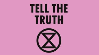
Instead of claiming a single colour traditionally used as a signifier of allegiance, its array of 12 lively hues have become synonymous with their key messages to Rebel For Life and Tell The Truth. “Our use of lots of different colours signifies that we’re many things – that we’re open to all people, we’re not a closed movement,” said Clive Russell, design director at This Ain’t Rock ‘n’ Roll, the agency behind XR’s intersectional aesthetic, in an interview with Viewpoint Colour magazine.
Get the Creative Bloq Newsletter
Daily design news, reviews, how-tos and more, as picked by the editors.
The explicit palette creates a visual spectacle that unifies crowds, who can access the tools to create protest materials themselves via the dedicated arts group (one of many open-source skillshares at XR).
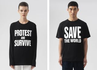
Fashion remains a momentous vehicle for protest, with icons such as Vivienne Westwood and Katharine Hamnett breaking convention and galvanising audiences. Hamnett’s seminal T-shirt designs Choose Love, Cancel Brexit and Vote Trump Out express block type political slogans, designed to be easily copied in order to reach as many people as possible. A limited range for today’s young activists includes tees such as Save The Future.
Similarly, Wolfgang Tillmans’ Between Bridges foundation, set up in 2017, intends to advance democracy and LGBTQ rights by engaging a non-typical audience through the arts. Tillmans’ multilingual slogan tees and posters trended both prior to the initial EU referendum and again for the MEP elections this year.
This protest movement is fuelling a graphic language that’s spontaneous, rich in unrefined textures and kinetic in application of colour. While the global picture is sombre, the message for the future is to collaborate and inspire, with the intention of propelling us toward solutions.
02. DIY activist
Responding to a need for a more inclusive and democratic political and environmental conversation, the rise of creative workshop culture has led to community-driven activism that amplifies the voices of all. The aesthetic of the DIY Activist is makeshift: whether hand-assemblage or digital collage, the process is wholly ad hoc.
The visual language has evolved from design collectives such as Protest Press and Collage Club, which are bringing hacktivism to the fore by embracing an imperfect aesthetic in open-to-all cut-and-paste workshops. Using the poster as a vehicle for bold messaging, slogans are expressive, savvy and shorthand in style.
Scissored lettering suggests uncompromised intention and the anonymity of a collective voice. The material-led palettes are defined by salvaged and appropriated matter in industrial pastels and dulled synthetic brights of reclaimed papers and plastics, knocked back with concrete greys and cool off-whites.
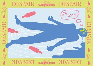
This reclaimed aesthetic translates well into digital collage, maintaining elements of the rudimentary using naive illustration and rough-cut stencil forms. Climate club Adapt is on a mission to side-step the gloom surrounding the existential crisis by melding humour with design. Its nine-point guide to tackling individual climate action, designed for It’s Nice That, stays true to poster conventions boasting digital nostalgia in the form of flattened two-dimensional layouts. Spray-can smileys and a limited primary palette of washed-out reds, blues and yellows are reminiscent of early Microsoft Paint. Online or in real life, its highly shareable, meme-like graphics make the climate crisis a more accessible conversation.
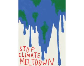
Championing design communities around the world, creative networking movement Glug is building the world’s largest database of climate protest posters, titled Protest by Design, in support of the UK Student Climate Network and Fridays For Future. The informal open-submission is encouraging designers to use “slapstick imagery, comedy, banter, stupid phrasing, and downright light-hearted mockery if needed” to protest that the time for a business-as-usual mindset is over.
03. The zine mindset
The look and feel of DIY activism is strongly influenced by zine culture. Punk zines grew in the 70s with an improvised aesthetic and then in the 90s, feminist zines subverted mainstream content producing personal and political manifestos that could be distributed readily. Moving forward to today, zines are pedalling social and environmental concerns of young activists, using the do-it-yourself design tool to take action. And streetwear brands are adopting this zine aesthetic to communicate sustainable agendas to a youth market.
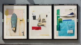
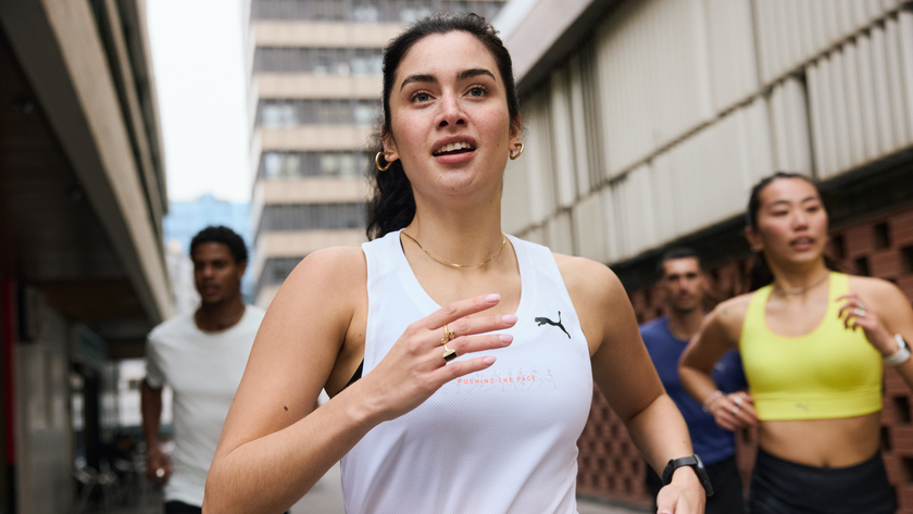
AMATEUR(DOT)ROCKS crafted a visual language for Adidas’ Run For The Oceans campaign. This was a socially charged activation designed to spark the conversations around the global plastic problem and educate the next generation of climate activists. AMATEUR(DOT)ROCKS describe its typographic repetition as representing “collective voice and urgency” with an approach to photography “that captured new running in a real, raw and authentic way.” Layering wrapped plastic textures in a collaged manner drives home the crisis.
Ad hoc, spontaneous and reconfigured, the language of DIY activism is very much an assemblage of the salvaged and reappropriated. Materials are hacked and remade as valued waste is given a second life. A quick and dirty design approach is a vehicle for bold, action-led messaging.
04. Chaotic colour
Pantone’s Vibrant Rebellion describes the activist generation as rising up and reclaiming ownership of their future. Colour is explosive, chaotic and this design direction is a call to action, provocative and unapologetic. It represents a manifesto for urgent measures, an uncompromising and tribal approach to protecting the planet. The hyper-tactile narrative sees a frenzy of pigment, pattern and texture overloading billboards and storefronts, catwalks and editorial in a very public campaign of anger and vibrant optimism. Today’s youth are angry: they want their hopes and dreams back.
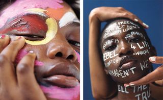
As explored in Viewpoint Colour Rise Up, make-up artist Phoebe Walters’ Peace Paint features smudged, smeared and sprayed pigments, thickly layered in unrefined textures as the skin becomes a canvas for expression. An update on the concept of war paint, the haphazard and confident finger strokes apply sugary-sweet hues and dirtied primaries to bare skin for a striking message of activism and communal purpose.
Adopting well-established vehicles of resistance, Vivienne Westwood’s AW19 show at London Fashion Week elevated social issues from freedom of speech to saving the planet with all the theatre and disorder of a protest rally. Placards carried emotive slogans while the frenetic layering of a punk collection expressed anger in an audacious clash of patterns.
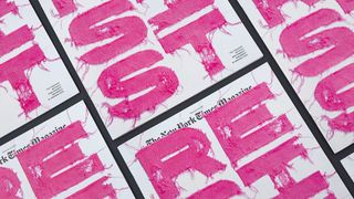
The subversive adoption of textiles in protest graphics often speaks to a feminist narrative. In 2017, Sagmeister & Walsh’s Resist cover for The New York Times designed type with knitted swatches and unravelling yarns, in an ode to the fuschia hats made for the Women’s March on Washington.
05. Digital overload
In the gritty and anarchic Maison Margiela Artisanal show in Paris earlier this year, a glitched layering of digital graffiti blurred garments with stage sets in a graphic overload. Saturated cobalts fought with fiery reds and deep violets in kaleidoscopic excess. This rebellious use of kinetic mark-making can be seen across digitally printed textiles and printed campaigns. For example, Sydney-based graphic designer Kris Andrew Small has a bold and abstract visual identity that layers sweeping colour in a riotous assault of 90s tropicana, shaking up visuals for festival branding and streetwear drops.
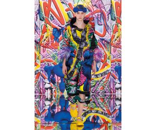
The activist generation is driving a digital revolution, exploring an immaterial future by creating hyper-tactile textures in a virtual realm. Selfridges Presents The New Order is defining the future of fashion and retail in a vibrant celebration of the phygital, promoting creatives such as Ines Alpha and Digi.gal, a global womxn’s network of 3D designers [the spelling is intentional to reject the idea of ‘woman’ being ‘of man’]. The store fronts are otherworldly landscapes that stretch the imagination, rebellious in their use of digital motion and immediately shoppable product.
An uplifting and unapologetic visual expression of activist rhetoric, tangy hues bleed into one another in a kinetic but gritty flow of colour. As a vehicle for rich political and environmental narratives, the story is heavily textile (both material and immaterial), clashing saturated brights with graffiti-style type.
06. Changing the gaze
The global feminist uprising has evolved from the suffragettes to today’s youth who are calling out inequality across the world. Not only are they questioning outdated social norms, they’re demanding a voice at the table, reclaiming space in the creative industries and redefining power on their own terms.
At the centre is collaboration, uplifting and empowering all female-identifying people. A by-womxn-for-womxn model is driving a new aesthetic that moves away from a subversive millennial pink, to the confident honey-warmth of tangerine in a renewed show of energy.
In an age of #metoo and #timesup, there’s an ongoing message of solidarity and persistence in the fight for equality. Womxn are seeking out products that speak to them, not for them.
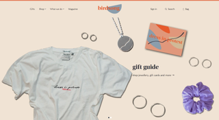
Fashion brand Birdsong is part of the fight, employing female artisans to make politically inspired tees for those who dress in protest. Hand-embroidered or screen-printed, its slogans encourage all to Resist & Persist by protesting inequality with everyday acts. Birdsong’s design for International Women’s Day 2019 uses a retro-inspired orange font that speaks to the history and future of the cause.
07. Come together
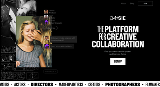
A growing pool of female content creators are instigating change through collaborative platforms. Creative playground Daisie is the brainchild of Maisie Williams and Dom Santry. Daisie uses bold sans serif messaging, layered with illustrative scribbles and mark-making in social-style communications. Wonder Women, a recent initiative of the platform, was designed to bring together teams of womxn to shine a light on raw, underrepresented talent. The graphics for the open-call combine playful, softly-lit analogue photography with deep indigo backdrops. Layered on top are digitally drawn embellishments that act as graphic furniture throughout their online presence.
Complementary palettes are evident throughout communications by and for womxn; with inky blues, moss greens and warm tangerines offset with heavy, nearly-black type. Tactile, brushed paper stocks are the canvas for Room For Rebellion’s club night posters, designed by Caterina Bianchini to raise awareness for abortion rights across Dublin, Belfast and London. The hand-cut rouge shapes are delicately layered and framed by weighted hand-drawn type that brings strength to a soft composition.
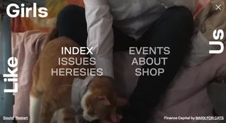
Girls Like Us magazine, which captures the stories, essays and beautiful visuals of a community of womxn within arts, culture and activism also uses a border-style type. The authentic nature of the content shines through in hazy film photography on the cover, framed by type that’s spaced in such a way to encourage pause with every word.
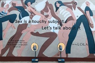
Straight-talking and taboo busting, the messaging from LOLA is “Let’s Talk About It.” Communicating in a way that’s honest and open, life-long feminine healthcare brand LOLA is opening up the dialogue around uncomfortable subjects, ranging from periods to sex. Its larger-than-life mural in Brooklyn, New York, adopts painterly illustrations of the female body as a backdrop for a telephone hotline that shares intimate and real experiences within the public sphere (a campaign spearheaded by agency Giant Spoon). The stylised illustrations communicate the autonomous female body with a robust femininity.
Messaging is always straight-talking and honest, driving creative collaboration and instigating change. Brushed paper stocks stained with painterly, gestural mark-making celebrate the female form in all its diversity. Palettes of two or three colours, warm neutrals with inky blues and tangerines move toward a more complex feminine colour space.
08. The new eco warrior
The New Eco Warrior is all about paring back and slowing down, in a backlash against gluttonous excess. The less-is-more aesthetic sees traditional hand-tooling and natural treatments as a step toward a more considered future. Designers are embracing imperfect aesthetics that are aged or dirtied, scratched or darned. Far from makeshift, this is a luxe design direction that honours the time-old traditions of craft.
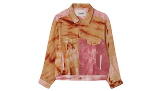
The New Eco aesthetic is a quiet act of protest, driving a desire for the well-loved, the treasured one-offs. Tie-dye and block printing are of a language that’s imperfect by nature. The muddied pastels of Story MFG’s collection stain cottons and linens, creating cross-directional prints in a patchwork effect. The airy cloths are contrasted with heavy cotton twills that, when dyed, create a crumpled aesthetic in raspberry and sand.
As Story MFG told New Order Mag in an interview earlier this year, “Our setup is almost more like a fine winery than a fashion brand. We leave a lot of the design up to the weather, soil, crop and we just work with what we’re given. It’s liberating and challenging in equal measures.” Changing the parameters of possibility and bringing it back to the resources that are available on a local and sustainable level can lead to innovative results. Pieced together and over-embroidered, Story MFG is an artisanal patron of slow-made.
09. Plant origins
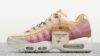
To reduce the impact of toxic chemical dyeing, brands are turning to plant-based pigments resulting in earthy tones stretching from khaki greens to sunbleached ochres. Nike’s Plant Color Collection is a nod to colour futures exploring alternative material treatments and finishes across product design. Increasingly, unbleached textile fibres and papers in light fawn, oatmeal and putty are replacing stark whites.
Tangent GC’s garment care solutions are designed to prolong the life of carefully crafted clothes, and their products carry the same weight of artistry. Painterly marks and watery translucency are elevated in its packaging designs by Åsa Stenerhag, design director at Totême, resulting in 100 unique soap boxes across four fragrances. The organic papery textures and earthy palette reimagine packaging as an object to treasure.
With consumers demanding more sustainable solutions, afterlife is ever-increasingly an important material consideration. Brands are turning to biodegradable and compostable substrates, made of and for the Earth. Haeckels’ cosmetic products are based on ingredients from the coast around Margate for its mineral-rich properties, enabling a restoration of calm.
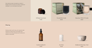
As investors in coastline conservation and natural innovations, Haeckels has developed bio-contributing mycelium packaging for its products. Rather than smoothing and perfecting the surface, the pulpy and fibrous textures of mycelium proudly embrace their wholesome philosophy. Home-compostable coffee capsules from Halo are the world’s first, celebrating a zero-waste aesthetic made of sugar cane and paper bagasse that breaks down in the ground, releasing rich fertilising coffee grounds into the soil.
The pared-back aesthetic finds beauty in the slow-made, the plant-based and that which is designed to outlive us. Sympathetic treatments using natural pigments and organic matter stain coarse surfaces in unpredictable ways, before being pieced together in tapestry-like compositions or grown as living materials into entirely new forms.
This article was originally published in Computer Arts, the world's best-selling design magazine. Buy issue 299 or subscribe.
Read more:

Thank you for reading 5 articles this month* Join now for unlimited access
Enjoy your first month for just £1 / $1 / €1
*Read 5 free articles per month without a subscription

Join now for unlimited access
Try first month for just £1 / $1 / €1
