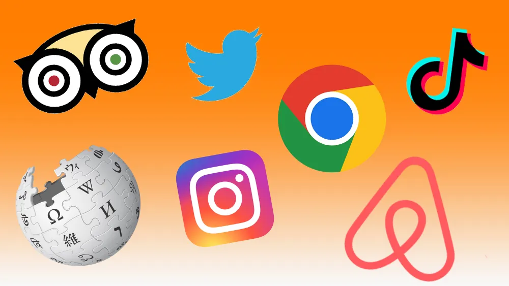
These 21st century logos show how newer brands have made their mark.
(Image credit: TripAdvisor / Wikipedia / Twitter / Instagram / Google / TikTok / AirBnb)
The best 21st century logos, or at least the most successful in terms of recognition, tend to have certain things in common. Most of the biggest brands of the current century emerged in the fields of tech, most specifically in web, mobile and social media spaces.
That means their logos tend to share certain traits as well because they were designed to live as app icons and favicons from the outset. That means they tend to have quite simple, flat designs that are easily recognisable in a small square on our phones or at the top of a browser. And they've quickly become so famous because we see them all the time on our devices.
Of course, there are also plenty of older, bigger brands that have updated their logos in the 21st century, but here we'll be looking exclusively at 21st century logos from 21st century brands. For more on logo design, see our pick of the best textless logos and the best animated logos.
Latest Videos From Creative Bloq
10 of the best 21st century logos
01. Firefox logo
Literal logo Firefox has stood the test of time
Once upon a time, a long time ago, there were two rival browsers dominating the web: Microsoft’s Internet Explorer and Netscape. The former eventually eclipsed the latter, but out of Netscape’s ashes came a new browser, based on the same code, as part of an open-source project.
The logo for what became Firefox 0.8, launched in 2004, was a concept from Daniel Burka, that was sketched by Stephen Desroches and then rendered by Jon Hicks using Fireworks MX. It started as quite a complex, literal logo of a fox circling the world, but it's since been tweaked and flattened, although its basic essence remains, and its design has been carried through into the Mozilla Thunderbird logo.
02. Chrome logo
Chrome’s logo has moved from skeuomorphic to simple and flat
Yes, another web browser, but that shouldn't be surprising considering how much the internet has come to dominate our lives. If the early years of the century saw tech observers fretting over the dominance of Internet Explorer, the ensuing years put their minds at rest. Following the success of Firefox, Google launched its own browser, Chrome, in 2008. It's done very well – StatCounter estimates it now has a 62 per cent market share.
Created by illustrator Michael Lopez and front-end tech lead Ben Goodger, among others, the Chrome logo ties in nicely with Google's overall look, extracting the red, green, yellow and blue colours from the letters of the main Google logo. The original design had a glossy, 3D skeuomorphic look, but, inevitably, it's since been given a simplified, flat makeover. While the Chrome logo was a hit, people have been complaining about Google extending its colours to all its other logos, including the Google Chat logo.
Get the Creative Bloq Newsletter
Daily design news, reviews, how-tos and more, as picked by the editors.
03. Facebook logo
Facebook’s logo is instantly recognisable, everywhere
It’s hard to remember a time when social media meant Friendster and MySpace. But it was only in 2004 that Mark Zuckerberg launched Facebook onto the students of Harvard University, eventually infecting the entire globe with its schema of pokes, shares, likes and status updates.
Designed by Cuban Council in 2006 in collaboration with Joe Kral and Peter Markatos. the Facebook logo has become one of the most recognised symbols in the world today. Largely unchanged since then, it features a slightly modified form of the Klavika Bold typeface. This 2015 version of the wordmark was designed in collaboration by Facebook’s in-house design team and Eric Olson of Process Type Foundry.
04. Twitter logo
The Twitter bird represents everything from the freedom to speak your mind to freedom from tyranny
Twitter may not be as globally ubiquitous as Facebook, and it's been through some ups and downs... particularly downs lately, but the microblogging service, created in 2006 by Jack Dorsey, Noah Glass, Biz Stone and Evan Williams, has nonetheless made a huge impact on the world, particularly in the way breaking news stories emerge.
The Twitter logo has remained relatively constant, despite being replaced by a shiba inu dog for a period earlier in 2023. Oh, Elon, such a prankster. How he makes everyone laugh, right? “The Twitter logo is a powerful symbol for what’s happening in the world now, and the power of the voices and unique conversations that happen on the platform everyday,” old Twitter pointed out long before Musk's arrival, urging people to stick to its strict brand guidelines.
See our Twitter logo history for the full story, but the original wordmark for Twitter was created by graphic designer Linda Gavin, who was given just one day to develop a new logo in time for its official launch on July 15 2006. The third Twitter redesign, created by in-house designer Douglas Bowman and released on June 5 2012, saw the introduction of the famous bird icon. The dog? That was just ripped off from Dogecoin.
05. Netflix logo
There’s a subtle sense of the epic about the Netflix wordmark
Netflix has the dubious accolade of becoming a euphemism for sex, in the form of ‘Netflix n’ chill’. Perhaps more importantly, the brand which in 2007 transformed from a DVD rental company to a streaming media service has changed the way we watch TV forever. Watercooler talk has morphed from ‘Did you see the latest episode last night?’ to ‘No spoilers, I’m binge-watching season 5 this weekend.’
In fact, it’s become such an institution, so quickly, that this year there were howls of anguish over the dumping of the ‘classic’ Netflix logo in a favour of a minimal red ‘N’ icon. The good news is that those fears were unfounded: the latter is a secondary icon for use at very small sizes, and doesn’t replace the tried and tested wordmark.
While that logo has been tweaked and flattened over the years, it retains its essential essence, with a pleasing curve to its seven letters that conveys idea of a comfortable, widescreen experience. You can see the latest version above, designed by Gretel.
06. TripAdvisor logo
Tripadvisor’s owl has traffic lights for eyes
How did we manage to choose a hotel before TripAdvisor? The online travel forum, founded in 2000, has made good customer service paramount for any tourist-facing business since a few bad reviews can easily put off a potential guest.
Its logo has become an icon, proudly displayed by the best-rated businesses, with its owl emblem representing the wisdom of planning your trip ahead, and the binoculars symbolising the search for a good deal. Did you ever notice that one of the bird’s eyes is red and the other green? That's for traffic lights, symbolising the places tourists rate to visit (green) and not to visit (red).
07. Airbnb logo
Airbnb’s unusual logo has become a modern classic
While TripAdvisor has changed the way hotels operate, Airbnb has changed what we think of as a hotel. Enabling normal people to rent out rooms to visitors has opened up a whole new type of tourism, which the company is keen to trumpet with its slogan: ‘Don’t Go There. Live there’.
Launched in 2008, Airbnb had fairly mundane branding until it released its current logo design in 2014 to howls of controversy and comparison of the graphic with genitalia. Since then, though, it’s bedded in nicely and has become instantly recognisable wherever it appears, from giant billboards to tiny mobile screens. Created by DesignStudio, we’d argue it’s already become a modern design classic.
08. Instagram logo
Instagram’s ditched the leather look for something simpler
Launched in 2010, the image-based social network Instagram was the first to have Facebook seriously worried. So they bought it, two years later, for an estimated $1 billion. In the same year, Instagram debuted its faux-leather camera icon, which its massive worldwide community took to their hearts.
There was a big backlash, then, when that skeuomorphic design was jettisoned for a radical flat redesign (above). But despite all the wailing and gnashing of teeth, it’s unarguably a more flexible design for small screen sizes and it's perhaps more easily recognisable. See our Instagram logo history for more on the story.
09. Wikipedia logo
The Wikipedia logo is unusual for modern logos in that it looks 3D (Image credit: Wikipedia)
The Wikipedia logo is perhaps the odd one out in our pick of the best 21st century logos. It's the only one that still looks 3D, and it's relatively complex for a modern logo for a web-based brand. The logo actually went through several iterations. The first two were way too complex, featuring lengthy literary quotes on a fisheye effect. The concept of a globe shape covered in text was kept, however, and progressively simplified to get to the puzzle globe we know.
Designed by David Friedland the "silver ball" was intended to loosely resemble an electric typewriter typeball. The puzzle includes 16 letters 16 different alphabets, many of them being the letters that most closely resemble the English 'W'. The missing pieces of the puzzle convey the idea that there is still knowledge missing that needs to be completed by Wikipedia's contributors (at least that's my interpretation!)
10. TikTok logo
Finally, the newest of the big social media platforms, has a very 21st century logo that seems fitting for its audience. As we saw in our TikTok logo history, there's actually a little hidden meaning in the mark, since as well as representing a musical note, it's intended to look like the letter D because the app is called Douyin in China.
Why a musical note if TikTok's all about video? Well, its initial speciality was dance and lipsync videos as the app was all about performance. The company has said that it wanted a logo that "spoke to the stage that TikTok had created for so many talented people." The colours were chosen to "excite users for the performances behind the app." Fair enough, but they also feel different enough from rivals to make TikTok feel younger and more rebellious.
Tom May is an award-winning journalist and editor specialising in design, photography and technology. Author of the Amazon #1 bestseller Great TED Talks: Creativity, published by Pavilion Books, Tom was previously editor of Professional Photography magazine, associate editor at Creative Bloq, and deputy editor at net magazine. Today, he is a regular contributor to Creative Bloq and its sister sites Digital Camera World, T3.com and Tech Radar. He also writes for Creative Boom and works on content marketing projects.