8 golden rules of handmade
Expert career and artistic tips and practical advice for creatives who like to get their hands dirty.
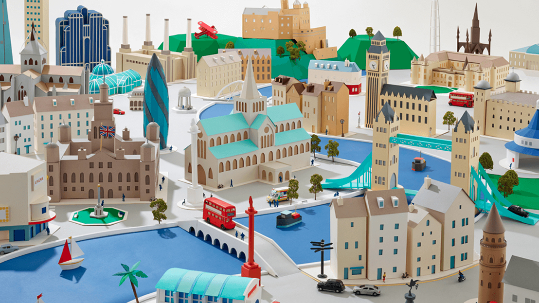
At the Reasons To: creative festival in Brighton, UK, this month, traditional artists were out in force. Hattie Newman, who specialises in paper art, muralist and hand-letterer Vic Lee, professional doodler Jon Burgerman, quilling queen Yulia Brodskaya, and illustrator and maker Chrissie Macdonald all took to the stage to share their expertise for creating handmade projects.
Here are the golden rules that we learned from these experts of handmade.
01. Bite off more than you can chew

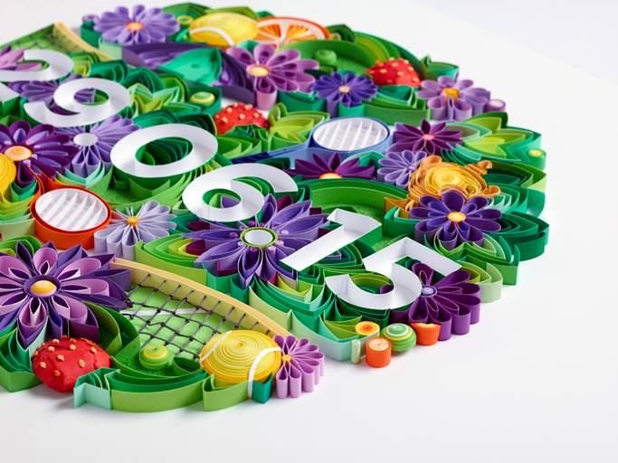
Paper artist Yulia Brodskaya's whole career can be traced back to one slightly rash decision. She'd just started experimenting with quilling and sent out some basic designs to people she wanted to work with when Richard Turley, then at G2 magazine, got back in touch asking her to create a cover.
Until that point, she hadn't taken on any client projects and neither had she timed her personal quilling experiments. They had four and a half days before the magazine went to print.
"I kind of jumped into the water without really testing the temperature," Brodskaya smiles. It paid off: the cover raised her profile so much that she hasn't really had to pitch for work since.
Muralist and illustrator Vic Lee has a similar story, from a job designing a limited-edition packaging and bottle illustration for The Famous Grouse. Despite a painfully short turnaround time, he remembers it as one of his favourite projects.
He suggests not being put off by timescales: "If someone asks you to do something, unless you really, really, can't do it, I'd urge anyone to say yes," he says. (Although we have to add that there are sometimes good reasons to say no).
Get the Creative Bloq Newsletter
Daily design news, reviews, how-tos and more, as picked by the editors.
02. Brief your clients properly
If your client doesn't work with handmade artists often, they may not realise the difference that physical mediums can make to the project workflow.
During one memorable project for the French transport service, Brodskaya spent days creating a quilled paper design of a typographic slogan surrounded by colourful paper paint. When she was finished, the client decided to change the wording. Now Brodskaya makes sure that she emphasises that all edits and tweaks must be made at sketching stage, as one the paper's stuck down, it can't come back up again.
To keep everyone happy, it helps to ensure that the client has the best possible idea of what the finished product will look like. For example, Brodskaya sends over examples of previous work so that they can see how a sketch might compare to the final thing.
Multimedia maker Chrissie Macdonald has a different approach: "I've discovered that doing quite rough roughs is a good idea because it leaves a bit of ambiguity as to what you can do," she smiles.
03. Let your mind wander
"Exercise for the brain is just as important as physical exercise," asserts doodle artist Jon Burgerman. Doodling doesn't have to just be about filling a space or keeping your hands busy during a boring phone call, it can be about channeling your thought process.
Burgerman suggests trying to think and make at the same time (although he emphasises that the thinking part is important: it's not just randomly doing things).
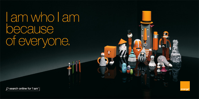
Macdonald took a similar approach in her high-profile project for Orange. She'd never done character design before, but rather than painstakingly sketching out her ideas, she sat down with her assistants on-set and played about with a collection of different objects – a shuttlecock, tennis ball, light bulb – to see what worked and what didn't.
04. Beware of risk assessments
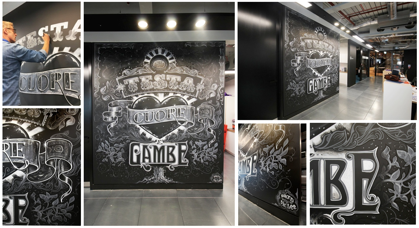
Think paper and paint are relatively safe? You're wrong. Making physical stuff introduces a whole plethora of dangers that those designers sat safely behind their Macs can barely comprehend – and with them, a fair share of health and safety red tape.
"I was a 60s kid. You basically knew what was safe to stand on and what wasn't. Now you can't get on a box without a certificate," Lee sighs.
He tells a story of one wall mural project for a company that made him bring his own stepladder with him, to pass health and safety regulations. The company was unconcerned that he had to carry it with him on his bike as he cycled to the job, though.
Jokes aside, both paper artist Hattie Newman and Macdonald bemoan back backs and poor posture from spending days hunched over their paper models. So perhaps there's something to be said for taking up yoga or similar healthy hobbies to make sure you don't end up crippled by your work.
05. Embrace basic tools
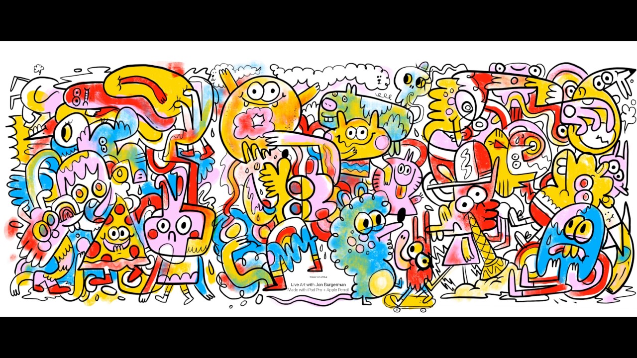
Analogue creations can be hugely complex, but they don't have to be. Several creatives say that being limited in your tools can be a good thing, because they mean you can work anywhere.
Macdonald also points out that if you're working with paper, you can work on into the night to get a job done, because you don't need to rely on anyone else or any specialist tools being available.
"Allow your imagination to be the raw material," echoes Burgerman.
06. Get assistants (so you can sleep)
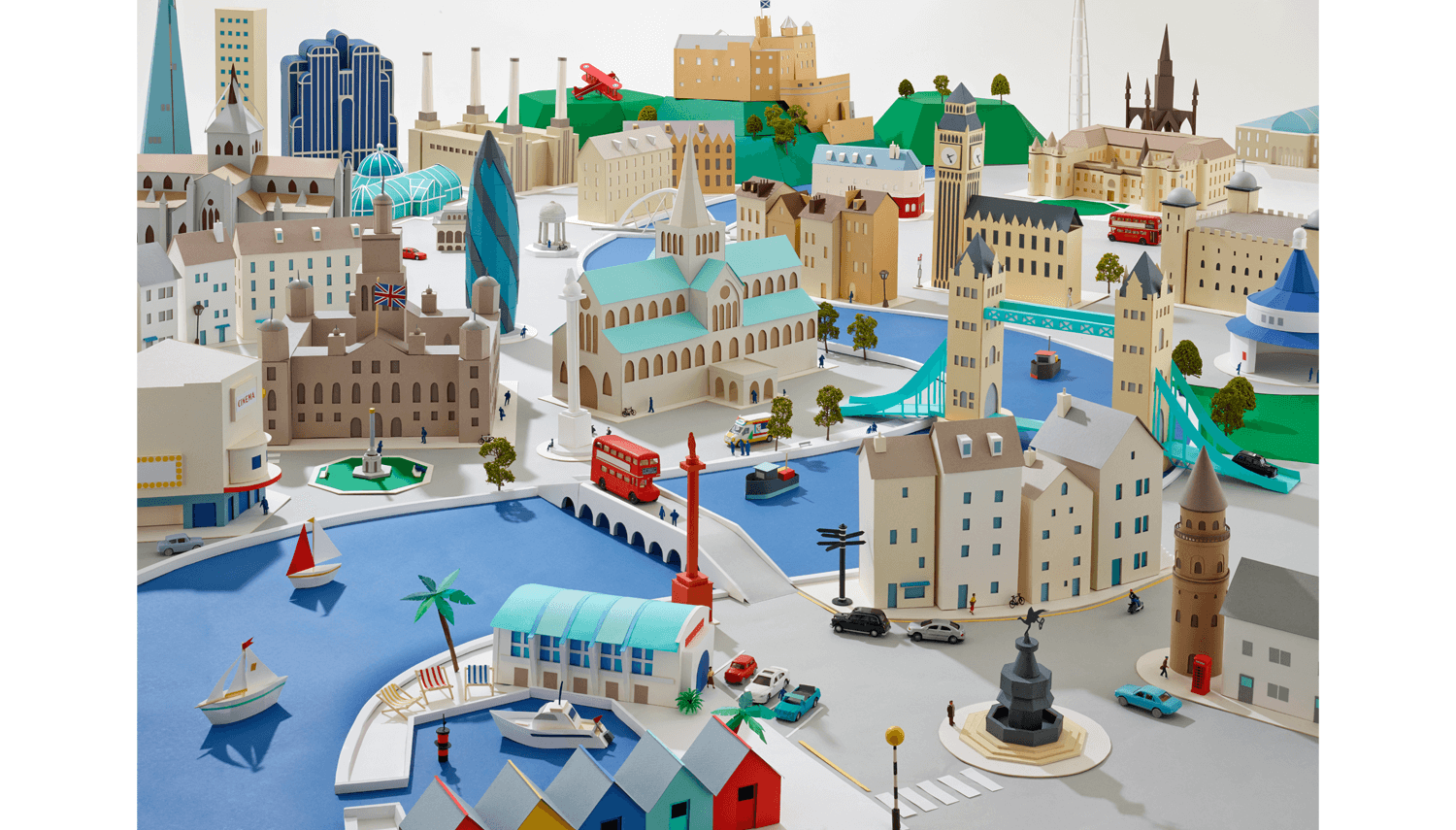
While it can be difficult to let go, handmade projects can be incredibly time-consuming, so if the budget allows then it's worth outsourcing any simple, repetitive tasks.
Newman has learned, for example, to get assistants in to make the straightforward window frames of her 3D paper cityscapes.
Macdonald echoes the sentiment: "I realised I could get some sleep if I got in an assistant to do some cutting out," she smiles.
07. Enlist a proper photographer
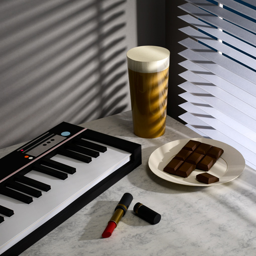
There's one thing that all the creatives – especially those working in 3D – agreed on: that it's worth getting in a professional photographer to capture your work.
Practically, not everyone's going to see your work in situ (and some of it might be headed for the recycling bin as soon as the promotion is over), so it's worth taking time to make sure you have good shots for your portfolio.
Brodskaya also points out that with 3D work, you can photograph it in different ways, with different lighting, to create totally different effects.
Macdonald regularly collaborates with photographer John Short to get the best from her designs. "As much as I can have an idea of what I want to create, the shifting of a light or the movement of an object can make a big difference," she says.
In the project shown above, Macdonald's original plan was to make the shadows out of paper, too. In practice, it didn't work, but the photographer was able to capture the effect she was after just by using the right lighting.
08. Let people see behind the scenes
With social media, there is an opportunity to share behind the scenes insights much more easily than before. And these days, everyone's fascinated by a making-of film, photo or story.
If the client doesn't have the budget to commission something properly, a simple time-lapse video can be a really effective way of showing how a piece came together. And it serves to emphasise that it's a real, handmade thing; no digital trickery here.
Read more:

Thank you for reading 5 articles this month* Join now for unlimited access
Enjoy your first month for just £1 / $1 / €1
*Read 5 free articles per month without a subscription

Join now for unlimited access
Try first month for just £1 / $1 / €1

Ruth spent a couple of years as Deputy Editor of Creative Bloq, and has also either worked on or written for almost all of the site's former and current design print titles, from Computer Arts to ImagineFX. She now spends her days reviewing small appliances as the Homes Editor at TechRadar, but still occasionally writes about design on a freelance basis in her spare time.
