Logos are the centrepieces of brand identity. The complex range of stories and feelings they convey can become so deeply rooted that many of the best-known brands are hard to imagine with different marks. Would the brand be seen in a different way today if it had adopted a different logo? Would it even have survived?
But many well-known brands did almost have different logos. For designers it can be instructive to look at the abandoned proposals and consider the lessons that can be learned from them (for more logo lessons, see our logo design guide). Here are eight logos that could have been, and the stories behind why they were ultimately ruled out.
01. Sony
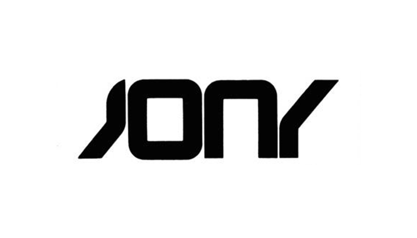
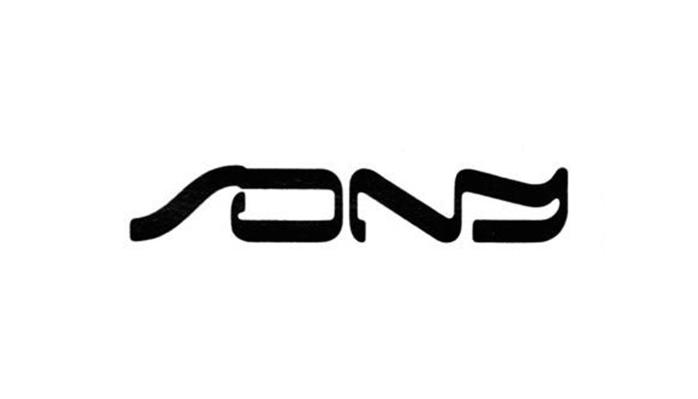
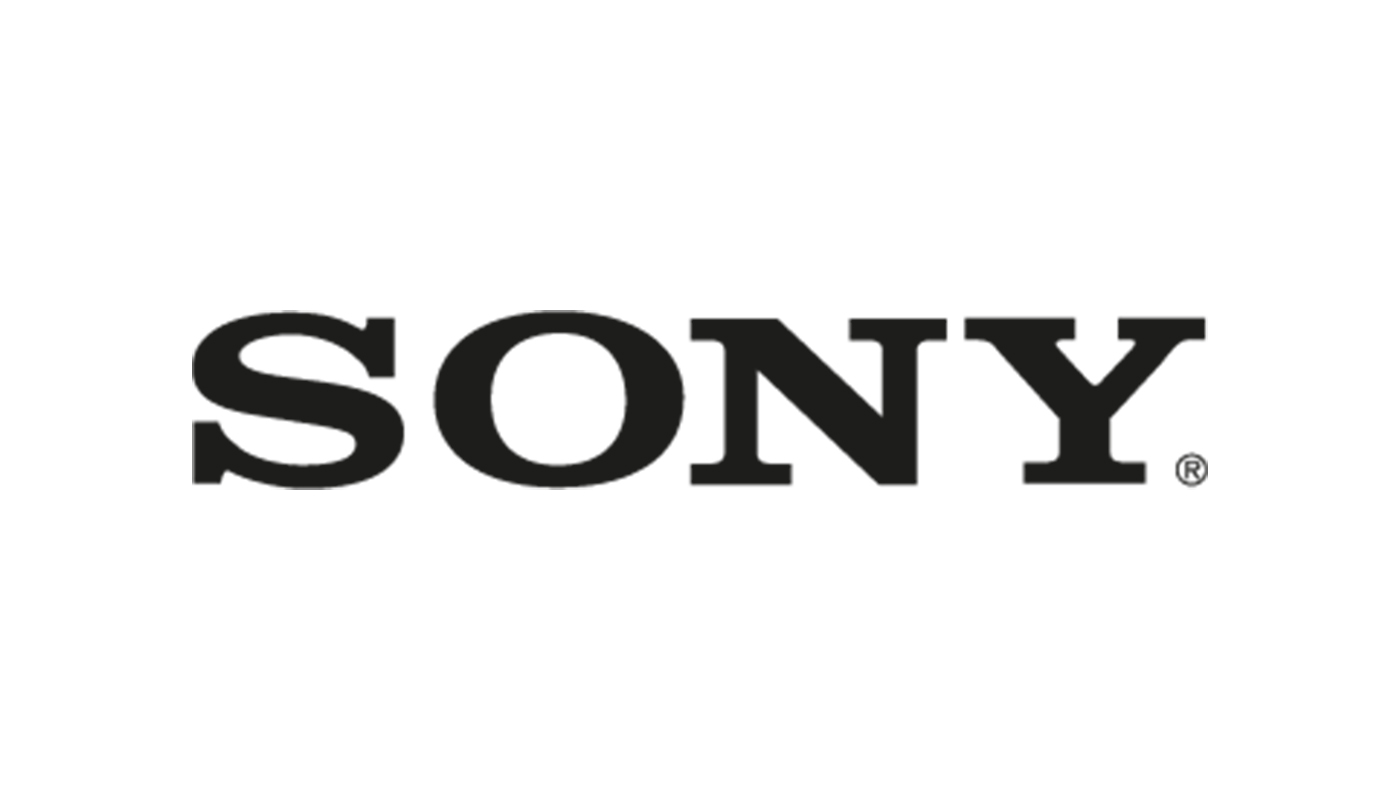
A longstanding logo can become entrenched in the public mind, coming to symbolise a timeless solidity and reliability. Even so, fear of becoming staid can lead established brands to consider something new. Sony has retained its wordmark practically unchanged for more than 50 years, but the company almost ditched it for a very 1980s crowdsourced alternative.
To mark the Japanese corporation's 35th anniversary in 1981, barely a year after the launch of the first Walkman, Sony held an international competition to redesign its logo. Almost 30,000 entries were whittled down to three contenders, which included the above designs from a Mr Vilim Vasata, from the Federal Republic of Germany, and Mr Bruno Grasswill from Australia. Finally, Sony co-founder Masaru Ibuka saw sense and decided that none of the designs was superior to the original. Sony realised its mistake and fudged the competition by dividing the prize money between its board's three favourite designs without adopting any of them.
Clearly products of their time, the logos that could have been lack the readability of the classic Sony logotype and would look much more dated by now, while the existing Sony logo has proved timeless (even if the PS5 logo has proved so controversial).
02. Ford
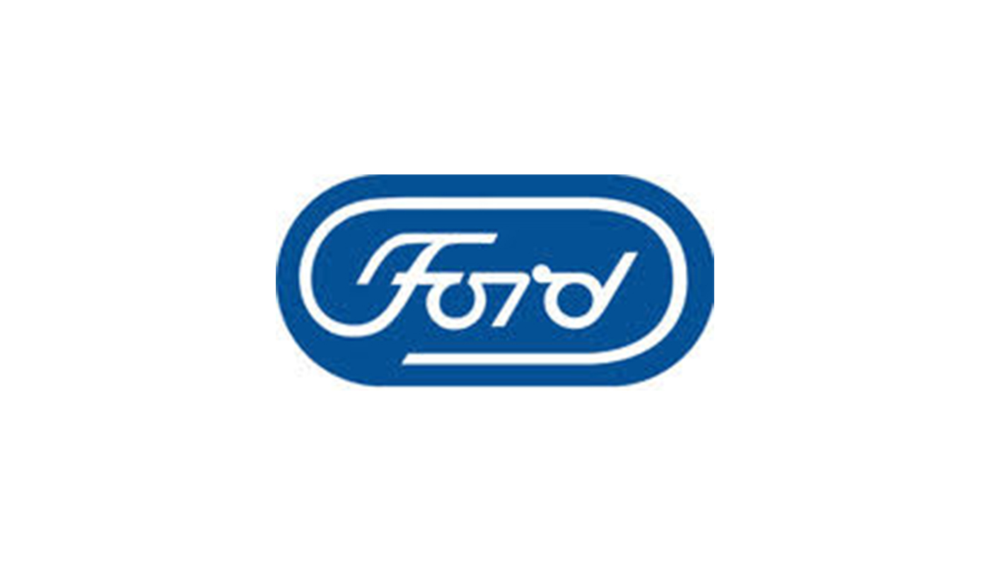
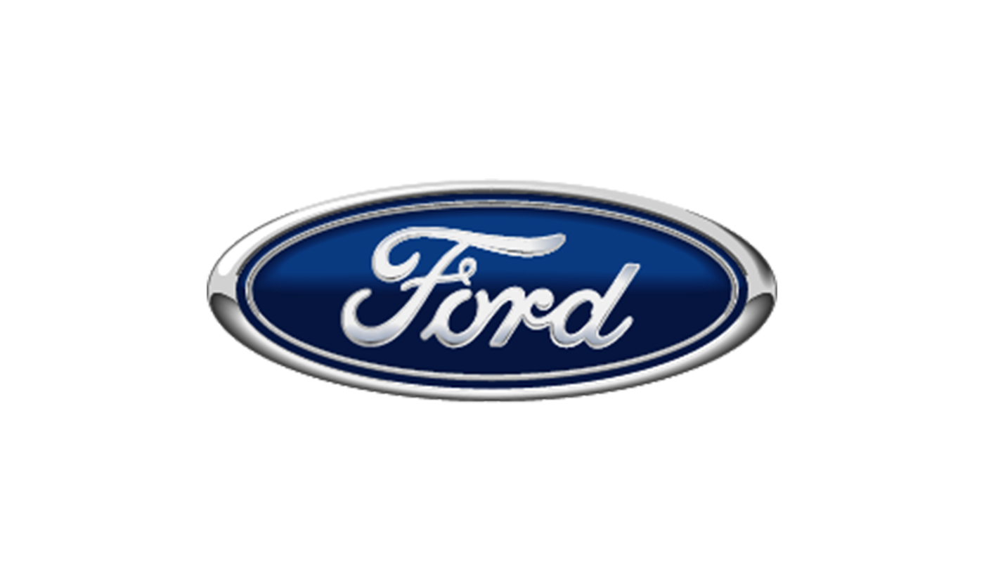
Even the most esteemed designers have created work that never saw the light of day. The carmaker Ford has made few changes to its logo since 1917. The classic Copperplate script in an oval emblem is familiar and instantly recognisable. But it almost had a major redesign in 1966 at the hands of none other than Paul Rand, who designed logos for IBM, ABC and UPS.
Rand was brought in by Henry Ford II to modernise the logo and its calligraphy script. Rand's proposal retained key features such as the ligatures between letters and the break in the 'O', but adopted a more modern even-stroked lettering and used the tail of the 'F' to create an elongated oval frame.
Get the Creative Bloq Newsletter
Daily design news, reviews, how-tos and more, as picked by the editors.
The design achieved a good balance between retaining the heritage value of the existing logo and creating something fresh and dynamic, but Ford finally decided that the change was too radical. The carmaker has changed its logo several times since, but only tweaking only the oval frame and the colour and shading of the blue background. Perhaps Ford made the right decision – the logo was one of the assets the company used as collateral to obtain a multibillion-dollar credit line in 2006.
03. Star Wars
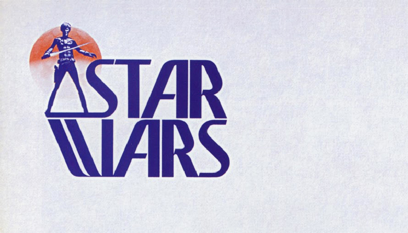
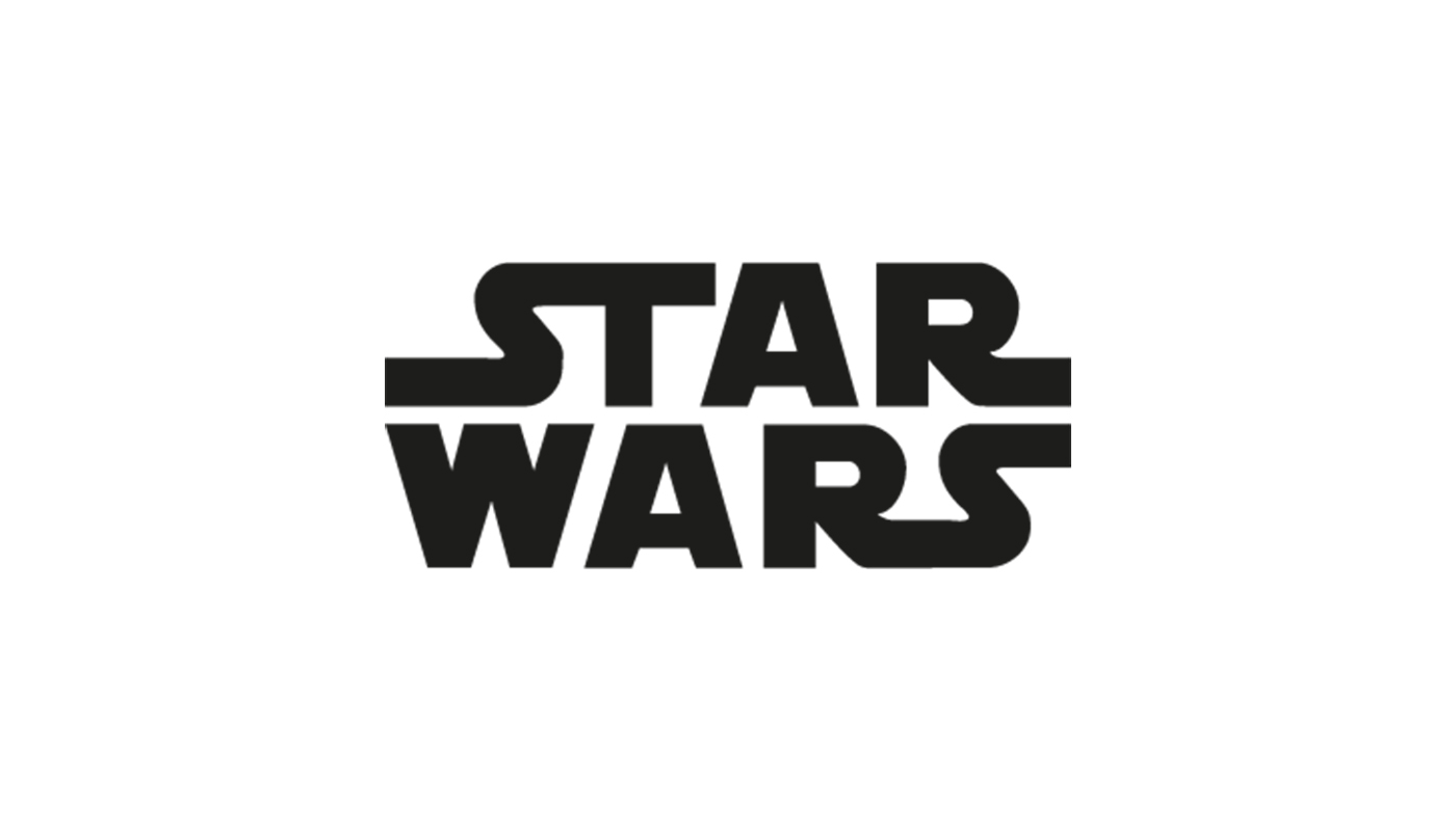
Even films have logos, and they can be hugely important for major franchises that go on to produce a whole range of merchandise. As with any brand, the logo has to communicate a lot of information. It has to tell us about the genre of the film and something of what we can expect to experience on screen. However, early versions of the Star Wars logo suggest a camp space opera that's more Flash Gordon than the menacing threat of the Death Star.
This early logo was designed before production began by illustrator Ralph McQuarrie, with text added by effects artist Joe Johnston. But the film's script and even the personalities of the main characters changed significantly during production, so that the figure in the logo, which looks more Ziggy Stardust than Luke Skywalker, had to go.
Director George Lucas also sensibly decided that the direction the film was going needed a logo that looked more intimidating. He reportedly told designer Suzy Rice to come up with something "more fascist looking". She gave herself to the dark side and turned to Helvetica Black for inspiration. The logo changed as the product itself evolved to reach its final form. (See our favourite free Star Wars fonts or the best Baby Yoda memes for more Star Wars fun.)
04. Tokyo 2020
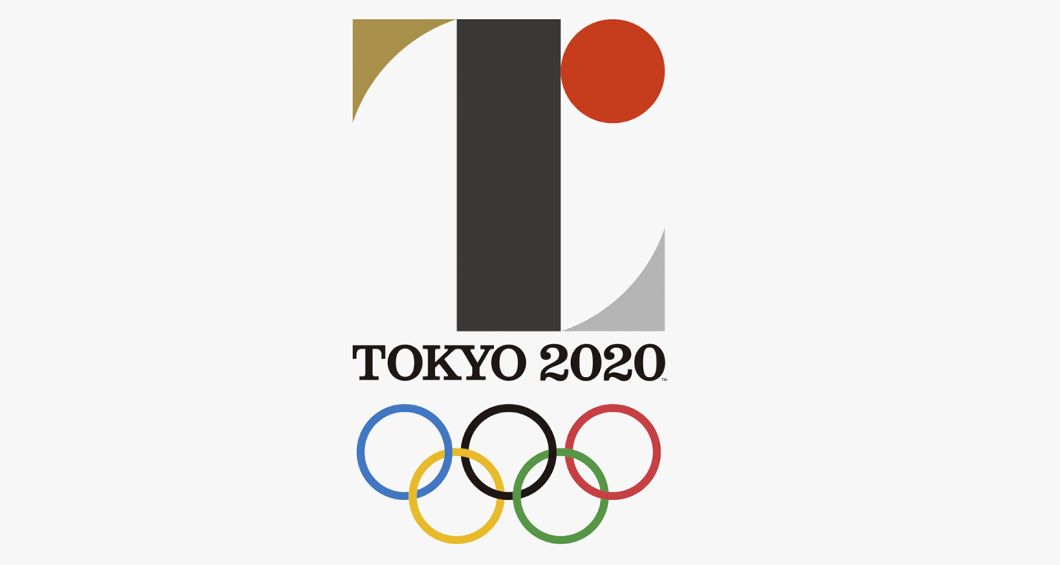
The proposed logo for the Tokyo 2020 Olympic Games was abandoned for a very different reason. Designed by Kenjiro Sano, the logo featured a letter 'T' for Tokyo and a red circle that was intended to represent a heart, although many couldn't help see it at the sun of the Japanese flag.
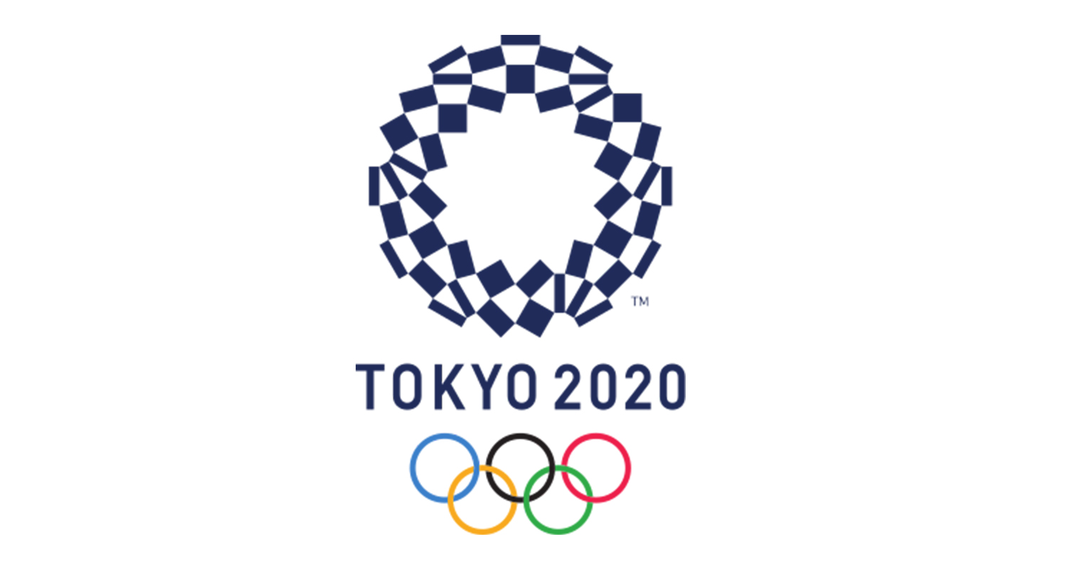
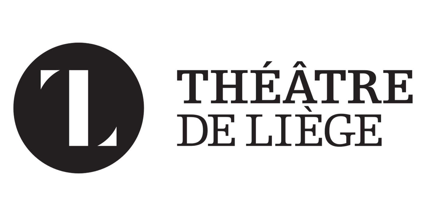
But after the logo was made public, Belgian designer Olivier Debie argued that it was a rip-off of a logo that he had designed for the Theatre de Liege in 2013 and mounted a legal challenge. The accusation of plagiarism was denied but the controversy was enough to make the Tokyo Olympic Committee drop the logo and launch a competition to design a replacement.
The winning design by Asao Tokolo uses a chequered pattern intended to reference Japanese heritage but also the intercultural aspect of the games. The fact that the original logo had to be dropped showed just how exhaustive designers' research needs to be before submitting a proposal.
05. Ghostbusters
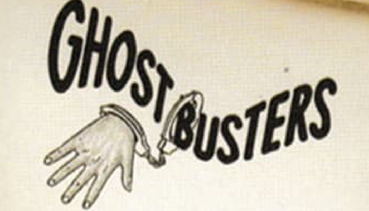
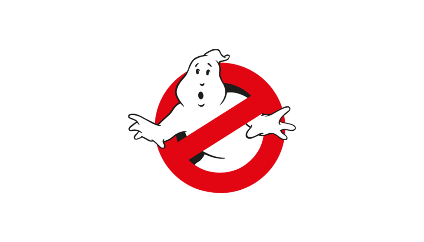
The Ghostbusters logo was everywhere after the film's release in 1984, but it's another logo that exists because of a legal problem. Originally the team's logo mentioned in the film script was only going to be used on the Ghostbusters' uniforms and the Ghostmobile, so designers hadn't put a lot of work into it. In an effort that's more ghastly than any ghoul in the film, one draft shows what appears to be Thing from the Adams Family in handcuffs.
That all changed when Columbia Pictures realised it wasn't going to obtain the rights to the name Ghostbusters in time to launch early teasers for the film. They would need a strong mark that could work alone without the title in promotional posters. The original logo designs that included the word Ghostbusters were dropped, and illustrator Michael Gross stepped in to create the "no ghosts" icon that became so well known, and influenced the way that blockbusters are promoted to this day, with initial teasers often using a mark alone with no title.
Funnily, Gross's design ended Columbia in legal problems all the same. The company was sued by Harvey Comics, who claimed that the ghost in the logo resembled Fatso from Casper the Friendly Ghost. The suit failed because Harvey had failed to renew the copyright.
06. Google
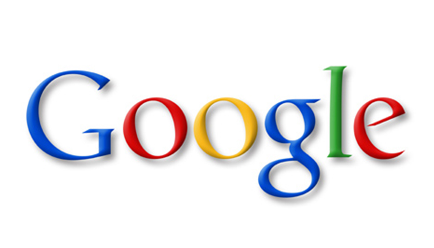
Google can boast one of the most recognised logos in the world. It's seen by millions of people every time they search online and has inspired thousands of temporary Google Doodles. It's also a lesson in creating a simple, legible logotype. But it could have ended very differently.
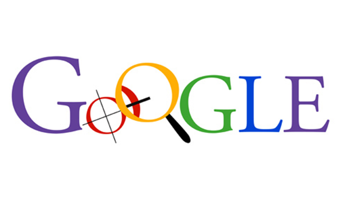
Google's founders Larry Page and Sergey Brin turned to designer and Stanford professor Ruth Kedar in 1998 to improve their own self-designed logo. Her initial explorations were far busier than the stripped back logotype Google is known for.
Kedar settled early on the Catull font and on using a colour scheme that would subvert the usual order of the primary colours to show that Google was about breaking the rules, but she also included illustrative elements to tell a story about what Google did. She incorporated both a magnifying glass to represent the search function and crosshairs to represent the accuracy of Google's algorithm.
Larry and Sergey apparently liked the idea, although they were concerned that using both of the elements together meant that there was a lot going on. The final decision to drop both elements was taken less for aesthetic reasons, but because they were already beginning to envision a future in which Google would become more than just a search engine. They decided to avoid adopting a logo that could limit the brand and wouldn't make sense with a wider range of productions. The case shows that when designing a logo, it can serve to gaze into a crystal ball and consider where a company might be several years down the line.
07. Leeds United
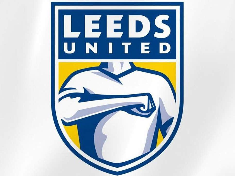
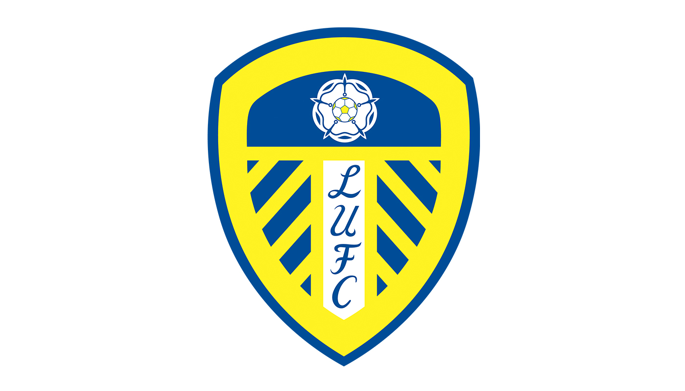
Sometimes a logo is dropped not because it doesn’t make it past a brand's board or owners, but because it doesn't fly with loyal customers. And there are no brand followers more loyal than football fans, who can be particularly sensitive to changes to their team's identity. Some teams have got away with pushing an unpopular change through, but this redesigned crest to mark Leeds United's centenary in 2019 didn’t even get off the centre mark.
The club carried out six months of research and consulted 10,000 people in the process of designing a crest that was intended to serve for the club's next 100 years. It replaced the former blue and yellow insignia with an image that represented a headless fan performing the "Leeds salute", a gesture used by fans in the stadium. But fans weren't saluting the change. "Leeds’ new badge for the next 100 years looks like a bloke trying to elbow his way to the front of the bar," sports journalist Rob Staton quipped. "It looks like something from Pro Evolution Soccer in the early 2000s," a fan tweeted. Others claimed it even looked fascist.
The club admitted it had misjudged fans' opinions and the logo was never used, showing that even the biggest research and consultation is not enough if you're not asking the right people.
08. New England Patriots
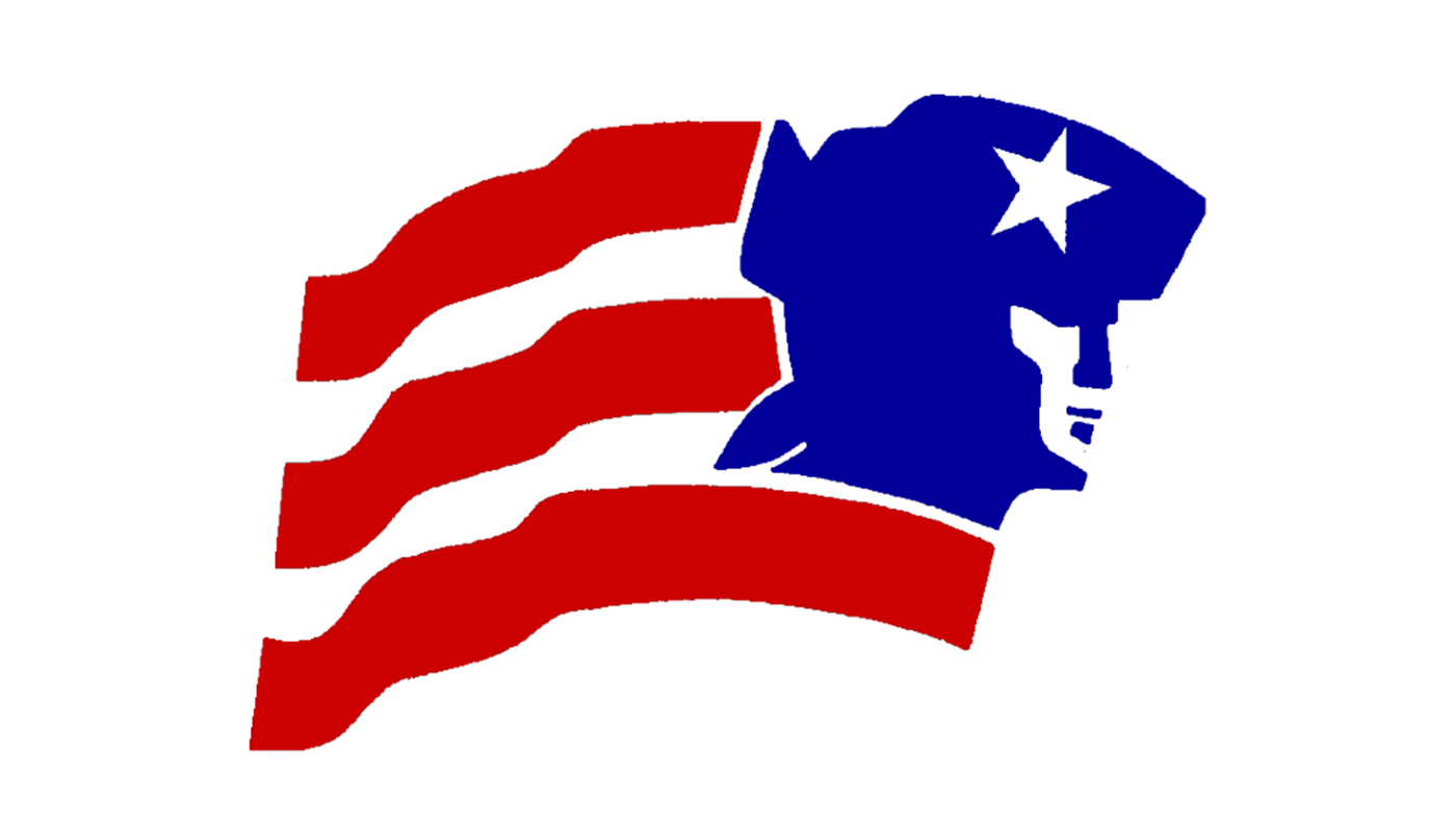
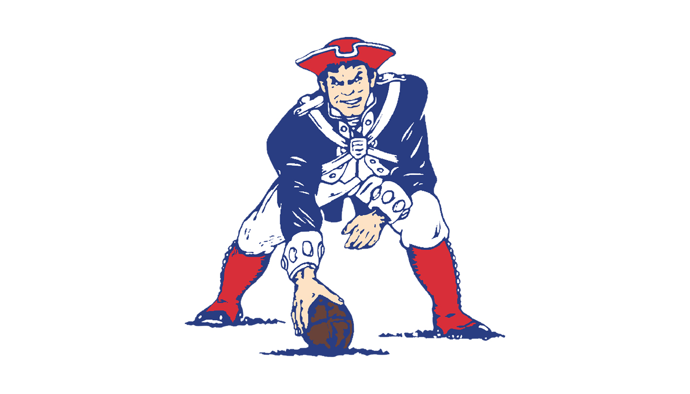
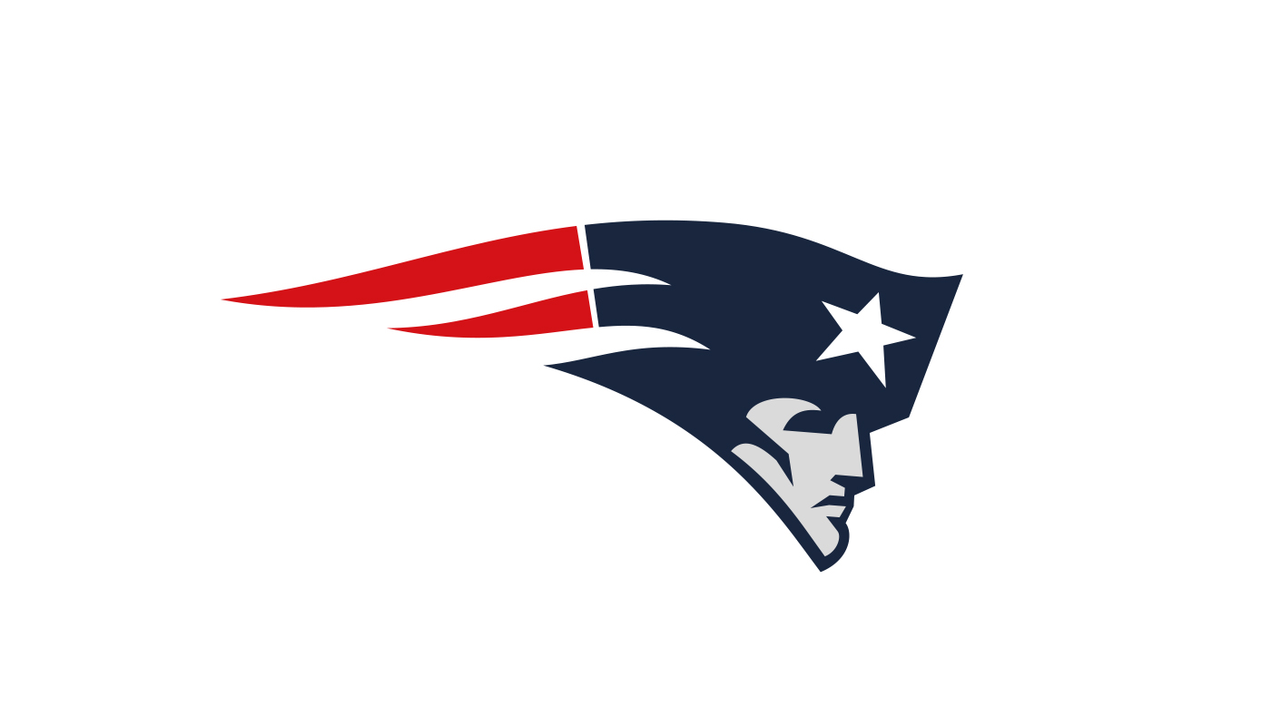
The rejection of a logo concept doesn't necessarily mean it's dead forever. Dropped logos can be brought back to life when the time is right.
Back in 1979, The New England Patriots found a simple way to avoid the embarrassing backtracking suffered by Leeds United two decades later. The club wanted to update its logo because the two-decade-old illustration of team mascot Pat Patriot was too detailed to apply easily on different supports. The NFL came up with a simpler logo that showed the face of the soldier with his tricone hat trailing into a flag, but the club took a last-minute decision to let fans decide. At halftime during a home game, the new logo was shown on poster boards in the stadium. It was greeted by overwhelming boos, and the old logo was used for another 14 years.
But in a twist to the story, in 1993, a new logo was unveiled that seems to have been influenced by the 1979 reject. This much more streamlined version of the logo is now affectionately known by fans as the Flying Elvis. Its similarity in concept to the logo that was rejected more than a decade earlier suggests that while the original design probably needed a few more iterations, sometimes it can be a case that the timing is wrong and people aren't ready for a proposal. Or perhaps it's just that the designer is ahead of their time.
Read more:

Thank you for reading 5 articles this month* Join now for unlimited access
Enjoy your first month for just £1 / $1 / €1
*Read 5 free articles per month without a subscription

Join now for unlimited access
Try first month for just £1 / $1 / €1

Joe is a regular freelance journalist and editor at Creative Bloq. He writes news, features and buying guides and keeps track of the best equipment and software for creatives, from video editing programs to monitors and accessories. A veteran news writer and photographer, he now works as a project manager at the London and Buenos Aires-based design, production and branding agency Hermana Creatives. There he manages a team of designers, photographers and video editors who specialise in producing visual content and design assets for the hospitality sector. He also dances Argentine tango.
