Having a cool logo is by no means a requisite for design studio success. Some of the biggest studios around have little more than a basic workmark in a standard typeface, yet continue to attract huge clients and do great work.
But if you’re going to create something eye-catching that gets you noticed, you may as well do it properly. In this post, we’ve brought together 7 logos that do just that, to inspire your own efforts.
Of course, there are many more great studio logos out there, and we’d love to hear about your favourites. So please let us know and share the links in the comments box below (see Computer Arts to learn how to run a thriving design studio).
01. Moving Brands
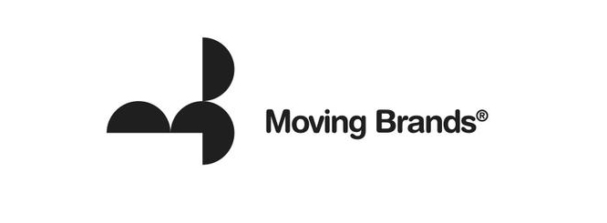
Moving Brands is an independent, global creative company with studios in London, Zurich, San Francisco and New York, whose clients include the likes of Facebook, 20th Century Fox, ARM and the British Red Cross. Their eyecatching logo makes inventive use of geometric shapes, and looks as sleek and modern now as when it was designed by Bibliotheque back in 2004, as part of an entire new identity system for the company.
“We have always had a close relationship with Bibliotheque, and tasked them with the design of our identity rather than doing it in-house,” recalls John Faye, Moving Brands’ UK/EU marketing manager. Why? As MB co-founder and chairman Ben Wolstenholme wrote at the time, they felt it was important to work with someone who could bring objectivity to the process. “For me the most important part is the outside perspective. It’s hard to define or redefine yourself from first point perspective.”
You can read more behind the story of the design here.
02. The Mill
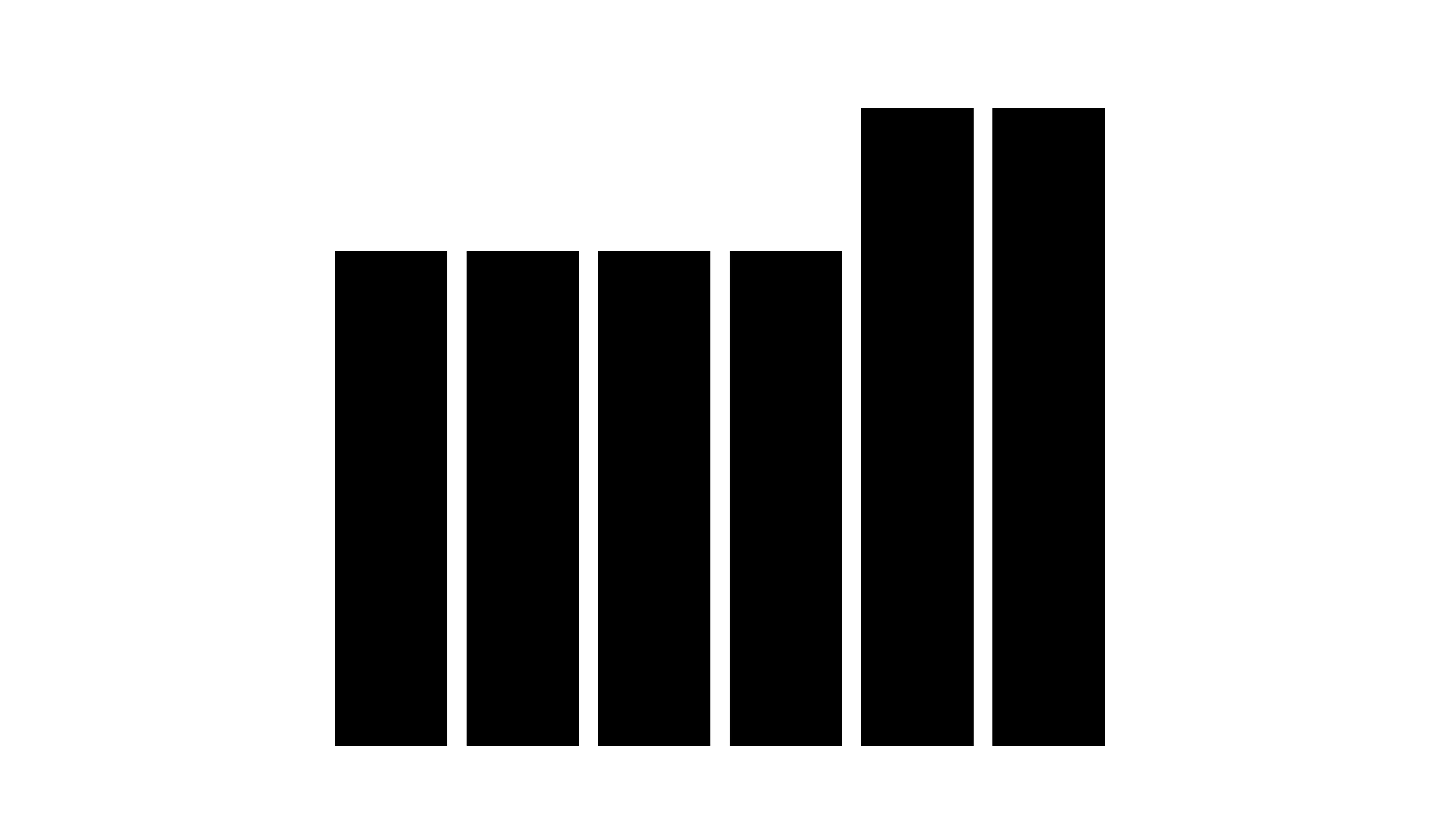
The Mill is a VFX and creative content studio headquartered in London, with offices in New York, Chicago and Los Angeles. And over the last two decades their logo, which stylishly echoes the letterforms of the word ‘mill’ with horizontal black bars, has become a true design icon, instantly recognisible and infinitely malleable in all kinds of media.
Get the Creative Bloq Newsletter
Daily design news, reviews, how-tos and more, as picked by the editors.
“The logo was originally designed in 1999 by North Design in London,” explains Chloe Skinner, a designer at The Mill Los Angeles. “I know there was a lot of discussion originally as to whether the ‘The’ should be spelt out in the same manner. But it was decided that the abstracted form of ‘mill’ was stronger and would become our logo.” In hindsight, they couldn’t have made a better choice.
03. Flow
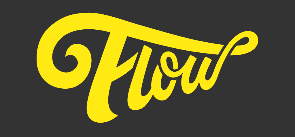
Flow is a creative design and production company based in the Northern Quarter of Manchester, UK that makes motion graphics, animation and films. It’s a (purposely) small agency but one with some big name clients including the BBC, Apple, JD Sports and Manchester United. And there’s a suitably artful sense of ‘flow’ to their big, bold and beautiful logo design.
The bright and cheerful colour scheme is balanced nicely by the dramatic swoop of the lettering, which avoids cliche to create something strikingly original. This arresting logo has been in place for around a year, and was designed by independent designer, illustrator and photographer Tim Easley, who generally prefers to use hand-crafting type in his designs. “For the logotypes and lettering that I've done over the last few years, I try not to use fonts much unless the client requests them,” he explains. “Most are hand-lettered then finished up in Illustrator.”
04. Hat-Trick

Hat-trick Design is a multidisciplinary London design company with an impressive client list including Apple, Royal Mail, Wimbledon, Imperial War Museums and University of Amsterdam. Its logo plays the (admittedly hackneyed) upside-down text trick with elan, and is a great example of how the best ideas are the simplest (well, when executed brilliantly, at least). “We created the logo just before we formed in 2001,” says creative director Gareth Howart. “We spent ages on it and went round in circles – as ever – for ages. We always describe it as having a creative ‘twist’ on our work.”
05. Taxi Studio
Taxi is a brand design agency based in Bristol whose clients include the likes of Coca-Cola, Carslberg, Nestle and Minute Maid. Their mission statement is a fervent belief that “courage and collaboration deliver great success – we call this fearless creativity.” And there’s such a passion for this concept, they’ve put it at the heart of their elegant logo, with its trademark-style design evoking the idea of experience and trustworthiness.
Then there’s that furry creature – what’s all that about? Anton Rush, chef de projets at 3rdRock, puts it better than we ever could: “Founder Spencer Buck chose the Honey Badger, arguably the world's most fearless mammal and [...] it's quite obvious why. He was the man who (illegally) projection mapped a 60ft troll under Clifton suspension bridge, let loose a Bengal Tiger in Whittards tea shop, parodied builders' bellies to double the sales of plasterboard for Siniat, and bagged the chairman of one of the world's largest design consultancies as Taxi's ECD.”
So now you know. You can check out an interview with Spencer Buck on our YouTube channel here.
06. B-Reel Films
Global production company B-Reel Films (BRF), a sister company of B-Reel the creative agency, has offices in Stockholm, London, and Los Angeles. It recently launched a new brand identity and logo, presented on the newly redesigned website, brf.co, created in-house by a team led by design director Vincent Lowe.
The new identity will be formed around an arry or icon shapes, and this new wordmark serves to unify them, Lowe told It’s Nice That. Both simple and sophisticated, and dripping with cool confidence, it’s set in the font Replica which, says Lowe, “has a classic modernist heritage but with a technical DNA: qualities BRF proudly shares”.
07. Ilovedust
Ilovedust is a multi-disciplinary design boutique based in the heart of London’s fashionable Shoreditch, which partners with brands like Nike, Red Bull, XBox, Coca-Cola and Kiehls. And their skull-themed logo has to be one of the most distinctive we’ve seen in the agency world.
“The concept behind the logo is pretty simple,” lead designer Matt Howarth. “First and foremost we’re a creative studio, so the light bulb reflects our creative thinking. Secondly, we do like a skull, as you may already know if you’ve followed our work over the years.”
He adds: “Skulls are an icon which we use a lot in client and non-commercial work: you could say they represent our dark side. So what better than a skull light bulb? Oh, and we like neon too. So we made it in neon.”

Thank you for reading 5 articles this month* Join now for unlimited access
Enjoy your first month for just £1 / $1 / €1
*Read 5 free articles per month without a subscription

Join now for unlimited access
Try first month for just £1 / $1 / €1

Tom May is an award-winning journalist and editor specialising in design, photography and technology. Author of the Amazon #1 bestseller Great TED Talks: Creativity, published by Pavilion Books, Tom was previously editor of Professional Photography magazine, associate editor at Creative Bloq, and deputy editor at net magazine. Today, he is a regular contributor to Creative Bloq and its sister sites Digital Camera World, T3.com and Tech Radar. He also writes for Creative Boom and works on content marketing projects.
