7 of the most hated redesigns of all time
Get the rage flowing with these provocative redesigns.
Redesigns can be a dangerous business. Whether you're dealing with a familiar logo, a popular website or a well-known character, if you mess with the DNA of a design that people know and love then you're running the risk of a backlash – all the more so these days when people can take straight to the internet to announce their displeasure.
A lot of the time it's simply a matter of people fearing change, and even if you're giving a tired brand a much-needed update there'll still be people who hate the new look. Sometimes, though, you'll see a company introducing a baffling and unwanted new logo or rebrand that draws a torrent of well-deserved ire (or at least it seems well-deserved at the time). Here, then, are seven of the most rage-inducing redesigns in recent years; take a chill pill before you read on, or read our guide to logo design to see how to avoid angering your audience.
01. Twitter

Let's kick off with the big redesign that's still provoking plenty of rage. A big redesign of a popular app or website is always bound to cause consternation, but Twitter's recent rollout of its new site has angered users in their masses. And it's not hard to see why; it's brought everything you hate about the app version – such as repeatedly trying to show you 'top tweets' rather than a chronological list, an unwanted Bookmarks option and a confused layout – to the desktop.
From Twitter's point of view it makes sense, as the platform's now a progressive web app that works across everything, meaning that it doesn't have to maintain a stack of different versions. For the rest of us, though, it's still a pain to use; we're waiting for Stockholm Syndrome to kick in.
02. Gap

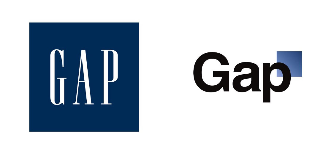
Gap's disastrous 2010 logo escapade is a textbook example of how not to do a redesign. Ditching its 24-year-old logo – a restrained work of tall and sober serif text against a calm navy blue background – and replacing it with a combination of Helvetica and a gradient was, in retrospect, never going to go down well with its customers. It stood out far too much, and nobody buys clothes from Gap because they want to stand out. After a tidal wave of complaints the new logo was withdrawn within a week.
Looking at it nine years on, however, it doesn't seem too bad; there are so many minimal logos around these days that it's hard to muster any real disdain right now for Gap's effort. Perhaps it was just too ahead of its time?
03. Airbnb

By contrast with Gap's hapless logo adventure, let's revisit Airbnb's headline-grabbing redesign of 2014. As with Gap, Airbnb's Bélo logo drew no end of criticism when it was introduced; a high-concept piece by DesignStudio, it was described as "an expression of what it truly means to belong anywhere", and was meant to evoke thoughts of a hug, a map and a heart.
Get the Creative Bloq Newsletter
Daily design news, reviews, how-tos and more, as picked by the editors.
Everyone else, however, thought it looked more like female genitalia, and not only that, it bore a striking resemblance to various other old logos. With a shape that simple, though, there are bound to be similarities to any number of other designs; there have been plenty of cases over the years of a company adopting a minimal shape for a logo that's been used elsewhere before. While Airbnb had to put up with an initial slew of criticism and mockery, unlike Gap it held its ground, and now the logo has settled in nicely.
04. BP

BP's controversial 2000 rebrand, led by Landor Associates, managed to provoke outrage on two fronts. The headline factor was its stratospheric cost: £4.6 million for the logo, and total rebranding cost of £136 million. That's a lot of money, but when you put it into perspective and factor in the business of rolling out the rebrand across a global company, it's not quite so eye-watering.
The real misfire, though, is the sunflower-style logo itself. Designed to promote BP's investment in alternative energy, it was slated at the time as an attempt to 'greenwash' BP's environmentally-unfriendly reputation. Today, with climate change a bigger issue than ever and BP still invested heavily in the fossil fuel business, it feels disingenuous and even insulting.
05. American Airlines

What do you do if you have a company logo that's arguably a classic, created by one of the biggest names in design ever? Obviously you'd hold onto it; that is, unless you're American Airlines.
In 2013 it got rid of its bold and iconic logo, designed by Massimo Vignelli, and replaced it with a bland diagonal effort from FutureBrand. The old logo was a fine-looking and symmetrical piece, featuring a stylised cross-winged eagle between twin 'A's; the new one's more like an emaciated tailfin adorned with a minimalistic beak.
No-one liked it, and even Vignelli himself felt the need to weigh in: "It has no sense of permanence," he told Bloomberg BusinessWeek. "There was no need to change. Every other airline has changed its logo many times, and every time was worse than the previous one."
06. Leeds United

An important thing to bear in mind when approaching a big redesign is the loyalty of your brand's audience. If you have a lot of committed followers who have been with you for a long time, it's likely that they're not going to react well to an enormous change. And they don't come much more committed than football fans.
So you have to wonder what Leeds United was thinking when it proudly announced a new club crest in 2018. Conceived as a way of celebrating the club's fans and, Leeds United said, the product of six months of research and a consultation of 10,000, the crest portrayed the 'Leeds Salute', a gesture used by fans on match days. And despite it being all about them, the fans were not happy, with a petition to get rid of it quickly attracting over 10,000 signatures. The result? The 2018 crest has already been replaced by a more traditional design.
07. Sonic the Hedgehog

Let's bring this collection of infamy to a close with another big design horror from this year. Sonic the Hedgehog is one of the most instantly identifiable characters in video games, and while his look has been tweaked a number of times over the years, nothing could prepare people for what emerged in the trailer for the upcoming live-action Sonic movie.
Gone was the lovable cartoon character, replaced by a CG monstrosity straight out of the uncanny valley, a nightmare-inducing chimera complete with human teeth. The backlash was swift and brutal, and Paramount's response was suitably speedy; within hours of the trailer's release, the film's director was on Twitter promising to go back to the drawing board and start again.
Related articles:

Thank you for reading 5 articles this month* Join now for unlimited access
Enjoy your first month for just £1 / $1 / €1
*Read 5 free articles per month without a subscription

Join now for unlimited access
Try first month for just £1 / $1 / €1

Jim McCauley is a writer, performer and cat-wrangler who started writing professionally way back in 1995 on PC Format magazine, and has been covering technology-related subjects ever since, whether it's hardware, software or videogames. A chance call in 2005 led to Jim taking charge of Computer Arts' website and developing an interest in the world of graphic design, and eventually led to a move over to the freshly-launched Creative Bloq in 2012. Jim now works as a freelance writer for sites including Creative Bloq, T3 and PetsRadar, specialising in design, technology, wellness and cats, while doing the occasional pantomime and street performance in Bath and designing posters for a local drama group on the side.
