Testing responsive design for websites is important to ensure that your site will look and behave they way you want on different devices. Every modern web designer will know the principles of responsive web design, which aims to make sites render perfectly on whatever device or screen size they appears on. (see our pro’s guide to responsive web design for a refresher).
But theory is one thing, and practice is another. To ensure your site is fully responsive, you need to test it on different device. Most of us don’t have the budget to acquire the hundreds of physical devices needed to carry out a real-world test, but, happily, there are other solutions. The website testing tools below allow you to test responsive design in a virtual environment.
01. Google Chrome Inspect

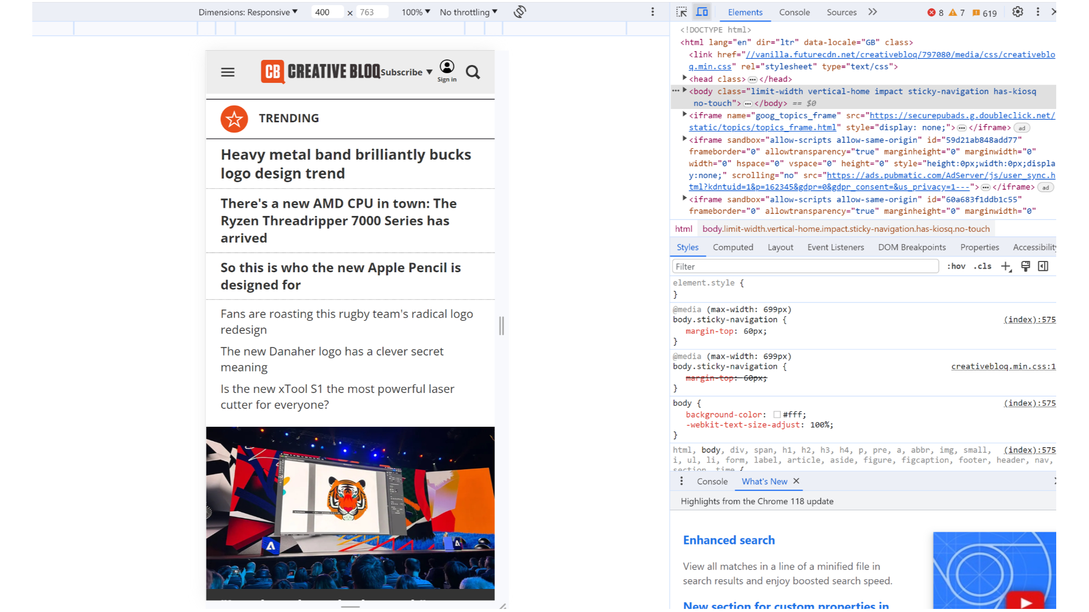
One of the quickest and easiest website responsiveness tests is available directly in your browser if you're using Chrome. As well as allowing you to inspect code, the Chrome Inspect tool allows you to virtually view a site on different screen sizes. Just right-click a website and click ‘Inspect’. When the window opens, look for the devices icon to the left of the 'Elements' button. You can input a specific size or drag the corner of the window to manually choose the breakpoint.
02. Responsinator

The beauty of Responsinator lies in its simplicity. Just type in your web page's URL and this free, browser-based tool shows you how your web page renders in the most popular screen shapes and sizes. Brilliantly, you can then interact with your page, clicking on links, typing into search fields and so on. Note that these are generic devices, though, not specific ones.
03. Google DevTools Device Mode

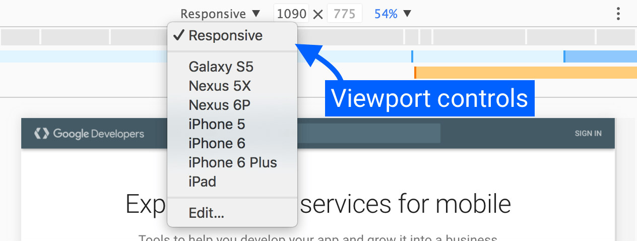
DevTools' Device Mode offers an easy way for developers to simulate mobile devices within the Chrome browser. You can use it to learn how your site appears across different screen sizes and resolutions, including Retina screens. You can even simulate device inputs for touch, geolocation and device orientation within the emulator.
04. Browser Stack

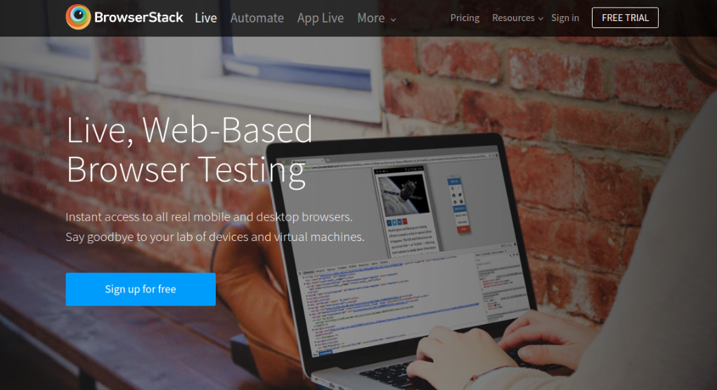
Browser Stack is one of the most advanced, full-featured testing tools around. The paid-for app offers access to more than 1,000 mobile and desktop browsers for testing purposes, a list which is continually being updated, based on market trends and usage statistics based on Browser Stack’s 36,000 customers. With users including Twitter, Microsoft, AirBnB and Mastercard, it's obviously doing something right.
05. CrossBrowserTesting

Browser Stack’s biggest rival in the testing space is CrossBrowserTesting, which offers more than 1,500 browsers and devices to test your responsive website on. Its all-in-one platform allows you to run parallel automated tests, compare screenshots visually, swipe and interact with your website on real-world devices, and remotely debug your code as you go. It offers a free trial.
Get the Creative Bloq Newsletter
Daily design news, reviews, how-tos and more, as picked by the editors.
06. Testsigma

Finally, Testsigma is another paid-for browser-based option. This cross browser and responsiveness testing tool provides automated responsiveness testing for more than 1,000 browser OS and 2,000 iOS and Android devices. It boasts features like scriptless automation testing, parallel testing for large test suites and drill-down test reports and integration with popular CI/CD and bug reporting tools. Customer support is also reported to be good. Again, there is a free trial.
Note that there are aspects of mobile devices that virtual tools cannot simulate, such as the architecture of mobile CPUs. If in doubt, it's best to actually run your page on a mobile device if possible. Remote Debugging can be used to view, change, debug, and profile a page's code from your laptop or desktop while it runs on a mobile. For more tools, see our pick of the best web design software.

Tom May is an award-winning journalist and editor specialising in design, photography and technology. Author of the Amazon #1 bestseller Great TED Talks: Creativity, published by Pavilion Books, Tom was previously editor of Professional Photography magazine, associate editor at Creative Bloq, and deputy editor at net magazine. Today, he is a regular contributor to Creative Bloq and its sister sites Digital Camera World, T3.com and Tech Radar. He also writes for Creative Boom and works on content marketing projects.
- Joe FoleyFreelance journalist and editor
