When it comes to the visual design of a website, the emphasis is often on the photography, illustrations or vector graphics. But at the end of the day, most websites are there to be read, so typography is one of the most important things you need to nail.
In this post, we look at some examples of great typography on websites, all new for 2017, and talk to the designers to find out how they went about creating it.
01. Hi-Pointe Drive-in
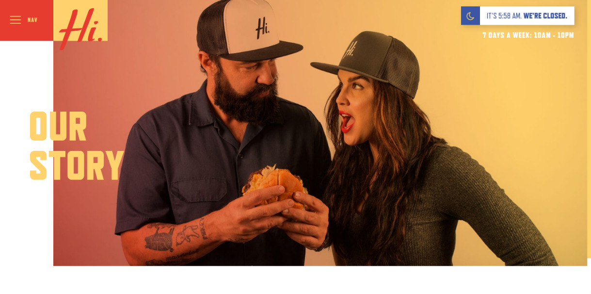
The Hi-Pointe is a hip, modern spot for burgers and sandwiches in St Louis, Missouri, highlighting local ingredients and located in a former 1980s drive-in.
The website created for the restaurant by local agency Brevity strikes a careful balance design-wise, looking thoroughly modern while incorporating design elements from the 1980s.
And it’s all tied together with its clever use of typography, as Bob Schuster, partner and creative director at Brevity, explains: “On the site, we used typography as a design element, breaking the grid in certain places, and becoming a moving, interactive element in others.”
The primary headings are set in Refrigerator Deluxe from the Mark Simonson Studio. “This captured the nice blend between the industrial and mid-century architecture, along with the modern and friendly vibe we were going for with the brand. I also really enjoy how fat and bold the typeface is. Because of this, it works really well over photography,” Schuster says.
For body copy and other smaller treatments, Brevity used Museo Sans from exljbris Font Foundry. “Overall, it’s just a nice, legible typeface, even at smaller sizes,” says Schuster. “Museo still has a little bit of character that helps it stand well next to the bright personality of Refrigerator and the site design, overall.
Get the Creative Bloq Newsletter
Daily design news, reviews, how-tos and more, as picked by the editors.
“We kept the containers for long-form copy to a narrow width to increase readability and allow other elements on the site like photography, colour, and icons to assist in telling the story.”
02. Chris Biron
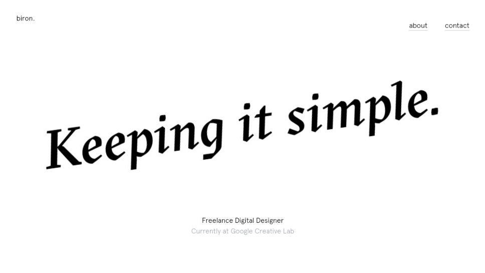
A freelance digital designer based in London, Chris Byron collaborates with brands, businesses and startups to shape their digital projects. Currently working with Google Creative Lab, his personal website is beautifully minimal, with bucketloads of white space, so the typography has to do a lot of the heavy lifting.
Byron opted for GT Sectra for the headings and large quotes on his site. “I chose it to really hero my website, because it’s quite an unusual font, which is beautiful and memorable,” he says.
“The sharpness is less common in serif typefaces and makes the font feel fresh and contemporary to me. I also played with 3D rotations on my site and attaching these to the scroll created a real motion and control, allowing the user to be able to play with the typography in a unique way.”
Body copy, meanwhile, is set in Apercu by Colophon Foundry. “It’s probably my favourite sans-serif font,” says Byron, “because of its clean geometry and unique shapes such as the sharp ascender on the ’t’ and the loops of the “g’.”
03. Ditto
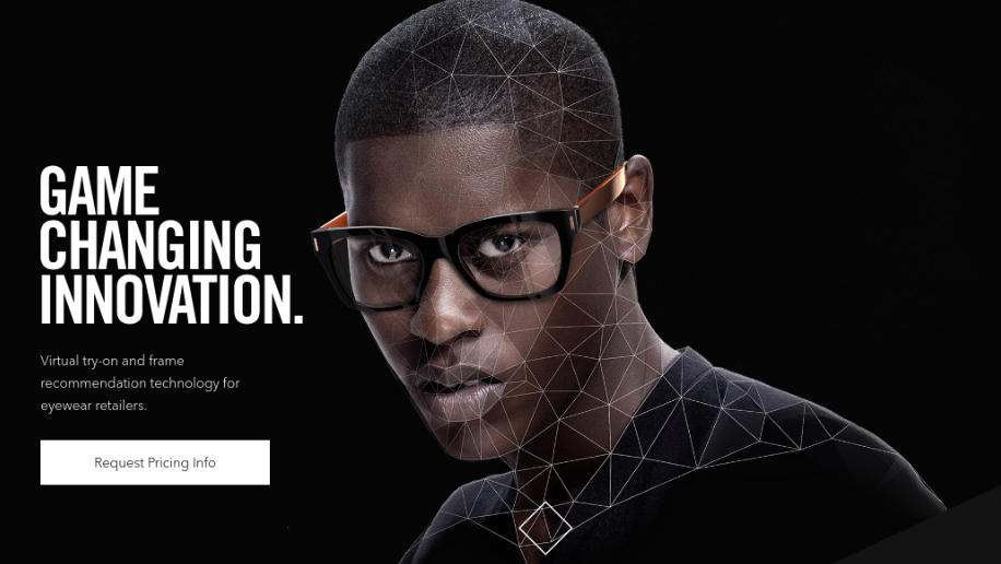
Ditto is a company that offers eyewear retailers the opportunity to provide customers with virtual try-on and frame recommendation technology. Central to its website is a cool little effect that overlays the central figure with a digital mesh as you scroll.
Beyond that gimmick, though, this one-page site offers a clean, elegantly laid-out reading experience, dividing what could have been an overwhelming amount of information into bite-sized, manageable chunks.
Sam Dallyn describes the design process as trying to strike the right balance between type size and the structure of content. “The messaging and structure changed about three times, which was really frustrating, but ultimately each time I restructured the layout things became better,” he says.
When it came to font choice, Dallyn used Trade Gothic Bold Condensed, “to help give punch to the titles” and Avenir Light “because of the great contrast and this lightness reflected in the preciseness of the technology”.
“Also, we had some long titles with words like ‘omnichannel’ that I wanted to keep reasonably graphic, something that's hard to do with a regular typeface,” Dallyn adds. “A classic rule that aids design is always sticking to few typefaces and minimal variations as this forces you to design in a certain way.”
04. Ade Mills
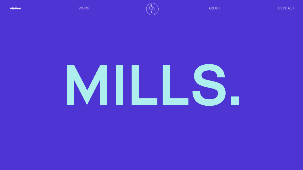
Ade Mills is a young graphic designer and illustrator from Hastings with a broad skillset. He has a day job as a full-time designer at Playne Design, but he’s also keen to take on side projects in his spare time, including The Design Jones, a podcast where he interviews creatives from around the UK.
His personal site is another super-minimal one, which makes original use of blue filters to create a distinctive look. “I wanted to create something that would be flexible and work well with both small and long content,” he explains. “The overarching idea was to give myself very strict parameters like colour, image styling and typography.”
When it came to the typography on the site, he says, he wanted to limit himself to a single typeface, which would need to be readable and to render across platforms in the best possible way across the design. “I wanted something classic but nothing obvious or overused, so I ended up going with RM Pro from The Designers Foundry, which was designed by Mark Bloom of Mash Creative.
“For me, this was visually perfect for the design,” he adds. “It worked well as the body text and was easy on the eye when reading long texts, but it also held its own with the larger display type.”
When it came to implementing the font, Mills decided to give type.js a try. It’s a tool that allows you to write new CSS properties to take finer typographic control of type styles on the web.
“I'd always wanted to use type.js in a project, as a way to create something where the type styling wasn't limited and the finer points could be adjusted with the content,” he explains. “It's integrated so that I can plug in values through the CMS, which then injects them into the code rather than having to keep editing the CSS.
“Nothing unexpected really came up when using it, but I had to be mindful of how it worked across screen sizes. Some features like the rag and widow adjustments worked perfectly on some screens, while on others it broke the design or didn't have the desired effect. It was a bit of a challenge finding that happy point.”
05. The Lincoln Hotel
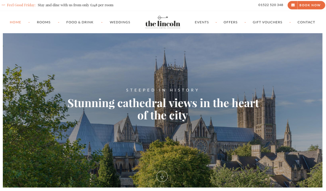
The Lincoln Hotel is a beautifully restored 1960s hotel just next door to England's famous Lincoln Cathedral. To promote such a high-class destination in an iconic medieval city, Shotgun Front was tasked with creating an equally high-class site. And it didn’t shrink from the challenge.
“Our approach was simple: produce a beautiful website with elegant and well considered typography,” says Jonathan Daly, head of design at Shotgun Front.
“The Lincoln Hotel came to us with a strong, clean and well balanced typographic identity, and so continuing this approach across the website was essential to the project.
“We used a combination of fonts that complemented each other beautifully: Playfair Display & Lato,” he adds. “We found these two fonts a joy to work with and when composed in such a way as on The Lincoln Hotel’s website they can transform a design into something special.”
06. Go Short
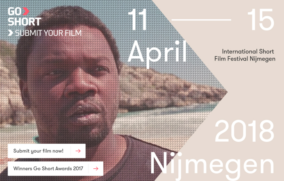
Go Short is the biggest short film festival in the Netherlands, and the next edition will take place in April 2018. The website needed to include a day-to-day schedule, film database and a personal timetable for the festival.
Dutch agency Studio Airport took on the challenge, and made great use of typography to condense a mass of information and detail into something that’s delightful to look at and easy to navigate.
“The concept of the website was based on short films,” explains Studio Airport’s strategy director and co-founder Bram Broerse. “And for us it was important that the typeface was both characteristic and clean. GT-Walsheim has both of these values. We used this typeface for the navigation, main text and headers.
"For the quotes we used an existing typeface of the Go Short identity (Vista Slab) to link everything together with the print material, which was already designed.”
To learn more about the website and the digital branding for the Go Short festival, watch the case study video of the project below.
07. Evert_45
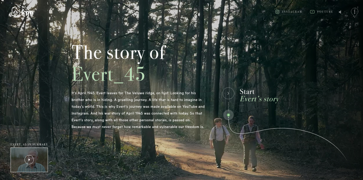
Many online projects have tried to bring the Second World War to life for today’s younger generations. But Dutch website Evert_45 is one of the most innovative we’ve seen to date. It focuses on a 13-year-old boy, Evert, who shares the everyday events of April 1945 on Instagram, YouTube and the site itself as if it was in real time.
The main font used was Linotype's Bodoni 72, says Jan Jesse Bakker, interactive designer at N=5, the Dutch agency that designed the site. “In my opinion, it’s one of the best Serif fonts out there. The numbers in Bodoni 72, especially, stand out compared to the other Bodoni families.”
The focus of the project, he adds, was on bringing history to life for young people. “But for the website we also wanted to share the whole story in one timeline for a broader audience. Bodoni, a historical font, was the right choice. And the contrast between the big round numbers with the small caps creates a beautiful historical feeling.
“To connect to the Instagram and YouTube content, we used large typography guided by a voiceover at the start of each chapter, to create a seamless online story. And it all seems to be working. We reached an incredible 50 per cent of Dutch teens within two weeks.”

Thank you for reading 5 articles this month* Join now for unlimited access
Enjoy your first month for just £1 / $1 / €1
*Read 5 free articles per month without a subscription

Join now for unlimited access
Try first month for just £1 / $1 / €1

Tom May is an award-winning journalist and editor specialising in design, photography and technology. Author of the Amazon #1 bestseller Great TED Talks: Creativity, published by Pavilion Books, Tom was previously editor of Professional Photography magazine, associate editor at Creative Bloq, and deputy editor at net magazine. Today, he is a regular contributor to Creative Bloq and its sister sites Digital Camera World, T3.com and Tech Radar. He also writes for Creative Boom and works on content marketing projects.
