Splash pages – introductory pages that users have to exit to explore the main site – are old right? They’re certainly not as common as they once were, and they may not be the best choice for SEO or user experience, but splash pages should not be written off. There are still enough examples out there of good use of splash pages that they cannot be overlooked by web designers, and there are times when a splash page may still offer the best UX.
A splash page is a preliminary initial page that visitors see when arriving at the website before advancing to the first page proper. They can serve as a gateway that customers pass through before getting free reign to the whole site. They're usually heavy on visuals and include a call to action to help the visitor decide what to do next.
They can serve simply to wow the visitor with impressive CSS animation or graphics, or to deliver a crucial message such as an upcoming event or special promotion, but they can also serve to check people are arriving at the right place, check where they want to go, check they’re the right age in the case of accessing restricted content. Here are seven good examples of where a splash page can still be a good idea.
01. Zara
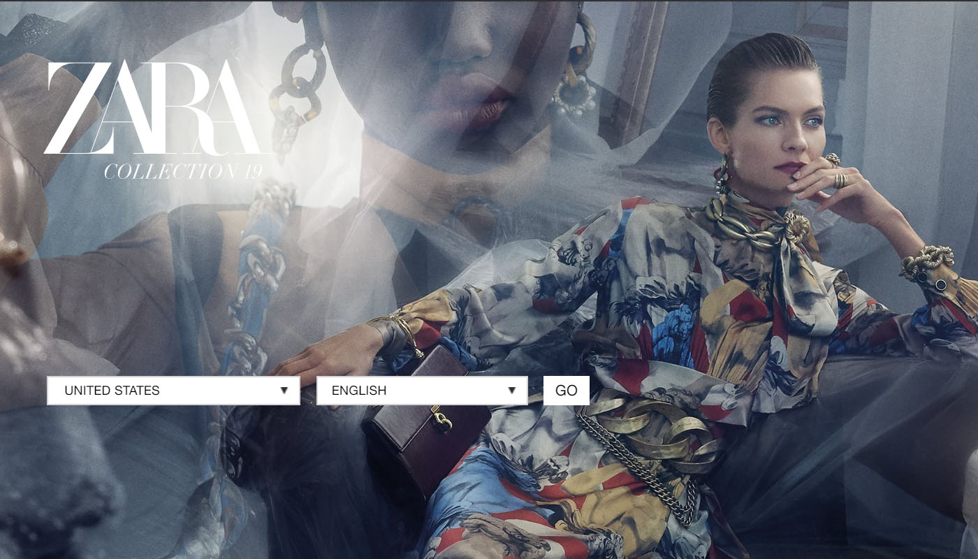
Most websites that operate across regions and languages will now automatically detect location and language and take you the site that fits, but it’s not an exact science and can still end you in a site in a language you don’t understand struggling to find the language selector.
The official Zara website still uses a splash site to ask visitors to choose. It also avoids the common error of confusing language and region, not assuming that everyone in a particular country prefers to communicate in the dominant language, so the US store, for example is available in both English and Spanish.
For a brand with stores in 96 countries, it makes sense and avoids sending people away from the site all together if they arrive at a store they weren’t looking for. But Zara also takes advantage to dazzle with impressive imagery. In the case of the Zara page, the site stores your preferences for the next time you visit, to avoid getting tired, and they change it every couple of months to make sure people are seeing something new if they visit again.
02. Yeezy (Adidas)

A splash page can be just the ticket for a newsworthy event or to respond to something happening now. In this case, Yeezy's splash page (on the Adidas site) serves to preempt visitors’ disappointment, making it clear before they begin the order process that a new limited edition model has sold out, and providing the chance to join the waiting list. This also serves to promote the excitement around the product, making it seem even more desirable and hard to get.
Get the Creative Bloq Newsletter
Daily design news, reviews, how-tos and more, as picked by the editors.
03. Smooth Hound Smith
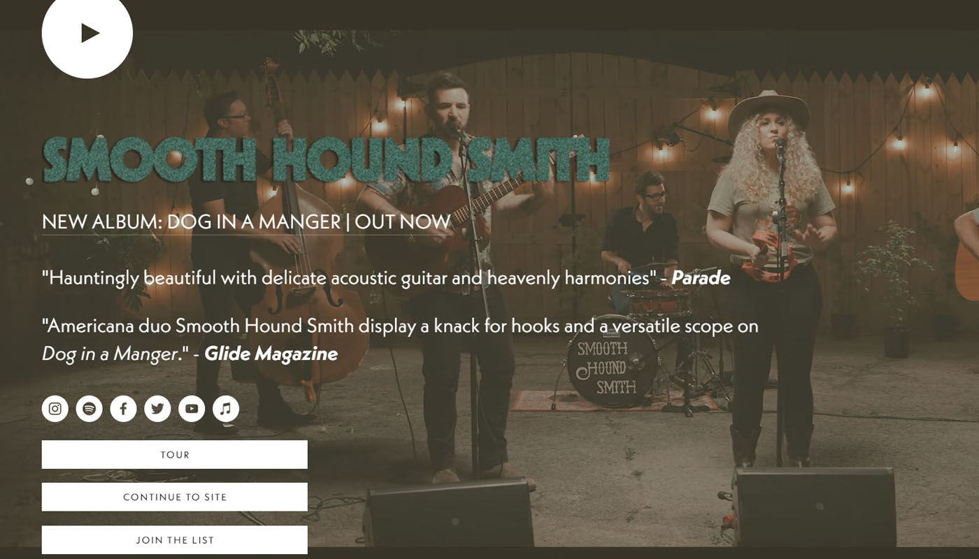
Users of certain sites have particular common behaviour. Fans of a band for example are often want to get straight to the latest tour dates or newest material from the group without needing to go to the main site. Nashville Americana duo Smooth Hound Smith provide a basic splash page that previews new material while giving option to go straight to tour dates or to join the mailing list or go to social media accounts, as well as continuing to the homepage.
The site lets us see the band’s new material and provides a clear and concise roadmap for the most common actions. The video in the background highlights new material and promotes the duo’s music, accompanied by a couple of good-sized quotes from reviews,
04. Glassful
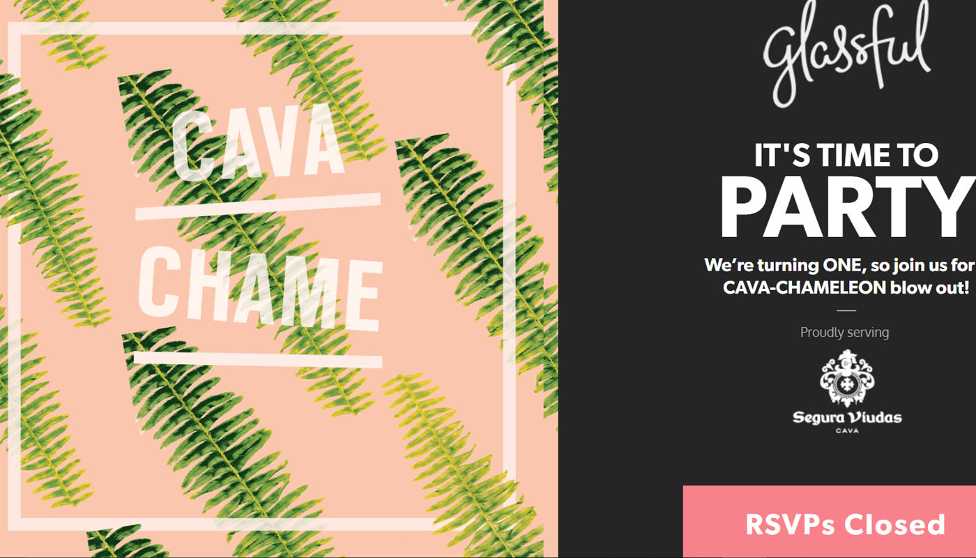
Special events are another source of splash-worthy material. In this example, wine club Glassful used a splash to promote its first birthday party, with all the information needed and a call to action to RSVP Ideally, splash pages should be as lightweight as possible to load quickly and avoid SEO or usability issues. A simple event invitation does the job nicely.
05. Schmoll
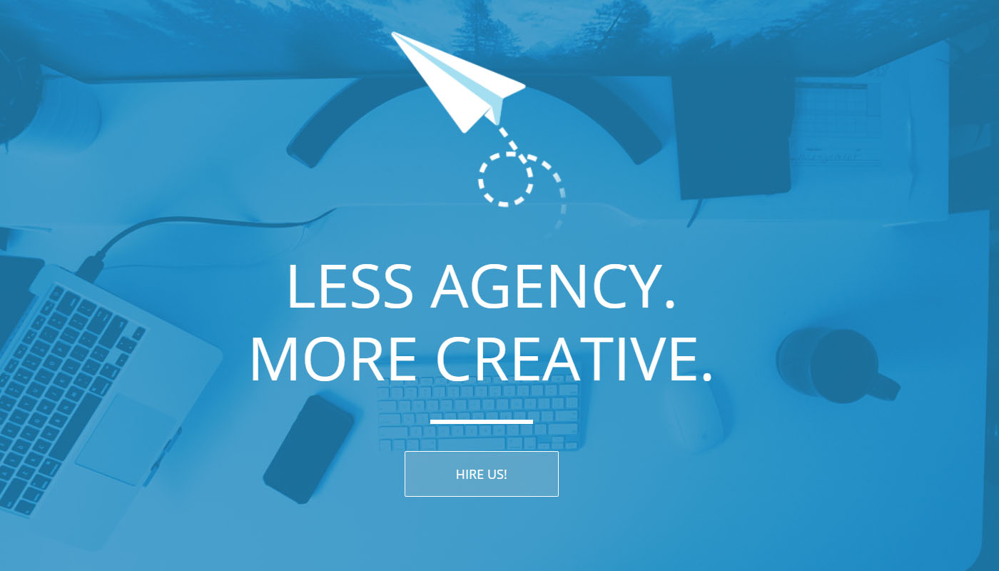
A splash page can be just the ticket if you have a message you want to get out there before people are distracted by anything else. Schmoll Creative’s minimal splash page says a lot without trying too hard, with a bold claim of "less agency, more creative", it defines its personality, and offers a boldly direct call to action "hire us". It’s clear and concise and gives you a good idea of what the agency is all about before seeing a single piece of its work.
06. Resn

Here's another agency splash page, but this one has a very different approach. New Zealand-based Resn showcases not only a direct message, but takes splash pages as an opportunity to have some fun and show off its creativity by taking us on a wandering journey through a greyscale, apple-themed kaleidoscope; a bat with a ouija board that uses its x-ray laser beams to strip the flesh from people in old paintings; a psychedelic bottle that tips out bizarre clipart.
It breaks all the rules of designing a splash page in that it’s meandering, has a vague point and is not entirely useful, but then a production agency can get away with such things if it highlights its creativity. The result is compelling enough that it works as something of a filter. You're likely to keep digging around if you like the style, and it’ll make an impression that will stay with you. If it’s not you thing, you’ll move on and not waste the agency's time with an enquiry.
07. Football
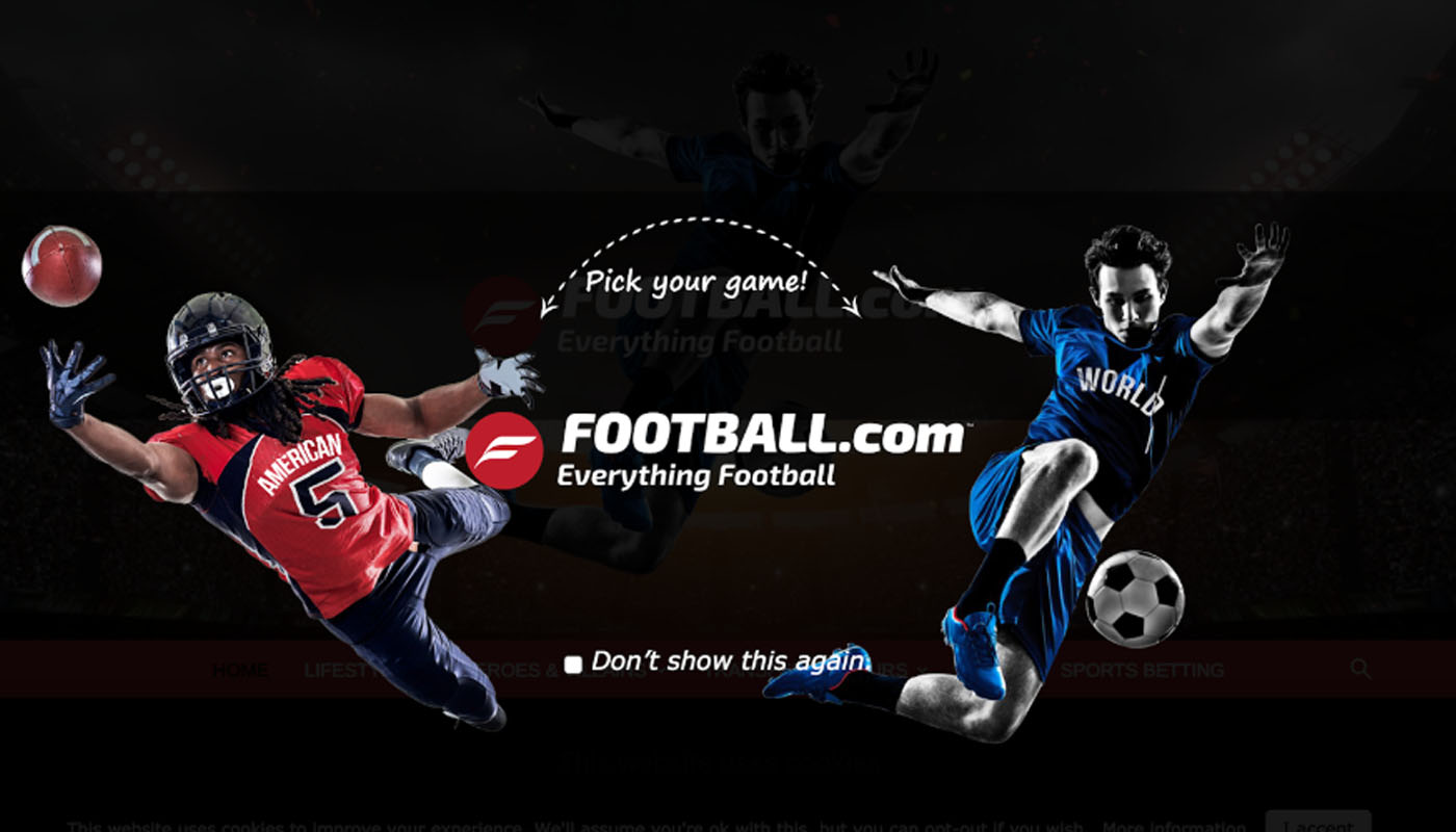
Language and region settings are not the only thing you might want to give a visitor the chance to choose from when they hit your site. If you’re providing widely different products or services, a splash page can be a quick way to divide the experience and allow visitors to choose which service they want and avoid them having to wade through irrelevant menus relating to other services.
American football website football.com for a time took a fun advantage over the confusion around the use of the term “football” in North America versus the rest of the world to check with visitors just what they were looking for with a visual clarification.
Read more:

Thank you for reading 5 articles this month* Join now for unlimited access
Enjoy your first month for just £1 / $1 / €1
*Read 5 free articles per month without a subscription

Join now for unlimited access
Try first month for just £1 / $1 / €1

Joe is a regular freelance journalist and editor at Creative Bloq. He writes news, features and buying guides and keeps track of the best equipment and software for creatives, from video editing programs to monitors and accessories. A veteran news writer and photographer, he now works as a project manager at the London and Buenos Aires-based design, production and branding agency Hermana Creatives. There he manages a team of designers, photographers and video editors who specialise in producing visual content and design assets for the hospitality sector. He also dances Argentine tango.
