6 web design trends that have had their day
Trends have their uses, but these have outstayed their welcome.
Everything moves in cycles. Trends come and trends go in every creative field, and if you want your designs to stay relevant, then it pays to be aware of trends and deploy them when they work for you. Web design, though, is a fast-moving world, and every year you'll find any number of new ways to define a site's look and feel; some ideas stick for a while and others are quickly cast aside.
Other trends, however, hang around for too long, and either lose their impact through over-use or simply get in the way of an effective website layout. Here are six trends that we hope to see a lot less of in the future. Make sure you also see our top web design tips.
01. Hamburger menus
All right, we accept that #NotAllHamburgerMenus are problematic. They exist for a very good reason: providing instantly recognisable navigation on mobile, where small screen sizes aren't any good for traditional nav bars.
The big issue with hamburger menus is that they've leaked onto the desktop, where they're either a redundant secondary navigation option on top of the existing nav, which is irritating, or they've replaced the nav bar altogether, which can be infuriating when you're looking at a big display with plenty of room for providing a way to get to what you want with a single click. We get the need for hamburger menus; they just don't have to be everywhere.
02. '90's styling
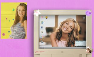
One of the inescapable facts of life is that there's always going to be a revival of a recent decade's style and fashions, and right now there's a bit of a '90's revival going on in web design. Designer Ulrich Schroeder points out to us that he's already sick of '90's and Windows 95-revival typography, gradients and styling. "It's not a renaissance," he says. "Taking giant steps back in design isn't innovative or revolutionary. It's lazy."
He makes a good point; while it's fun for a bit to see sites like Poolside FM, Britney OS '99 and the Geocities-style Captain Marvel site, the retro novelty starts to pall pretty quickly.
03. Infinite scroll
Infinite scrolling is a web design tricks that definitely has its place, and that's on ecommerce websites where you're likely to be presented with a lot of stuff to choose from and you don't want to have to click through a stack of pages to find what you're after. We're all absolutely fine with endless scrolling in that situation, right?
Get the Creative Bloq Newsletter
Daily design news, reviews, how-tos and more, as picked by the editors.
Everywhere else, though, it's not so welcome. News sites that automatically load a related story under the one you've just been reading. Portfolio sites that keep on loading images as you scroll down. We understand the thinking behind each case – the need for retention and for getting that dwell time up – but we've lost count of the number of sites where we've needed to get to the footer for contact information or similar, and been defeated by thoughtlessly-implemented endless scrolling. Stop doing it!
04. Flat cartoon figures
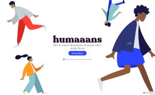
"Bored of this now!" says Lex Lofthouse of Nottingham agency, JH. And adorable as they are, it's safe to say that we're probably all becoming a little tired of those flat cartoon figures doing their thing all over corporate sites.
It's easy to see why these minimal illustrated people have become so completely ubiquitous; they're the go-to solution for any corporation that wants to give the impression that it's fun and approachable, but also that it's getting stuff done. These figures are never just standing around; they're always full of energy, nailing their KPIs and chasing down the next big lead.
Ubiquity brings its own problems, though: when you see something all the time, you pay less and less attention to it, and we're arguably at the point now where if you use these cartoon humans in your designs they're going to make a lot less impact than you hoped for. It's time to wean yourself off them.
05. Massive hero images
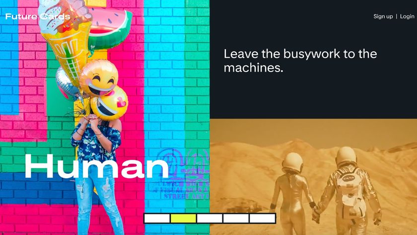
Everybody loves a massive hero image, right? So much visual impact! And if your business is largely based on image, there's a great case for hitting visitors with something big and visual as soon as they land on your site.
However, in a lot of cases your users don't want to be confronted by an enormous image; they want to find whatever products or information that they've come for, and that hero image is getting in the way. Worse, it could be slowing them down if they're on a mobile connection, and let's not even start on full-screen video backdrops. Keeping things minimal isn't just an aesthetic decision; it's a way to ensure your visitors can find what they're after without unnecessary obstacles.
06. Modals
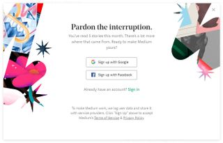
Remember popups? They were the bane of every web user until web browsers started blocking them by default. And it was lovely to be able to browse the web without having to swat unwelcome popups for a while; that is, until someone discovered modals. When we asked on Twitter for opinions on which web design trends had had their day, modals were one of the top answers.
And it's easy to see why; it's near-impossible to visit a site without getting a modal in your face, particularly in the EU where you're constantly harangued by GDPR compliance dialogs. A well-paced modal can be a useful way to drive engagement; yet another appearance of a needy modal if you dare to mouse out of a site's window is just a turn-off, and we've become so used to them that we all dismiss them instantly.
Related articles:

Thank you for reading 5 articles this month* Join now for unlimited access
Enjoy your first month for just £1 / $1 / €1
*Read 5 free articles per month without a subscription

Join now for unlimited access
Try first month for just £1 / $1 / €1
Jim McCauley is a writer, performer and cat-wrangler who started writing professionally way back in 1995 on PC Format magazine, and has been covering technology-related subjects ever since, whether it's hardware, software or videogames. A chance call in 2005 led to Jim taking charge of Computer Arts' website and developing an interest in the world of graphic design, and eventually led to a move over to the freshly-launched Creative Bloq in 2012. Jim now works as a freelance writer for sites including Creative Bloq, T3 and PetsRadar, specialising in design, technology, wellness and cats, while doing the occasional pantomime and street performance in Bath and designing posters for a local drama group on the side.

