Logo design is something you should get better at throughout your career, just by doing it. But if you’re looking to create truly great logo designs, practice alone won’t always be enough.
In this post, we suggest six key areas you can work on to help improve your logo design, to take it to the next level...
01. Do better research

Logo design isn’t about making something that looks pretty; it’s about serving a business need and reflecting what a brand stands for. So before you start sketching out ideas, you need to do some solid research into your client and what it's about.
In the same way that you’d prepare for a job interview, then, you need to thoroughly research the company and its brand. Read what it has to say about itself, on its website and other official sources, as well as what industry blogs and other commentators have written about it, and what people have posted about it on social media.
All this will give you a head start in your initial discussions with the client. Your logo design ideas will be far more likely to be accepted, because you’ll be able to explain them in terms of how they can help the business.
An example of this principle in action can be seen in Design Bridge’s 2016 redesign of the Guinness logo, which drew on extensive research into the company’s heritage to tell the brand's story.
02. Ask better questions
The initial research you do into a company is only the first step in understanding it. The next is to dig deep; taking advantage of your access to its leaders, and asking some penetrating questions.
Get the Creative Bloq Newsletter
Daily design news, reviews, how-tos and more, as picked by the editors.
Your questions will normally include things like: Who is your target audience? How do you plan to grow the business? Who are your main rivals? What’s your mission statement? What are your long-term goals? These may sound irrelevant to the discipline of logo design, but they couldn’t be more central.
For example, if the target audience turns out to be the over-50s then you probably won’t want to give your design a youthful, funky vibe. If the main rival’s logo uses a distinctive font, you’ll want to use a different one (for legal reasons alone).
It’s also worth asking the obvious question: “Why do you need a new logo?” The answer, or lack of one, can often be quite enlightening.
03. Focus on mobile first
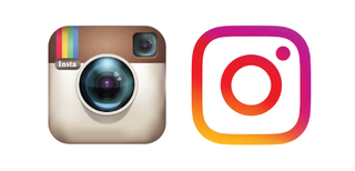
If you’ve been paying attention to Creative Bloq's logo news channel, you’ll have noticed a number of big brands have simplified and flattened their logos. They’re continuing a trend that’s been evident throughout the decade, with the likes of Facebook, Instagram, eBay, Microsoft and Yahoo leading the way in making their designs super-minimal.
It’s no accident that these firms are all tech giants, because it’s largely a tech-driven phenomenon – but it’s one that increasingly affects all brands.
In short, as more and more people start accessing the web via mobile rather than desktop, the more logo designers lose control of the size their creations are reproduced at. When it comes down to a tiny number pixels, an overly fussy logo is just going to look like a splodge, whereas a flat, minimal design with a simple colour palette is still going to be recognisable.
Whether you like it or not, then, the future of logo design will be simplified. So you may as well jump on board now and start thinking ‘mobile first’ when you start designing your logo.
04. Exit your font comfort zone
One part of creating a distinctive-looking logo can be to use a distinctive-looking font. There are new fonts coming out all the time that could give you that bolt of inspiration; a good place to find them is our constantly updated Best free fonts post, while we’ve gathered together some great logo fonts too.
You don’t have to necessarily spend a lot of money to take advantage of new fonts, either. These days, Adobe Illustrator lets you play around with Typekit fonts, directly within the software, without having to purchase them, plus there are a range of other try before you buy font services too. So don’t hold back from experimenting with different fonts, and hopefully inspiration will strike.
05. Study the masters

Many posts on logo design recommend you check out the countless logo galleries that populate the web for inspiration – and there’s nothing wrong with that. But don’t be fooled. Many of these logos are personal or student projects, serving no business need whatsoever. And while others will be real logos, there’s usually little or no information about whether they actually succeeded in their business goals.
If you wanted to improve your football prowess, you’d watch the stars of the Premier League, not the kids kicking a ball around on the local playing field. And similarly, if you want to learn logo design, you’re better off learning from the best. So rather than trawling through middling logos on logo galleries, hoping to be inspired, spend your time studying the big brand logos that have stood the test of time.
It’s only by seeing how well they work in the real world of posters, packaging, supermarkets, commercials and elsewhere (you don’t exactly have to go far to find them) that you can truly appreciate why and how well they work. Plus, to get a taste of the stories behind them, check out our posts on the history of the McDonald's logo, Penguin books logo, Adidas logo, BMW logo and Coca-Cola logo.
06. Understand psychology
It’s all very well giving a long and detailed explanation of why your logo design is so clever. But in reality, nobody (except possibly other designers) will ever glance at your logo for more than a millisecond. To make an impact, then, it needs to appeal to people’s subconscious human instincts, at their most primitive level.
It follows that a good understanding of human psychology can help you create better designs that connect on this subliminal level. A proper understanding of psychology requires some serious reading, of course. But if you find academia off-putting then a pop-science book such as Thinking Fast and Slow by Daniel Kahneman, Nudge by Richard H Thaler or Drive by Daniel H Pink will get you most of the way there.
Meanwhile, for some simple psychological tips, it’s also worth checking out our posts on the psychology of logo shapes and How to pick the perfect colour palette every time.
Read more:

Thank you for reading 5 articles this month* Join now for unlimited access
Enjoy your first month for just £1 / $1 / €1
*Read 5 free articles per month without a subscription

Join now for unlimited access
Try first month for just £1 / $1 / €1
Tom May is an award-winning journalist and editor specialising in design, photography and technology. Author of the Amazon #1 bestseller Great TED Talks: Creativity, published by Pavilion Books, Tom was previously editor of Professional Photography magazine, associate editor at Creative Bloq, and deputy editor at net magazine. Today, he is a regular contributor to Creative Bloq and its sister sites Digital Camera World, T3.com and Tech Radar. He also writes for Creative Boom and works on content marketing projects.

