6 trends that are changing the face of UX
Get ahead by learning these themes shaping the future of UX design.

When I started my UX career, the iPhone didn’t exist. I was wireframing screens for car navigation systems using PowerPoint. User experience consisted of interacting with the touchscreen interface with their fingers or voice. Tap was the only gesture; there was no swipe, pinch or slide. There were quite a few voice commands but they were difficult to recall, and you had to say them a specific way. Even then, the system didn’t understand it most of the time.
Today, when new web design tools are released every day, swipe is the new click. Technology has made it possible for us to talk to computers as if they were human. We’re designing experiences for multiple platforms using design-specific tools (a top website builder will help here). The rules have changed: the next generation of UX designers will face new challenges that will impact our everyday lives (take the edge off with a super web hosting service).
Here’s a look at some of the themes that are changing the face of UX.
01. Conversational UX
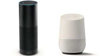
Hey Siri, find a table for six in Los Angeles tonight. OK Google, take a selfie. Alexa, ask Uber to request a ride. Tech giants Apple, Google, Amazon and Facebook have embraced conversational interfaces. Virtual assistants and chatbots have exploded onto the scene. We’re seeing a growing number of applications with invisible interfaces; applications with no commands to remember or user interfaces to learn. Users can just type or talk as they would to their friends or family.
Conversational UX will be one of the biggest shifts in how people interact with devices. Natural language recognition is progressing at a rapid pace. Frictionless computing can be a reality.

So what does this mean for user experience designers? We won’t be designing visual interfaces as often. Instead, we will design experiences through conversations – experiences that help users achieve their goals. The future of interaction is screenless.
These are some things to consider for your conversational UI designs:
Get the Creative Bloq Newsletter
Daily design news, reviews, how-tos and more, as picked by the editors.
- Start with a quick introduction and explanation of what you do
- Make it clear the person on the other side is a bot and not a human
- Avoid open-ended questions; encourage a specific answer
- Acknowledge valid answers before moving on to the next question
- Focus on micro-copy that is natural and represents the brand
Conversational UI is still in its infancy. As designers, we have the opportunity to shape the experiences we want. Through the power of conversation, computers and humans will finally be able to speak the same language.
02. Focused design tools
It was only a few years ago that designers had to hack existing tools when designing for the web. They’d retrofit tools like Photoshop and Illustrator to create wireframes, flows and mockups.
Organisations now realise the importance of a great user experience and are willing to invest in it. New web design tools or sets of updated features are frequently released and are all vying to be a part of the designer’s workflow.
Currently leading the way is Sketch, a tool focused on interface design. With a robust set of powerful features and plugins, it has become the go-to for most designers. Competitors have taken notice.
Adobe got into the game with XD. It differentiates itself from Sketch by adding a prototyping component and Windows compatibility. Another tool that has been gaining popularity recently and could offer a glimpse towards the future of design tools is Figma. It runs in a web browser and allows for real-time collaboration. CAD-inspired design tool Subform adds another new dimension – it focuses on the unique constraints of responsive layouts.
The prototyping game continues to evolve. InVision launched a plugin for Sketch and Photoshop called Craft. Craft helps users design with real data, sync styles, and prototype within Sketch. Facebook has developed its own prototyping tool called Origami Studio. And Framer continues to push updates, making it easier to design with code.
03. A mobile future
In 2009, Luke Wroblewski wrote that websites should design for mobile first. Mobile users were growing at an alarming rate. Mobile internet adoption was on the rise. Time spent in mobile apps kept going up. It was clear mobile was here to stay.
Fast-forward to today and the numbers don’t lie. There are more smartphones in the world than PCs. The time spent in mobile apps dominates the web browser. A growing population of people no longer use a PC at all. Smartphones have changed the way we communicate with each other and access information. Yet the mobile experience is still riddled with bad UX.
04. Integrated experiences
If we are to design for tomorrow’s mobile experiences, we can’t be guided by today’s constraints. Phones will get smarter and more integrated and powerful.
Apps are beginning to scratch the surface of contextual experiences. Enter a restaurant and get a suggestion of what to order, based on your preferences. Got a meeting across town? Your phone will tell you when to leave, based on traffic. In the future, the camera will act as another context-aware source – it will be an extra eye that can understand what it’s seeing in real time.
We’re starting to see more integration of data and services. Instead of opening a specific app to complete a task, we’ll be able to do it via voice or inside another app. Apps that don’t integrate with each other will seem like a broken user experience.
We’ll interact with the other devices in our home, car and at work. To provide the best experience, all devices will talk with one another. The phone will be the one device that’s always with us; the hub of the frictionless experience. The apps that will become a part of our everyday life will be the ones that can best anticipate our needs.
05. Building a library

Creating and maintaining an effective design system requires a huge investment. The Airbnb team created its system by first identifying the inconsistencies in its products. Designers printed out their designs and laid out the screens side-by-side. They audited the flows in order so they could see where the experiences were breaking. Principles helped inform their decisions to standardise on components and design patterns.
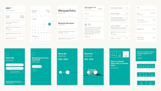
A pattern library acts as a centralised hub for all components of the user interface. Effective pattern libraries provide pattern descriptions, annotations and contextual information. They also showcase the code and pattern variations, and have the ability to add real data into the pattern structure.
Once a design system is up and running, it’s only the first step in the journey. It needs to be living. Nathan Curtis, a co-founder of UX firm EightShapes, says: “A design system isn’t a project. It’s a product, serving products.” Like any good product, a design system needs maintenance and improvements to succeed. Both Google and Salesforce have teams dedicated to improving their design systems. The goal is a workflow where changes to the design system update the documentation and the code.
The benefits realised by a thoughtful, unified design system outweigh the effort involved in establishing one. There is a consistency across the entire user experience. Engineers and designers share a common language and systems are more sustainable. Designers can spend their time solving harder problems and the actual user experience.
Creating a design system? Keep everyone in the loop with accessible cloud storage.
06. The UX of virtual reality

User experiences are not limited to a desktop or mobile screen – many everyday objects now connect to the internet. One of the more exciting design challenges is virtual reality, which has been around for some time but has recently become more accessible, thanks to headsets like the Oculus Rift.
Designing an immersive experience is not the same as designing for a flat screen. Design principles for two-dimensional screens don’t always translate to three-dimensional environments. A new medium means new rules, interactions and patterns.
Moving on
Design has come a long way. Mobile is the face of digital. Organisations are creating large-scale design systems and a culture of design. Tools for designers are becoming more accessible. We have had a small taste of the power of conversational UX and virtual reality.
When I was designing car navigation systems, the goal was to get drivers to their destination. Now, we’re seeing cars that can drive themselves and are safer than humans. As technology is always changing, so will the rules of UX. Now more than ever, it’s an amazing time to be a user experience designer.
This article was originally published in net, the world's best-selling magazine for web designers and developers. Subscribe to net.
Want to learn more on the latest UX trends?

If you're interested in learning more about how you can offer your users a silky smooth user experience, make sure you've picked up your ticket for Generate London.
An award-winning freelance front-end UI developer and author from Lebanon with clients including Netflix, The Royal Schiphol Group and Smashing Magazine, Sara Soueidan will be delivering her talk – Using CSS (and SVG) for the good of UX – at Generate. In it, she will show you how UX has a direct impact on how the user feels, whether they find it delightful to use and, most importantly, whether or not they can use it properly.
Generate London takes place from 19-21 September 2018. Get your ticket now.
Related articles:

Thank you for reading 5 articles this month* Join now for unlimited access
Enjoy your first month for just £1 / $1 / €1
*Read 5 free articles per month without a subscription

Join now for unlimited access
Try first month for just £1 / $1 / €1
