In the Instagram and Snapchat era, audiences are increasingly visually oriented. But sometimes an image alone isn’t enough: you need a clever combination of words and graphics to tell a detailed story in a way that can be grasped quickly and easily.
Cue the infographic. But while they may look easy to create, the best infographics are deceptively difficult to get right.
You'll need to make sure you have the best infographics tool before you get started, but beyond that there are some basic principles you can follow to make sure your design is as effective as possible. (And here's a bonus content tip: always run a spellcheck before sending your infographics out into the world.)
Here, we share six secrets to creating outstanding infographics...
01. Decide whether you actually need an infographic
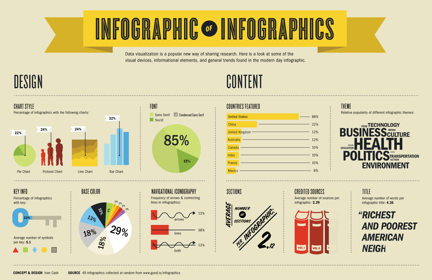
The first thing to consider when setting out to design an infographic is whether or not you actually need one.
Your client may have heard at a marketing seminar that infographics are “big right now” and “a great way to go viral”. But it’s your job to explain that unless there’s a very clear and indisputable reason to present information in this form – rather than through any other sort of design, or an email, press release or blog post – then going viral is unlikely to happen.
There’s no one single rule of thumb, but in general an infographic is a good option when you need to present complex data in a simple visual format that’s easy to share across multiple platforms. If that’s not what you need to do, then you’re probably better off investigating another medium.
Get the Creative Bloq Newsletter
Daily design news, reviews, how-tos and more, as picked by the editors.
02. Clearly define your goal
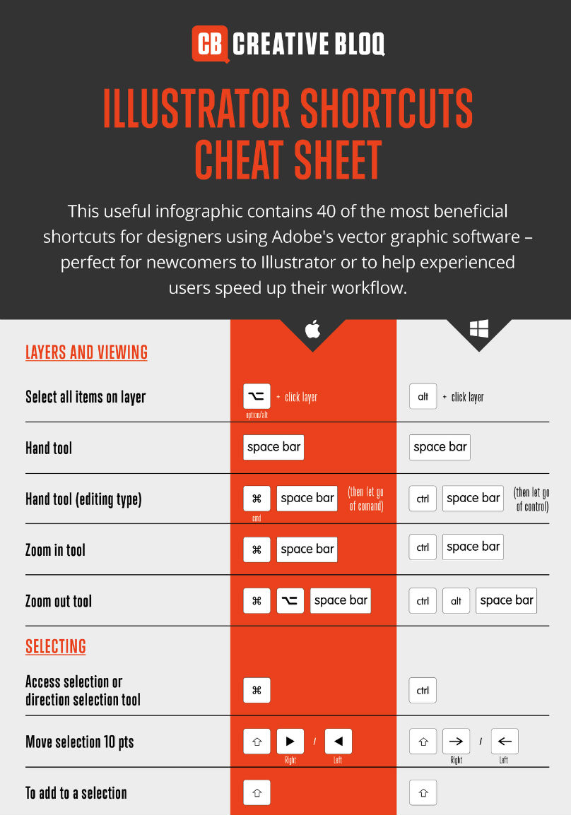
Once you’ve established that your project requires an infographic, you then need to ruthlessly focus in on your topic, and decide what information needs to be included, who the target audience is (ideally, including detail personas), how they will most likely view the infographic, and why they might want to read it. That last part is crucial, because online it’s certainly not the case that “If you build it, they will come” – quite the reverse.
So don’t put the cart before the horse. Only once you’ve answered the above questions will you be in a good position to decide what kind of layout, visual style, colour scheme and so on is going to work best.
And when we say ‘define your goal’, we purposely chose the singular version of that noun. The idea of pursuing multiple goals with your infographic is self-defeating, because the whole essence of the discipline is to...
03. Keep it simple
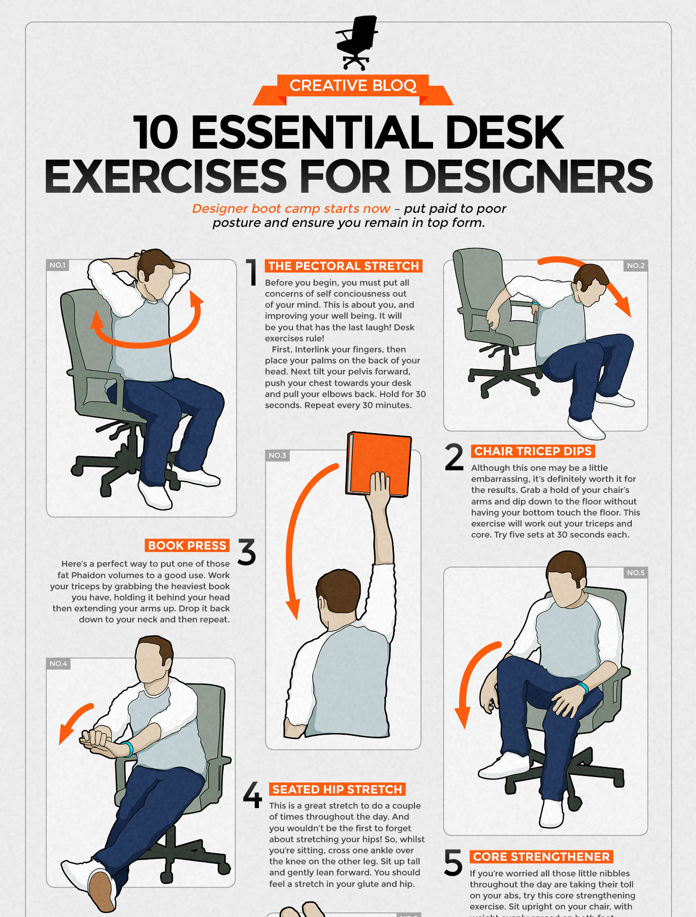
At Creative Bloq, we often see infographics that are so complex and confusing that few people will read or share them online. We can't stress this enough, then: your infographic needs to be as simple, focused and visually uncluttered as you can possibly make it.
This isn't always easy. Streamlining information is tricky at the best of times – and even more so when you have multiple stakeholders involved in a project. But you must stand firm.
This means keeping things to a single specific point or story, rather than trying to cover broad or multiple themes. It means applying a simple visual theme that will prove consistency and flow to your design. And above all, it means keeping text to a minimum: it’s an infographic, after all, so the graphics need to work hard to tell the story.
In particular, avoid big chunks of text in favour of small bite-size pieces, such as bullet-pointed lists, which are easier for readers to digest at a glance. And make good use of whitespace to ensure that both text and images are attractive, accessible and legible.
Finally, don’t make your infographic too long: you want readers to get to the end without becoming bored. And if you are going to make them scroll, you might include some kind of visual device to let them know how far they’ve got to go (similar to a progress bar on an app). In the infographic above, for instance, the reader knows that there are 10 steps to follow.
04. Choose your colours carefully

Another important aspect of keeping your infographic simple is to choose an uncomplicated colour scheme. That doesn’t mean, however, that it needs to be dull. In fact, some of the most effective infographics are based on bright, bold and attention-grabbing colours.
As with any design, your choice of colour palette will depend on a variety of factors. What mood do you wish to instil in the reader: excitable, chilled, passionate? Are there specific brand colours you need to follow for your client? What cultural factors do you need to take into account for the intended audience?
To help you nail your perfect colour palette, check out our posts on How to choose a colour theme, The designer’s guide to using colour in branding, and Tools for choosing a colour scheme.
05. Use infographic tools to save you time
Depending on your needs and how fast you need to get your infographic out of the door, there are a number of tools that can help.
Of course, these are going to be limiting, and you’re only going to have creative control by using bespoke software like Photoshop, Illustrator or Affinity Designer. But sometimes limits can be an aid to the imagination, especially when you’re asked to produce something simple at the last minute, for instance for a social media campaign.
In such cases, these infographic tools are all high quality and free to boot.
06. Be inspired by the best infographics
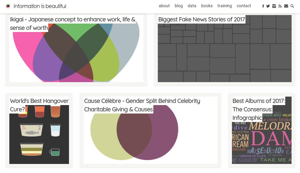
Infographics offer an almost endless variety of ways to express information in visual form. But in practice, it’s easy to become repetitive and keep falling back on the same kinds of designs. So give your imagination a reboot by checking out some of the best and most original examples of infographics online.
There are plenty of infographics galleries, including Cool Infographics, Infographics Bee and our own regularly updated selection of the best infographics. Also look for new infographics on Dribbble and Behance, and check out the blog Information is Beautiful, which showcases its own consistently high standard infographics.
Related articles:

Thank you for reading 5 articles this month* Join now for unlimited access
Enjoy your first month for just £1 / $1 / €1
*Read 5 free articles per month without a subscription

Join now for unlimited access
Try first month for just £1 / $1 / €1

Tom May is an award-winning journalist and editor specialising in design, photography and technology. Author of the Amazon #1 bestseller Great TED Talks: Creativity, published by Pavilion Books, Tom was previously editor of Professional Photography magazine, associate editor at Creative Bloq, and deputy editor at net magazine. Today, he is a regular contributor to Creative Bloq and its sister sites Digital Camera World, T3.com and Tech Radar. He also writes for Creative Boom and works on content marketing projects.
