6 of the most iconic drinks logos
Everyone needs something to drink, and while it's perfectly feasible to get by on tap water, realistically we all want a bit of flavour in our lives, and maybe something with a little extra kick as well. That's why the global drinks market is so huge, and why so much money and effort goes into creating appealing brands.
Drinks account for some of the largest brands in the world, and having an instantly recognisable logo design is key to success in a crowded market. And because tastes change over time, most (but not all) of the big brands need to keep refreshing their look in order to stay relevant. Here are six of the best drinks logos.
01. Coca-Cola
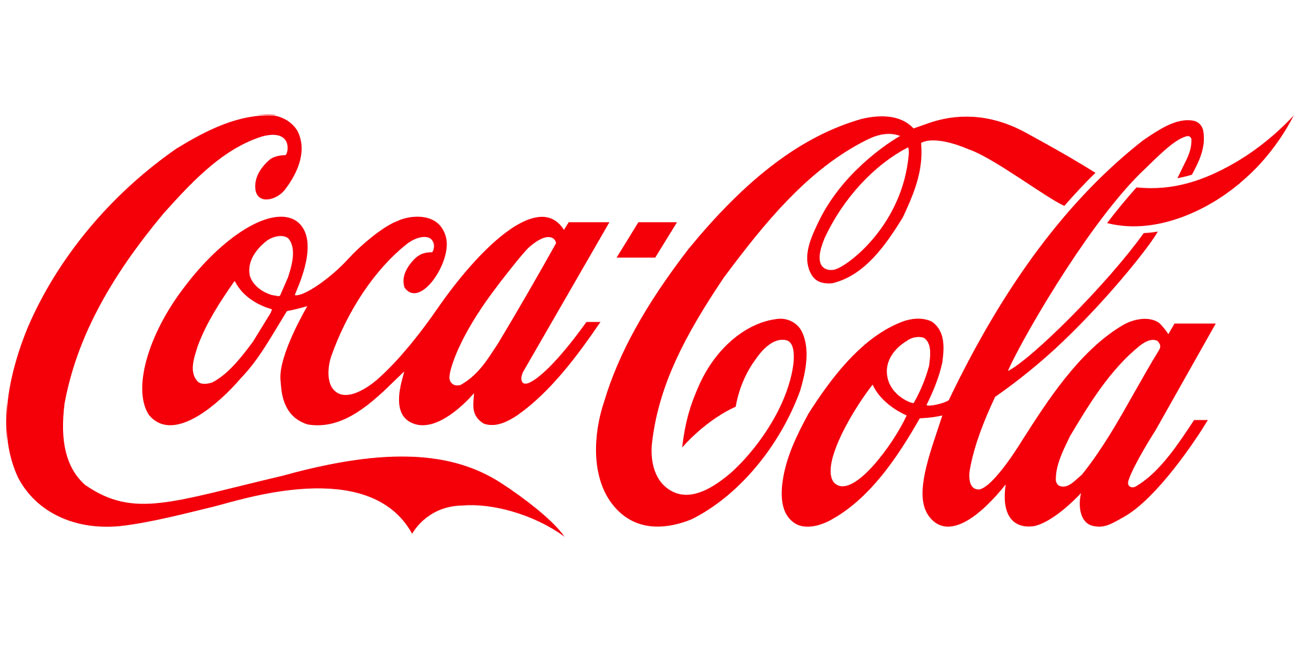
There's something distinctly magical about Coca-Cola's branding. And by that, we don't mean that it has a particularly brilliant logo design; it's a perfectly serviceable logotype, originally designed in 1886 and given various minor adjustments over the years. The last major addition to it was in 1969, when the white wave was added underneath, and that seems to have been largely shelved in recent years.
What we love about the Coca-Cola logo is how it's wormed its way into the popular subconscious thanks to many, many years of repetition via keenly focused advertising. If you're in a supermarket and you want brown fizzy drink, you're probably going to reach for the Coca-Cola.
And yet despite the power of the Coca-Cola brand, it's still somehow divorced from the product itself. If you're in a pub or restaurant and you order a Coke, only to be told, sorry, they only have Pepsi, chances are that you don't really care. Isn't that weird?
02. Pepsi
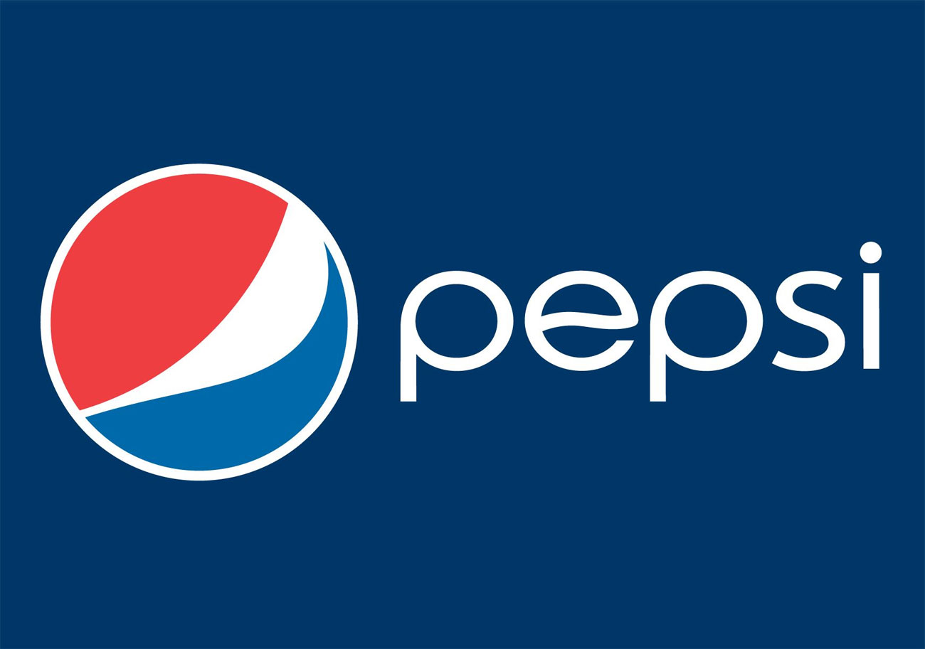
Forever stuck in second place in the global 'best brown fizzy drinks' stakes, Pepsi – originally launched in the 19th century as Brad's Drink – is in a constant state of trying to catch up with Coca-Cola, and so has worked harder over the years at updating its brand in an attempt to capture some of its rival's magic.
For the longest period it called itself Pepsi-Cola and had a very similar red logotype; it was only around the time of the Second World War that it adopted its familiar red, white and blue design, to show support for American troops.
Daily design news, reviews, how-tos and more, as picked by the editors.
Originally used on its bottle caps, the design has become the brand's default logo and has been tweaked numerous times over the years, most recently in 2008 to give it a smiley appearance. It's a strong look, and yet somehow it's never had the power of Coca-Cola's design.
03. Red Bull
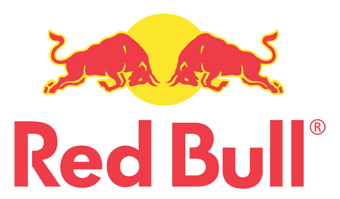
Red Bull as a brand is about much more than an energy drink; today the company's as well-known for its Formula One team and other sporting enterprises as it is for its caffeine-packed beverages. However its iconic, energetic logo, featuring a pair of solid-looking bulls about to lock horns, actually predates the Red Bull brand itself.
Red Bull founder Dietrich Mateschitz came across an energy drink called Krating Daeng in Thailand and stuck a deal with its creator to create a version suitable for Western palates. And while he changed the recipe and translated the name into English, he retained the Krating Daeng logo design. It may be instantly associated with Red Bull worldwide, in Thailand you'll still see it adorning bottles of the original Krating Daeng.
04. Starbucks
The Starbucks logo is a fascinating exercise in branding that shouldn't really work. Originally created in 1971 by Terry Heckler, the two-tailed mermaid design, derived from Norse folklore, has been refined over the years as the Starbucks brand has grown into a global coffee powerhouse.
Quite what a mermaid has to do with coffee is anybody's guess, and yet it has become inextricably linked with the Starbucks name, to the extent that the company's 2011 rebrand by Lippincott put the mermaid front and centre, without any text. That's quite an achievement for an over-complex mark with no real link to the product it's promoting.
05. Heineken
Heineken may be one of the world's biggest beer brands, but it's one that's never taken itself too seriously, as its traditionally light-hearted advertising demonstrates.
When the company's chairman, Freddy Heineken, brought in a rebrand in the 1950s with the company name taking prominence, he insisted that it should have a friendly appearance. So the wordmark ditched Heineken's previous all-caps look for more rounded, smaller letters, and also adopted a small backwards slant on the letter 'E', giving it a smiling appearance.
06. PG tips
PG tips may not be a global brand, but it's one that shines out as a beacon of hope anywhere in the world where there are British expats in search of a good cup of tea. There are various brands of tea available in the UK, but PG tips is the only one that really matters to a nation of serious tea-drinkers.
Established in 1930 as 'Pre-Gestee' – referring to tea as a digestive aid – it soon became known as PG, and manufacturers Brooke Bond later added 'tips' to the name, in reference to it being made using only the tips of the tea plant.
Its distinctive red-and-green logo, complete with a little sprig of tea tips, has been in use for years, and had become weakened by the sort of evolutionary changes that any long-lasting brand has to put up with. A 2016 redesign by Jones Knowles Ritchie took it back to basics, with a new, minimal brand mark inspired by the notion of togetherness.
Related articles:
Jim McCauley is a writer, performer and cat-wrangler who started writing professionally way back in 1995 on PC Format magazine, and has been covering technology-related subjects ever since, whether it's hardware, software or videogames. A chance call in 2005 led to Jim taking charge of Computer Arts' website and developing an interest in the world of graphic design, and eventually led to a move over to the freshly-launched Creative Bloq in 2012. Jim now works as a freelance writer for sites including Creative Bloq, T3 and PetsRadar, specialising in design, technology, wellness and cats, while doing the occasional pantomime and street performance in Bath and designing posters for a local drama group on the side.
