6 inspiring redesigns of design agency portfolios
What we can learn from the recent relaunches of six top design studio websites.
A portfolio website is one of the most important tools in any design agency's self-promotional toolkit, and it needs to fulfil many different jobs effectively.
These include showcasing your back-catalogue to best effect to impress clients, peers and potential recruits; explaining your background, ethos, and creative process; and where applicable, also getting across opinions and attitudes that make you stand out.
It's not an easy balance to strike, and even world-class design studios need to rethink their approach sometimes. Read on to discover how six top agencies approached the redesign of their portfolio websites over the past year, and what you can learn from their successes...
01. Pentagram
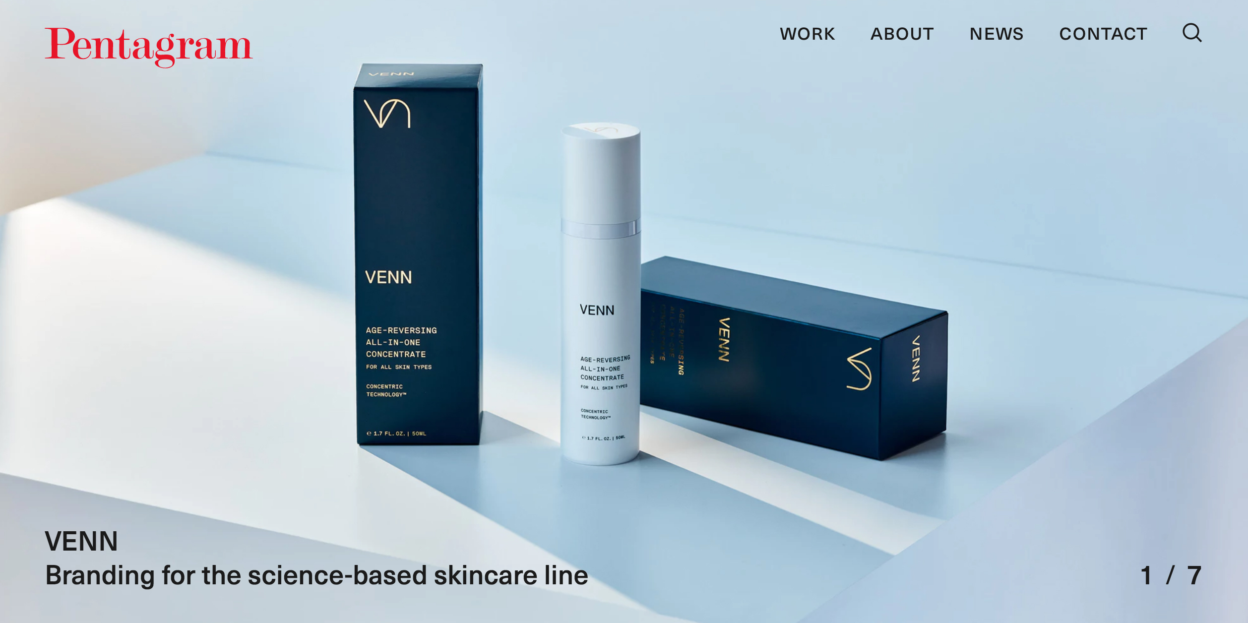
Granddaddy of graphic design Pentagram has a dizzying archive of inspirational work that stretches back to the 1970s, split between its unique network of largely autonomous global partners. So any attempt to rework its website has a unique set of challenges not faced by smaller, younger studios.
Its last major redesign in 2011 had a very archival, almost museum-like feel, with a grid of thumbnails that could be categorised according to project, client or how recently they were produced. It was a simple approach that acknowledged the many decades of design history that the world's largest independent design consultancy has under its belt.
Pentagram's most recent portfolio shake-up has taken the polar opposite approach, visually speaking. You're greeted by an enormous screen-filling hero image that transitions between seven flagship case studies.
Scroll down and you're met with a patchwork of thumbnails showcasing a selection of other recent work, with minimal text: just the project name at first, with a one-sentence qualifier visible on mouseover.
Get the Creative Bloq Newsletter
Daily design news, reviews, how-tos and more, as picked by the editors.
Click those for a visual feast of high-resolution imagery for each project; and again for a more in-depth rationale behind the design solution. It's a mine of information for those who choose to explore it, fronted by a mouth-watering visual treat.
02. Johnson Banks
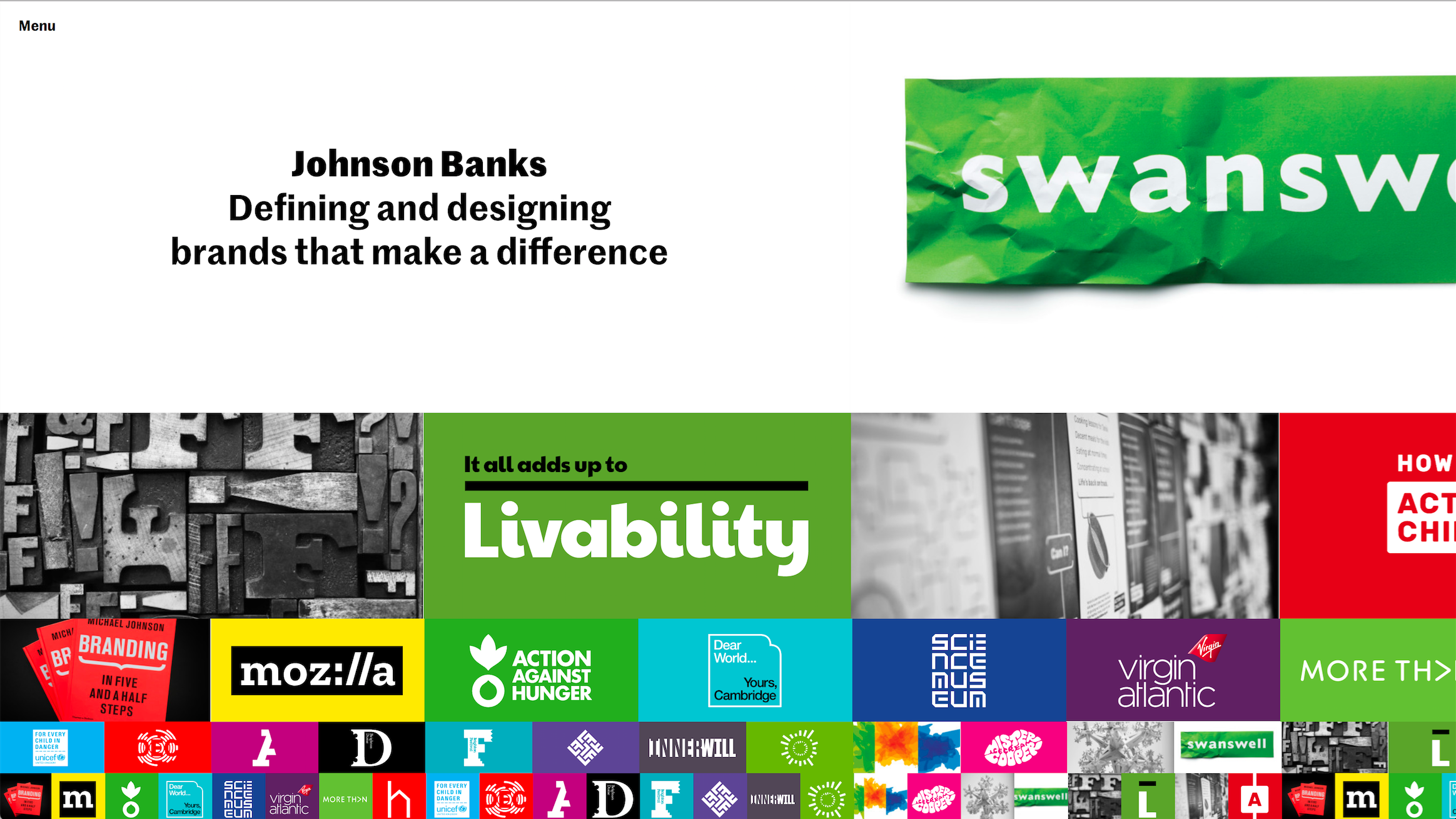
It would be remiss of us not to mention one of the most innovative design studio website redesigns of 2017: Johnson Banks' side-scrolling splendour, reviewed here on CB last April.
Created in collaboration with BONG, Johnson Banks' smart infinite-scrolling interface splits the studio's extensive portfolio into a grid, with five rows of thumbnails of decreasing size, which scroll at different speeds.
It's a mesmerising experience to navigate, and can be customised according to sector and discipline to help you zero right in on your work of choice.
Other areas of the website following a similarly innovative navigation model, including Thoughts, News and even the About section – so often neglected compared to other, more visual areas of a design studio's portfolio. In short, it's a real pleasure to explore.
03. Rose
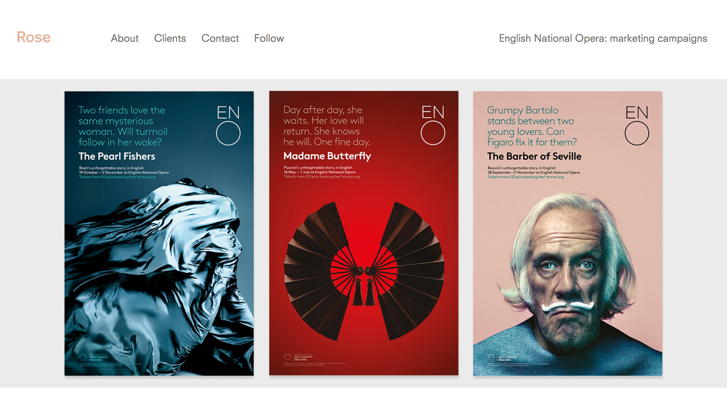
Despite a hugely impressive haul of design awards for an equally impressive list of clients, Rose often flies under the radar when it comes to overt self-promotion, compared to some of its more public-facing peers – preferring to let the work speak for itself.
Like Pentagram, in its 2017 site redesign Rose opted for screen-filling inspiration for its homepage: huge, high-resolution hits of design porn that cycles automatically through the agency's back catalogue.
Unlike Pentagram, however, the rest is kept much simpler, in line with Rose's understated attitude. In place of multiple layers of project information to explore, there's a clean menu interface: a few paragraphs about the agency; a matter-of-fact roll-call of clients; the necessary contact details. The implicit message is: if you love the beautiful work that's filling your screen right now, just drop us a line.
04. Studio Dumbar
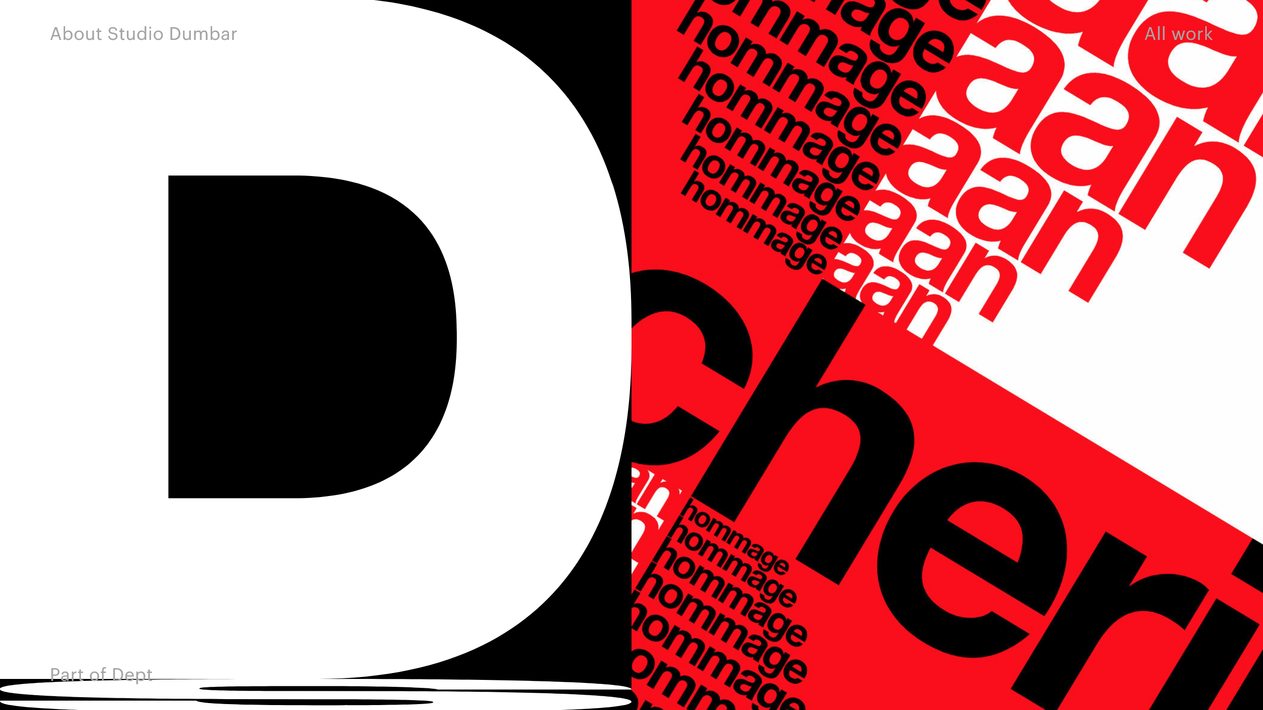
Studio Dumbar also enjoyed a portfolio shake-up last year, and the Dutch agency's penchant for warped and distorted type is brought to the fore with an arresting split-screen treatment.
On the left-hand side of the page two giant, chunky sans serif letters – an 'S' and a 'D', white out of black – are on a constant rotating loop, pushing and squeezing each other. Hover the mouse over and the letters change to numbers – a '4' and a '0', black out of shocking pink – to represent four decades in business since 1977.
Meanwhile, the right-hand side cycles between a selection of project imagery, often cropped to become quite abstract, with no immediate context until you click through to discover full details about the brief and Studio Dumbar's solution.
It's a bold, original approach that takes up a great deal of screen real estate with giant warped typography. And in doing so, reflects the agency's aesthetic and speaks volumes about its creative approach.
05. DesignStudio
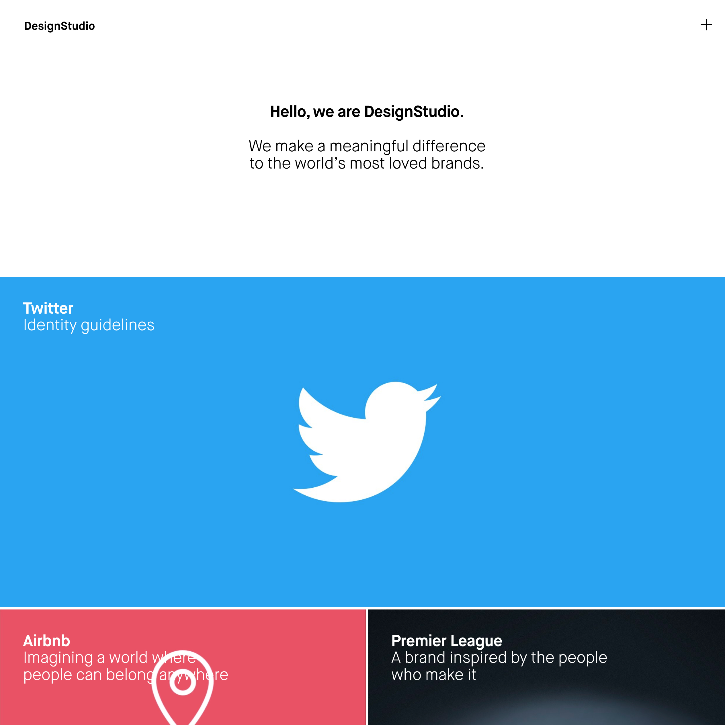
The cleanest, most minimalist above-the-fold approach on this list comes courtesy of DesignStudio – the agency that placed itself firmly on the global branding map in recent years with its high-profile rebrands of Airbnb, Deliveroo and the Premier League.
Before you scroll down to explore a grid of dynamic project imagery, many of which is eye-catchingly animated, you get a bold statement surrounded by a sea of pure white: 'Hello, we are DesignStudio. We make a meaningful difference to the world's most loved brands.'
Similar to Pentagram, once you click through from each hero asset on the homepage you can delve deeper into the thinking, and explore the various different touchpoints that each project involves. That confidence to put the spotlight on its mission statement definitely sets DesignStudio apart however, and no doubt those 11 words were agonised over for some time to get them spot on.
06. Superunion
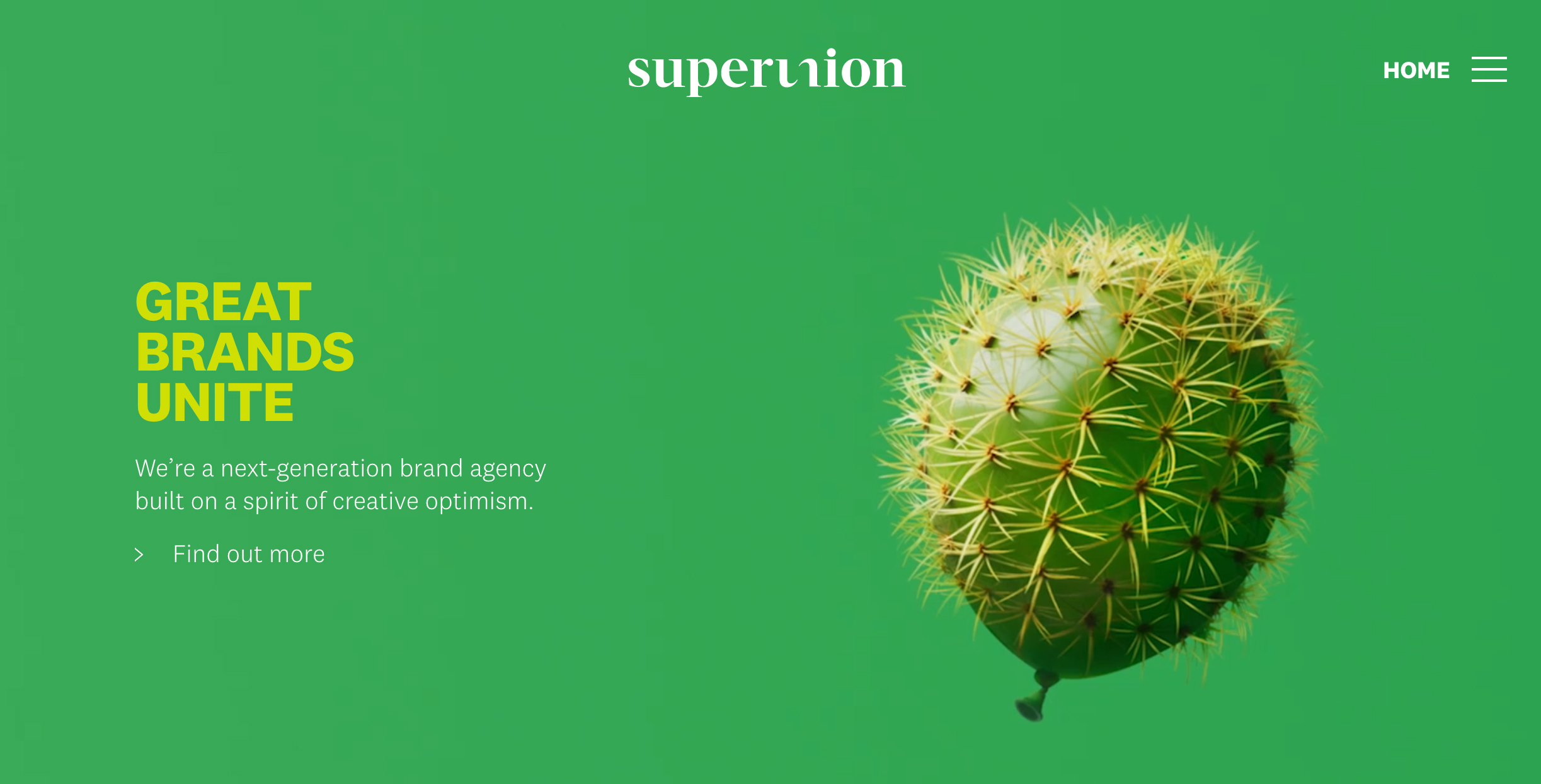
Our most recent inclusion is, we assume, an ongoing project for the mega-agency formed from WPP stablemates The Partners, Brand Union, Lambie-Nairn, Addison and VBAT, and officially launched in January 2018.
With 750 staff worldwide, this is the biggest agency on the list by some distance, and from a portfolio perspective, needs to collate the diverse legacies of five well-respected, long-established agencies in one place.
In its current form, Superunion's website is surprisingly clean and simple, putting the homepage emphasis on six hero case studies, as well as a handful of thought-leadership pieces.
Most distinctive is the surreal brand imagery that currently lives above the fold, created by artist Nancy Fouts. The campaign features unexpected visual unions between objects, such as a balloon and a cactus; a bunch of flowers and a hand grenade; and a brain and a perfume diffuser.
Where DesignStudio chose an 11-word mission statement, Superunion opts for visual metaphor to represent its birth in 2018: it will be fascinating to see how the agency's online presence develops over the coming months.
Related articles:

Thank you for reading 5 articles this month* Join now for unlimited access
Enjoy your first month for just £1 / $1 / €1
*Read 5 free articles per month without a subscription

Join now for unlimited access
Try first month for just £1 / $1 / €1

Nick has worked with world-class agencies including Wolff Olins, Taxi Studio and Vault49 on brand storytelling, tone of voice and verbal strategy for global brands such as Virgin, TikTok, and Bite Back 2030. Nick launched the Brand Impact Awards in 2013 while editor of Computer Arts, and remains chair of judges. He's written for Creative Bloq on design and branding matters since the site's launch.
