The most popular design software is full of tricks and shortcuts that can speed up processes or provide new creative possibilities. The way these features work can be far from intuitive, leading to them to go unnoticed by designers. Sometimes you may find that you have been using a piece of software for years with your own defined processes that work only for someone to reveal a neat little productivity-boosting feature that you never knew about.
Here, we round up six of our all-time favourite design tricks that users have discovered in Photoshop, Illustrator, InDesign and beyond, many of which have been around for years and will seem basic for those in the know. However, they still continue to stun designers who discover them for the first time. If you want to learn more tips, see our Photoshop tutorials.
01. Learn the tilde trick in Illustrator
Adobe Illustrator Tip - Hold down the tilde key (~) while you draw closed shape then let go. You’ll be amazed pic.twitter.com/4bMhIyUeX2February 13, 2014
Illustrator users continue to be bowled over when they discover this trick. The tilde key is the ~ symbol that often seems to serve little purpose other than to write a Spanish ñ. But in Illustrator, if you hold it down while using a shape tool from the tool palette, you can drag to create new instances of the shape that follow your cursor. This works with any of the shape tools in Illustrator, including the line tool, plus you can combine pressing the tilde key with Alt/Option, Shift/Command or Space to create interesting variations on the effect.
Add to this the ability to alter the stroke weight and colour afterwards, and a whole host of possibilities opens up for creating incredible designs from repeated shapes. Some designers have got so excited when they’ve discovered this functionality that they’ve set about creating whole galleries of creative experiments using it. This function depends on the layout of your keyboard. If you find the tilde doesn’t work on your keyboard, try the @ key.
02. Get a bird's eye view in Photoshop

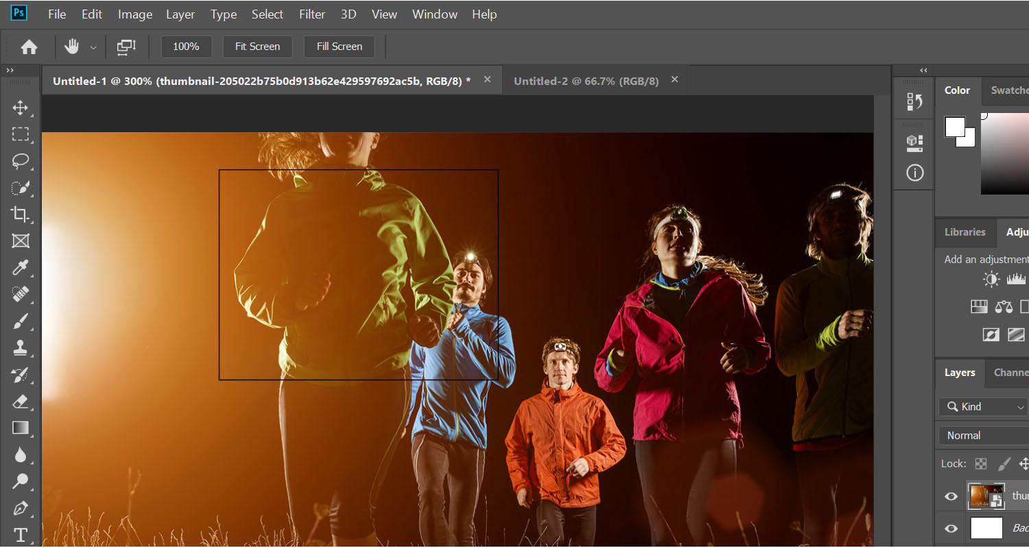
If you're working close in on an image at a high zoom level in Photoshop to carry out minute edge refinement or cloning, moving around the document can become a real pain, and it’s also easy to lose sight of the bigger picture developing. The bird's eye view feature is your answer. When zoomed in close, simultaneously press and hold the H on your keyboard, while you quickly left click and drag and the you’ll temporarily zoom out so you can see how the full image is looking.
A rectangular box will also appear, which you can then move around the image. Let go of the left mouse button and you'll zoom back in to the level you were working at before wherever you place the box. This provides an easy way to check how things are looking and to jump around different parts of the image for detailed corrections.
03. Sample any colour with the eyedropper

We all know you can use the eyedropper tool to pick a colour within the application in which you’re working, but many people still find it a revelation when they discover that in many of the most popular Adobe products, you can use it to pick a colour from any image showing on your screen.
Get the Creative Bloq Newsletter
Daily design news, reviews, how-tos and more, as picked by the editors.
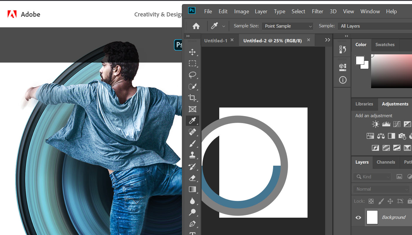
This allows you to sample colours from a website or from any file that you have open. In Photoshop, Illustrator and Lightroom, reduce the size of the application window so you can see the colour that you want to sample. Then select the eyedropper tool, hold down the left button and drag. You’ll see that a circle appears showing your current stroke and fill colour selections. Keep dragging the cursor right out of the application window and the eyedropper tool will allow you to pick any colour on your screen.
The trick also works in After Effects if you press the return or enter key instead of clicking the mouse button to make the selection. The trick can save a great deal of time and hassle for those who regularly take screenshots to sample colours that catch their eye on a website or elsewhere.
04. Easily identify fonts

So you’ve stumbled across an awe-inspiring landing page with a great attention-grabbing headline in a killer font that can’t quite place. Well, there’s no need to the source and find the CSS because there’s an extension for that. WhatFont is a simple Google Chrome extension that can quickly identify fonts on the page before you so that you can find them to use in your own designs. Just install the Chrome extension and an icon will appear in your browser to the right of the address bar. Give it a click when you see a font that you like the look of and you’ll then be able to hover the cursor over the font to identify its name quicker than you can say 'Lato'.
05. Generate multiple assets in Photoshop

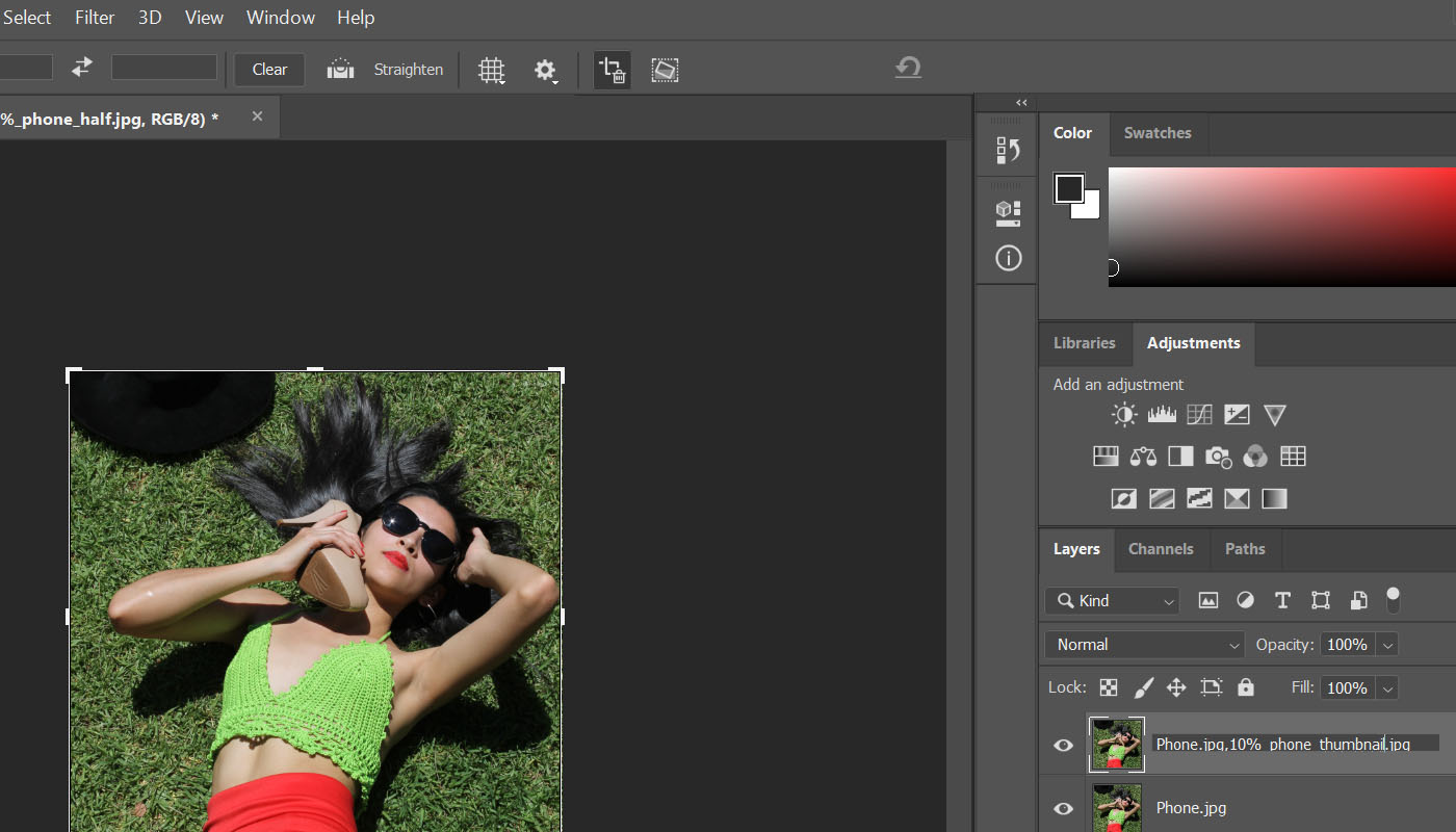
Sometimes a project requires a range of assets in different sizes and formats. Wouldn’t it be great to have a hassle-free way to create them instantly without having to interrupt your process? In Photoshop go to File > Generate > Image Assets, and Photoshop will automatically create an assets folder within the folder where your initial image is located. By changing the suffixes in the names of each layer within the project you’re working on, you can then automatically save layers in different formats.
Add the .jpg suffix, and a JPG file of that layer will automatically be saved in the assets folder. Add a comma followed by a percentage to automatically save a version in a different size, for example to create a thumbnail. You can create control layers, different file types including GIF and PNG, and put layers together in groups to create combinations. Everything updates live as you edit the image. It’s a huge timesaver if you’re designing something like a website that requires images in multiple sizes.
06. Perfectly align type in InDesign

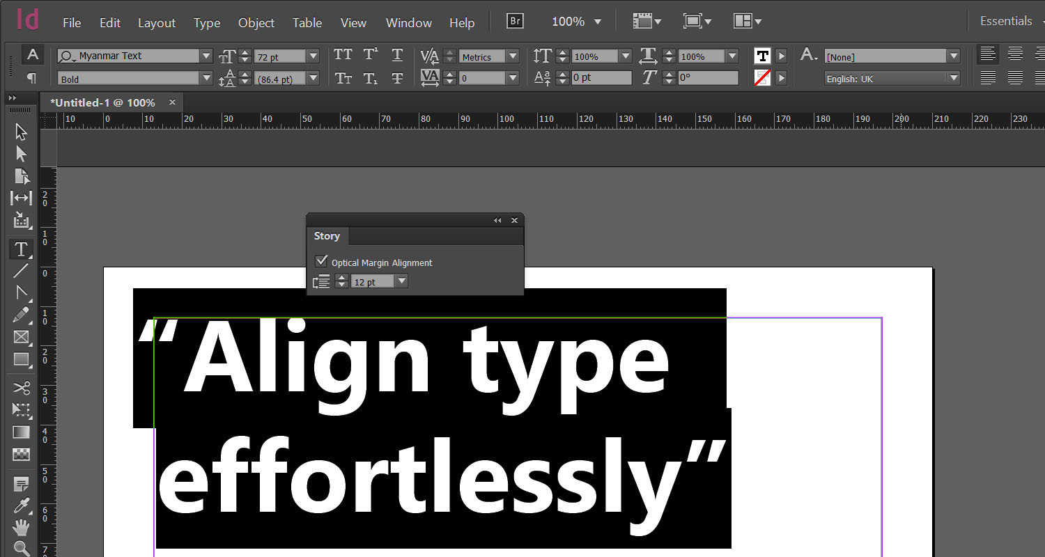
A huge number of aesthetic considerations go into creating great looking type, including hung punctuation. By slightly extending lines of text that begin or end with punctuation over the margin, you can improve alignment and avoid creating an uneven-looking column. Adobe InDesign can do this quickly and effortlessly with Optical Margin Alignment, a powerful but lesser-known feature that lives burrowed away in the curiously named Story palette.
Select your text, go to Window > Type & Tables > Story and check Optical Margin Alignment. Adjust the point size as needed and presto! A beautifully aligned margin. Punctuation plus serifs and the protruding edges of some characters have been pulled into the margin to make it look more even. You can set Optical Margin Alignment as a default for new documents if you check the box before you create a document.
Read more:

Thank you for reading 5 articles this month* Join now for unlimited access
Enjoy your first month for just £1 / $1 / €1
*Read 5 free articles per month without a subscription

Join now for unlimited access
Try first month for just £1 / $1 / €1

Joe is a regular freelance journalist and editor at Creative Bloq. He writes news, features and buying guides and keeps track of the best equipment and software for creatives, from video editing programs to monitors and accessories. A veteran news writer and photographer, he now works as a project manager at the London and Buenos Aires-based design, production and branding agency Hermana Creatives. There he manages a team of designers, photographers and video editors who specialise in producing visual content and design assets for the hospitality sector. He also dances Argentine tango.
