6 hot new websites to be inspired by
Feast your eyes on these stunning examples of stand-out web design.
Designing for the web is a constantly evolving art, which means that superb developments are always around the corner. And with innovations catered towards accessibility, sensational designs can be more than just visually pleasing.
To give you a taste of some of the latest web design inspiration to come our way, we take a look at six stunning sites that have pushed the boundaries. Read on to discover why they work.
01. Smashing Magazine
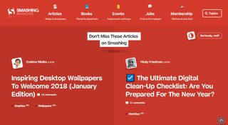
After 18 months of redesigning, Smashing Magazine launched its website in a big way. By not shying away from red, a colour associated with authority and strength, it chose to stand out against typical editorial websites that predominantly utilise white as a backdrop.
People often associate user experience with design but it's equally relative to the platform's architecture as well. Visitors make instant subconscious decisions that drive their opinion on the value and trust of a website, with a fundamental influence being loading speed. Because of this Smashing Magazine chose to move away from using a combination of WordPress, Kirby, Rails and Shopify. By moving to JAMstack: a methodology for front-end web development driven by JavaScript, reusable APIs, and streamlined markup, it was able to improve issues with usability, scaling and caching.
The company collects anonymous user behaviour data using Hotjar to assess pain points that expand beyond technical frameworks. Over time it hopes to remove all advertising from the site and focus on the readers.
02. Slack
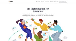
Slack, the fastest growing business application in history, updated its website in 2017 to better reflect its core values and company culture. Although the website is simplistic in structure, one of the first elements you notice are the vibrant, stylised illustrations from designer Alice Lee.
"Trying to capture the playful and collaborative aspect of the culture and given how warm and friendly the tone of these are, I wanted to push it beyond your standard 'people working at a desk' imagery," she explains. It's an interesting direction, as it conflicts a bit with the actual application's design, but better embodies the personality of the company. It raises the question: does the marketing site and application truly need to share fonts and design elements or can they both represent the same idea differently?
Get the Creative Bloq Newsletter
Daily design news, reviews, how-tos and more, as picked by the editors.
The Slack team tackled vital improvements like accessibility and decoupling asset dependencies between the web-based Slack client and the marketing site with a behind-the-scenes code overhaul. To accomplish this a new UI framework (spacesuit) was created. Slack's spacesuit framework is class-based and utilises reusable components and utility classes, reducing CSS load by 70%. It is inspired by the BEM naming convention where classes are in one of three groups – Block, Element and Modifier – and uses single letter namespaces.
03. Ubersignlanguage.com
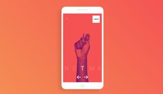
A strikingly simplistic approach to driving home Uber's integration of accessibility into the company culture; this website is a stellar example of design with restraint. A common approach to design is to explain value, but it's another to rely on interaction to educate. Uber has given the deaf opportunities to become drivers since 2015 by incorporating accessible technology directly into its app, such as flashing trip requests notifications instead of an audio prompt, text-only communication options, advance notifications to inform the rider that their driver is deaf or hard of hearing, and an additional request for the rider to enter their destination in advance.
It has now brought that another step forward with ubersignlanguage.com. You are prompted to enter your name and are greeted with common phrases like 'yes', 'no', 'turn left', and even your name. What makes this experience stand out is the visual feedback, or short form videos, which instruct you on how to sign each phrase. It shows you don't need long form clever copy in order to convey a strong message for your organisation. You just need to understand the goal of the end user and deftly provide solutions.
04. The Savvy Backpacker
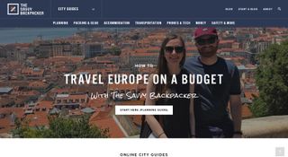
The Savvy Backpacker, a budget focused travel blog, follows husband and wife team, James and Susan, as they backpack to Europe.
They package online city guides as their key point of value and do a great job pulling that user pathway out of the main navigation and placing it next to their logo as a primary touch point. Each guide acts as an archive of past visits where they break down topics in great detail, like the best hotels, travel costs, and how to pack your luggage.
Ben Bush, co-founder of FHOKE, elaborates: "It really was that, a focus on the City Guides making them front and foremost on the home page, a dedicated landing page for them, and clear and separate navigation links that were quick to browse, too".
Travel blogging is a competitive space. To further establish themselves as a legitimate resource, they needed to do more than simply take nice photos and generate an incredible amount of content. They needed to guide visitors to the proper content intuitively.
Ben adds: "The key is not being too alternative and placing these in areas users are familiar with. If they have to search around for something, you've lost them already."
05. POM Wonderful
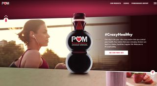
It would have been easy for POM to rely on its polarising bottle design or existing marketing campaigns to drive the digital experience and play it safe with the website.
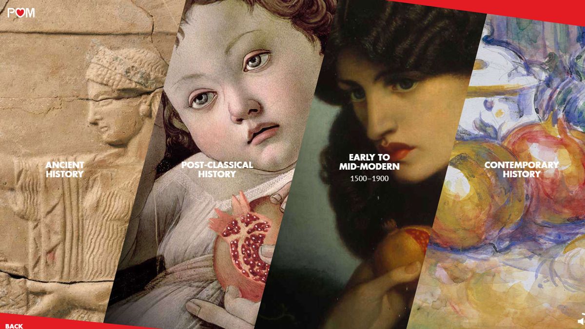
In an inspiring move, once you venture beyond the home page, it chose to create a museum-like experience, focusing on the history and art of the pomegranate. In the History section you will find fully voiced stories for 68 unique entries.
Andrès Conde, group director of Digital POM Wonderful, states on his website: "Understanding our target and their particular interests, drove a lot of the UX, especially as the site is also the first time the brand will sell the product online. We had to be able to weave the content-centric brand site with a functional shopping experience." The website is bold, colourful, and always seems to be in motion. The site was built as a single-page app that loads assets in the background to achieve smooth transitions between sections of the site.
06. Packwire
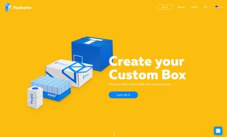
Packwire's marketing site, packwire.com, shows little restraint in its attempt to make a strong first impression. With its use of vibrant colour and scroll-powered movements, users are left with a sense of childlike exploration. Rounded buttons and playful hover interactions bolster this as you dig deeper. The real gem of this website is the service itself: the set up of your own custom made-to-order box. Who would have thought customising a box would be so intuitive?
But what exactly makes this intuitive? The separation of manufacturing information and design, for starters. On the left you have fulfilment details such as box type, size, quantity and price. The right side focuses solely on the creative implementation of your custom creation. This mirrors the hemispheres of our brains as well: left brain for logic and right for creativity.
Beyond that, the company also makes an attempt to understand the end user and their needs by offering two fully functioning non-checkout options: Get Link and Save. Get Link enables you to generate a bit.ly URL to share your custom work in progress, generate a .jpg or share on social media. Save enables you to save your work to resume later.
How does this help? It means creatives can generate mock-ups that can easily be shared with the client or stakeholder for approval, which then increases the likelihood of a purchase through the service. It's really well thought out as a service for the user.
Pay a visit to a sample net magazine box we had fun creating here.
This article was originally published in issue 303 of net, the world's best-selling magazine for web designers and developers. Buy issue 303 or subscribe to net.
Related articles:

Thank you for reading 5 articles this month* Join now for unlimited access
Enjoy your first month for just £1 / $1 / €1
*Read 5 free articles per month without a subscription

Join now for unlimited access
Try first month for just £1 / $1 / €1
