In the 21st century, for the first time in human history, more of the world’s population lives in cities than in the countryside. With this seismic shift from our rural roots, the disconnection between food production and food consumption has never been higher.
In response, food brands are increasingly making use of images that reinforce the farm-to-table process. In an era of health scares and horse-meat scandals, such imagery helps to instil trust in the product, plus a more general comforting sense that the world hasn’t changed that much, really.
In this post we’ve gathered together six great examples of the trend. If you’ve spotted others in the wild, please share them in the comments below.
01. Organic Valley

An independent cooperative of organic farmers based in Wisconsin, Organic Valley wanted to target a broader audience through mass grocery channels. This more mainstream shopper (mainly mothers with young children) had to be persuaded its products were the best for their kids, justifying the premium price.
Minneapolis agency Solve Ideas masterminded the campaign, which involved TV, radio, sponsorship and print, and used farming imagery to convey the core values of the brand. But rather than using bland, generic photography, they used shots of real farmers, identifying them clearly and emphasising their role as local suppliers to Organic Valley. This created a sense of trust and authenticity, which was reinforced by the handcrafted feel of the typography and overall design. You can see more of Solve’s work for Organic Valley here.
02. Whole Foods
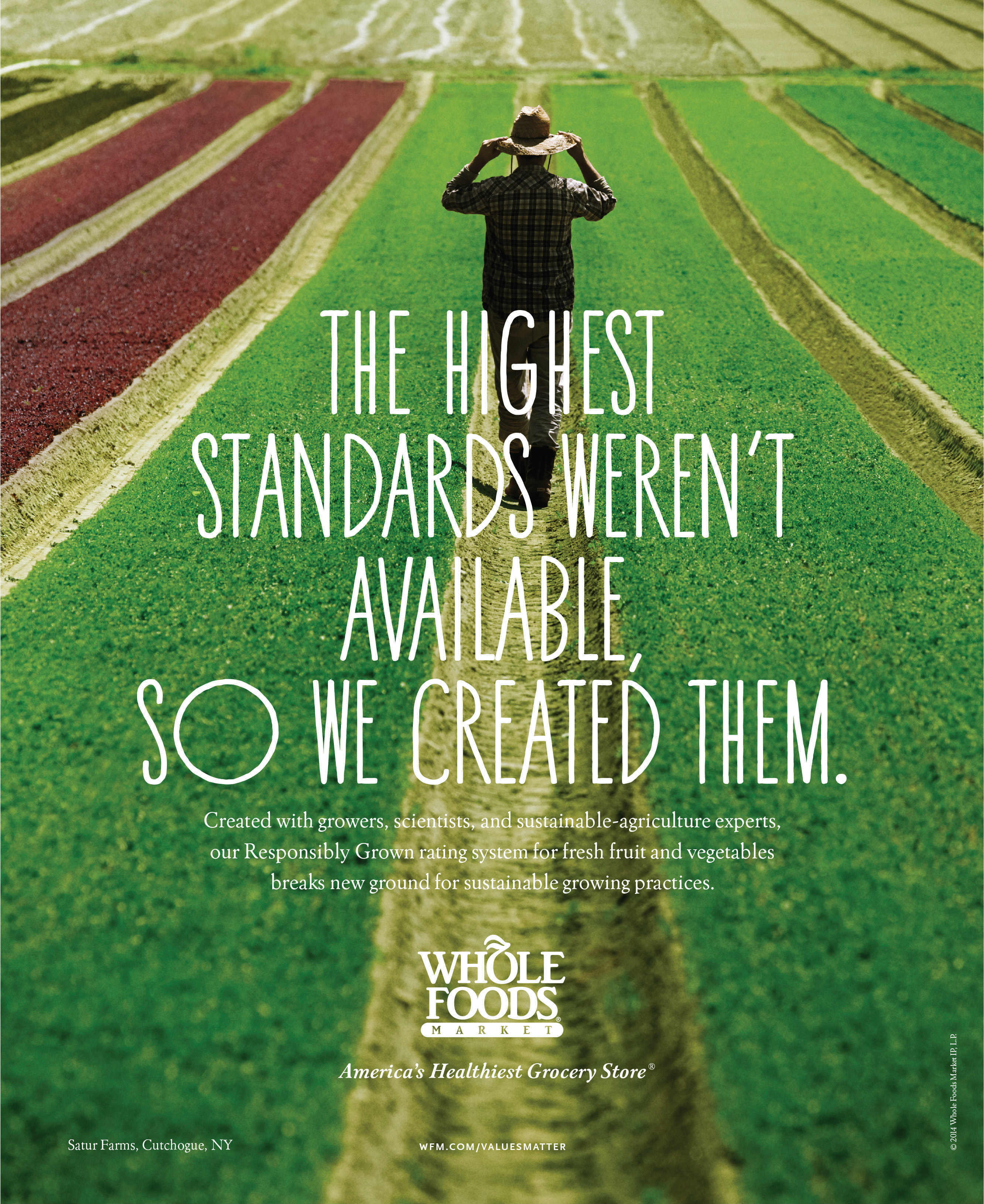
Until 2014, the American grocery chain Whole Foods was the only consumer product company in the Fortune 500 that had never run national ads. In that year, they tasked Manhattan agency Partners & Spade with developing a campaign for them across TV, print and digital on the theme ‘Values Matter’.
Highlighted the company's quality standards, healthy products and key milestones as a food industry pioneer, the ads made full use of colourful and eye-catching farm-to-table imagery, with some endearingly quirky typography to tie it all together. You can see more of the campaign here.
Get the Creative Bloq Newsletter
Daily design news, reviews, how-tos and more, as picked by the editors.
03. Chipotle
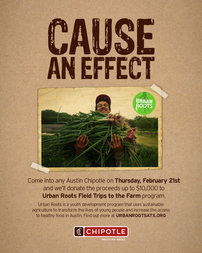
The ‘healthy fast food’ chain Chipotle Mexican Grill prides itself on its efforts to find "the best ingredients raised with respect for the animals, the environment, and the farmers". And it’s long made this connection between farming and the food explicit, most notably winning a Cannes Grand Prix in 2012 for a TV ad satirising factory farming.
Since the following year, they’ve also partnered with Urban Roots, an organisation that uses sustainable agriculture to transform the lives of at-risk youth in Austin, Texas. This gives Chipotle access to imagery that’s both strikingly authentic and infectiously upbeat, complemented here by a nicely crafted DIY-design ethic.
04. McDonalds
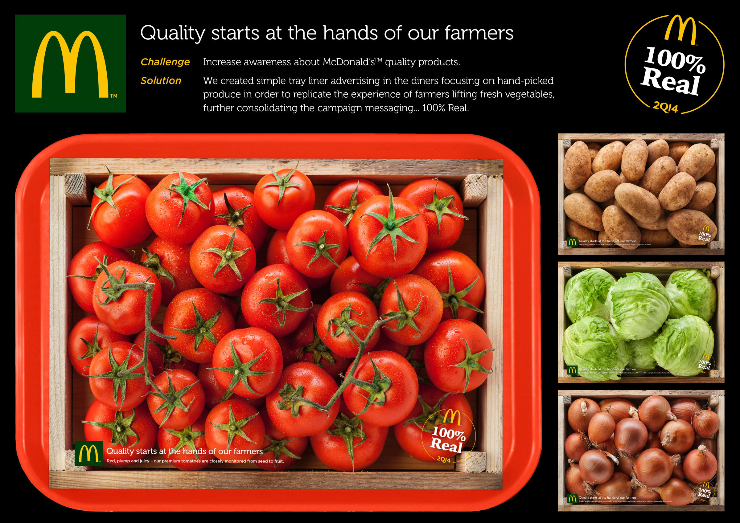
McDonald’s food may be high in calories and fat, but it’s still based on high quality, natural ingredients. That’s the message TBWA\ANG aimed to convey with their fully integrated campaign for the Maltese market, entitled ‘100% Real’. Given the level of public scepticism, photography was vital to convey the authenticity of the message, and serving up fresh, hand-picked produce in a McDonald’s tray made the point clearly and concisely. You can learn more about the campaign here.
05. Lightlife
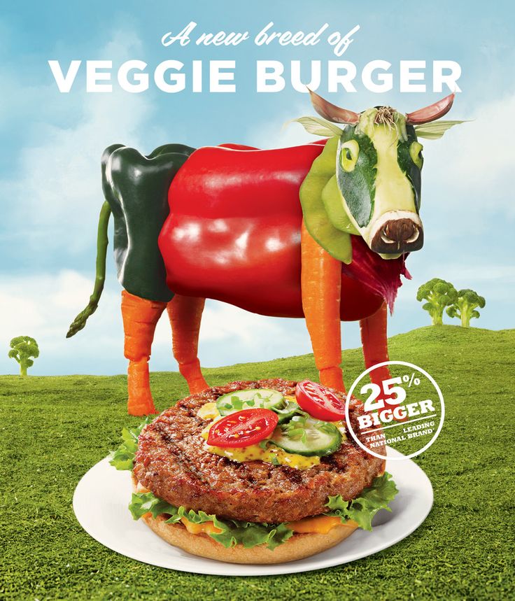
The whole discussion surrounding the healthiness and provenance of food can quickly become preachy and boring. So here’s a great ad that blows through all that with humour and a sense of the surreal.
Adam Levey teamed up with Venables, Bell & Partners to make this print ad, which finds an imaginative way to convey that Lightlife’s burgers are meat-free. Tying together both farming imagery and the finished product, this design looks simple at first glance but on closer inspection, it’s quite cleverly constructed. You can learn more about the campaign here.
06. Abbots Village Bakery
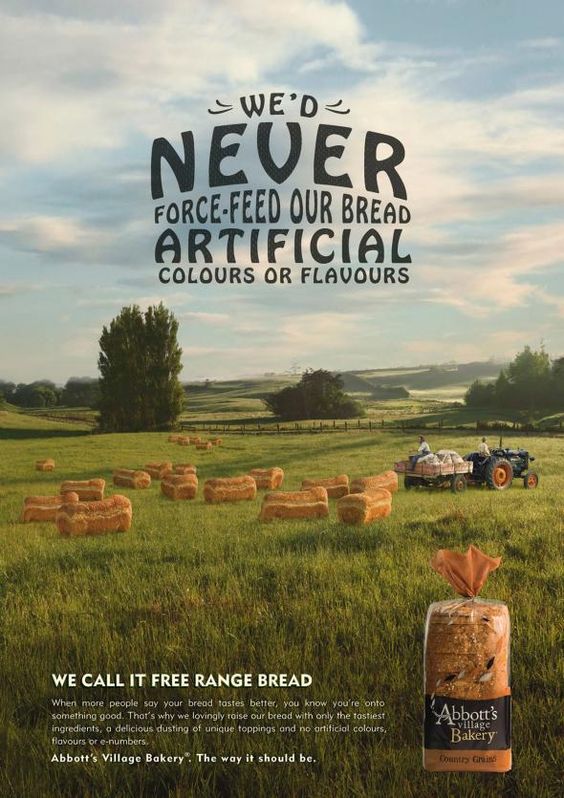
Another design with a sense of humour, this print ad for Abbott’s Village Bakery takes the idea of ‘free range’, combines it with bread, and runs off in a very surreal direction. Creative agency BMF deserves credit for a campaign that communicates the authentic goodness that goes into the homely, additive-free bread without surrendering to cliche.

Thank you for reading 5 articles this month* Join now for unlimited access
Enjoy your first month for just £1 / $1 / €1
*Read 5 free articles per month without a subscription

Join now for unlimited access
Try first month for just £1 / $1 / €1

Tom May is an award-winning journalist and editor specialising in design, photography and technology. Author of the Amazon #1 bestseller Great TED Talks: Creativity, published by Pavilion Books, Tom was previously editor of Professional Photography magazine, associate editor at Creative Bloq, and deputy editor at net magazine. Today, he is a regular contributor to Creative Bloq and its sister sites Digital Camera World, T3.com and Tech Radar. He also writes for Creative Boom and works on content marketing projects.
