When it comes to designing a website for a design agency, there’s no one-size-fits-all method to follow. Every agency offers a different range of services and targets a different type of client, so your design will vary depending on the unique needs of your business.
That doesn’t mean, however, that you can’t take some inspiration from what others have done.
So in this article, we look at six well-known agency websites, each of which takes an approach to presenting their projects that dovetails with their unique approach.
We’re not saying that everything about these websites is perfect, but each example does something particularly well. Read on as we highlight one or two areas of brilliance – and what lessons we can learn.
01. Happy Cog
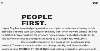
Founded in 1999, Happy Cog web design agency was a pioneer in the early days of the web. It was among the first to petition browser makers for what are now commonly accepted web standards. And that approach continues to drive the agency to create award-winning work, specialising in user-and content-focused design, to this day.
While many agency websites set out to dazzle prospective clients with eye-catching visuals and zippy animations, Happy Cog offers something different: a text-only homepage that explains its mission statement in 176 words. That’s a bold approach, but it manages to pull it off, for a number of reasons.
Firstly, and most importantly, it actually has something to say. While corporate mission statements are often a bunch of empty marketing speak, jargon and slogans, Happy Cog actually has a story to tell, and tells it well. Secondly, Happy Cog knows a thing or two about typography (it redesigned Fonts.com, for a start), and it has harnessed that here, with a clean, friendly and vintage-esque type style that instantly draw you in.
Get the Creative Bloq Newsletter
Daily design news, reviews, how-tos and more, as picked by the editors.
And once you click through to the website proper, there’s plenty more to read about. Many agency websites disappoint prospective clients because the ‘Projects’ section features just a few screengrabs and not enough insight into what the agency did on a project or how that helped the business.
Happy Cog’s case studies, though, go into a good level of detail, under headings in a sidebar such as ‘What we did’, ‘Content strategy’, ‘Development’, ‘Experience design’, ‘Front-end development’ and ‘Stakeholder interviews’.
While that kind of deep-dive is not always possible when clients have to approve everything you post, that should never be an excuse to simply not bother. It’s clear that Happy Cog has made the effort here, and it offers a good signal that it cares about what it can offer the businesses it works with.
Lesson learned: Mission statements don’t have to be empty and boring; if you have a story to tell, they can be a compelling way to attract clients. Lure them in further with detailed case studies.
02. DesignStudio
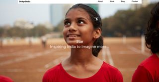
Founded in 2009, DesignStudio was created to fill the gap between boutique agencies with limited capacity for projects and enormous ones with impersonal bureaucracies. Now boasting offices in London and San Francisco, it currently offers rebrands, graphic design, film, photography, artwork, 3D and animation services to a range of global clients.
Photography is a great way to make an instant impact, and that’s the approach DesignStudio has taken with its website. Based around a series of beautiful full-width images, it works brilliantly at luring you into the individual case studies. And once you get there, the image-heavy approach continues – along with some choice words of explanation, of course.
Lesson learned: The saying ‘a picture is worth a thousand words’ may be a cliche, but that doesn’t stop it being true. And harnessing this concept, by making carefully chosen visuals the main star of your site, can pay dividends when it comes to visitor engagement.
03. Chermayeff & Geismar & Haviv
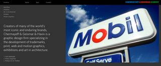
‘Keep it simple, stupid.’ We all know the KISS acronym from countless design talks and articles, but how often do we put it into practice? Well, you can see a good example on the website of Chermayeff & Geismar & Haviv.
Founded in 1957 by two Yale graduates, the agency has become a rock star of the branding world. Specialising in the development of trademarks, print, web and motion graphics, exhibitions and art in architecture, the global firm is perhaps best known for designing classic logos for the likes of Pan Am, Mobil, MoMA, NBC and National Geographic.
Although you might expect such a famous agency’s website to aim for a striking visual impact, there’s really nothing flashy or epic about its design. Instead, the agency has focused on presenting a huge amount of information in a simple and straightforward way.
So while Chermayeff & Geismar & Haviv’s portfolio of work is divided into just five categories (Identities, Graphics, Art in Architecture, Exhibits and Motion Graphics), there’s a ton of projects to be discovered by clicking through. Graphics, for example, sub-divides again into Posters, Print, Web, Books, Packaging and Iconic Images.
Once you realise how much work there actually is here, it becomes clear how cleverly the site’s design harnesses a simple structure to avoid appearing cluttered and intimidating.
Lesson learned: A huge number of case studies can be offputting to visitors. But a careful and methodical approach to categorisation can help make your site appear invitingly simple.
04. The Partners
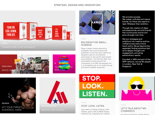
Founded in 1983 and part of the WPP Network, The Partners has studios in London, New York and Singapore. In its own words, “The Partners is more than our name”, and the ethos of the company is grounded in the idea of close collaboration to build brands over time. In practical terms, that means forming integrated teams that aim to be fluid in response to changing circumstances.
The Partners’ work, then, is multi-faceted and ever-changing. And so the aim of its website appears, essentially, to be to present itself as a dynamic and fast-thinking thought leader.
Showcasing a mixture of news, thought pieces and case studies – and everything in between – means that the kind of orderly system of categorisation shown in the Chermayeff & Geismar & Haviv site (above) probably wouldn’t work so well for The Partners.
Instead, it’s gone for a more modular, blog-style design for its main page. This enables it to present a variety of post types in a way that balances a sense of dynamism with a fundamental simplicity and orderliness (no crazy scrolling effects here).
Lesson learned: If you wish to present a diverse range of activities on your homepage, develop a modular design that does so without seeming cluttered.
05. AKQA
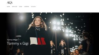
Founded in London in 1994, AKQA has offices in Europe, North America, South America, Asia and Australasia, across 18 major cities. Bought by WPP in 2012, it’s regarded as one of the leading full-service agencies worldwide for digital creativity. So you might expect its website to be replete with all-singing, all-dancing bells and whistles to show off its pixel-pushing smarts.
In fact, visit the AKQA website and you’re greeted with a fairly standard design based on a large series of hero photographs, rotating in a carousel.
But although there’s nothing unique about this approach, the design is still marvellously attractive, with elegant typography, well-chosen images, and enough whitespace to convey an air of relaxed sophistication.
The same style language is applied consistently across the site. This means that even a fairly run-of-the-mill news story about a new appointment transforms into alluring and attractive content.
Lesson learned: Want people to actually read what’s on your agency site? Then develop a strong system of design elements, and apply them rigidly throughout all of your content.
06. GBH
Founded in 1999, GBH (Gregory Bonner Hale, named after its founders Jason Gregory, Mark Bonner and Peter Hale) is a multi award-winning design and advertising agency based in London.
With clients including Puma, the British Royal Mail and Virgin Galactic, it’s won multiple awards and appears consistently on Computer Arts magazine’s list of best design studios.
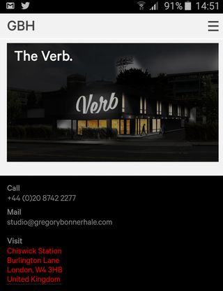
There’s lots to like about GBH’s website, but one thing above all stood out for us: how easy the site makes it to contact the agency. That might seem like a small thing. But as it’s one of the main reasons for an agency having a website in the first place, it’s worth getting it right.
It’s great then, that on our smartphones, the normal contact info in the footer is all clickable. This means you can phone GBH (via the phone number), email (via the address) or bring up a map to its offices (via the address) in a single click. That might not sound that important, but visit the average creative agency’s site and see how many clicks those things take you.
Lesson learned: Look after the small but important things, and the clients will keep flowing through your doors.
A note about agency sites and accessibility
Famous agencies are famous for a reason, and it’s well worth checking out their sites to pick up a few tips about how to create an attractive and alluring website. But that doesn’t mean that everything they do is automatically going to be perfect. And one thing that most agency websites can improve on (as can this very site) is their accessibility.
When used in the context of web design, accessibility means removing barriers to people with disabilities accessing your content. With around one fifth of the population having some form of disability, that’s a lot of people you could be potentially failing to reach, and so there’s a strong business case for building accessibility into your design process, as well as an ethical one.
Plus making your website more accessible often involves usability and visual improvements that make it more attractive to all users in the process.
There are many accessibility experts who will help you in this, such as consultant, writer and speaker Adrian Roselli. “My role as an accessibility consultant is not to tell designers and agencies they cannot do what they want, but to help them do what they want and make it accessible,” he explains.
But you don’t have to be an expert to judge how accessible your site is. “The simplest test for any site, and the one that can net the most potential accessibility issues, is trying to use a site without a mouse,” says Roselli.
“So just opening every page and trying to use it with only a keyboard reveals many issues that an automated tool will not catch (visible focus styles, tab order, things that are not really controls).
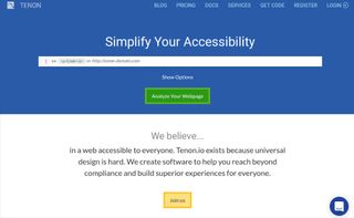
“Other tests can be as simple as killing images via the Web Developer Toolbar, removing the CSS, or just throttling the connection. There are also automated tools such as Tenon.io, which is typically built into a team's test-driven development process and gives the fewest false positives in my experience.”
The accessibility of agency websites is a big topic, and one we’re planning to investigate further on a more extensive basis – so we’d love to hear from you. Have you made a special effort to make your website accessible, or conversely, have you found unexpected obstacles keeping your website up to date in terms of accessibility? Get in touch via Twitter.

Thank you for reading 5 articles this month* Join now for unlimited access
Enjoy your first month for just £1 / $1 / €1
*Read 5 free articles per month without a subscription

Join now for unlimited access
Try first month for just £1 / $1 / €1
Tom May is an award-winning journalist and editor specialising in design, photography and technology. Author of the Amazon #1 bestseller Great TED Talks: Creativity, published by Pavilion Books, Tom was previously editor of Professional Photography magazine, associate editor at Creative Bloq, and deputy editor at net magazine. Today, he is a regular contributor to Creative Bloq and its sister sites Digital Camera World, T3.com and Tech Radar. He also writes for Creative Boom and works on content marketing projects.
