As shoppers increasingly seek out organic and healthy produce, the once quixotic notion of buying food from its source is now entering the mainstream. In the US, for example, the number of farmers markets has grown by 180 percent since 2006, to more than 8,000.
But while farmers markets are on the rise, there’s still plenty of room for them to grow. And the right branding designs can help drive visitor numbers, and the amount they spend, considerably.
In this post, we highlight some great examples of branding for farmer’s markets, all (suitably enough) from agencies local to the market’s area. If we’ve missed out your favourites, then please let us know about them in the comments below.
01. Des Moines
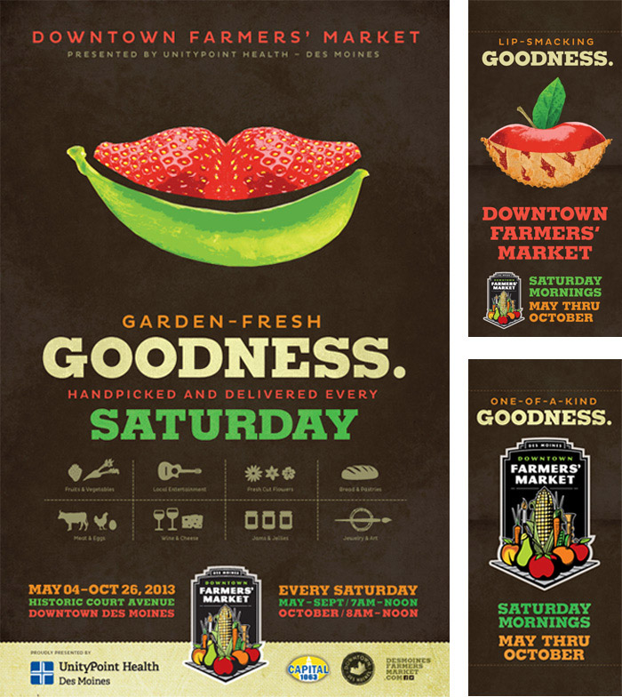
The Downtown Farmers’ Market is a Des Moines tradition, and communication agency Red Dot wanted to associate it in people’s minds with feelings of happiness. So they developed a visual theme around that idea, with fresh fruit and vegetables combining to form a series of subtle smiles.
It’s a childlike concept, but once with a sophisticated execution that avoids being patronising and instead draws you into the fine detail of the design. You can see more of the campaign assets here.
02. Sedgefield
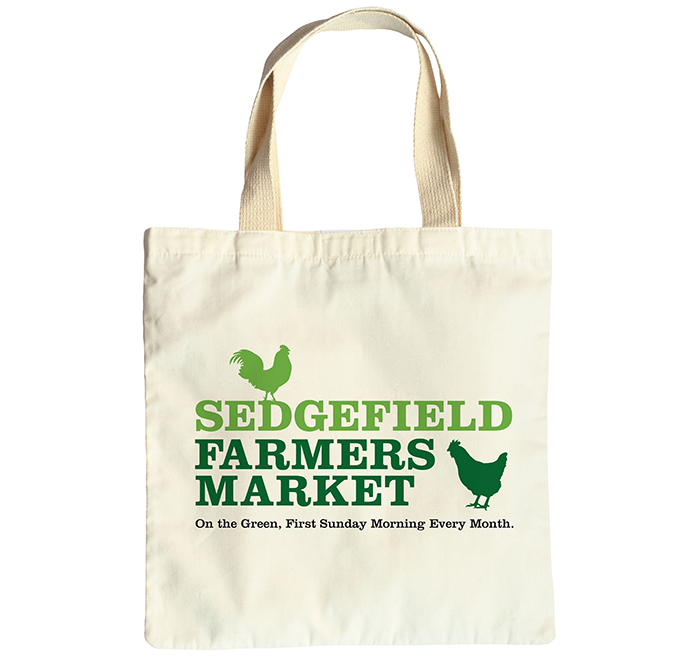
Neil Edmundson, an independent graphic designer and illustrator working in north-east England, was tasked with branding and advertising the relaunch of the Sedgefield Farmers Market, including a new logo, posters, banner, leaflet and social media assets.
We love the minimalist approach he’s taken with this bag design, which conveys all you need to know in an attractively uncluttered fashion. You can see more of Edmundson’s designs here.
Get the Creative Bloq Newsletter
Daily design news, reviews, how-tos and more, as picked by the editors.
03. Cleveland State University
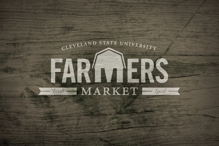
Originally created for students and faculty members alone, Cleveland State University decided to share its farmer’s market with the wider downtown community. So they asked Flourish to design a guerilla campaign to bring everyone to the table, so to speak, and this typographic logo is among the assets they created.
With the minimum of graphical fuss – there’s not even any food on show – this design conveys the concept simply and beautifully. You can see more of the campaign assets here.
04. Dallas
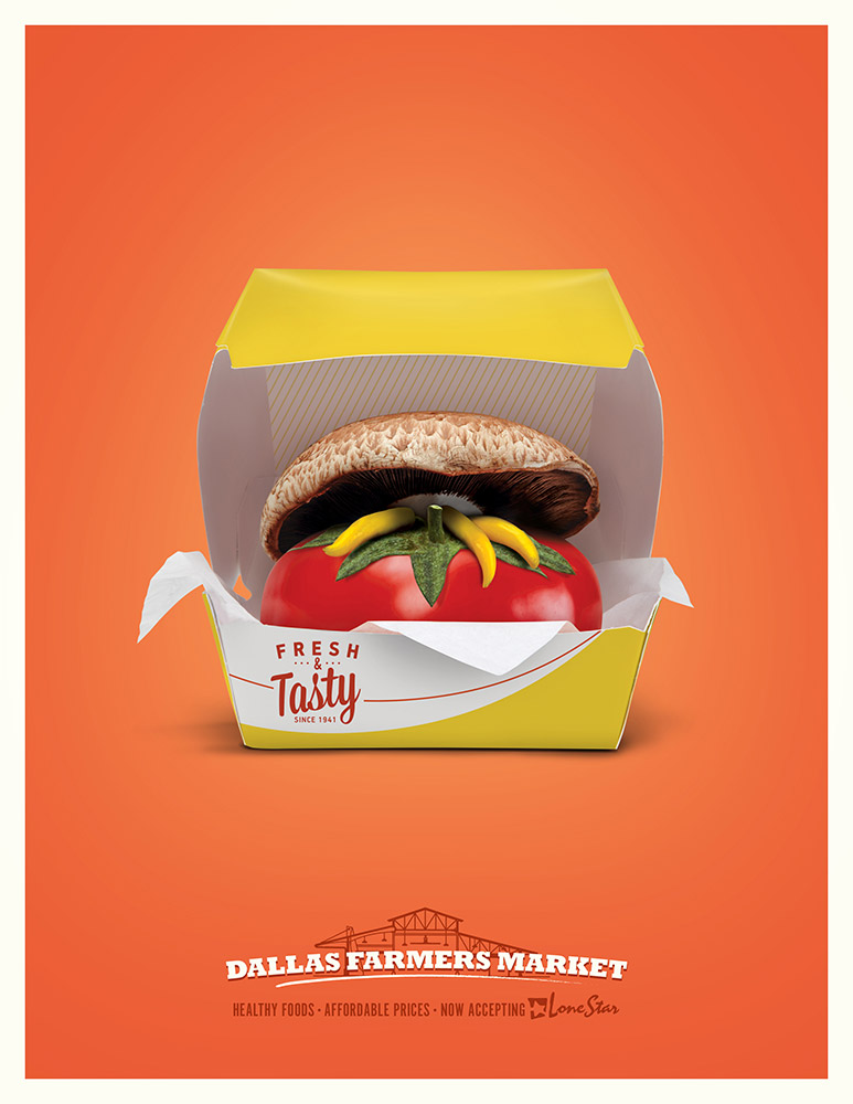
We all know we should eat more healthily, but the lure of fast food is a powerful one. With this visually inventive poster, Firehouse casts this internal struggle in a clever way that demands a second take.
The brief from Dallas Farmers Market was to challenge the perception that good, healthy food is more expensive than junk; the posters (which targeted low-income neighbourhoods) achieved this in an economic and fun way, and you can see more of the designs here.
05. Calgary

While you expect ads for farmers’ markets to feature fresh produce, there’s no rule to say you can’t be subtle about it. This clever campaign by award-winning Canadian agency WAX for Calgary Farmers Market presents what looks a snowy landscape, but is actually a collection of hens’ eggs.
The main image was shot by photographer Ken Woo, and the tagline ‘Fresh all Winter’ ties it all together beautifully. You can see a series of similar posters for the market here.
06. San Francisco
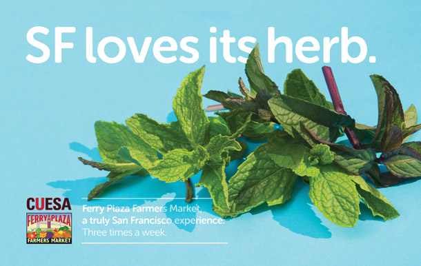
San Francisco’s An Otherwise Co deliberately set out to create a provocative campaign for the Cuesa Ferry Plaza Farmers Market. The agency chose words that are often used pejoratively towards San Francisco, and turned them on their head with a tongue-in-cheek sense of humour.
So a poster about SF being’ ‘Dirty’ showed soil-speckled vegetables. Another accusing the city of being full of ‘Fruits’ featured literal fruits rather than gay people. And the ‘Herb’ poster shown above presented not illicit drugs but a bunch of freshly picked mint leaves. You can see more of the posters in this series here.

Thank you for reading 5 articles this month* Join now for unlimited access
Enjoy your first month for just £1 / $1 / €1
*Read 5 free articles per month without a subscription

Join now for unlimited access
Try first month for just £1 / $1 / €1

Tom May is an award-winning journalist and editor specialising in design, photography and technology. Author of the Amazon #1 bestseller Great TED Talks: Creativity, published by Pavilion Books, Tom was previously editor of Professional Photography magazine, associate editor at Creative Bloq, and deputy editor at net magazine. Today, he is a regular contributor to Creative Bloq and its sister sites Digital Camera World, T3.com and Tech Radar. He also writes for Creative Boom and works on content marketing projects.
