6 digital trends we loved in 2018 (and 3 we did not)
Trends that shone this year, and the ones we're more than happy to wave goodbye to.
As the year draws to a close, we've been looking back at the trends that shaped digital design in 2018 and considering how they might develop in 2019. Put aside your Christmas designs for a moment, and read on to discover the stylistic movements that have prevailed this year within the main pillars of digital design. Here you'll find six key trends we're excited to see developing in 2018... and three more we'd be more than happy to see the back of.
We're talking about digital design here, but if you're after a look front end development and shifts in the web industry as a whole, take a look at our post on the big web trends for 2019. And to see the studios of the year, see Computer Arts UK Studio Rankings 2018.
6 trends we loved in 2018...
01. Bolder use of colour
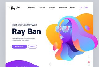
The vast digital spectrum enables designers to explore a wealth of intense, complex and bright colour combinations. Without the limitations of print there is more freedom to experiment, so we’re seeing a richer and greater variety of colour across digital platforms.
This is now being recognised and integrated into companies' identities, with brands often using bold, vibrant colour as a core part of their visual identity. Gradients are still one of the key current trends, appearing in logo design, illustrations and backgrounds. Inspired by nature and as a progression from flat colour, gradients bring depth and dimension within a modern realistic aesthetic. They can add layers of mood and emotion to a design, bringing visuals to life whilst also feeling new and fresh.
02. Abstract figures
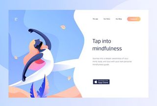
Abstract human shapes with big hair has been a popular illustrative style trend seen throughout 2018 and is showing no sign of going anywhere. These quirky characters help bring a human element into a digital space, often supporting the brand purpose and demonstrating functionality with bespoke personality.
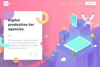
Icon-driven isometric illustrations are becoming more detailed, brought to life with gradients and monotone opacity layers, and being placed in a 3D space. This brings depth and realism to digital imagery, helping online spaces become more recognisable and relatable.
- Read more: The biggest illustration trends for 2019
03. Experimental typography
With design and technology working together, we’re set so see some exciting and fresh typographic approaches in 2019. Interaction, animation and transitions provide a new playground in which designers can push the boundaries of experimental type across digital platforms. This new creative layer can be used to further communicate brand purpose and personality. Creative typography is increasingly becoming a core part of an online brand presence, with aesthetic as well as functional benefits.
Get the Creative Bloq Newsletter
Daily design news, reviews, how-tos and more, as picked by the editors.
The capabilities of digital typography have progressed significantly. The advent of online font libraries and improved browser support for features enabling brand fonts to be used as real text means typography can now be scaled much more easily.
Whereas previously, a simple update would have required several steps and input from different specialists, there are now tools that make it much easier to realise the initial visual concept. This gives designers the freedom to be more imaginative with their solutions, in the knowledge that type can be easily refreshed and updated.
It would be great to see more brands embracing the possibilities of digital design next year, exploring creative typographic approaches and moving away from static designs.
- Read more: Typography trends for 2019
04. Intelligent animation
Animation is nothing new, but we're using it in increasingly intelligent ways. Animation now uses accurate movement with consideration of physics and a focus on detail. This increasingly realistic movement resonates much more with the audience as it helps make content more relatable and relevant, bridging the gap between digital and real world.
Animation appears in many forms, from vector iconography through to cinemagraphs and bespoke website transitions. Integrated animation is now used to enhance engagement, encourage interaction and convey substantial information succinctly. Whilst an all-singing, all-dancing animation will undeniably demand customer attention, it’s often the more subtle and smart use of movement that creates a lasting impact.
As digital designers we’re in a privileged position to be able to really make the most of animation – and it can be extremely helpful. When screen size is limited, animation allows us to cleverly hide and guide customers through a ton of content, drawing attention to important points.
05. Authentic photography
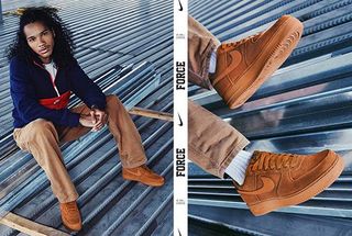
Gone are the days of over-polished, cheesy stock photography. We’re now seeing brands adopting authentic and genuine-feeling imagery that resonates more with their customers. Lifestyle images capture relatable scenarios that integrate a brand or product seamlessly into everyday life.

A rise in popularity of free stock libraries, such as Unsplash, are mutually beneficial, giving talented amateur photographers a platform for their work and a more diverse selection for creatives to find suitable images.
06. Digital reality
A trend that’s become evident through all areas of design, and looks set to continue into 2019, is the shift towards developing an online presence that’s reflective of real life. As more and more aspects of our everyday lives exist in a digital space (calendar, shopping lists, social life), it increasingly needs to feel like an extension of reality. Design elements are representative of how things work in the real work, meaning they feel more relatable and relevant. People respond to what they recognise, so these subtle design techniques are helping shape customer behaviour.
...and 3 digital trends we're happy to leave in 2018
01. Following the herd
In short, we're talking about unconsidered content. Everything should feel relevant and have a purpose. It’s about implementing the trends, techniques or approaches that are right for your brand, not just using them because they’re popular. For example, animation should only be used when the purpose has been carefully considered. Is the aim to enhance a brand message, convey a sense of movement or draw attention to something specific? And importantly, does it align with the brand tone of voice?
02. Natural textures
A trend seen in recent years has been the use of natural textures. Present in imagery and used for surfaces and backgrounds, this can bring tangibility and a real-life familiarity to a digital space. However, if it doesn’t doesn’t relate to the product or offering, it can look completely out of place and have the opposite effect in terms of believability.
03. Bland brands
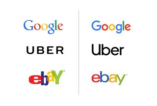
2018 was a big year for brands simplifying their identity. Sans-serif wordmarks have replaced busier logos, with the intention of having a clean sophistication that translates across multiple platforms. And whilst we're fans of uncluttered design, it would be a shame if this trend continued to the point where we start to lose the quirky individuality of a brand.
Liked this? Read these:

Thank you for reading 5 articles this month* Join now for unlimited access
Enjoy your first month for just £1 / $1 / €1
*Read 5 free articles per month without a subscription

Join now for unlimited access
Try first month for just £1 / $1 / €1
