5 web typography trends to look out for
What's going on in web typography today.
Earlier in the year we predicted the main typographic trends for 2018. Now, within web design specifically, we're seeing a few more themes starting to emerge.
Many web designers are becoming a little more experimental with their work, and exploring new treatments to better tell their stories.
In general, we're seeing headline typography becoming more integrated into the design of the page and looking less like it has just been plonked onto the canvas. Here are some examples of typographical treatments to look out for. Creating your own site? Consider using a website builder. And to make sure your site looks as good as it could, make sure you get your web hosting right.
Article continues below01. Typographic chaos
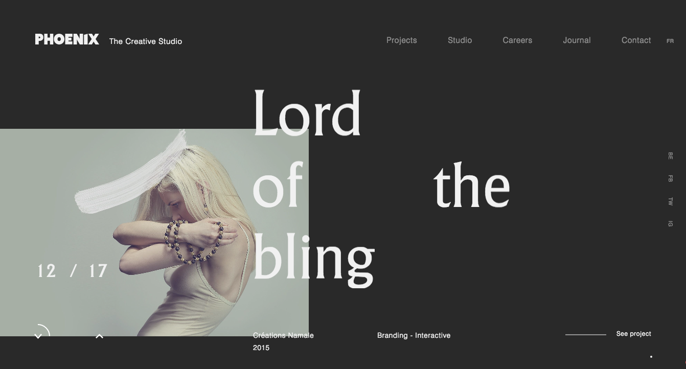
This trend kicked off a while ago and is still going strong. It sees web designers taking a more chaotic approach to the composition of typography on the page, splitting words and even letters to offer a more interesting look. An unconventional arrangement can pique the reader's curiosity.
02. Crop-and-cut type
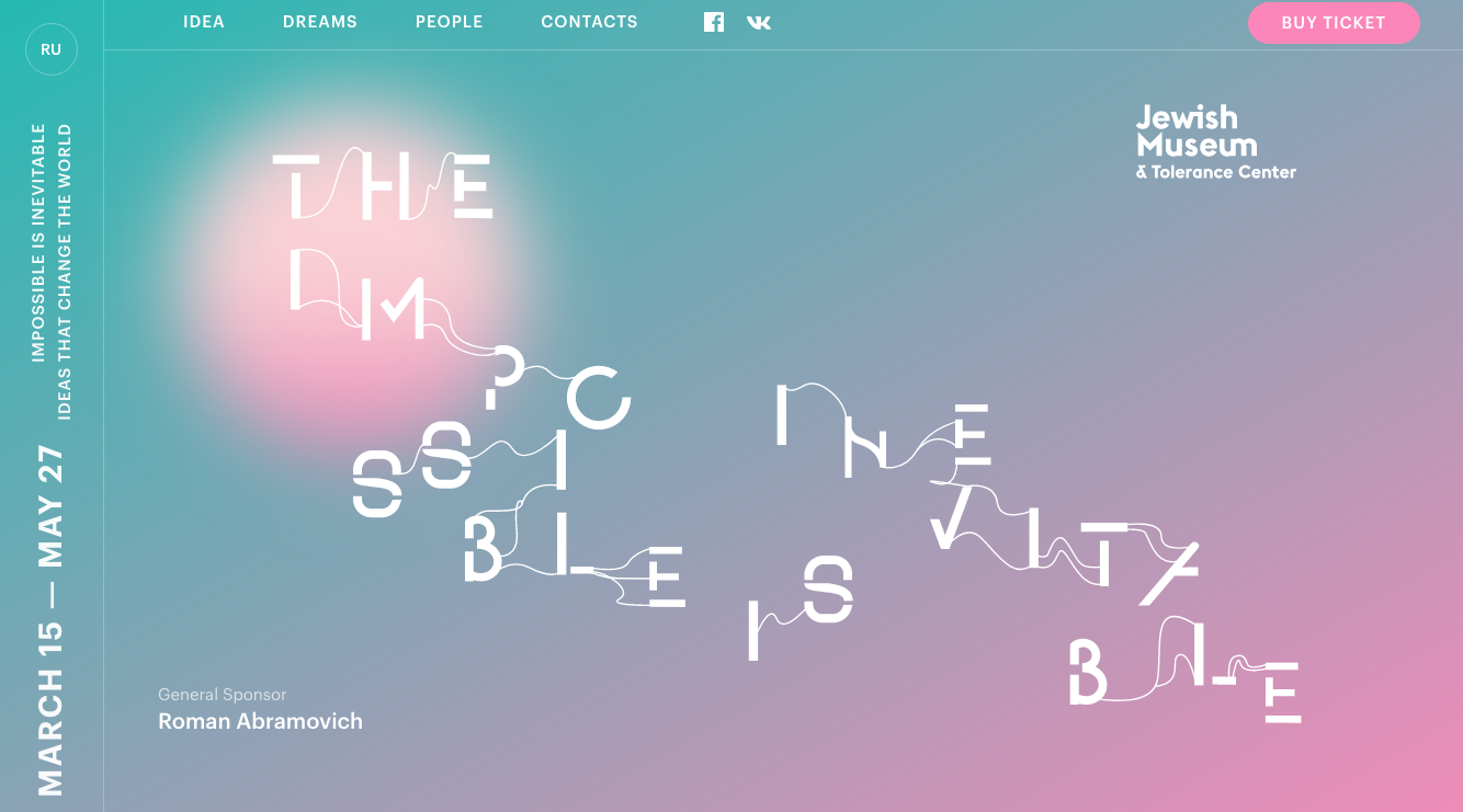
With the aim of creating interest and a more unique typographic design, designers are cropping or cutting letters up within a word, whilst leaving just enough to ensure the letters remain readable. There’s a really interesting neural behaviour that means humans can still read words, even if a number of characters are missing (take the game of Hangman, for example).
03. Negative space
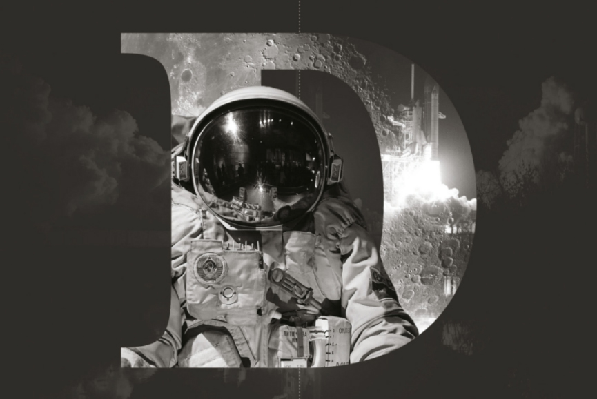
Integrating artwork into your typography is a wonderful way to make your text stand out. One great technique is to enable graphical elements to pop out of the negative space within the type itself, creating a dimensional space.
In a similar vein to the image above, YouTube displayed an animation within the title characters of each story in its Greatest Stories Retold project. The homepage showed a number of different animations within the headline, as a taste of what to expect.
Sign up to Creative Bloq's daily newsletter, which brings you the latest news and inspiration from the worlds of art, design and technology.
04. Graphical type
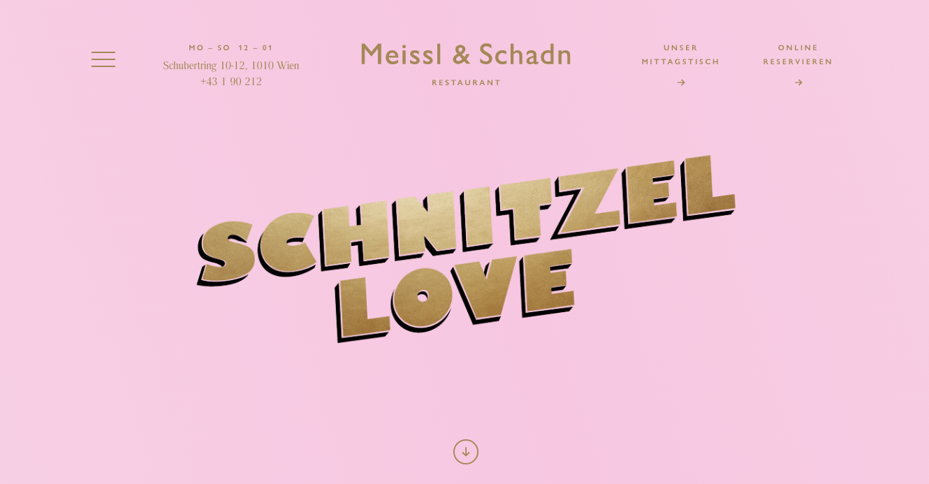
Enhancing flat typography graphically gives any textual elements more impact on the page. It might be that your typography is made furry or even paint-like. The objective here is to make your typography more like an object, as opposed to a character.
05. Dynamic typography
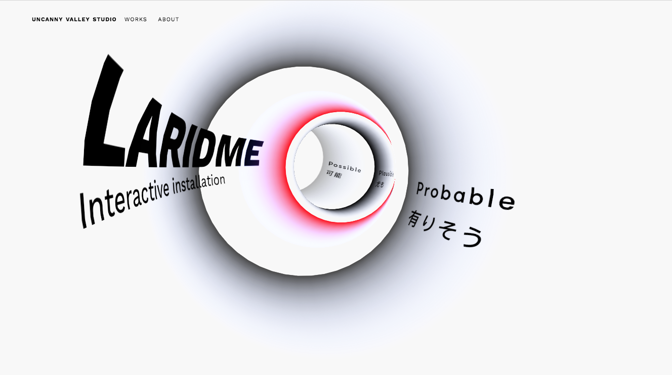
Here's another trend that's been around a while but is still going strong: several campaigns and sites have combined typography with motion to create a more dynamic effect. For a taster, take a look at our roundup of the best kinetic typography.
This keeps viewers engaged by forcing them to read quickly to follow the message, and keeping their focus entirely on the words that are displayed.
A variation of this seen on websites is typography that moves and shifts on scroll, or in response to the user's mouse movements.
Inspired by the typography others have used? Save examples for later in a cloud storage option.
This article was published in issue 271 of Web Designer magazine. Subscribe here.
Read more:

Carl is a creative who has been in the web industry for more than 14 years. Blessed with a passion for UX/UI design, Carl has been awarded Creative of the Year for his contribution to the industry. His diverse portfolio of past clients includes Facebook, Twitter, Unity Technologies, Ordnance Survey, and beauty brand Lush. He has written features for Web Designer magazine, and currently heads up the Salo Creative agency, which he also founded.
