5 web design trends and how to prototype them
Check out these top 5 web design trends and learn how to build them in high fidelity prototypes.
Material design, card layouts, illustration and more – the first half of 2016 has thrown up some strong trends in web design. Here at Justinmind, we recently conducted an online survey into the biggest design trends of the year so far, and among the avalanche of responses and comments 5 key trends emerged. Let’s take a closer look at them and how to mock them up with a prototyping tool.
01. Material design

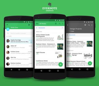
Before 2014, the world was flat, at least in design terms. Then Google introduced their paper-and-ink inspired visual language ‘material design’, and web designs suddenly began to look weirdly… tactile. Since then, skeuomorphic effects such as padding, depth, grid layouts, responsive animation and transitions have swept across not just Google powered interfaces, but across the web: check out these 10 examples of inspiring material design websites.
These sites take material design above and beyond, but a great place to start getting to grips with the visual concept is with Google’s humble little floating action button: it animates organically onto screens upon opening an app or web page, and it’s hugged by shadow, giving the impression of floating above the surface of the page. This illusion of spatial veracity doesn’t just look pretty; it also “ helps users quickly understand affordances”, as Google puts it. “Yet the flexibility of the material creates new affordances that supercede those in the physical world, without breaking the rules of physics.” So really, material design is like real life, only better.
How to make a material design prototype
Creating a floating action button with a prototyping tool is simple. There are a number of tools that we recommend for this design. For example, Pixate and Marvel allow you to add interaction to pre-designed images. However, if you need to create the button from scratch, Justinmind gives you more options.
You can use an Ellipse UI element to create the circle-shaped floating button icon, changing the background color, padding and shadow. You can also add text directly to this widget so that you can add the ‘plus’ symbol to the same component.
When it comes to adding behavior to the icon, remember that the floating action button should represent only the most common action on the page. Add a trigger or navigation event to the button to make it interactive. With a trigger event, something will happen on the same screen when the user taps on the floating button. With a navigation event, the user will be taken to a separate screen.
Get the Creative Bloq Newsletter
Daily design news, reviews, how-tos and more, as picked by the editors.
For more tips on building the floating acting button, see Google’s requirements here.
02. Flat design

Every hero-trend must have its nemesis, and so it is with the next top trend of 2016: material design’s opposite, flat design, which came in one percentage point behind material design in our top trends survey.
Flat design rejects all the skeuomorphic pretensions of material design, instead demonstrating a digital aesthetic characterized by bright colours, sharp edges and a lack of depth, or ‘flatness’. Flat design has proved incredibly popular with advocates of minimalism in web design, as it cuts the clutter and rejoices instead explicatory icons, ‘flat illustration’ and a celebration of the separation between ‘real world’ and ‘screen world’.
Find out more in this Beginner’s Guide to Flat Design
All of which combines to make flat design websites easy to understand and navigate, and so makes it a good design option for sites that are focused on content, or where clear navigation hierarchy is important.
How to make a flat design prototype
Designing flat design involves pays attention to the visual hierarchy. UI elements that allow us to create acres of open space, strong colours and two-dimensional/flat edges are what we’re going for here. Pay attention to the white space as well as the positioning of elements to create a cohesive design.
Atomic design elements allow you to create minimalist UI elements in an interface, perfect for flat design. Make sure that you keep those edges crisp with bright colours and borders that match the background colour. SVG UI elements are great because you can easily change the background colour and scale them to fit your design on multiple screens. Use grids and align tools to assess the spacing between UI elements.
Sketch offers fantastic UI kits for your flat design needs and UX Pin’s E-book on the evolution of flat design is a great place to start designing.
03. Card layouts

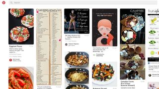
There’s little doubt that cards are the top design pattern of 2016, and just shy of 30% of our survey respondents confirmed this. Sites such as Pinterest are based wholly on card layout, and more and more are jumping on the bandwagon, including Facebook, Spotify and Google. So what exactly is the card layout and what makes it so special.
Card layout is as simple as it sounds. Onscreen information is presented in the form of cards that can be stacked, flipped over to reveal ‘the underside’, grouped then spread out, and vice versa. This allows for the non-hierarchical organization of lots of information, independent of screen or device use.
This flexibility has become vital as device use has multiplied and the days of standard screen sizes or shapes have long gone. Cards facilitate the design of responsive sites that adjust to screen size without losing their design cred.
How to make a card layout prototype
Container design is typically used to create the card trend design. It is essentially a category of cards grouped in a horizontal format. If you’re using Justinmind, build a card design with dynamic panels – container widgets – and create a grid for your cards in the canvas. This style is very responsive and can therefore be easily adjusted for different screen dimensions. By using multiple screens and linking events in your prototyping tool, you can create responsive design for your cards. Use templates to reuse content through your screens to avoid rework. Note that whitespace is also important here – avoid clutter in this UI.
Tip : when your cards are links to additional content: use mobile gestures for mobile card design and transition effects for web card design
04. Parallax scrolling
The parallax scrolling trend really gathered speed in 2015 and has shown no signs of slowing down since then. In basic parallax scroll, the site’s foreground moves at a different speed to the background, tricking the eye into seeing a 3D effect. These days, that baseline effect has been taken above and beyond by sites that play with multiplane animation and multi-directional scrolling to really expand the experience. In all well-done parallax websites, the design gains a certain depth and the foreground pops out, focusing users and creating a sense of narrative progression as they scroll. The parallax has certainly come a long way since its first appearance in the arcade game Moon Patrol, back in 1982.
How to make a parallax scrolling prototype
Prototyping parallax might sound scary at first, but fear not! There are plenty of tools available that offer UI kits and libraries with parallax-specific elements, such as Axure and Adobe Muse.
When prototyping parallax in your web design, you’ll need to design the website’s UI and then add your parallax tools/elements to the design. Once you’ve got a background image and the visual elements you want to add to the UI inside a container, you can start to add the parallax components into the equation. Adding pinned elements, applying varied scrolling speeds, prototyping sticky elements and scroll and creating floating menus will ensure you have an engaging site full of depth. If you’re creating parallax from scratch, you can use the pinned top, 30 per cent scroll speed and the 50 per cent scroll speed parallax widgets.
Tip: Don’t overdo it with parallax – just use it when it makes sense. Parallax is a great way to harness Calls to Action (CTA) and guide users towards the next step.
05. Illustration

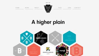
This trend might come as a surprise to some, but illustration has proven a force in 2016 as designers look for ways to avoid the dreaded stock photo. Illustrative web designs can range from a specially sketched font and custom vectorials, to 3D illustrations and entirely illustrated backgrounds. Whether they’re folksy in style or strong graphics, custom illustrations mean designers can have greater creative control over the branding and messaging of their site; illustration also appeals to the imagination, taking flights of visual fancy while reinforcing a site’s uniqueness.
How to make an illustration prototype
The recent surge in prototyping tools that are compatible with design tools, such as Photoshop, Illustrator and Sketch, means that designers can now easily leverage their work to include their designs in their prototypes. This type of integration also means that you can turn your static images into interactive, stunning prototypes without compromising on the visual.
Atomic design in prototyping tools means that it’s easy to edit and adapt existing images to complement the user interface because they can be broken down to their most basic elements.
Another great way to go about incorporating unique illustrations in your designs is by using Scalable Vector Graphics (SVG). SVG is an XML-based vector image format for 2D graphics that has support for interactivity and animation. The advantages of designing with SVG are numerous, but what really makes them stand out is that their ability to be edited in many different tools, including Photoshop and certain prototyping tools like Justinmind.

Thank you for reading 5 articles this month* Join now for unlimited access
Enjoy your first month for just £1 / $1 / €1
*Read 5 free articles per month without a subscription

Join now for unlimited access
Try first month for just £1 / $1 / €1
