5 ways type can define brands
Discover how bespoke typography can help shape a brand’s personality.
Choosing the right typeface is a crucial part of the logo design process, but when it comes to defining the unique characteristics of a brand, it can also play a much more subtle role in shaping its personality and tone of voice.
For smaller brands, this tends to be as simple as selecting an existing typeface that’s best suited for their particular needs. But the ultimate solution, for those with the time and budget to do so, is a bespoke font tweaked to perfection.
Studios such as Dalton Maag, Commercial Type, Fontsmith and Hoefler & Co have extensive experience in developing bespoke typefaces for brands, and many of their clients have honed their personality across many different platforms as a result.
Read on to discover how bespoke typography has enhanced brands across five different sectors…
01. Motion-friendly type for broadcasters
On-screen branding provides a particular challenge for bespoke typefaces, as motion graphics come into play alongside all manner of other uses, from billboards to corporate stationery.
Brody Associates’ highly distinctive typeface for Channel 4 is a great example of the versatility required to convey personality in this field. Within the same family, it combines a functional text face (Chadwick) with a highly expressive display version (Horseferry).
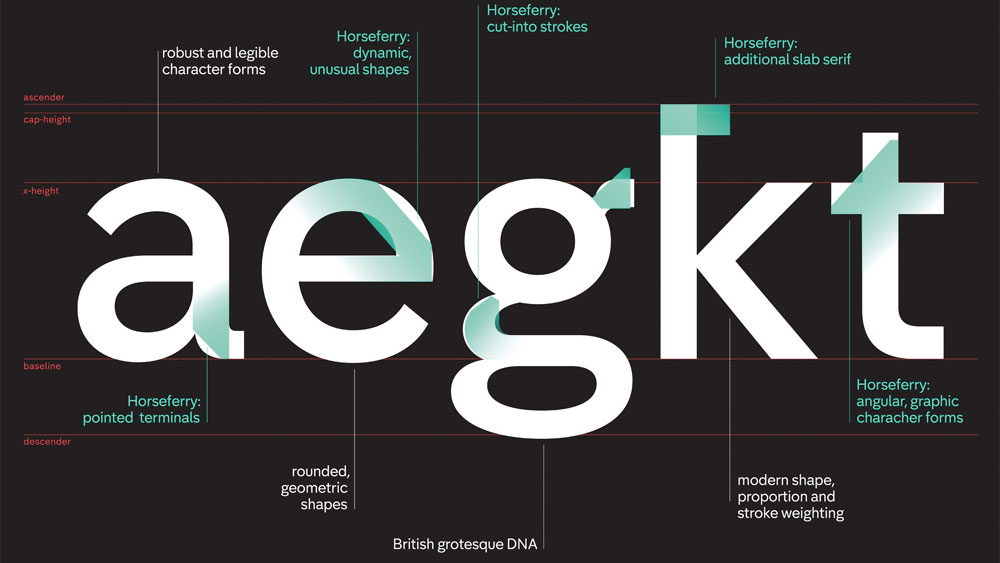
Horseferry incorporates elements from Channel 4’s logo into the letterforms, with highly unconventional, striking results that can only function at large sizes, such as for advertising. Chadwick follows the same basic structure, but calms things down to help with legibility, particularly when used to communicate information on screen.
Get the Creative Bloq Newsletter
Daily design news, reviews, how-tos and more, as picked by the editors.
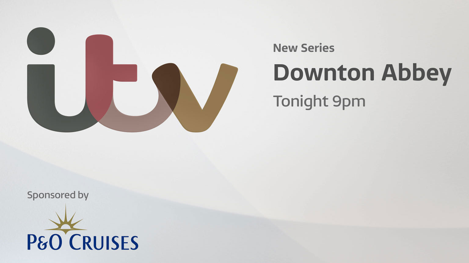
For ITV, Fontsmith was given the task of translating the smooth, flowing curves of the broadcaster’s logotype into a whole typeface family to be used across the brand, including TV, online and on-demand applications.
The resulting typeface is detailed and wide proportioned, with a subtle calligraphic feel. According to Fontsmith: “When you take a pen off the page when writing, you get the sense of a rounded ending to the stroke or line creating a subtle, modern and bouncy script tone of voice.”
02. Standout typography for packaging
When it comes to brands that express themselves on packaging, on-shelf standout becomes a critical factor to consider in a typeface. And where global brands are concerned, different language support also comes into play as that packaging needs to cater to different markets.
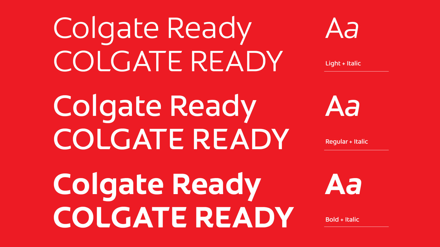
Another Fontsmith case study is Colgate, in collaboration with The Partners and Red Fuse Communications. The brief was to reflect the “emotional and tonal dimensions” of the brand through a Roman/Latin typeface in three different weights, and ‘Colgate Ready’ was the result.
Colgate Ready was translated into Cyrillic, Eastern European, Devanagari and Thai, with a consistent stroke weight, x-height, cap height, width proportions and terminals.
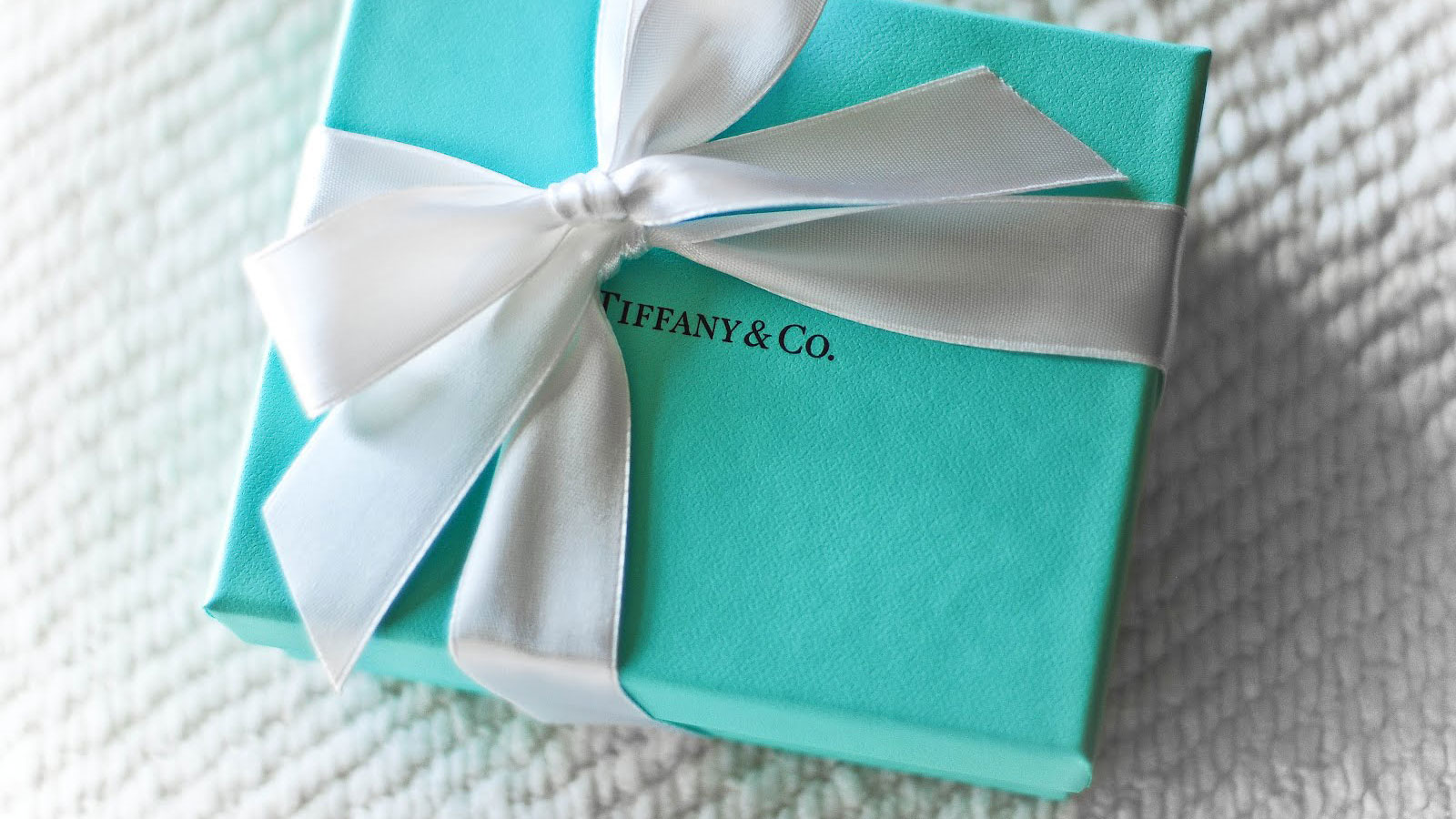
At the other end of the scale, in the luxury market, Tiffany & Co’s unique typeface, created by Hoefler & Co, is used sparingly on the jeweller’s minimalist packaging, making those iconic duck-egg-blue boxes even more desirable.
03. Flexible typography for retail
Another fascinating application of bespoke type is in the retail space, where applications range from signage and wayfinding, to point-of-sale displays, to own-brand packaging.
Dalton Maag was commissioned to create a bespoke font for Lush, translating the boutique cosmetics brand’s distinctive chalkboard-style handwritten signage into a more neutral and contemporary typeface.
“Every letter had two alternate versions, while the most-used letters had three alternates,” explains designer Riccardo de Franceschi. “On top of these we created ligatures, and selected them according to not only frequency of use, but also the way the Lush handwriters write.”
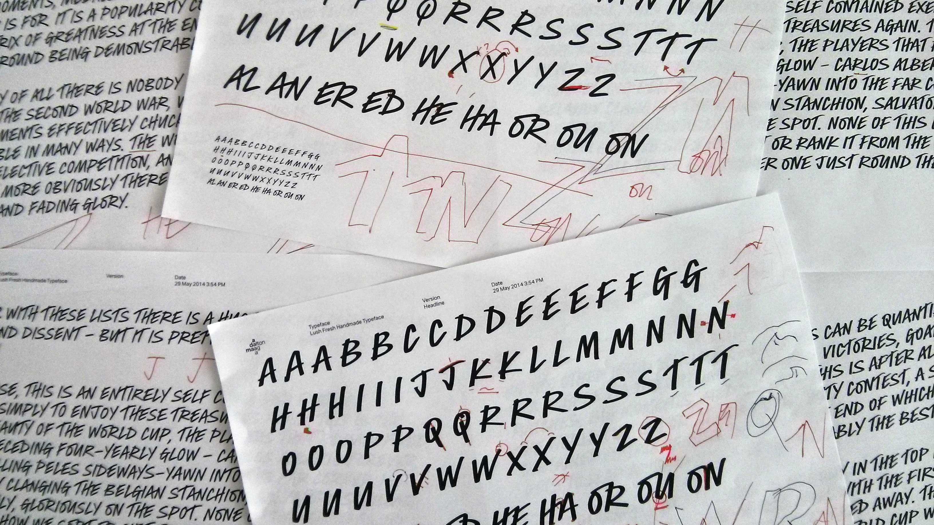
Lush’s typeface helps develop its boutique, artisan brand voice, but larger stores need to tread a finer line between personality and functionality – such as Fontsmith’s bespoke typeface for Sainsbury’s, which uses the foundry’s own FS Lola as a starting point.
“The new font needed to successfully stretch across a wide range of channels including above the line marketing, online, publications, packaging, in-store services, in-store navigation and in-store pricing,” reveals the agency. “It had to work from 400pt, all the way down to 6pt.”
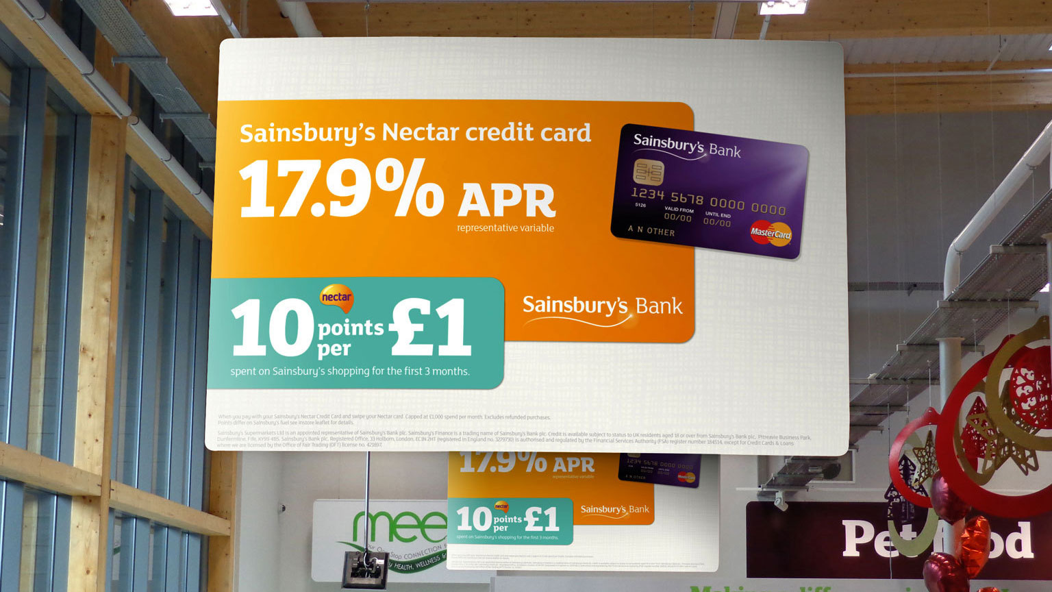
FS Lola’s distinctive slab serifs were softened, while regularly used brand words – particularly those that featured in wayfinding and signage – were adjusted on a case by case basis to improve legibility while conveying the supermarket’s personality.
04. Scalable typography for mobile
When it comes to mobile use, the need for functionality and legibility at tiny sizes on small screens can all too easily overwhelm brand personality. But it’s not impossible.
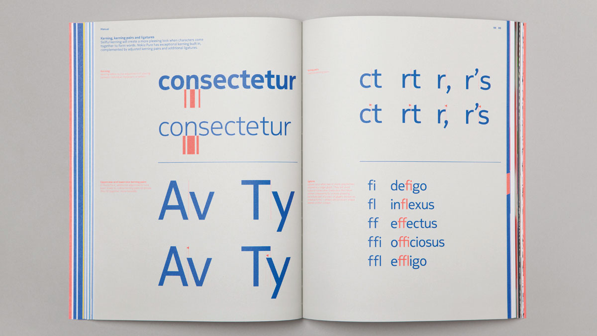
Bespoke type projects don’t get much more in-depth than Dalton Maag’s breakthrough project for global giant Nokia, which saw the agency expand massively to handle the demands of the multi-platform, multi-language project – including Hebrew, Arabic, Thai, Greek and Russian.
“This was all about going back to Finnish design roots – clean, simple, pure – and functionality was the primary objective,” explains Bruno Maag. “There was a big discussion about whether the brand fonts should have more personality or not. While the UI fonts need to be functional and readable, the display fonts have to do something else for their job.”
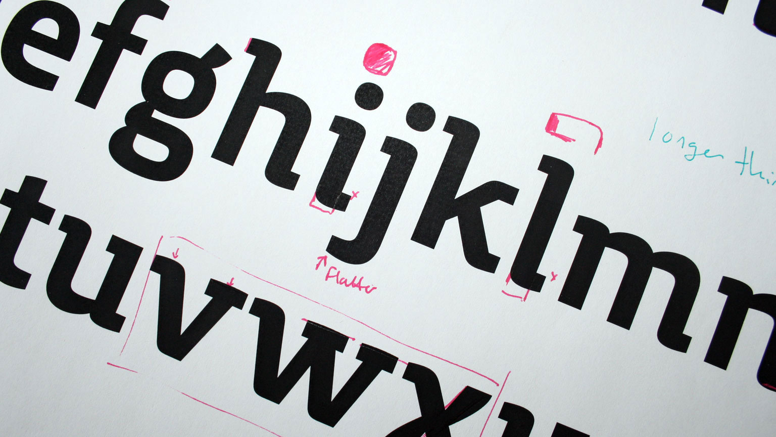
Fontsmith collaborated with Interbrand on a bespoke semi-slab serif typeface for Movistar, Telefónica’s Spanish and Latin American mobile operator. According to the agency: “We needed to be mindful that the slab wasn’t too static, that it had rhythm, progression, an approachable nature, and was authentic.”
05. Apt typography for editorial
One of the most varied uses for a bespoke typeface is in a newspaper or magazine, purely because there are so many sizes, weights and styles involved in different capacities.
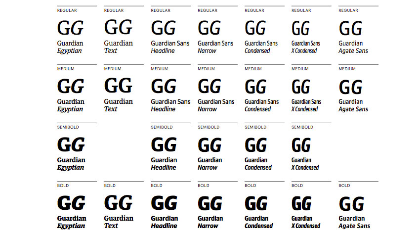
A particularly high-profile example of this is Commercial Type’s multi-weight typeface for The Guardian, which coincided with the newspaper's transition to the Berliner format in 2005. It has served the newspaper well ever since, although the recent announcement that it’ll shrink to tabloid size in 2018 may prompt another refresh.
The extensive family incorporates several interrelated families: an Egyptian for headlines; a Text Egyptian; four different widths of Sans for headlines; and finally an Agate Sans. Between them, they can handle everything from hard-hitting headlines to tiny financial listings.
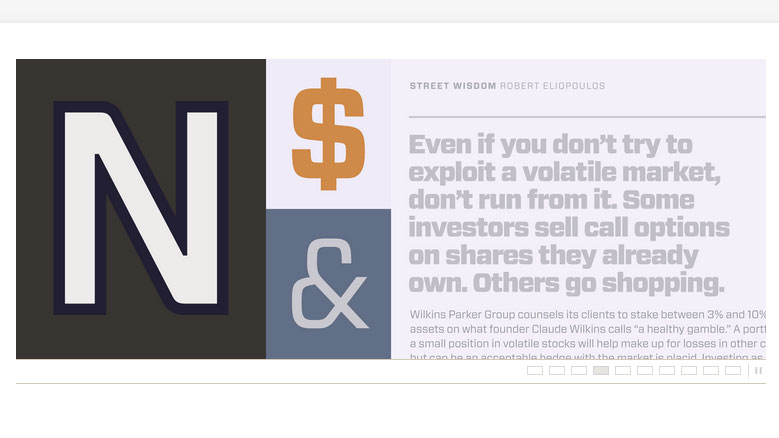
One magazine that's synonymous with innovative use of type is Condé Nast’s Wired – and again, Hoefler & Co rose to the challenge with Forza, an adaptable sans serif based on a rounded rectangle structure that, like Guardian Collection, is available commercially.
“Wired commissioned us to design a square sans as its editorial workhorse – one that could handle everything from philosophical essays to down-to-earth service pieces,” reports Hoefler & Co. “Forza’s sophisticated visual vocabulary makes it alert and engaging, and its broad palette of weights ensures it can meet the needs of the most demanding designer.”
Related articles:

Thank you for reading 5 articles this month* Join now for unlimited access
Enjoy your first month for just £1 / $1 / €1
*Read 5 free articles per month without a subscription

Join now for unlimited access
Try first month for just £1 / $1 / €1

Nick has worked with world-class agencies including Wolff Olins, Taxi Studio and Vault49 on brand storytelling, tone of voice and verbal strategy for global brands such as Virgin, TikTok, and Bite Back 2030. Nick launched the Brand Impact Awards in 2013 while editor of Computer Arts, and remains chair of judges. He's written for Creative Bloq on design and branding matters since the site's launch.
