5 top grid systems for web designers
Explore the key points to remember when developing a grid system for a new project.
Sign up to Creative Bloq's daily newsletter, which brings you the latest news and inspiration from the worlds of art, design and technology.
You are now subscribed
Your newsletter sign-up was successful
Want to add more newsletters?
When I begin a new project, half the battle is starting on the right foot. I imagine others feel the same, as they navigate countless tools and blogs trying to work out what is new and recommended. However, no matter what problem we’re trying to solve, a few elements are always necessary, and one of them is a grid system.
While Bootstrap and Foundation are great in many cases, it can take a lot of work to customise them for each project, and the array of options can make them heavy and clunky, with a lot of unnecessary features. With grids, it’s important to find a tool that is lightweight and lets you get to work right away. It should have CSS classes that are easy to use, and it should be responsive design-friendly.
Lots of tools break things down by device type (e.g. mobile, tablet, desktop), but with different models and Retina displays, it isn’t that simple. Follow Trent Walton’s advice: introduce a breakpoint when the design itself breaks and not when a new device size should begin.
Article continues belowGood grid systems rely on design principles to determine better breakpoints: appropriate column widths for typography; 12-, 16-, 18- or 24-column grids that allow flexibility with how columns can be divided; and consistency in spacing.
Relying on clean and lightweight grid systems makes coding a new site a lot easier. It takes out some of the guesswork with structure, but without limiting what you can do.
01. Simple Grid
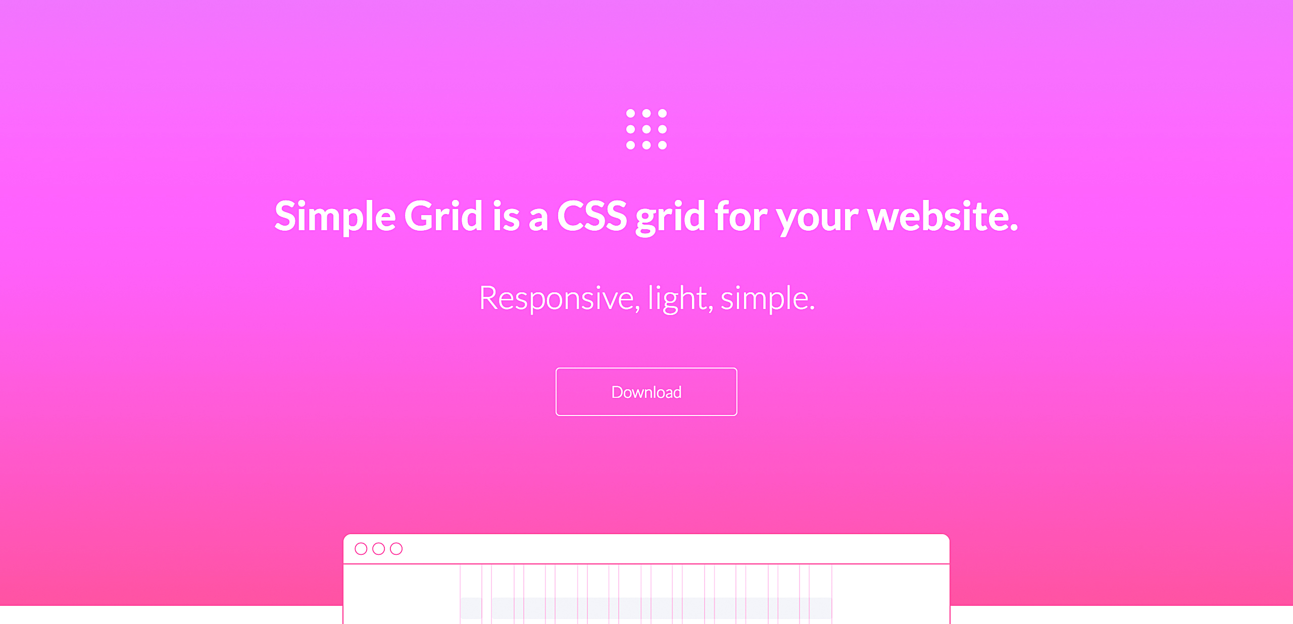
Simple Grid is open source and keeps it simple with a 12-column grid, easy-to-remember class names and nice documentation.
02. Pure
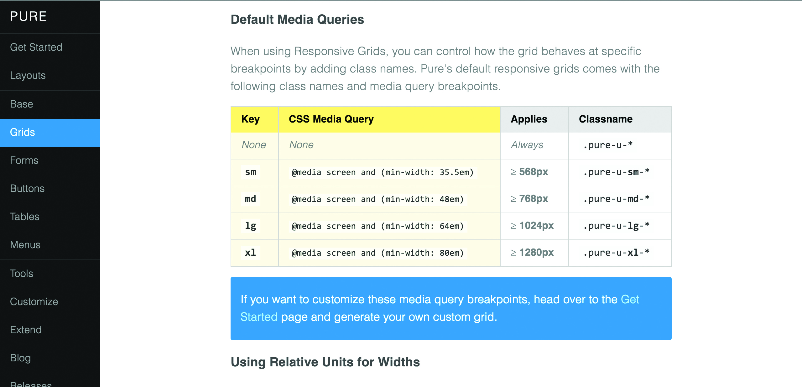
Pure is used a lot by one of my colleagues at The Iron Yard. The documentation is so well done, it’s as if it teaches devs about better CSS, design and responsive practices.
Sign up to Creative Bloq's daily newsletter, which brings you the latest news and inspiration from the worlds of art, design and technology.
03. Flexbox Grid
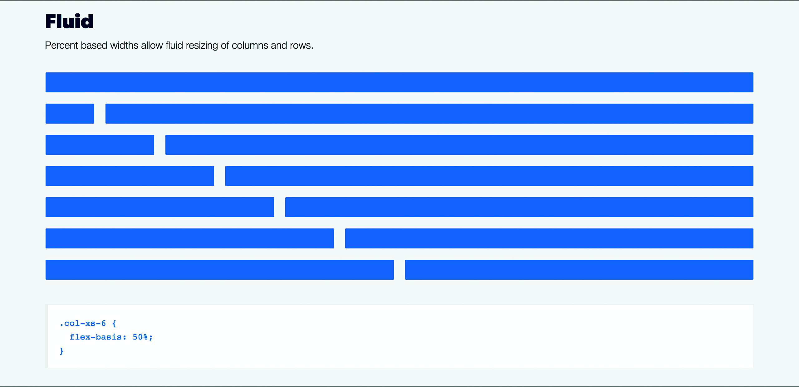
Flexbox Grid is particularly interesting as it's one of the first grid systems I’ve seen that is specifically using the flex display option in CSS.
04. Bootstrap
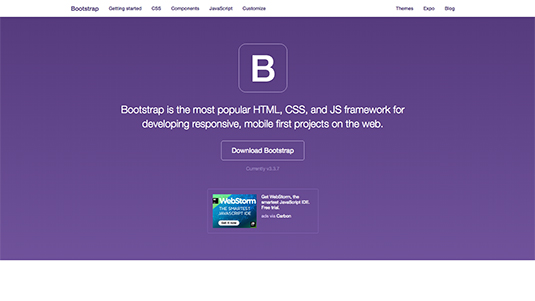
Bootstrap is tailored towards front-end development, and contains a wealth of HTML and CSS-based design templates. It's open source, free, and contains JavaScript extensions.
05. Foundation

Suitable for any device and any medium, Foundation is a versatile platform for making responsive front-end frameworks. It's easy to use as well as extremely flexible, and the team at Foundation are constantly updating their resources.
This article was originally published in net magazine issue 282. Buy it here.

Sam is a designer living in Austin, Texas, who speaks and writes extensively about web and product design, diversity, inclusion, and equity. In 2011, she wrote the first university course on the topic of Responsive Web Design. She is currently Design Director at thoughtbot, and serves on several design advisory boards in Austin.
