5 times brands shook up their logo to create a powerful message
How five top brands changed their logo to raise awareness.
'Don't touch the logo'. It's a common phrase in many design agency briefs. Sometimes it even makes its way into rebranding projects, when all the other brand touchpoints are up for grabs except that one.
The role of logo design may have diminished in the age of multi-channel, experiential branding, but that doesn't stop companies being rather attached to their carefully crafted marks. After all, brand recognition is built on coherence and consistency.
All of this means that when a well-known brand does, temporarily, shake up its logo – people take notice. In recent years, several household names have done exactly that, to raise awareness of a particular cause.
Read on to discover how five big brands successfully changed their logos for all the right reasons...
01. Lacoste
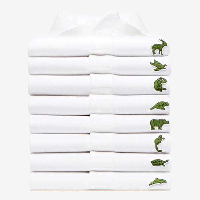
In February this year, French fashion brand Lacoste caused a media stir by changing its iconic logo for the first time in its 85-year history, to raise awareness for endangered species.
The project was the brainchild of BETC, and saw the world-famous crocodile emblem stepping aside for a limited time to make way for 10 more threatened animals, on a set of (fittingly) limited-edition polo shirts.
Lacoste partnered with the International Union for Conservation of Nature (IUCN) to produce one polo shirt for each of the corresponding animals left in the wild. That equates to 1,775 in total, including 350 Sumatran Tigers, 231 California Condors, and 67 Javan Rhinos, 50 Northern Sportive Lemurs and 40 Burmese Roofed Turtles.
Get the Creative Bloq Newsletter
Daily design news, reviews, how-tos and more, as picked by the editors.
Launched at Paris Fashion Week, the shirts retail for $183 apiece, with profits donated to IUCN. It's a bold move that raises awareness as well as cash, but the fact that the French sportswear brand messed with its long-established logo to do so added even more spice to the story.
02. PRODUCT(RED)
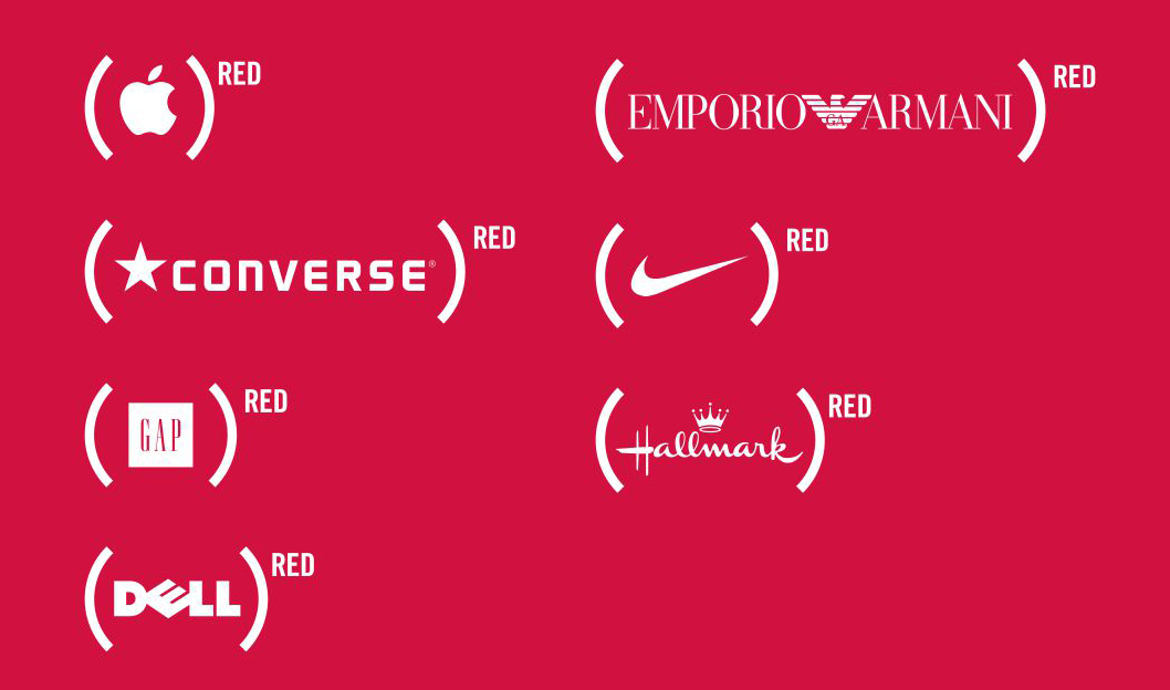
Founded in 2006 by U2 frontman Bono and Bobby Shriver of the ONE Campaign, PRODUCT(RED) seeks to engage well-known private-sector brands to help fight HIV/AIDS in eight different African countries.
Over the past 12 years, it has proved fantastically successful in doing so – convincing global brands such as Nike, American Express, Apple, Coca-Cola, Starbucks and Gap to shrink down their world-famous logos into brackets as part of the (RED) branding construct created by Wolff Olins.
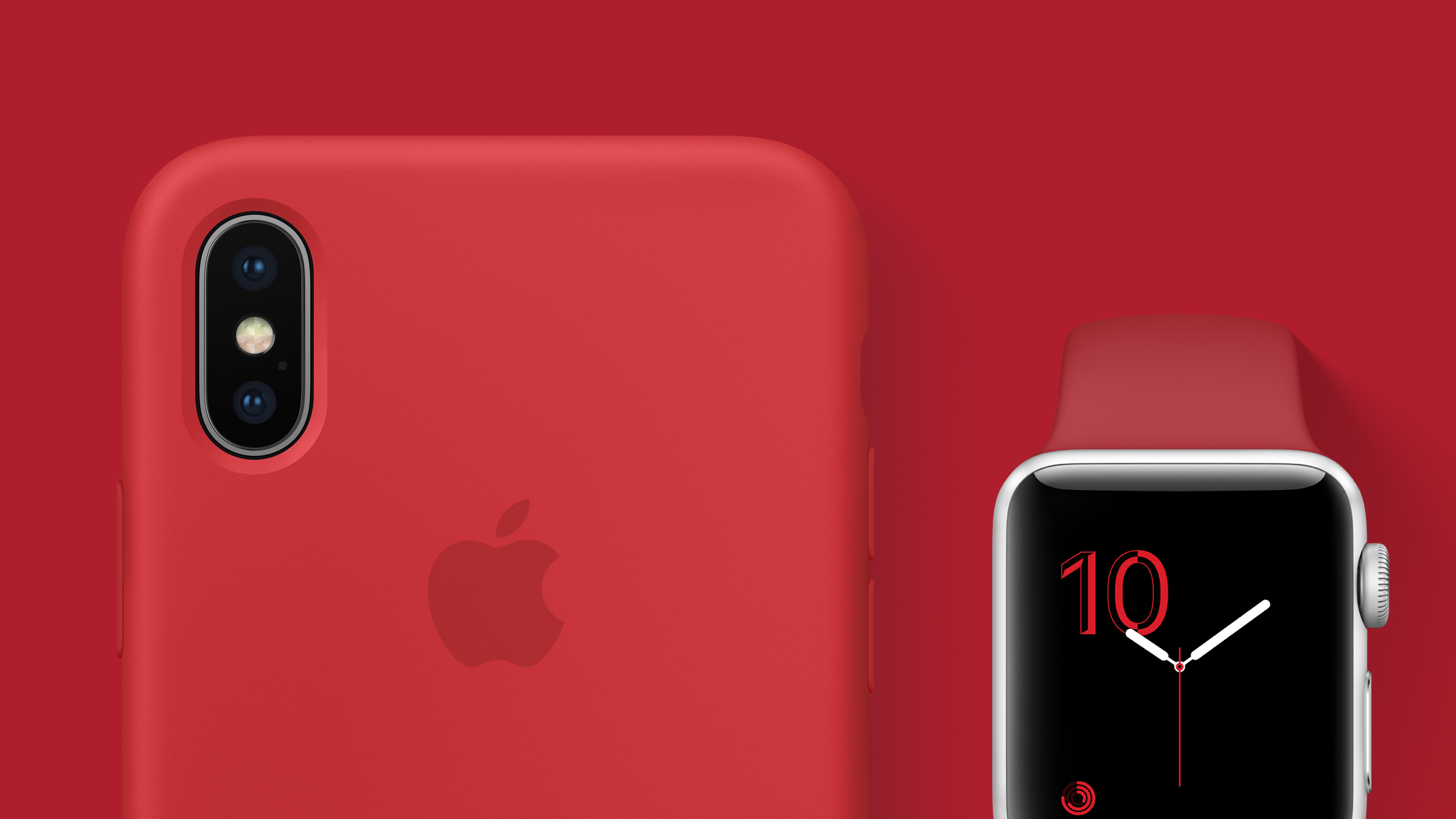
Like the Lacoste example, the impact of these partnerships goes far beyond raising awareness, as the project leverages the enormous commercial power of its partner network to generate charitable funding on a global scale.
Each partner company was tasked with creating a product, or range of products, featuring the PRODUCT(RED) logo and colour scheme, with up to 50 per cent of profits donated to the Global Fund to Fight AIDS, Tuberculosis and Malaria.
03. Google Doodles
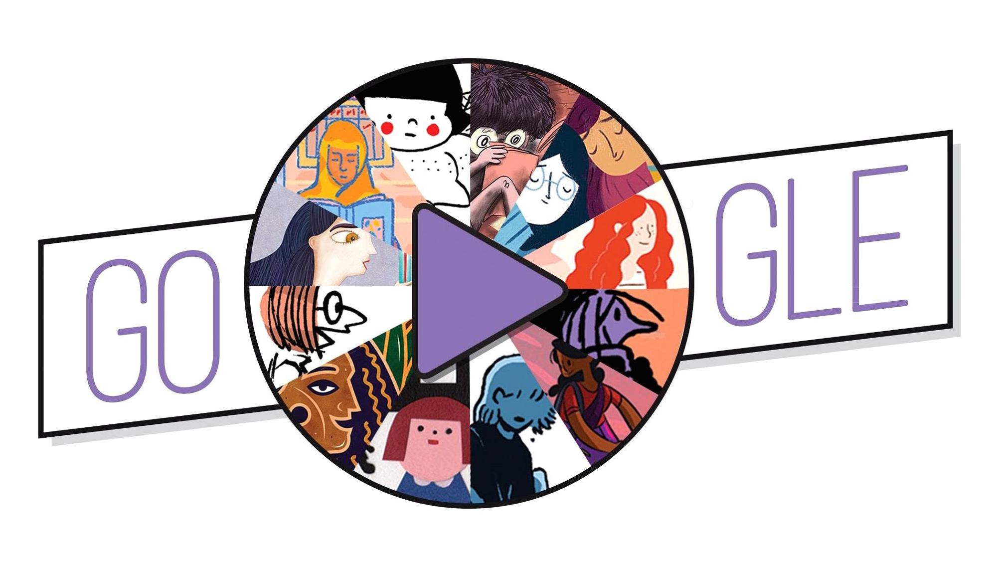
Google has been playing with its logo since the early days. Back in 1998, founders Larry Page and Sergey Brin added a stick figure drawing to the second 'o' in 'Google' to indicate that they were out of the office at Burning Man Festival. It was the first Google Doodle.
Ever since, the idea of decorating, redrawing and manipulating the company logo to celebrate notable events, and raise awareness of particular causes, has been a familiar sight on the tech giant's homepage. Google has its own in-house team of 'doodlers' to meet demand.

Google Doodles often mark public holidays and anniversaries, as well as the lives of famous artists, pioneers, and scientists. And the team invite suggestions from the public.
They're a colourful, quirky way to make the branding more playful, as well as reflecting popular culture – and can also convey a more serious, awareness-raising message. For Earth Day 2016, for instance, Google doodler Sophie Diao was tasked with representing each of Earth's five major biomes: the tundra, forest, grasslands, desert and coral reefs.
Each singles out a particular animal worthy of celebration and conservation, including a polar bear, red fox, elephant, tortoise and finally a coral reef with an octopus.
04. CokexAdobexYou
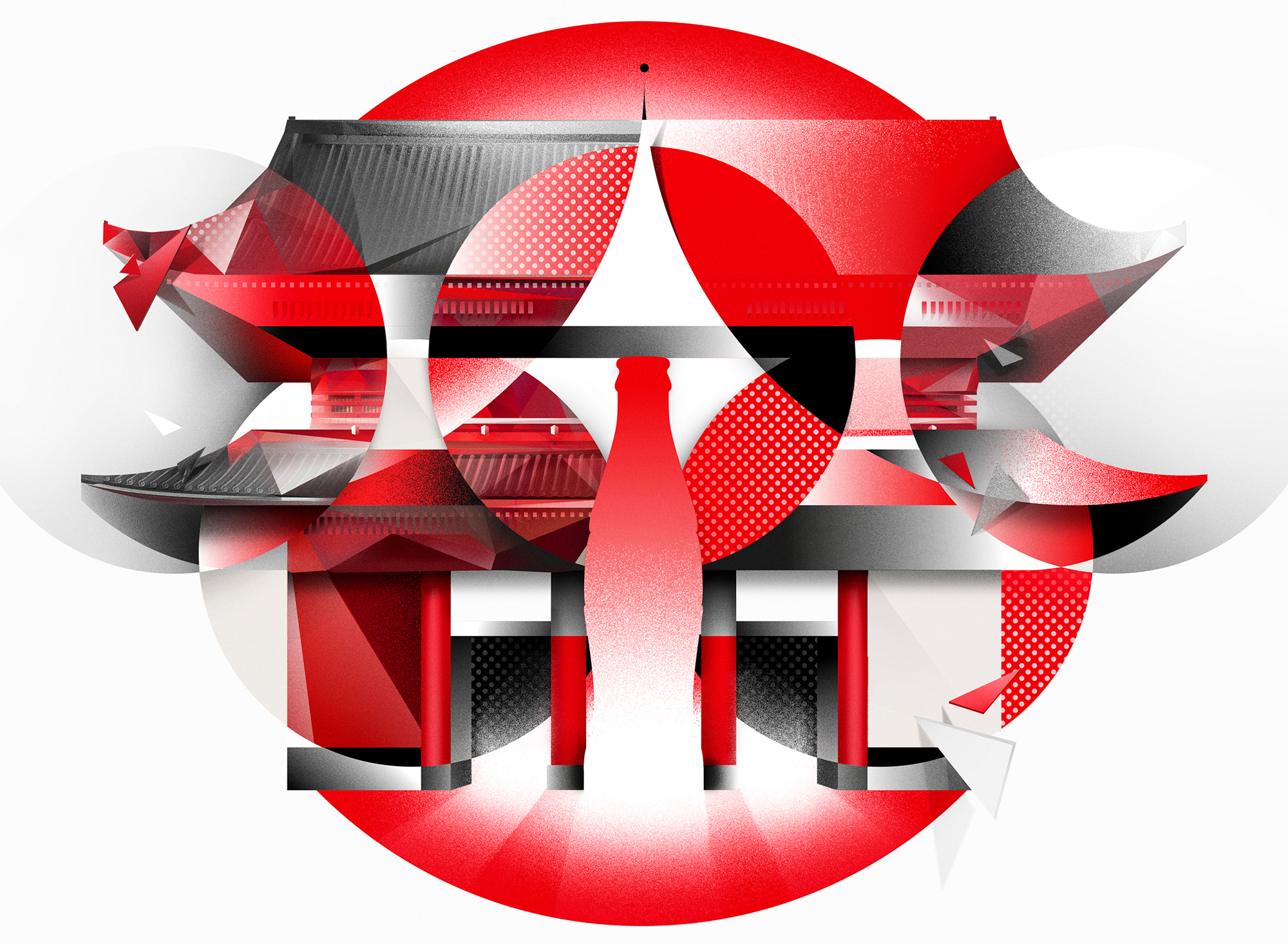
Lacoste was fronted by BETC, PRODUCT(RED) by Wolff Olins, and Google handles its doodles in-house. But it takes a particular kind of confidence to throw your brand open to the public, as Coca-Cola did in 2017.
To celebrate the Tokyo 2020 Olympics, Coca-Cola worked with Adobe to run a global contest, CokexAdobexYou – inviting people to use Creative Cloud to remix Coke's iconic brand assets into artworks that celebrate sport, movement and strength.
These assets included the Red Disc, Spencerian Script, Contour Bottle Icon, Dynamic Ribbon and the Coca-Cola Red (Hex E41E2B or R:228 G:30 B:43). Part of the brief was to base the composition on a circle, and use Coke's distinctive red-and-white colour scheme.
Of course, Coca-Cola never actually modified its official branding as part of the initiative. But it remains a bold move to throw such carefully protected brand assets open to the public to play around with.
While cynical onlookers may argue that Coke was primarily raising awareness of itself in the process, the project included a $35,000 donation to support the Special Olympics, a non-profit organisation that gets children and adults with intellectual disabilities involved in sport.
05. McDonalds
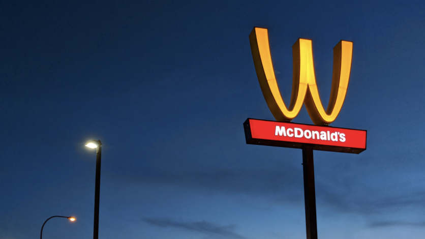
In an attempt to mark International Women's Day 2018 and "honour of the extraordinary accomplishments of women everywhere", McDonalds flipped its iconic Golden Arches logo on its head to make a 'W' for 'women'.
As well as updating its brand on social channels, including Twitter and Instagram, the fast-food chain also supplied 100 of its US restaurants with rebranded clothing, and even physically flipped a giant sign above a branch in Lynwood, California.
While it successfully garnered plenty of global publicity, the stunt backfired in some circles in terms of actually raising awareness of the real issues. Many drew attention to issues with living wages and zero-hours contracts, and the effort was disdainfully branded "McFeminism" by British left-wing group Momentum – which goes to show, once again, that a brand's values and message extend far beyond its logo.
Read more:

Thank you for reading 5 articles this month* Join now for unlimited access
Enjoy your first month for just £1 / $1 / €1
*Read 5 free articles per month without a subscription

Join now for unlimited access
Try first month for just £1 / $1 / €1

Nick has worked with world-class agencies including Wolff Olins, Taxi Studio and Vault49 on brand storytelling, tone of voice and verbal strategy for global brands such as Virgin, TikTok, and Bite Back 2030. Nick launched the Brand Impact Awards in 2013 while editor of Computer Arts, and remains chair of judges. He's written for Creative Bloq on design and branding matters since the site's launch.
