5 situations where illustration can work better than photography
Do you really need a photo? Here are scenarios in which illustration can be a much better fit.
In many creative projects, photography can be the perfect way of conveying emotion and giving your audience an instant sense of what you're trying to say. But sometimes photography doesn't quite cut it.
If you're trying to communicate more complex ideas and emotions, often illustration is the way to go, and current illustration trends mean that there's a vast choice of exciting visual directions in which you can take your work. We spoke to top iStock illustration contributors, Sam Posnick and Andre Jolicoeur, and iStock graphic designer Paul Braga, to get their take on when it's better to use illustration rather than photography in your projects.
01. Web design and UX
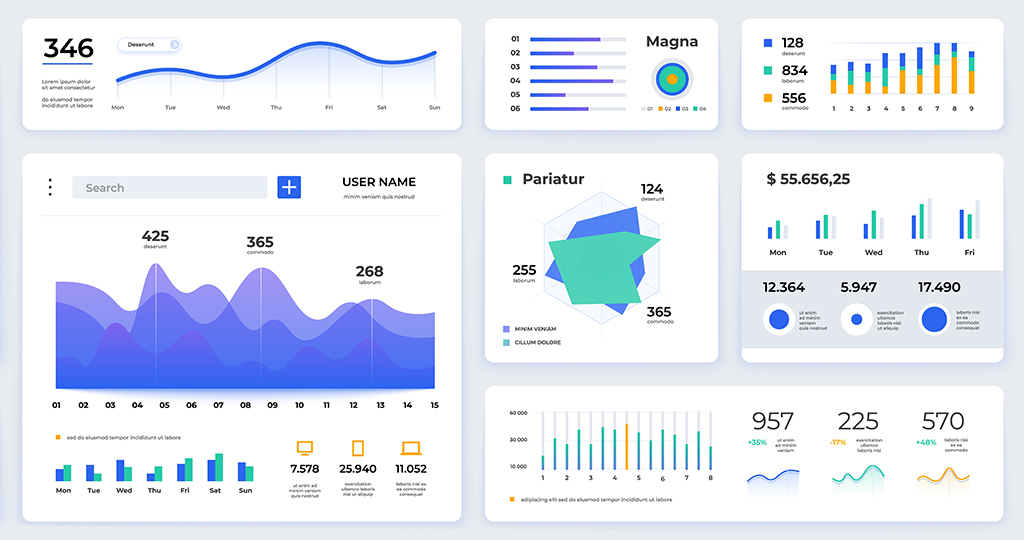
Full-screen photos are a popular and eye-catching choice in web design at the moment, but they can often get in the way of providing a good user experience. To make a website easy for visitors to use, you need a clean and simple design that signposts everything that your users need to know, and that's where vector illustrations and simple icons can help.
"When designing for website elements like nav menus or checkout pages, you don't want anything distracting the user from the task at hand," says Braga. "In these cases, a simple, single-colour set of illustrated icons would be a better starting point than a photograph."
To create a strong visual message, simplicity can be key, and many of iStock's contributors make a concerted effort to keep things straightforward. "I tend to keep [my stock illustrations] simpler—no detailed backgrounds, lots of copy space, etc.," says Posnick. "I like to give the folks who use them room to play creatively and allow their designs to shine."
02. Unique or large-format print projects

Just because a photograph looks good on your monitor, that doesn't mean it'll take well to being enlarged to poster or even billboard size. Not only are you likely to hit resolution issues, you'll also find that in large-scale print applications, flaws such as JPG artefacts in your image become a lot more obvious.
"The final size of the printed product will determine how the file should be constructed," says Jolicoeur. "A raster illustration may work well for a smaller application, while vector art is usually ideal when it needs to be able to scale to massive print sizes."
Another advantage to using illustrations is that they're often a much better fit for unique print placements such as t-shirts, tote bags or packaging. They're usually more visually inviting than a photo, they're easier to adjust and tweak to fit perfectly, and often use fewer colours than a photo, which makes them a lot more print-friendly.
"My illustrations have been featured on a few tote bags from some leading fashion brands," says Posnick. "And one of those totes was actually featured in an episode of a Netflix show!" A photo-based design probably wouldn't have had the same character as Sam's illustration, and might not have been such a good fit for the show.
03. Infographics
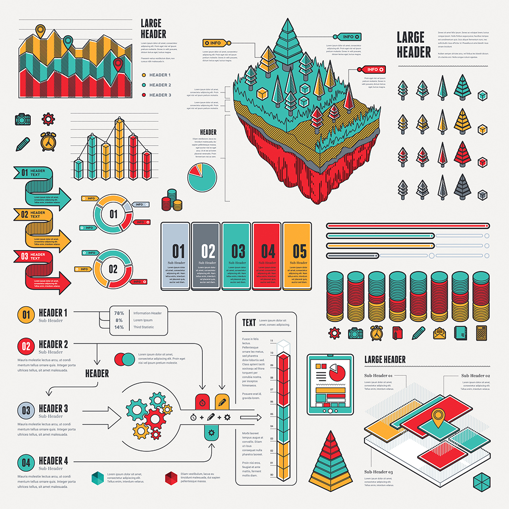
One area in which illustration almost always works much better than photography is infographics. These need to explain complex subjects in a visually-arresting and easily digestible way; photography is likely to complicate matters, and as a rule you need to take a custom approach, which might be a tall order for all but the most experienced designers. Using stock icons, vectors or diagram can help you make the same impact with a lot less work.
"If you start with an icon pack, that set will usually have a specified theme such as finance or e-commerce," says Braga. "So, if you use those icons for an infographic, it will help to lend that piece consistency and a clear message."
04. Video and motion graphics

Moving imagery can be a brilliant way to create content that stands out, but the cost of shooting video – not to mention post-production – can be prohibitive, especially if it's just for a single Instagram post.
However, taking a creative approach to illustration can provide you with great-looking animation at a fraction of the cost. "Recently, I've been playing around with making animated GIF-style pieces by taking illustrations into Photoshop and animating them frame by frame," says Posnick. "It gives a little life to Instagram posts, I find."
Not only does turning illustration into motion graphics save you money, it also gives you a lot more creative latitude and enables you to much better serve your video's needs.
"You have a lot more freedom to animate and customize an illustration than you would a photograph," says Braga. "You could change the size, colour, or even shape of the item to match your brand look and feel. That's something that's much more difficult to do effectively with a photo, especially if you're trying to make videos or GIFs"
05. Giving your brand a human touch
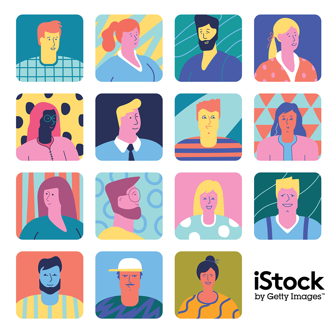
Photography is the go-to tool for giving a flavour of what a company or brand is about, but what does another boardroom shot of a group of handsome executives pointing at a laptop really tell anyone? With illustration, though, you can bring a whole new feel to a project.
"Photos have their place, they are used to show real things," says Jolicoeur. "Illustrations…can show things that don't exist, things that are beyond the physical world. They can also emphasise mood and emotion in interesting ways."
While the serious photographic look will always be the choice for many businesses, a lot of other companies can benefit from the more organic and welcoming aesthetic that you get from hand-drawn illustration. "I think the hand-drawn look can often serve to warm something up that otherwise appears too chilly or ultra-modern," Posnick says. "It also can serve as a way to transition people towards a new look for a brand."
Looking for somewhere to start your image search? Check out a few of our favourite images on iStock.
Sign up to Creative Bloq's daily newsletter, which brings you the latest news and inspiration from the worlds of art, design and technology.
Jim McCauley is a writer, performer and cat-wrangler who started writing professionally way back in 1995 on PC Format magazine, and has been covering technology-related subjects ever since, whether it's hardware, software or videogames. A chance call in 2005 led to Jim taking charge of Computer Arts' website and developing an interest in the world of graphic design, and eventually led to a move over to the freshly-launched Creative Bloq in 2012. Jim now works as a freelance writer for sites including Creative Bloq, T3 and PetsRadar, specialising in design, technology, wellness and cats, while doing the occasional pantomime and street performance in Bath and designing posters for a local drama group on the side.
