5 of the hottest typography trends
Stale typography is never a good look; here are five ways to stay relevant.
Trends are an inevitable part of any design discipline. And while obsessively following trends can be counter-productive – it's harder to develop your own distinctive style if you're constantly adapting to reflect what everyone else is doing – keeping an eye on trends, and bringing in developments that fit with your particular look, is a sure-fire way to stay relevant.
Typography is a vital element in graphic design; different font pairings can completely change the mood of a piece, and technological developments in typography mean that there are exciting options available now that didn't exist a few years ago. Here are five of the biggest current trends that you need to be aware of.
01. Colourful fonts
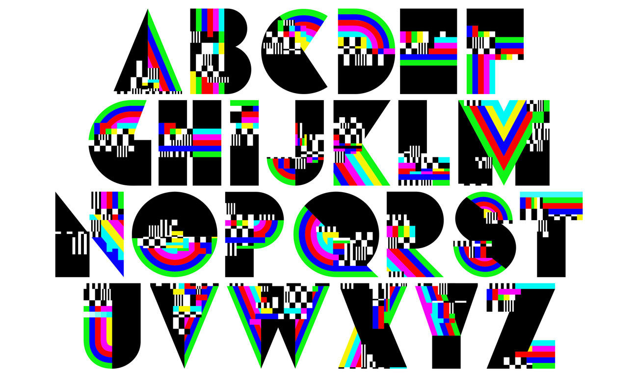
Fonts have traditionally been strictly monochrome as they've been largely tied to the print process. But with more typography happening on-screen rather than on the printed page, typographers are starting to open up to the possibilities of colourful fonts and their potential for creating exciting designs.
OpenType-SVG fonts, which allow for vector shapes with colours and gradients, have become the industry standard, and while it's still early days for colour fonts, there are a few great-looking options around. Gilbert was the first to come to our attention; we also love the attention-grabbing glitchiness of Alex Trochut's MEGAZERO.
02. Variable fonts
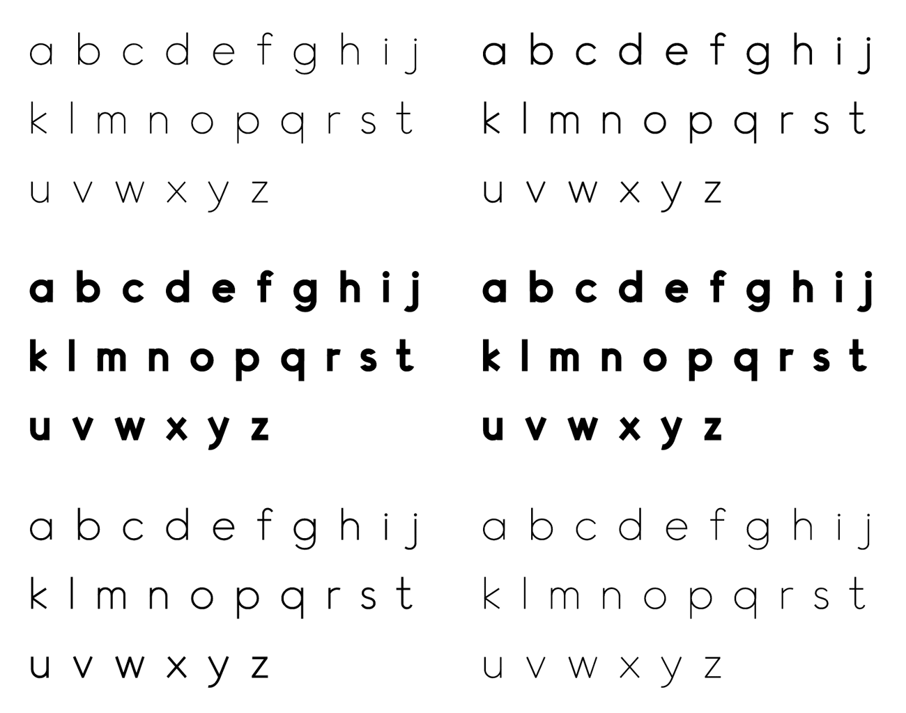
2019 has been the year in which people have really started paying attention to variable fonts, and it seems certain that they're just going to keep getting bigger. The basic appeal of them is self-evident: rather than having to get a whole set of different weights, with a variable font you get a single file that you can adjust to make it appear in any style you want.
The potential for variable fonts is much bigger than simply being able to roll your own weight, though. Used online, variable fonts can be adjusted on the fly, making it easy to create eye-catching kinetic typography effects.
And we've recently seen an even more intriguing typographic development in the form of Jongmin Kim's Leon Sans: a geometric sans-serif made in code that enables users to not only change font weight dynamically, but also to create custom animations, effects or shapes using the HTML5 Canvas element.
Get the Creative Bloq Newsletter
Daily design news, reviews, how-tos and more, as picked by the editors.
03. Retro type
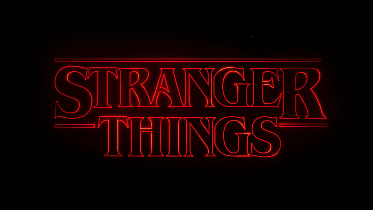
It's good to keep up with the latest typographic developments, but it also never hurts to look to the past. If you want to appeal to people's sense of nostalgia, or if you're simply after a look that stands out from the crowd, using retro fonts is a great approach.
Right now it seems to be all about hooking into the 80's revival, but there's a host of other design and visual movements that you can evoke through the right typographic choice. Whether you want a sophisticated art deco look, or the in-your-face appeal of ornate Victorian poster fonts, a good vintage font can light up your layout.
04. Hand-drawn lettering
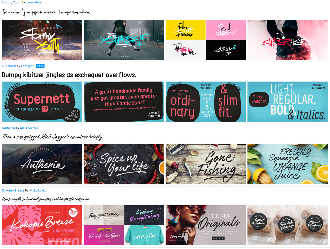
There's no escaping hand-drawn fonts right now, and we don't see them going away any time soon. There are way too many to choose from at the moment – luckily we've already picked out some of the best new free calligraphy fonts for you – with more appearing every day.
The bewilderingly vast selection of hand-drawn and calligraphy fonts means, however, that it's relatively easy to find one that fits the mood that you're trying to evoke in a particular design, and if you dig reasonably deep then the chances are you'll pick a font that hasn't been used anywhere else.
05. Plenty of contrast
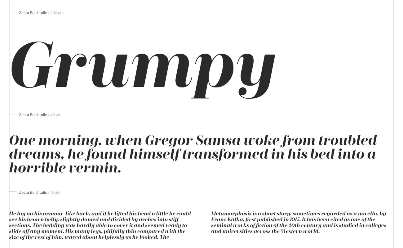
A healthy bit of contrast can always make for a visually rewarding design, and there are a few on-trend typographic options that will help you achieve that look. Right now, high-contrast serifs that mix fat downstrokes with razor-sharp upstrokes are a popular option; they're elegant and dramatic and the ideal way to bring a bit of class to a design, and you can amplify the effect by adjusting the kerning and leading to something a little out of the ordinary.
But there are two other hot typography trends that you can mix together to get a pleasingly high-contrast look. Massive, super-heavyweight bold fonts are a popular attention-grabber at the moment; combine them with sophisticated, minimal sans-serifs for a beautifully balanced but superbly contrasting overall effect.
Related articles:

Thank you for reading 5 articles this month* Join now for unlimited access
Enjoy your first month for just £1 / $1 / €1
*Read 5 free articles per month without a subscription

Join now for unlimited access
Try first month for just £1 / $1 / €1
Jim McCauley is a writer, performer and cat-wrangler who started writing professionally way back in 1995 on PC Format magazine, and has been covering technology-related subjects ever since, whether it's hardware, software or videogames. A chance call in 2005 led to Jim taking charge of Computer Arts' website and developing an interest in the world of graphic design, and eventually led to a move over to the freshly-launched Creative Bloq in 2012. Jim now works as a freelance writer for sites including Creative Bloq, T3 and PetsRadar, specialising in design, technology, wellness and cats, while doing the occasional pantomime and street performance in Bath and designing posters for a local drama group on the side.
