5 logo redesigns that got it right
Logo redesign can be a tricky business for high-profile brands. We look at five companies that nailed it through smart, brave design work.
A logo is both a calling card and mark of quality. Any changes to it, no matter how small, can have a big impact on business and on reputation. Get it right, and you're golden. Get it wrong and it could be game over.
Here we take a look at some big brands who have updated their logo designs in recent years and got it right. Among them you'll find Coors' new logo and how it reflects big changes in the brewing industry, and how Netflix updated its look to fall in line with its new business model. Burberry called in an enigmatic designer known for his aversion to deadlines, then challenged him to complete the redesign in just four weeks, and Mastercard refreshed its logo twice in three years, not because the first redesign didn't work, but because it worked so well. And finally, Italian football club Juventus made the biggest gamble with a redesign, breaking with a century of tradition.
All of these projects had their critics – some more than others. So read on to find out why we think they were all successful redesigns.
01. Burberry
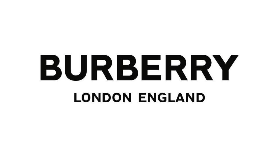
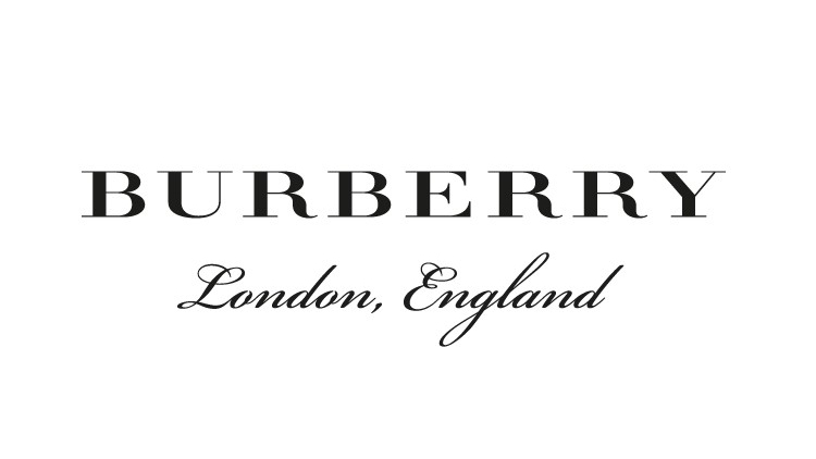
A surefire way of getting a good logo redesign is by enlisting the legendary Peter Saville. Although, by all accounts, you better have a big budget and flexible deadlines. Burberry got the enigmatic designer to refresh its logo for the first time in 20 years. And, apparently to preempt any problems, gave him just four weeks to get the job done.
The Burberry/Saville pairing seems like a good fit. Both have remained cool through countless changes in fashion in their respective fields. Definitely from the less-is-more school of design, Saville's gone for all-caps and sans serif, like he did on his 2017 Calvin Klein logo refresh, and a heavier modern typeface replaced the dated serif wordmark. Same for 'London, England' – where he also got shot of the comma.
Saville's work wasn't universally acclaimed – far from it. But, for us, it perfectly sums up the brand Burberry is today. In recent years, the company has increasingly straddled two markets: luxury and streetwear. The new logo makes it look more like streetcar brand, without losing that luxury appeal.
02. Netflix
Netflix started out by doing DVD sales and rentals by post. That was in 1997. That seems quaint and old-fashioned now, and it was hardly a revolutionary business model back then. So few could've predicted that within two decades the company would've helped change not only how we watch TV and films, but how TV and films are made and distributed.
Get the Creative Bloq Newsletter
Daily design news, reviews, how-tos and more, as picked by the editors.
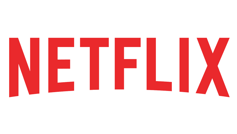
By 2014, it was due a new logo. Moving Brands got the nod. The colours and drop-shadow on the previous design made you think of old-style cinemas – pretty much the opposite of what Netflix is about now. This was designed thinking about how it would look in print when DVDs were posted to customer. The logo is almost exclusively seen online now. So Moving Brands' new logo looks suitably flatter and more modern. The red is bought forward as the central colour.
Why does this work? Restraint. A lesser agency would've gotten caught up in Netflix's success and gone for something louder and more over the top. Moving Brands gave a masterclass in how to subtly refresh a company logo in a way that reflects who currently uses the business.
03. Coors Light
Another industry that's seen big changes in recent years is brewing. Everybody takes their booze a lot more seriously these days, especially when it comes to craft beer. Coors is definitely not a craft beer. But in 2015, to make sure the brand didn't get left behind by the craft beer revolution, it was time for a rethink of its logo.
Brewer MillerCoors gave Turner Duckworth the job after the agency's successful Miller Lite rebrand in 2014. The old Coors logo looked very dated, quite shouty, and cartoonish. The new logo is more modern, understated, stylish. It came with the tag, 'Born in the Rockies' to help build "an emotional connection" with consumers. In short, it did what the craft beer market does very well. It tells you a story about where it was made and why it's better than any other seemingly identical drink. The logo helps the brand move with the times without changing the product. The drink itself is exactly the same. But Coors Light looks instantly more sophisticated.
04. Juventus
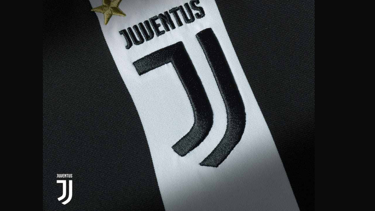
No brand can match the history and tradition of a football club. Brands have consumers – loyal for as long as the product is good. Football clubs have fans – loyal for life, no matter how bad the product becomes. For those reasons, Interbrand's bold reimagining of Juventus' club badge has to go down as one of the bravest redesigns in history.
The club was founded over 120 years ago. The badge has hardly changed since then and it's pretty much unheard of for team with Juventus' heritage to make such a dramatic change. Plus, the shield design is pretty universal in football. Rarely does a side wear anything else on its shirt.
The redesign wasn't as popular with fans as it was with the design community. The three key elements of the design are the stripes of the team shirt, the Scudetto (the 'little shield' worn by Italian league title winners).
So why does it work? Juventus dominates Italian football. They are currently heading for their eight consecutive title. And, crucially, the design says something about the club Juventus is today. This is not just a trendy redesign for the sake of it. It shows how the club sees itself as leader, not a follower. In short, it is a demonstration of the club's confidence.
05. Mastercard
This is not one redesign but two, which suggests something went wrong initially. But the second actually shows how successful the first was. Pentagram's 2016 redesign was Mastercard's first in two decades. The old logo had stripes in the overlapping bit of the two circles. Pentagram replaced that with a solid block of orange and put the brand name beneath the logo instead of across the centre. This was a smart, modern retake on an already very recognisable logo. Again, this was about restraint.
This year, however, Pentagram removed Mastercard's name from the design. This is a show of real confidence from both designer and brand. It puts Mastercard's identity in the same league as the Nike swoosh or the Apple apple. It's instantly recognisable.
Why does it work? Pentagram de-cluttered the old logo – which looked dated and very much of its time – then, as if to prove how good this new, more focused design is, the agency removed the name altogether.
Read more:

Thank you for reading 5 articles this month* Join now for unlimited access
Enjoy your first month for just £1 / $1 / €1
*Read 5 free articles per month without a subscription

Join now for unlimited access
Try first month for just £1 / $1 / €1
Gary Evans is a journalist with a passion for creative writing. He's recently finished his Masters in creative writing, but when he's not hitting the books, he loves to explore the world of digital art and graphic design. He was previously staff writer on ImagineFX magazine in Bath, but now resides in Sunderland, where he muses on the latest tech and writes poetry.
