5 inspiring web design case studies
A good case study makes for a top calling card; check out these examples.
The reality of web design is that once you've finished a project, you hopefully move straight onto the next one. However, every site you deliver is an essential portfolio piece that demonstrates your skills and abilities, and while you'll usually want to link to your recent work on your site, it pays to do the job properly.
Rather than simply grabbing a screenshot of a landing page and a link and adding it to your online portfolio, writing up an engaging case study on your work can be a lot more worthwhile. Case studies don't need to be lengthy essays; they just need to give readers a taste of your process and provide some insight into the challenges you've faced over the course of a web build and how you solved them.
They're a great way to let potential clients know how you work, and they can also provide inspiration for other designers and developers; here are five of our favourite recent examples. Make sure you also check out our top web design tips.
Article continues below01. Museum of Science and Industry of Chicago
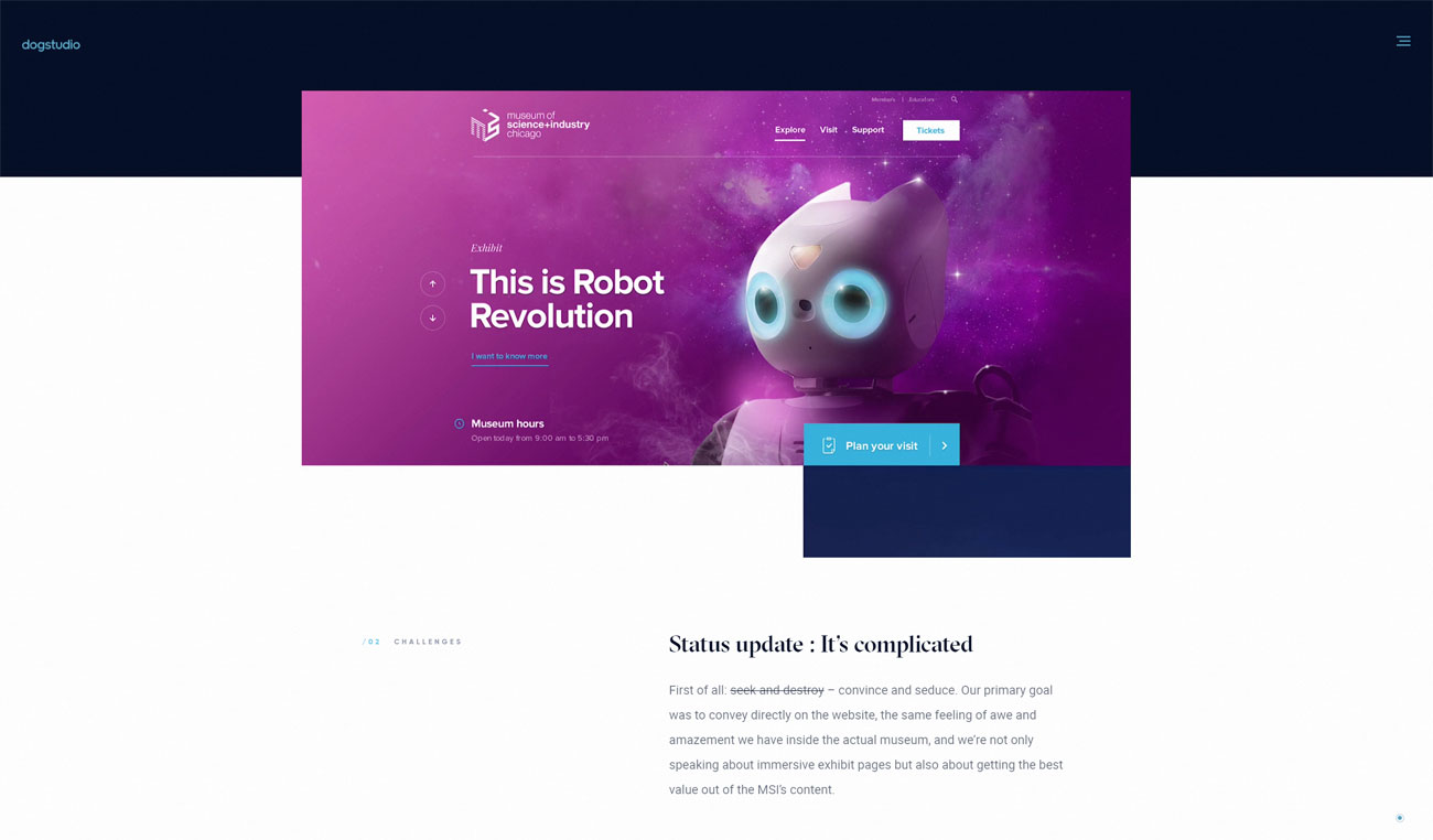
For a really inspiring case study, it's hard to beat DogStudio's extensive piece chronicling its work for the Museum of Science and Industry of Chicago. The museum is a vast and highly respected American institution, and you can't help but get the impression that DogStudio was punching well above its weight when it won the commission to rethink and revamp its web platform, but as this case study reveals, it carried the job off with aplomb.
Packed with revealing wireframes, imagery and animations, it's a fascinating insight into a massive and challenging build that had to cater for more than five million online visitors wanting to do everything from buy tickets through to figuring out where to park and finding information about individual exhibits.
02. National Geographic: A Bear's-Eye View of Yellowstone
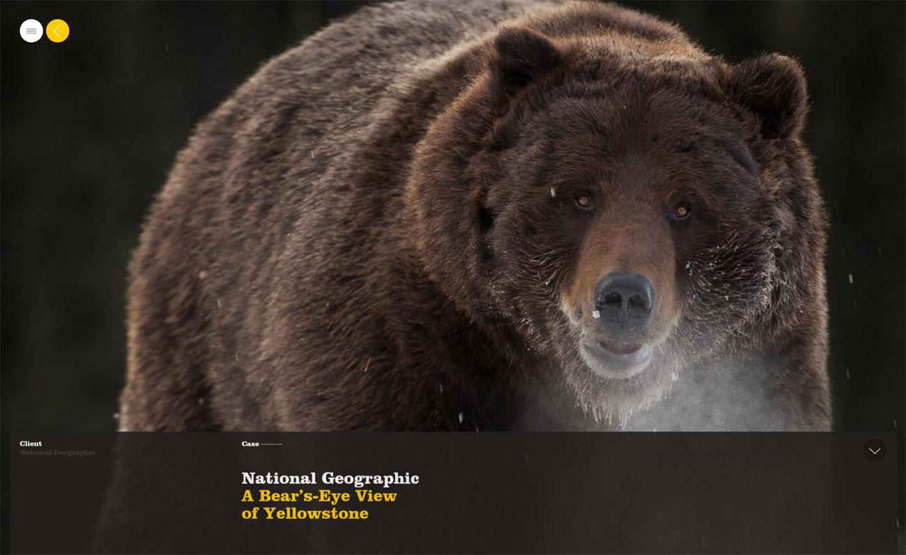
Sometimes it's better to show rather than tell. For this captivating look at Yellowstone National Park as seen by four bears fitted with camera collars and GPS, Hello Monday had a wealth of footage, data and expert analysis to work with. And rather than go into dry details of how it fitted everything together, it keeps things brief in its case study, providing a short outline of the project and deliverables before moving on to an entirely visual essay that demonstrates just how much work went into creating this digital feature.
As well as a good helping of footage and screenshots showcasing what the site's all about, what we really love about this study is a section dedicated to how Hello Monday stamped its own personality on the project, breathing extra life into the feature with animation, watercolour illustrations and pencil-drawn portraits of each bear.
Sign up to Creative Bloq's daily newsletter, which brings you the latest news and inspiration from the worlds of art, design and technology.
03. Once Upon a Time in… Hollywood
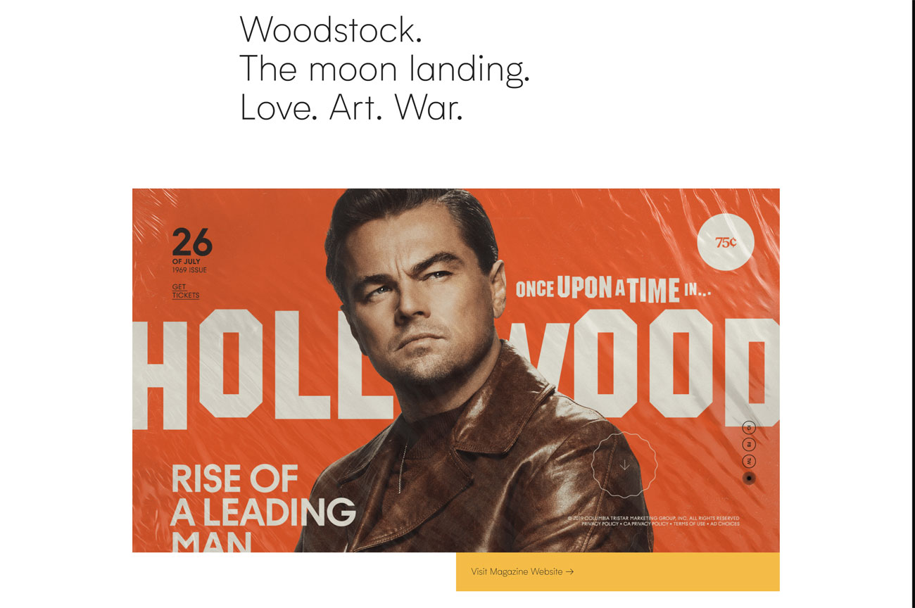
Currently doing big business at the box office, Quentin Tarantino's Once Upon a Time in… Hollywood is a love letter to 1960's cinema that recreates its era with Tarantino's typical attention to detail. And to create an online presence that captured the feel of 1969 Hollywood as well as the film, LA agency Watson went the extra mile to create a digital magazine that feels like it could have come off a newsstand 50 years ago.
In this case study the Watson team explain not only the thinking behind the magazine and its pitch-perfect adverts, but also how they create a physical print run of the mag that got handed out at the premiere and first-night screenings, creating a whole other social buzz as movie fans posted shots of their magazine to prove that they were there. If you're looking for ideas on how to run a strong social campaign, there's some great material here.
04. British Red Cross

Kota's case study on its recent work with the British Red Cross is a clear and concise piece that provides valuable insight on the challenges – and opportunities – of working on a campaign with an institution with clear-cut brand guidelines that need to be adhered to. In the case of the British Red Cross's OneKindThing campaign, Kota had to create a platform that stood out from previous campaigns while staying within the society's pretty epic brand guidelines.
With a handful of images and a couple of paragraphs, Kota outlines how it managed just that, and also covers some of the technical hurdles that had to be overcome to deliver the finished site. The end result was well worth the effort, as the British Red Cross testimonial at the end of the case study reveals.
05. Stonewall Forever
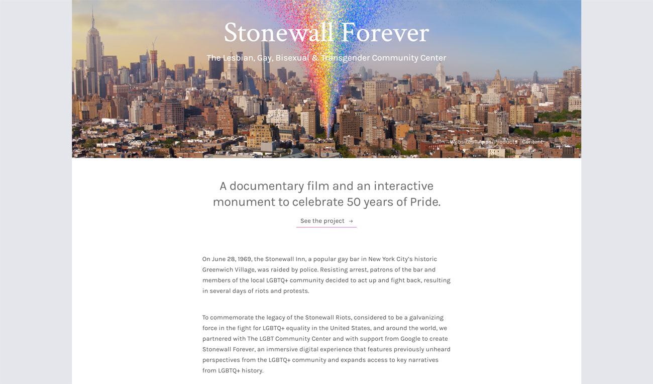
To mark the 50th anniversary of the Stonewall Riots, an event that helped bring about the Pride movement, Stink Digital partnered with The LGBT Community Center to create Stonewall Forever, an immersive digital experience that features key narratives and previously unheard stories from LGBTQ+ history.
Stink Digital's case study explains how it built a living monument to 50 years of Pride, based in Christopher Park, New York, but accessible anywhere through a website or AR app, and goes into some detail of the challenges of creating a WebGL monument that consists of over 10,000 individual shards with post-processing effects, but still runs at 60fps, even on low-end devices.
Beyond the technical challenges, though, this is an absorbing and insightful piece on a project that explores life before, during and after the Stonewall Riots.
Related articles:
Jim McCauley is a writer, performer and cat-wrangler who started writing professionally way back in 1995 on PC Format magazine, and has been covering technology-related subjects ever since, whether it's hardware, software or videogames. A chance call in 2005 led to Jim taking charge of Computer Arts' website and developing an interest in the world of graphic design, and eventually led to a move over to the freshly-launched Creative Bloq in 2012. Jim now works as a freelance writer for sites including Creative Bloq, T3 and PetsRadar, specialising in design, technology, wellness and cats, while doing the occasional pantomime and street performance in Bath and designing posters for a local drama group on the side.
