5 inspired self-promo ideas for design agencies
Take a look at these unusual approaches to self promotion.
Effective self-promotion can be notoriously difficult to get right. Whether you're a freelancer trying to make a name for yourself or a design studio fishing for new clients, the goal is always to stand out – but for the right reasons.
Extravagant, over-designed self-promo mailers aren't always the right approach. It goes without saying that your work needs to speak for itself. A pack of treats in a cool conceptual box might be a talking point, but if the recipient clicks through to your portfolio and finds nothing to inspire them, you won't get very far.
Don't be lured by style over substance. The best self-promo materials are beautifully designed, of course – it's all about practicing what you preach – but they also demonstrate how you think. They sell how you solve a design problem, rather than just a flash-in-the-pan 'look at me' gimmick.
So read on to be inspired by five design agencies whose innovative self promotion ideas hit the mark perfectly...
01. BLOCD: Edible Pantone and movable type
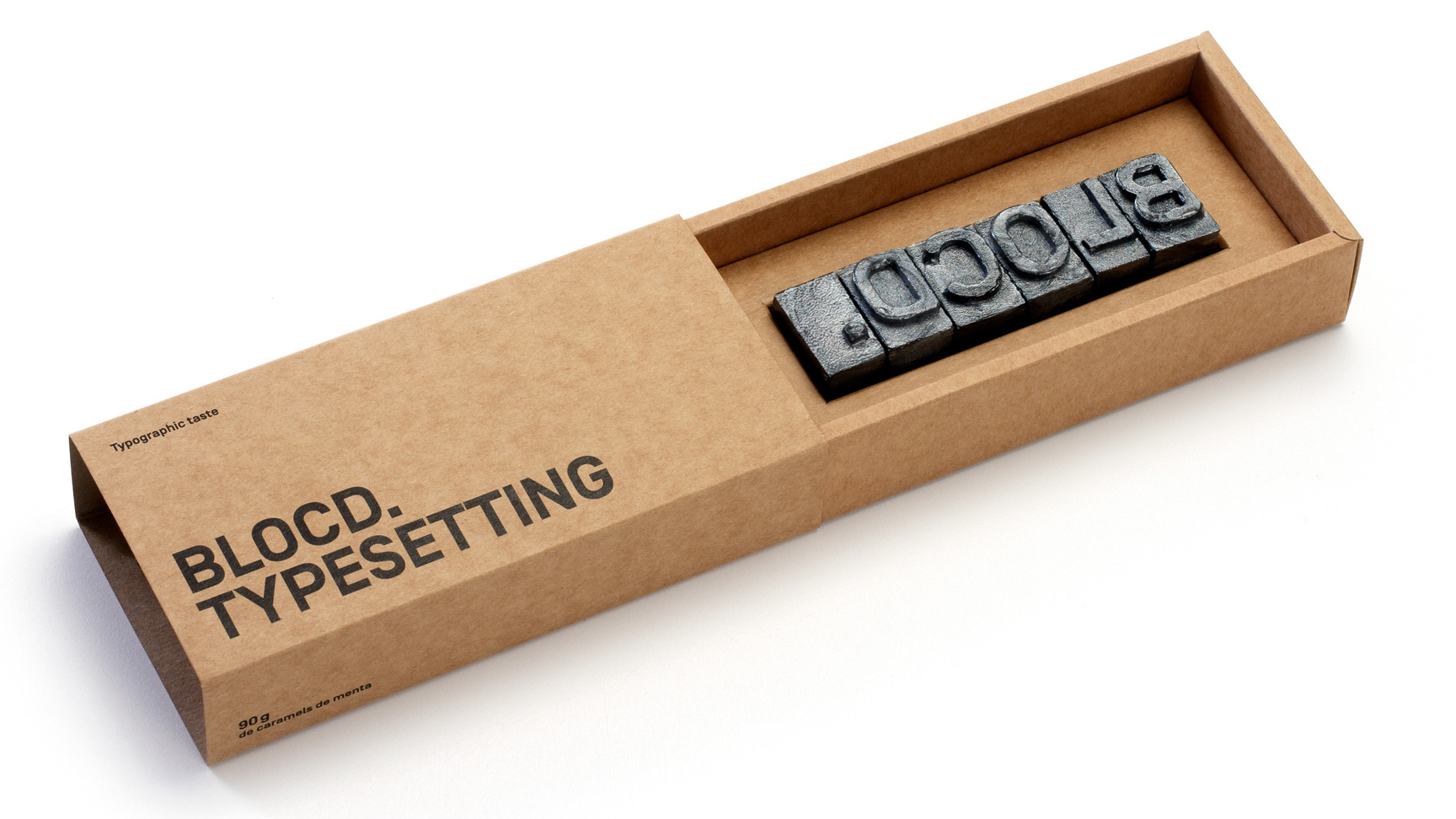
What client or commissioner doesn't appreciate receiving some sweet treats in the post? It can certainly make you, or your studio, a talking point. But if you can make that edible calling card directly relevant to what you offer, you're onto a winner.
Barcelona-based BLOCD has absolutely nailed this approach not once, but twice. First, the agency drew inspiration from the lead movable type pioneered by J. Gutenberg to create edible type spelling out its name and promoting its typesetting skills in one savvy sweep.
More recently, BLOCD translated the edible promo concept from typesetting into another familiar design tool, the Pantone colour chart – creating a chocolate 'swatch book' as a Christmas mailer.
Get the Creative Bloq Newsletter
Daily design news, reviews, how-tos and more, as picked by the editors.
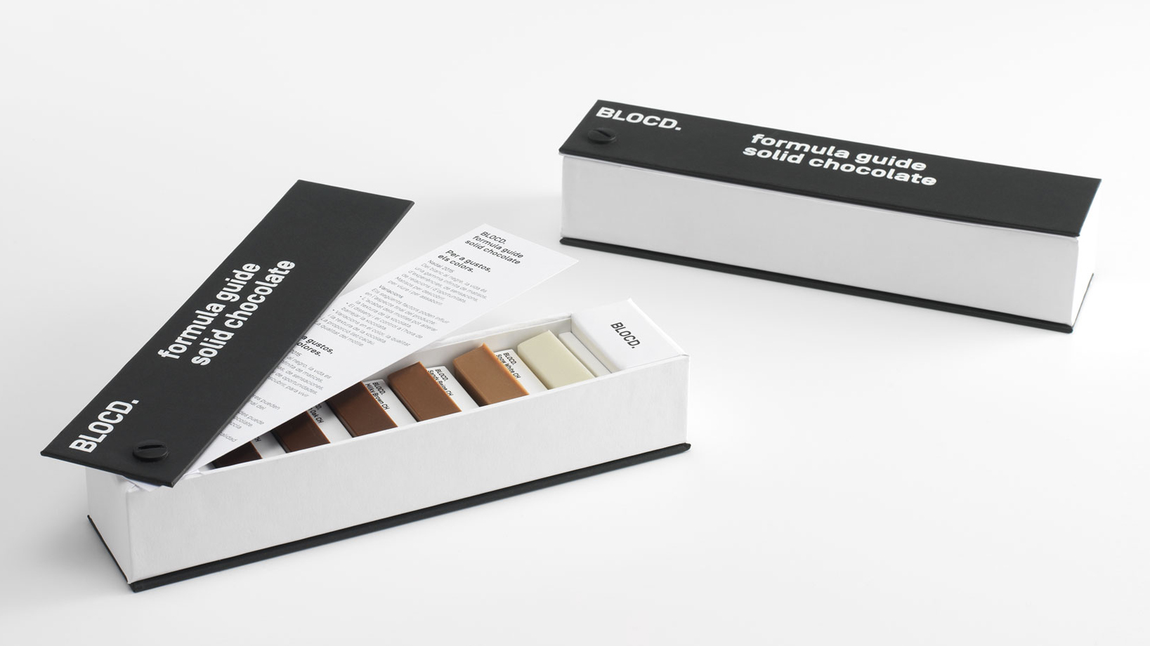
Like the movable type reference, the Chocolate Pantone showed impeccable attention to detail, with each delicious chunk labelled with an accompanying colour description – demonstrating BLOCD's attention to detail in its work.
Neither of them were over-designed or fussy, but just a really smart idea, confidently and stylishly executed.
02. Vasava: Work Your Socks Off
There must be something in the water in Barcelona that inspires beautiful, smart approaches to self promotion. BLOCD's neighbour Vasava also has a fantastic example up its sleeve.
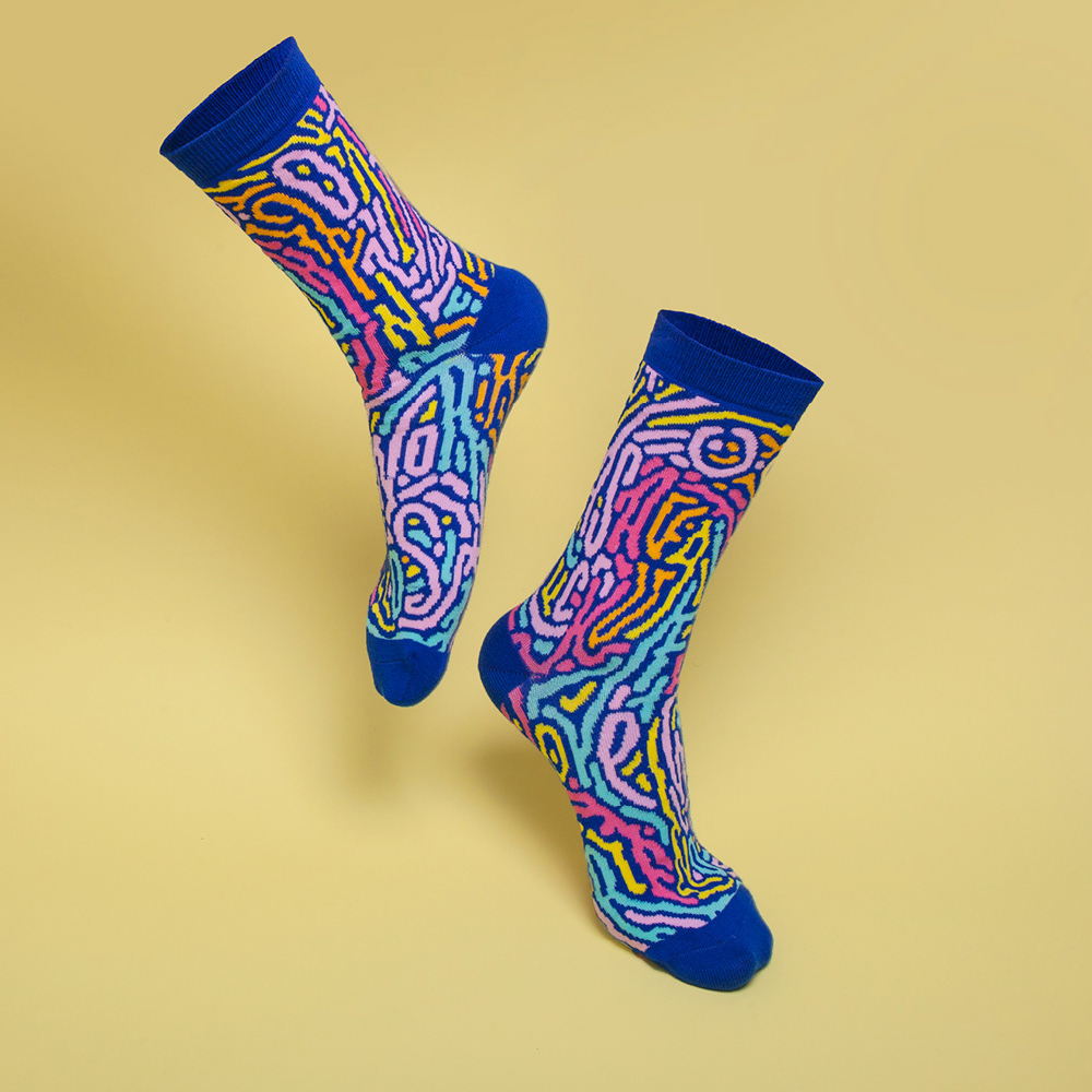
In 2016, Vasava created a beautifully patterned, colourful pair of limited-edition socks to send to a select few commissioners and potential clients, showing off the studio's illustrative style.
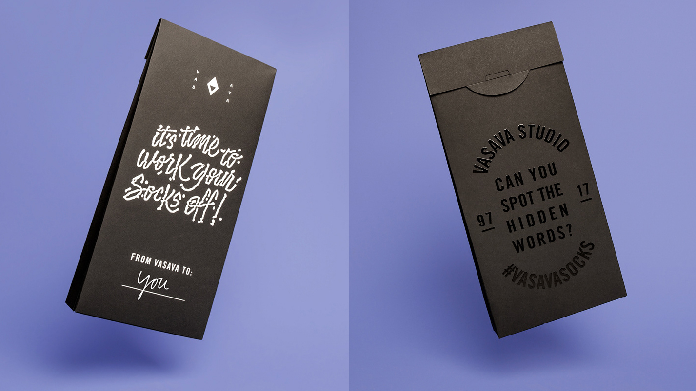
They were delivered in a slick, black, personalised package adorned with illustrated type – "It's time to work your socks off!" – on one side. The other featured a spot-varnished challenge: "Can you spot the hidden words?"
As part of a clever 'interactive game', recipients had to find six hidden keywords inside the pattern, as well as an emoji – and then share then using the hashtag #vasavasocks. As well as getting people engaged and encouraging them to study the intricate work closely, it also spread awareness far beyond the recipients themselves.
03. RRDCreative: Christmas Card
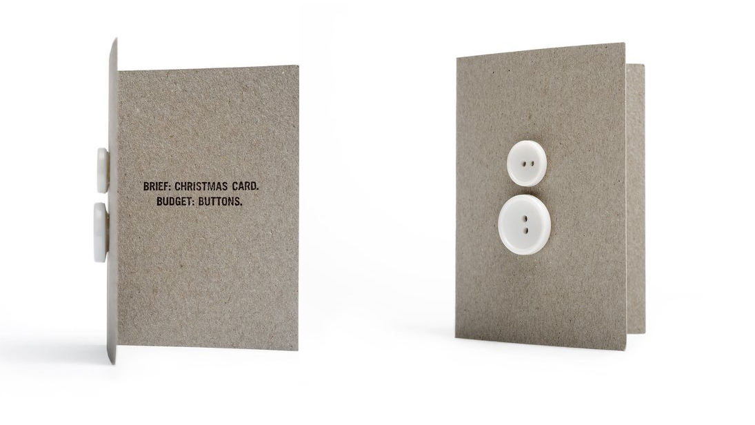
Both BLOCD and Vasava clearly had a handsome budget to spend on their carefully crafted, luxurious promo mailouts. But a lack of budget needn't hold you back, as brand communications agency RRDCreative skilfully demonstrated with its multi-award-winning Christmas card (which won a D&AD Graphite Pencil).
The concept was simple: the budget was buttons, so that's what they had to work with. Literally. Using two sizes of white button, the team constructed a brutally simple but nonetheless characterful snowman.
The wit of the line inside: "Brief: Christmas Card. Budget: Buttons" completes the effect perfectly, and showcases the smart thinking of the agency perfectly.
04. The Clearing: Wild Cards
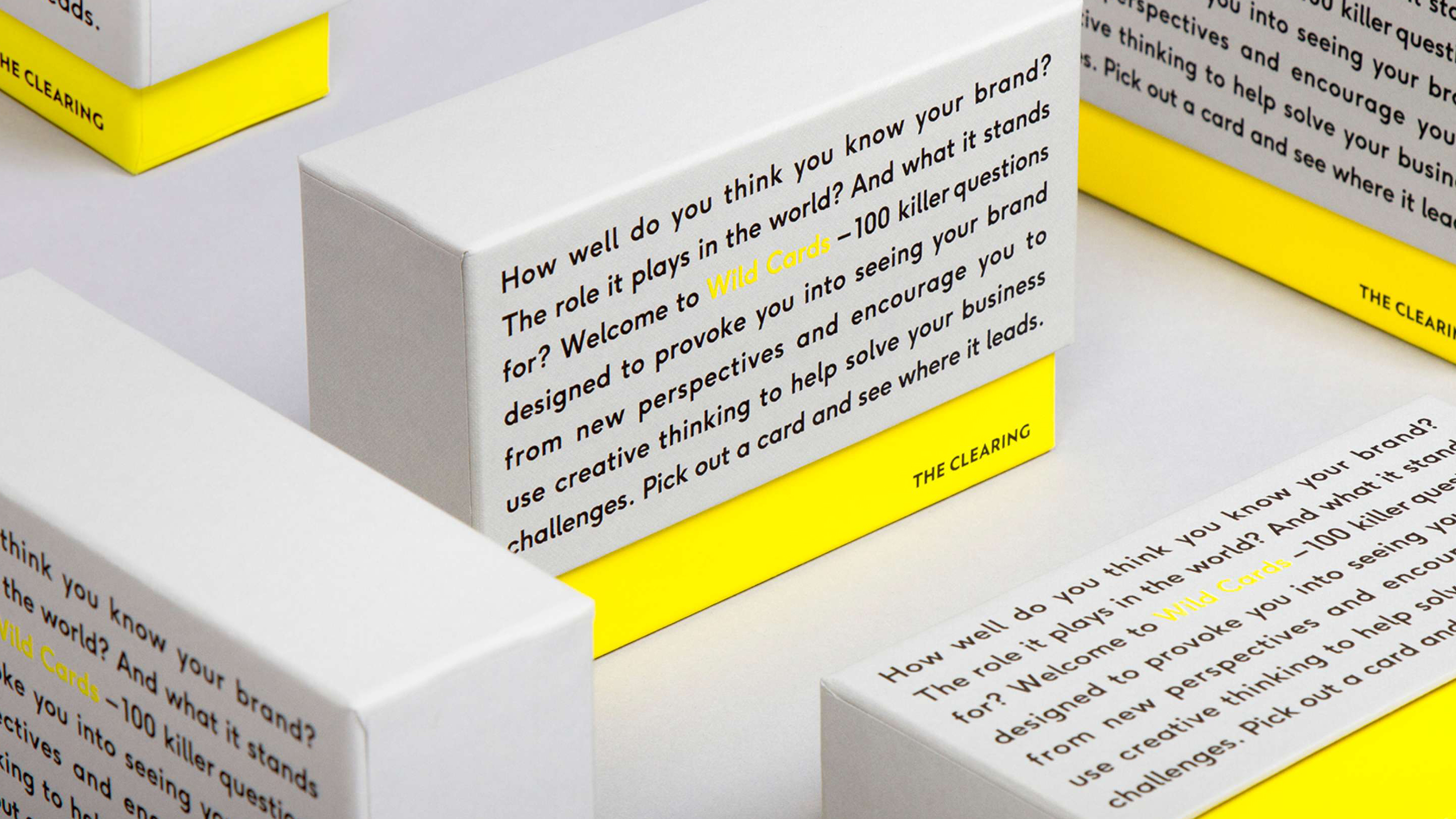
Shortlisted for a Brand Impact Award in 2017, The Clearing's ongoing Wild Cards project is a fantastic example of how self-promotion can be a byproduct of something much bigger.
Working with The School of Life, the London-based branding consultancy developed 100 provocative questions, designed to help explore a brand from new perspectives. Packaged in a stylish collectable box, the Wild Cards are a genuinely useful tool in the branding process.
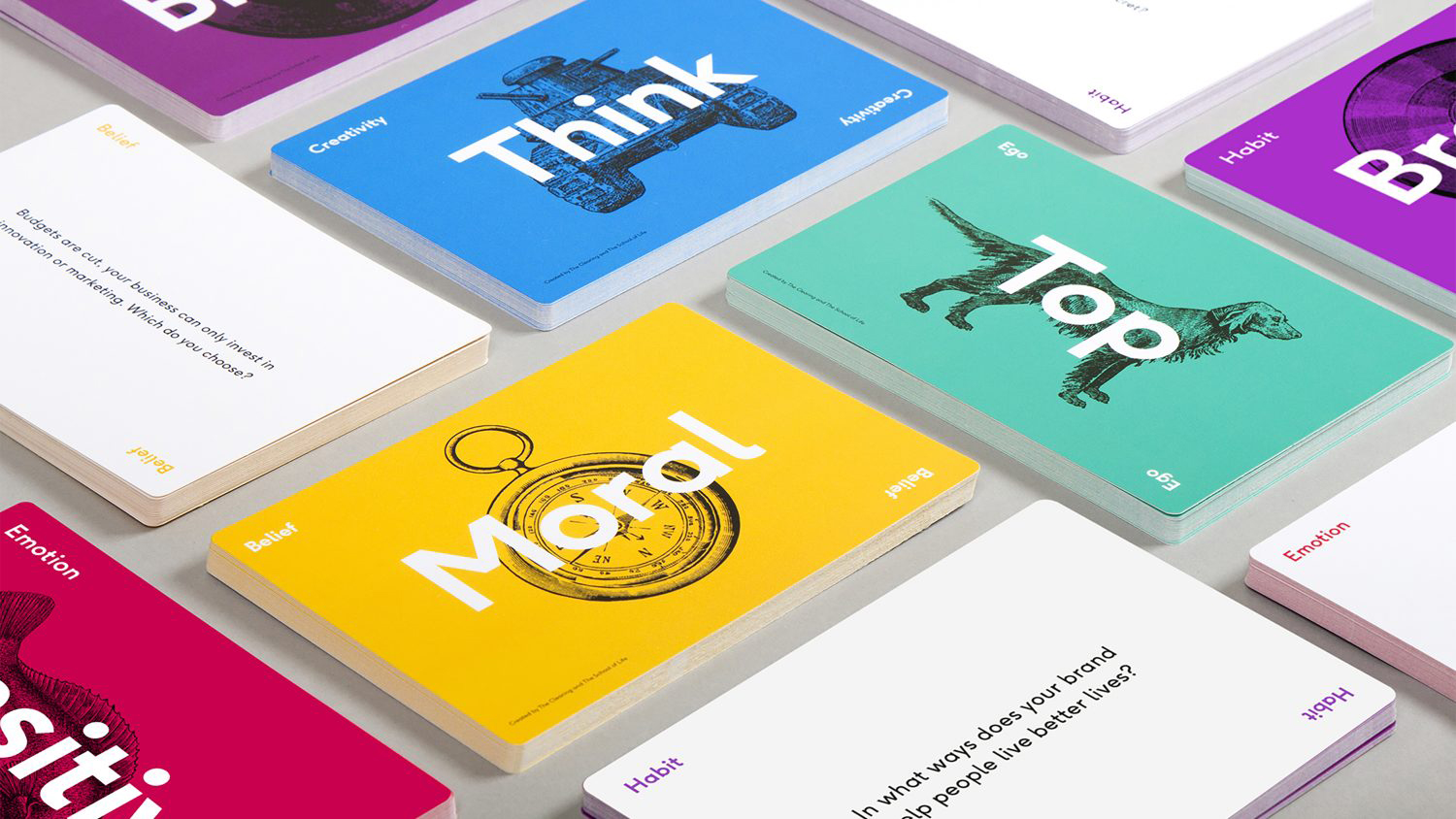
"We think the best businesses have a distinct point of view. They’re singular in their opinion but express it in many different creative ways – allowing them to own a space that’s distinctly theirs," is The Clearing's rationale behind creating the cards.
The agency has since gone on to organise a series of panel-based events with big-name brands, structured around some of the questions, to get to the heart of how they tick. It's a smart, savvy way to challenge new and existing clients to rethink their brands, and show off The Clearing's probing, thorough methodology in the process.
05. TBWA\Hunt\Lascaris: We Sent Their Briefs Back
The newly formed design department at TBWA\Hunt\Lascaris Johannesburg had an issue. All the big client briefs were landing with the well-established above-the-line (ATL) team, and they needed to get on the radar.
In South Africa, client briefs are delivered in brown envelopes known as job bags. The design team decided to intercept the in-tray of their ATL colleagues, and send them back to the clients as intricate pieces of three-dimensional paper art – proving, very literally, that they can "do amazing things with their briefs".
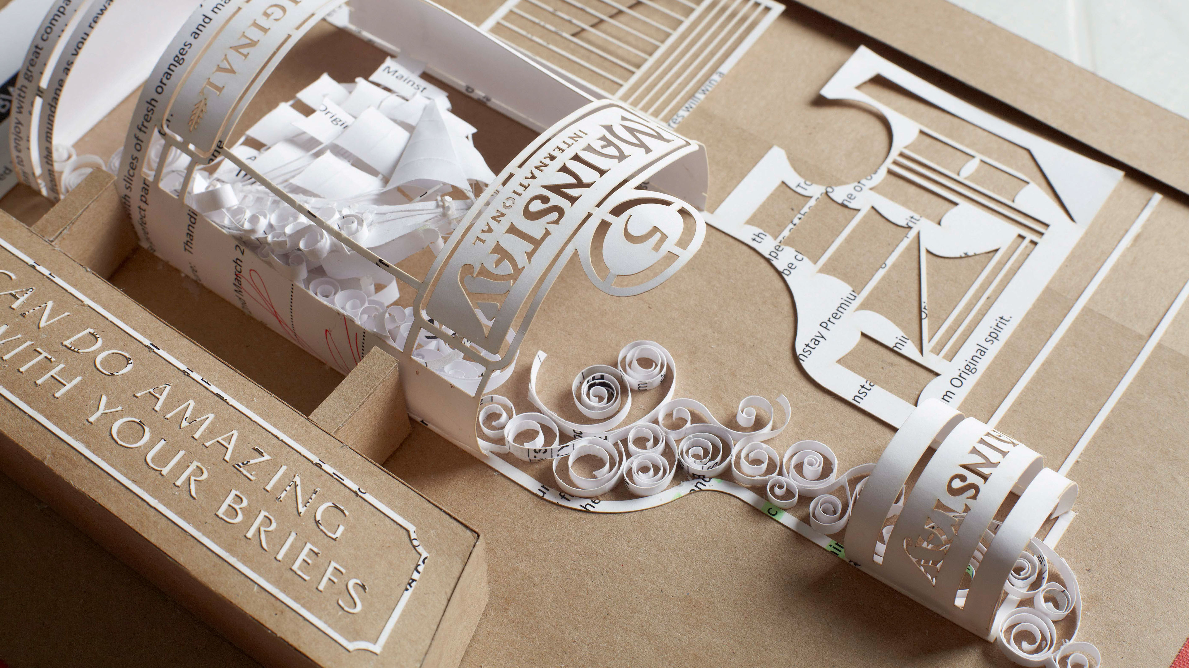
The campaign won a D&AD Pencil, but more importantly, was astonishingly successful at bringing in work. The design studio received its first new brief from a client just five days later, and within the first six weeks new work rose by 450 per cent.
What's more, the lucky client recipients exhibited the intricate paper artworks in their offices, as a permanent reminder of the craft and conceptual thinking found at TBWA\Hunt\Lascaris. The goal of most self-promo campaigns is to stay out of the bin: not many end up framed on the wall.
Related articles:

Thank you for reading 5 articles this month* Join now for unlimited access
Enjoy your first month for just £1 / $1 / €1
*Read 5 free articles per month without a subscription

Join now for unlimited access
Try first month for just £1 / $1 / €1

Nick has worked with world-class agencies including Wolff Olins, Taxi Studio and Vault49 on brand storytelling, tone of voice and verbal strategy for global brands such as Virgin, TikTok, and Bite Back 2030. Nick launched the Brand Impact Awards in 2013 while editor of Computer Arts, and remains chair of judges. He's written for Creative Bloq on design and branding matters since the site's launch.
