5 fascinating stories behind unusual logo designs
These seemingly random symbols for five top brands tell a tale.
At its most basic, logo design can be a very literal, representative thing – and that can be effective, if done well. Think Costa's bunch of coffee beans, iTunes' musical note, or Woolmark's ball of wool.
Other times, the name of the brand – even if it says nothing about the actual product or service it provides – becomes a gift for a logo designer. Step up Red Cross, Shell and Apple, and a whole gamut of animal-themed brands such as Puma, Jaguar, Penguin, Dove and Red Bull.
Increasingly, the trend for minimalist logo design is paring back clever illustrated symbols altogether in favour of clean, sans serif type and simple accompanying graphics. But a host of brands have built up an long-running association with a seemingly random symbol that rewards more digging.
Starbucks and McDonalds are two iconic US brands with such unusual associations. Before the Seattle-born franchise took over the world, who'd have associated a green topless mermaid and a Moby Dick character with coffee?
And while the 'Golden Arches' resemble an 'M' for McDonalds, they actually echo the distinctive shape of the fast-food giant's early roadside restaurants.
Read on to discover five more household brands whose symbols hide a fascinating backstory...
01. Nestlé: the family name
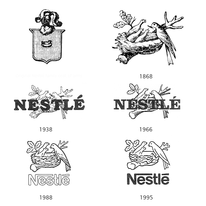
Have you ever pondered the connection between a multinational food and drink company and a bird's nest? It all comes down to the founder's heritage.
Get the Creative Bloq Newsletter
Daily design news, reviews, how-tos and more, as picked by the editors.
Henri Nestlé was one of the first Swiss manufacturers to develop a logo for his business, and turned to his family coat of arms for inspiration. Nestlé means 'nest' in German, so perhaps unsurprisingly, his crest featured a bird on its nest.
Given the company's range of products included cereal for infants, Nestlé adapted the otherwise fairly random symbol back in 1868 to gave it a nurturing twist, swapping the solitary bird for three baby birds being fed by their mother to create the ideal fusion between its name and its purpose.
Over time, the logo was progressively simplified. And in 1988 the three baby birds were reduced to just two, in an attempt to represent the 'average modern family' - albeit in bird form.
02. NBC: a colourful metaphor
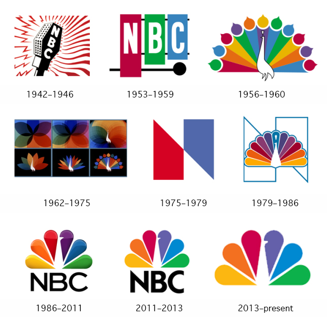
It may be a stretch to associate a peacock with a TV broadcaster in the modern era. But back in 1956 NBC wanted a visual metaphor that expressed the excitement of the recent innovations in colour televisions, and positioned the channel at the forefront.
Early versions showed a fairly literal line drawing of a peacock, with a graphic rainbow tail fanned out. Each of the 11 'feathers' featured a different coloured droplet, creating a vibrant explosion of colours designed to encourage black-and-white TV owners to make the switch to enjoy the full experience.
Besides its famously vibrant tail, the tagline 'proud as a peacock' used the well-known phrase to help express the network's pride in its colour system. Although during the 70s and early 80s – until Chermayeff & Geismar was brought on board to overhaul the brand in 1986, it was used alongside a graphic 'N' device.
Chermayeff & Geismar recognised the brand collateral in the peacock, even at a time when colour televisions came as standard rather than being any particular selling point for a network. The agency pared the feathers back to six, to represent NBCs different divisions. But the master stroke was the subtle notch that simply hints at the peacock's head - a much more elegant solution than its 1950s predecessor.
03. Domino's: counting the dots
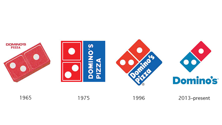
It may now be the world's most ubiquitous pizza chain, but Domino's had humble beginnings as a small, independent restaurant called DomiNicks, after its owner Dominick DiVarti. Tom Monaghan acquired the business with his brother James in 1960, but had bought him out within a year in exchange for the old Volkswagen Beetle they used for their deliveries.
By 1965, Monaghan had opened two more stores, but was unable to franchise the 'DomiNicks' name without DiVarti's permission, and it wasn't granted. An employee suggested changing it to 'Domino's', and Monaghan instantly loved it: besides the phonetic similarity and visual branding potential, he was also excited about how his franchising ambitions could be represented in the logo.
The three dots in the logo represent the three original Domino's locations: the plan was to add a dot for every subsequent store that opened. It was a neat idea, except the chain was vastly more successful than he could ever have imagined - had Monaghan stuck to his guns, there would now be over 10,000 dots to fit on.
04. MGM: King of the jungle
There are few things that'll make you sit up and take notice quite like a roaring lion. In the film industry at least, that symbol - and the accompanying noise - belongs conclusively to Metro-Goldwyn-Mayer, better known as MGM.
Generations of movie-goers were met with the roaring big cat, framed by an unravelling roll of film as part of the MGM crest. But the association with film was purely coincidental: the king of beasts was originally used as part of the 1916 trademark for Goldwyn Pictures Corporation, as a tribute to ad executive Howard Dietz's alma mater, Columbia University - and specifically its athletic team, nicknamed The Lions.
When Goldwyn Pictures merged with Metro Pictures and Louis B. Mayer Pictures in 1924, the lion - an actual animal, named Slats - remained as the MGM brand's official mascot. While he didn't roar at first, he was first heard, via gramophone, at the 1928 premiere of the silent movie White Shadows in the South Seas.
After Slats died in 1928, he was succeeded by a whole parade of MGM lions, including Jackie, Telly, Coffee, Tanner and George, before the best-known and longest-serving lion, Leo, took over in 1957. It's a rich branding heritage, and it all sprung from the fact that an executive went to a certain university.
05. Toblerone: the mountain and the bear
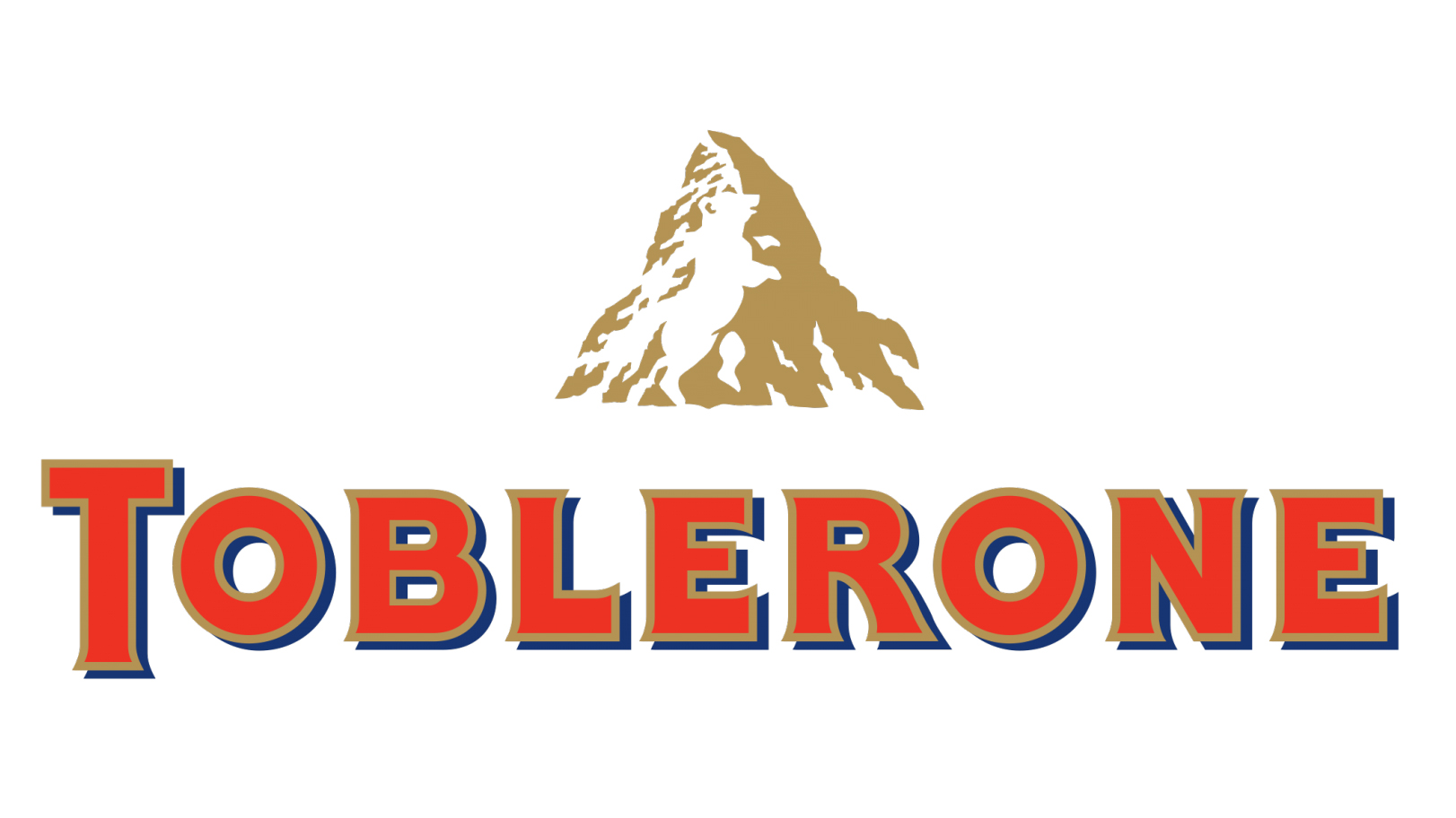
Many brands draw on the history and heritage of the city or country they hail from, rather than the products they make. Toblerone is a great example: rather than depicting anything to do with the chocolate itself, the brand chose a geographical landmark - the nearby Matterhorn - as its emblem.
That distinctive mountain shape is echoed in the triangular chunks of the chocolate bar itself, but the references don't stop there. Hidden within the snowy patterns on the sheer face of the mountain is the outline of a bear - the official symbol of Bern, the Swiss city where Toblerone was founded in 1908.
Where the symbols used by Nestlé and MGM are closely tied to a particular individual involved with the business - the founder's name, where a particular exec studied - Toblerone's symbol demonstrates pride in its origins, and gives a little-known regional emblem global significance.
Related articles:

Thank you for reading 5 articles this month* Join now for unlimited access
Enjoy your first month for just £1 / $1 / €1
*Read 5 free articles per month without a subscription

Join now for unlimited access
Try first month for just £1 / $1 / €1

Nick has worked with world-class agencies including Wolff Olins, Taxi Studio and Vault49 on brand storytelling, tone of voice and verbal strategy for global brands such as Virgin, TikTok, and Bite Back 2030. Nick launched the Brand Impact Awards in 2013 while editor of Computer Arts, and remains chair of judges. He's written for Creative Bloq on design and branding matters since the site's launch.
