It’s difficult to know, most of the time, how much big companies really spend on logo designs and redesigns. Few firms are willing to share figures, and even if they do, it’s difficult to distinguish the cost of designing the logo from the cost of the rebrand as a whole, which can include marketing, advertising and other associated costs.
But while we can’t list “the most expensive logos in history” (because we don’t definitively know the top five, and in truth, neither does anyone else), it’s interesting to look at examples where companies have spent vast sums on their logos, and whether they were worth it.
In this post, we look at five famous examples of expensive logo designs, and pull out some lessons we can learn from them.
01. BP

In 2000, BP paid an awful lot of money for a new logo. According to The Daily Telegraph, it cost a whopping £4.6 million just to design the logo, while the overall cost of the rebranding came in at £136 million (including the cost of rebranding stationery, van liveries and manufacturing plants).
The project, led by Landor Associates in 2000, saw the replacement of the old ‘shield’ logo with a new one designed specifically to promote “BP’s position as an environmental leader and its goal of moving beyond the petroleum sector”, as the company began to invest in alternative energy. According to Landor: “A stylised sunflower symbolizes the sun’s energy, while the colour green reflects the brand’s environmental sensitivity.”
The new logo attracted much ridicule from environmental campaigners, most of whom saw BP’s new interest in green energy as a smokescreen for continuing to promote fossil fuels. Later, Greenpeace even crowd-sourced a parody version featuring a bird stuck in an oil slick.
The cost of the rebranding exercise was also lambasted by the UK press at the time, in light of a continuing series of price hikes at petrol stations.
Get the Creative Bloq Newsletter
Daily design news, reviews, how-tos and more, as picked by the editors.
However, the case study on Landor’s website offers a different take on the project. Rather than focusing on what the public thought of BP’s revamped logo, it talks more about the internal institutional reaction to the new branding. Landor trained more than 1,400 brand champions in 19 countries on the promise of ‘Beyond Petroleum’. As a result, “nine months after launch, 97 per cent of BP employees were aware of the brand idea, and 9 out of 10 agreed that BP was heading in the right direction”.
In short, the tone of the case study suggests BP was less interested in convincing the public that it was becoming greener, and more interested in convincing its own staff. And that puts a completely different spin on how you view the success of the new logo design.
Lesson learned: Before you judge a logo, think about who its real audience is. It might, for example, be more targeted towards influencing employees, stakeholders or investors than consumers.
02. CitiBank
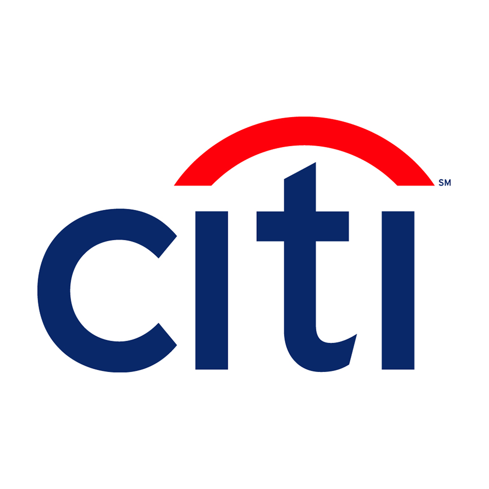
The CitiBank logo was designed in 1998 by well-known designer Paula Scher of Pentagram, when industry giants Citicorp and Travellers Group merged to create the world’s largest financial services firm. That the bank paid the princely sum of $1.5 million for this design (part of a near-$10 million for the branding as a whole) is not so surprising. With assets under management of $700bn, its pockets were deep enough.
But what was controversial is that the logo they received was based on a sketch Scher did on the back of napkin. During their first meeting. In around 10 minutes.
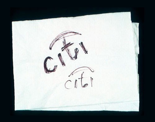
“My best work is kind of big, bold strokes that come very quickly,” Scher explains in this video interview. “And it’s problematic because a lot of clients like to ‘buy process’ and they don’t think they’re getting their money’s worth, like I sold it too fast. ‘How can it be that you talk to someone and it’s done in a second?’ But it is done in a second – and 34 years.”
In other words, drawing on those 34 years of experience meant that Scher could sidestep months of ‘process’ and produce the perfect basis for a logo design in an instant.
Certainly, in all meaningful ways, Citibank got their money’s worth. The now-globally recognisable logo has been in place for the whole of the century so far, and shows no signs of needing to be replaced.
Lesson learned: The economic value of a logo design lies not in how long it took to produce, but how well it works. Scher’s example highlights how experienced and talented designers can help shortcut the process and still obtain great results, and there’s no shame in being paid accordingly.
03. The City of Belfast

In 2008, the City of Belfast commissioned a new logo, but the process was longer and more involved than originally expected. It took a reported 15 months and £180,000 to create the new logo, designed by brand consultancy Lloyd Northover, along with £250,000 on advertising, launch events and showcase promotions, according to the Belfast Telegraph.
That figure attracted widespread press criticism, especially when Sunday Life revealed that the new logo was very similar to others already in use in England, such as a logo for Food and Drink Devon, which had been created for just £7,000.
It’s worth pointing out, however, that Lloyd Northover certainly worked for its money. Having won the contract following a competitive pitch process, it went on to consult around 3,000 key Belfast City stakeholders from within the business, tourism, hospitality, culture, arts and youth communities. Its in-house market research team also worked with focus groups, held workshops and conducted a web survey to test ideas and concepts across England, Scotland, the Republic of Ireland, Europe and the USA.
Given the troubled history of Belfast, it’s fair to argue that such consultation was necessary to avoid a costly mistake. Consequently, the resulting logo was welcomed across all communities.
Lesson learned: In a charged and conflicted environment, it’s good to get everyone on board. And if that costs a little extra when it comes to researching your branding, it’s a price worth paying: the alternative would have been far costlier in the long term.
04. NBC
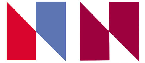
In 1976, NBC wanted to update its image for its 50th anniversary, and introduced a completely new logo design based around an abstract letter N made of two trapezoids: one red, one blue. It went on to be used in the first electronically animated ident for an American TV network, and came into official use on 1 January 1976. Designed by the firm Lippincott and Margulies, it was reported to have cost between $750,000 and $1million; an enormous sum for the 1970s.
Unfortunately, nobody had noticed that it was virtually identical to the logo for Nebraska Educational TV, part of the PBS network.
In February, the latter filled a trademark infringement lawsuit, and in the eventual out-of-court settlement, NBC gave Nebraska ETV over $800,000 worth of new equipment, as well as paying them $55,000 to cover the cost of designing and implementing a new logo. (Which seems especially high, given that NETV had spent less than $100 on designing their original logo.)
Lesson learned: Check you’re not plagiarising other people’s logos, even innocently, or it will cost you dear. Especially if they’re in the same industry as you.
05. Tropicana
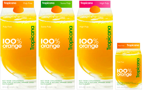
As the NBC example shows, the “cost” of a logo isn’t always just what you pay the branding company to develop it. In the case of Pepsico fruit brand Tropicana, it was the estimated $30 million in sales it lost because of it, over just two months.
To be fair, the failure of its 2009 rebrand wasn’t entirely down to the logo. The new packaging had swapped the well-known fruit-with-a-straw emblem for a generic-looking glass of orange juice, making it difficult to find on the shelves. The $35 million advertising campaign, with its overwrought overtures to family life and a nonsensical slogan (“Squeeze, it’s a natural”), was another factor.
But the new, straightened, vertical logo really didn’t help. While the old logo (below) had a sense of fun and personality, this new creation by now-defunct agency Arnell jettisoned all that. This logo looked more grown-up and professional, to be sure, but since when were those values associated with sugary drinks?
The leaf that forms the dot of the letter 'i' was still there, but so small as to be indistinct. And overall, beyond the word itself, the recognisability factor had dropped to near zero.

As a result, people were less likely to spot their favourite drink in the supermarket, and less inclined to buy it when they did. After two months, Tropicana sensibly reverted to the old logo and packaging.
Lesson learned: A clean, minimalist look might suit tech products and web startups, but for food and drink brands with a high degree of customer loyalty, it may not work. Also, if you rebrand and everyone hates it and you're losing millions, go back to your old brand.
Read more:

Thank you for reading 5 articles this month* Join now for unlimited access
Enjoy your first month for just £1 / $1 / €1
*Read 5 free articles per month without a subscription

Join now for unlimited access
Try first month for just £1 / $1 / €1

Tom May is an award-winning journalist and editor specialising in design, photography and technology. Author of the Amazon #1 bestseller Great TED Talks: Creativity, published by Pavilion Books, Tom was previously editor of Professional Photography magazine, associate editor at Creative Bloq, and deputy editor at net magazine. Today, he is a regular contributor to Creative Bloq and its sister sites Digital Camera World, T3.com and Tech Radar. He also writes for Creative Boom and works on content marketing projects.
